


I spent years teaching CSS layout on this blog. I put everything I know into The Layout Maestro course: 70+ lessons and 150+ interactive examples that teach you how to think CSS layouts, not just memorize syntax.
Pseudo-elements are in use for a long time. However, there are some uses cases that I feel they are not entirely known across developers. I wrote down this article to shed light on them so they can be used more.
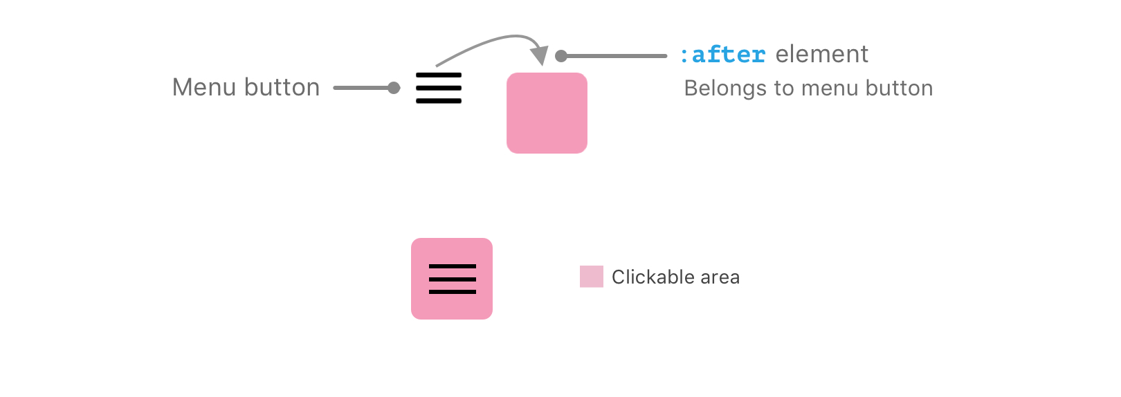
Since the pseudo-element belongs to its parent element, there are some unusual use cases for that. For now, let’s explore a straightforward example to demonstrate what I mean.
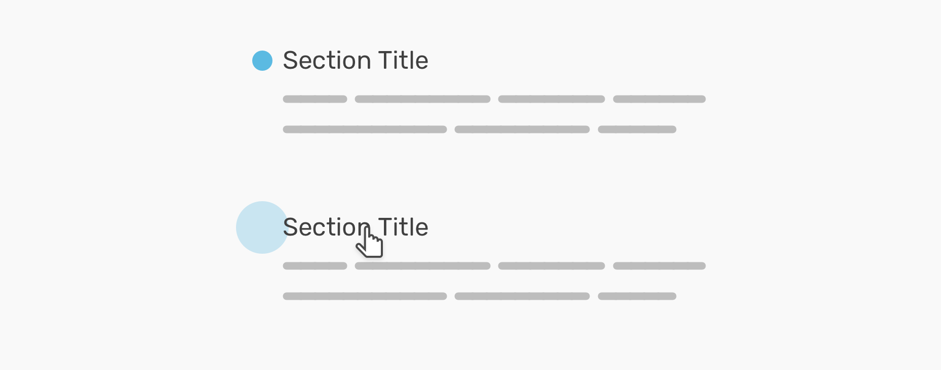
The design has a section title, with a little circle on the left side of it. When we hover on the section title, the circle gets bigger.
.section-title:before {
  content: "";
  width: 20px;
  height: 20px;
  background: blue;
  /* Other styles */
}

.section-title:hover:before {
  transform: scale(1.2);
}
Easy and straightforward. Let’s extend that concept to more useful use cases.
On my website, I have a section that lists all of my projects. I wanted to add a thumbnail for each project, but it wasn’t a top priority thing for me. What’s more important to me is the link itself. I first saw this effect a while ago on Ethan Marcotte website.
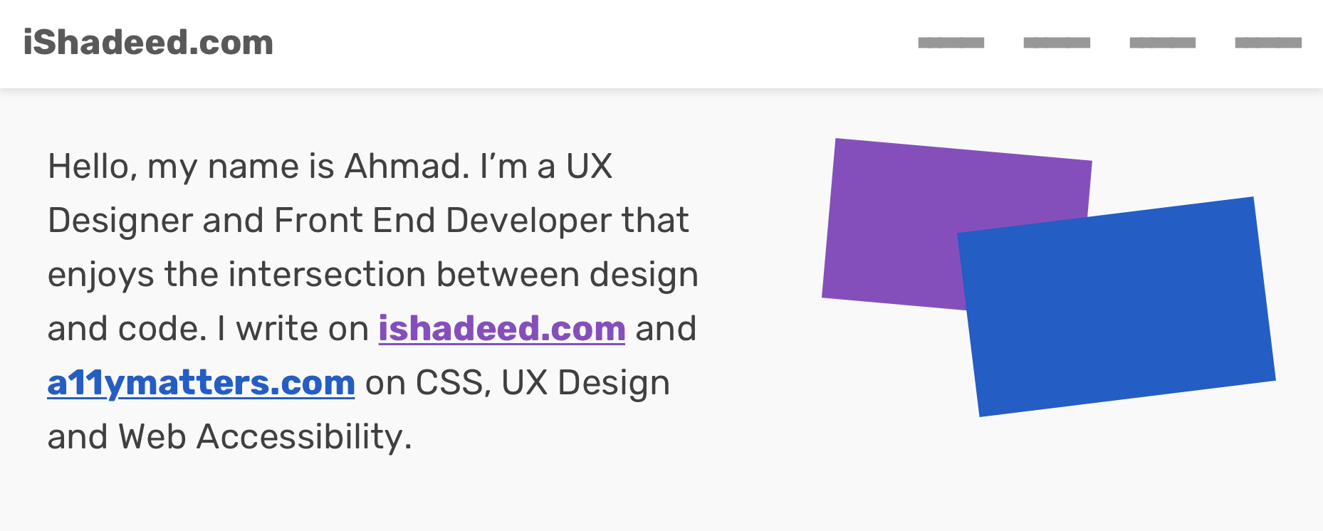
The above design mockup shows the idea that I wanted to apply. Each colored link in the paragraph has a pseudo-element paired with it.
<section class="hero">
  <p>
    Hello, my name is Ahmad. I’m a UX Designer and Front End Developer
    that enjoys the intersection between design and code. I write on
    <a href="www.ishadeed.com" class="link-1">ishadeed.com</a> and
    <a href="www.a11ymatters.com" class="link-2">a11ymatters.com</a>
    on CSS, UX Design and Web Accessibility.
  </p>
</section>
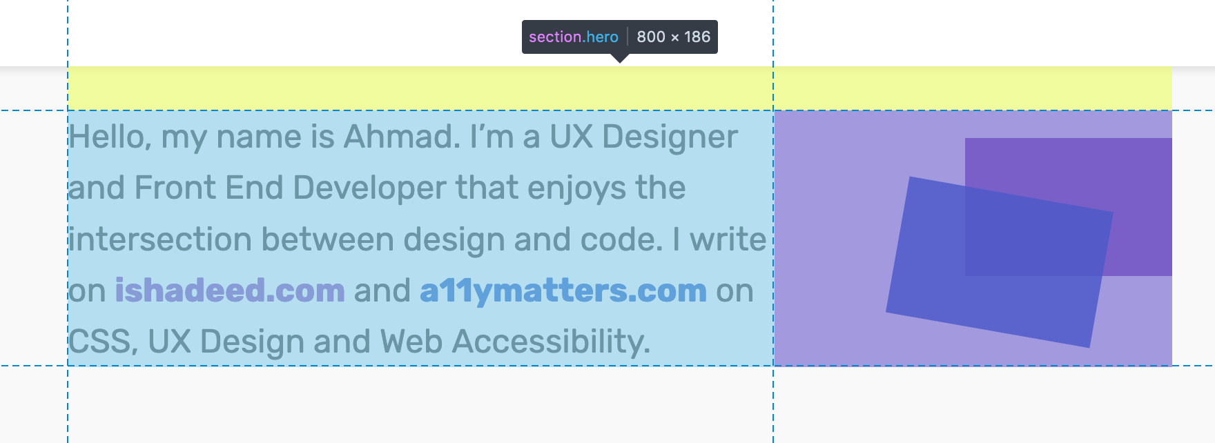
I want to reserve space for the pseudo-elements, so adding padding is a solution for that.
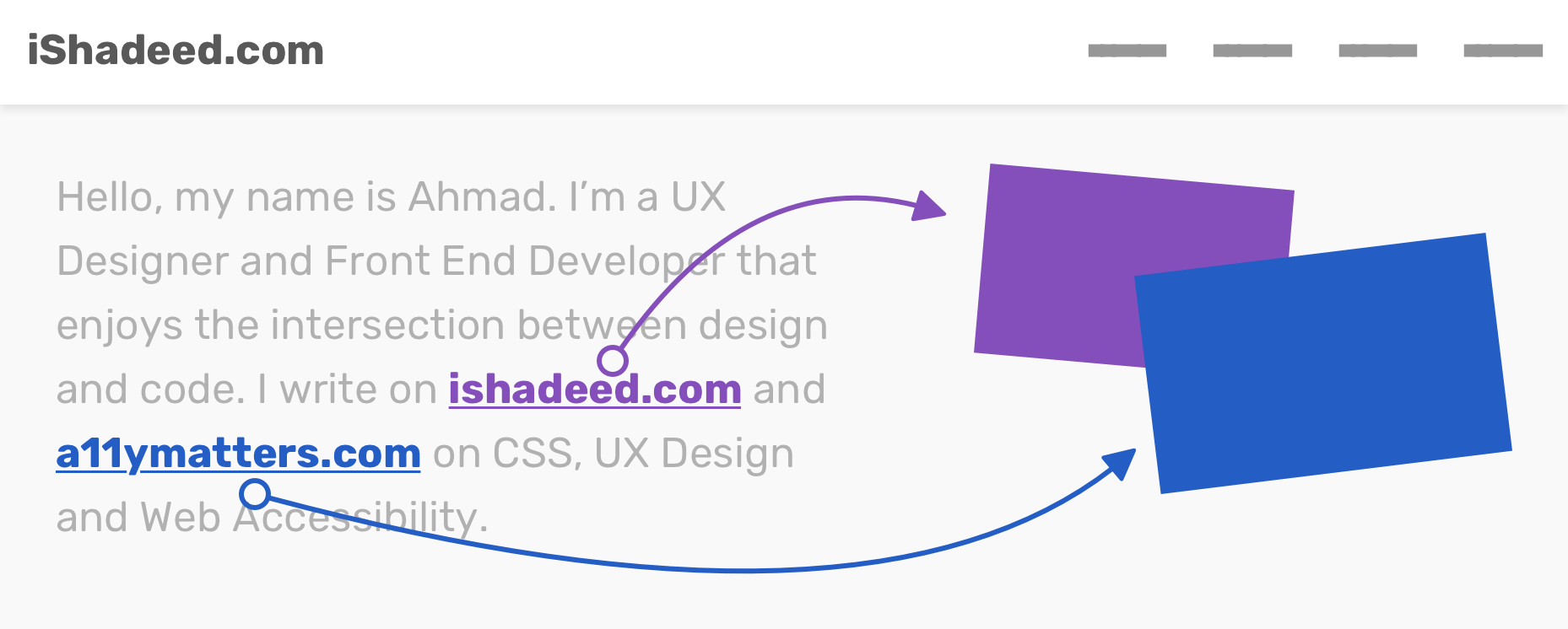
To position them absolutely, I need to define which parent is the relative one. It should be added to the hero section.
Notice in the below GIF how removing position: relative from the .hero section affects the pseudo-elements.
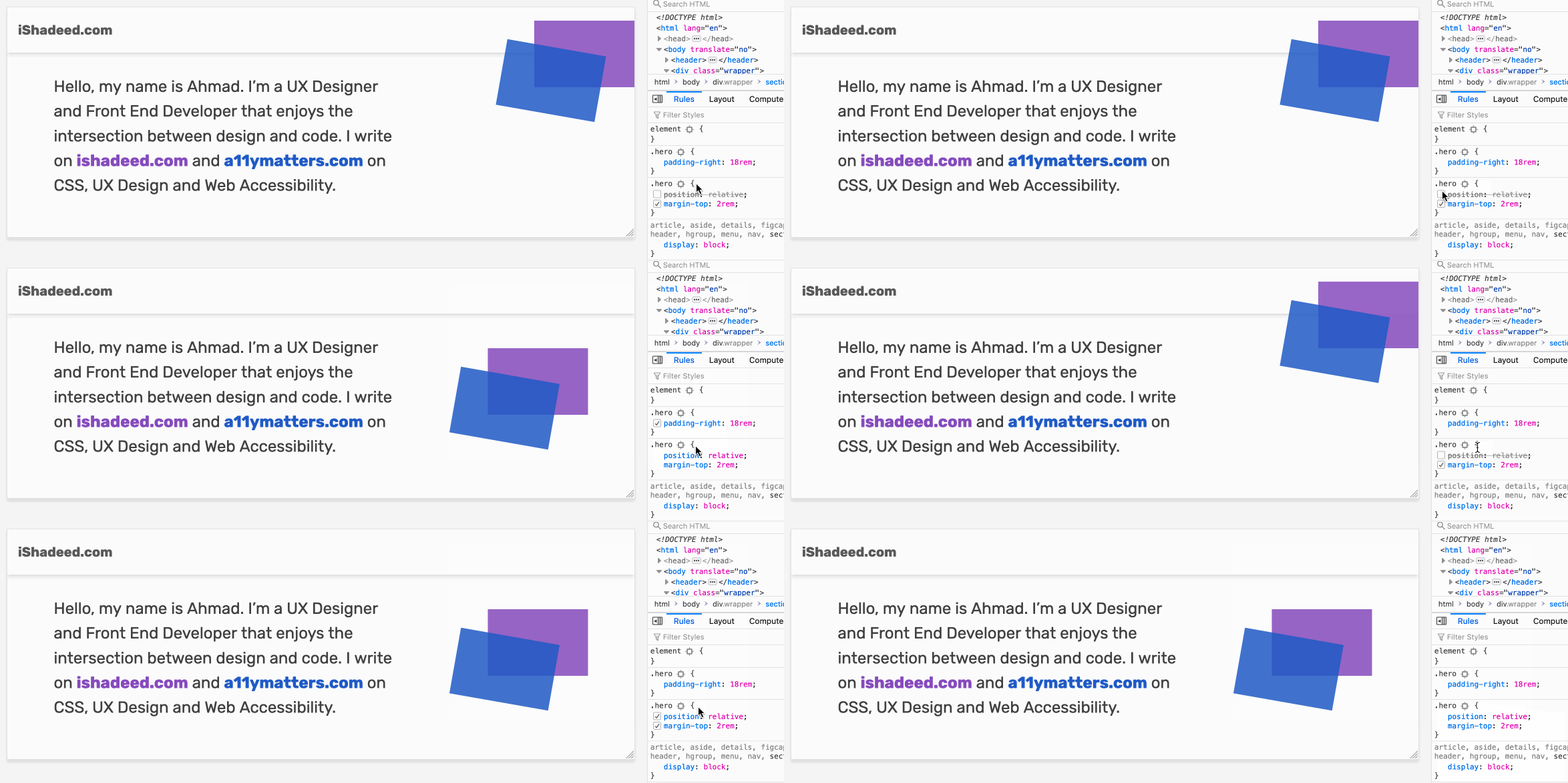
The final step is to add the pseudo-elements along with their hover effects. Here is how I did it:
.link-1 {
  color: #854fbb;
}

@media (min-width: 700px) {
  .link-1:after {
    content: "";
    position: absolute;
    right: 0;
    top: 20px;
    width: 150px;
    height: 100px;
    background: currentColor;
    opacity: 0.85;
    transition: 0.3s ease-out;
  }

  .link-1:hover {
    text-decoration: underline;
  }

  .link-1:hover:after {
    transform: scale(1.2);
    opacity: 1;
  }
}
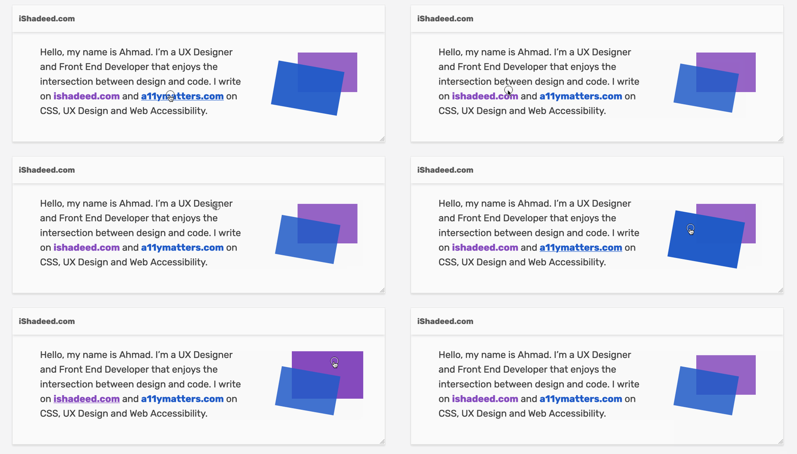
Notice that I’ve used currentColor for the pseudo-element background. If you don’t know about this keyword, it inherits from the color value of its parent. So at any point, I want to change the colors of the links, it’s easy to change them only once.
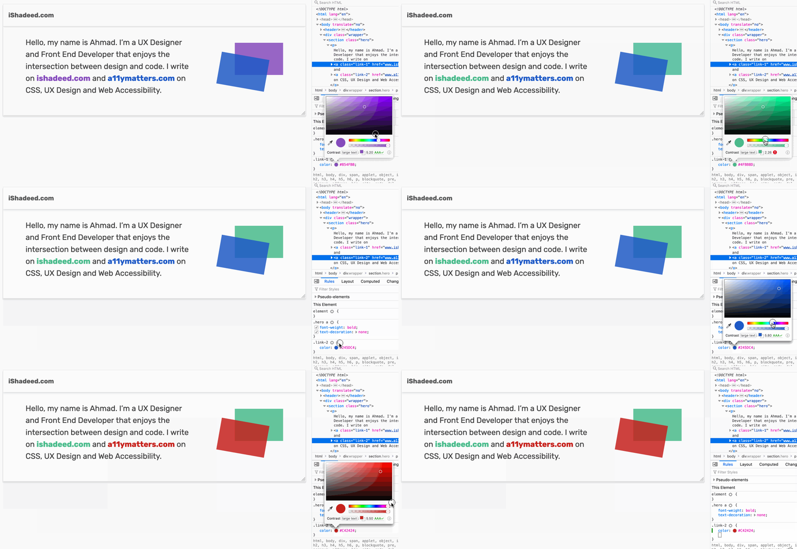
See the Pen Pseudo-elements: Example 1 by Ahmad Shadeed (@shadeed) on CodePen.
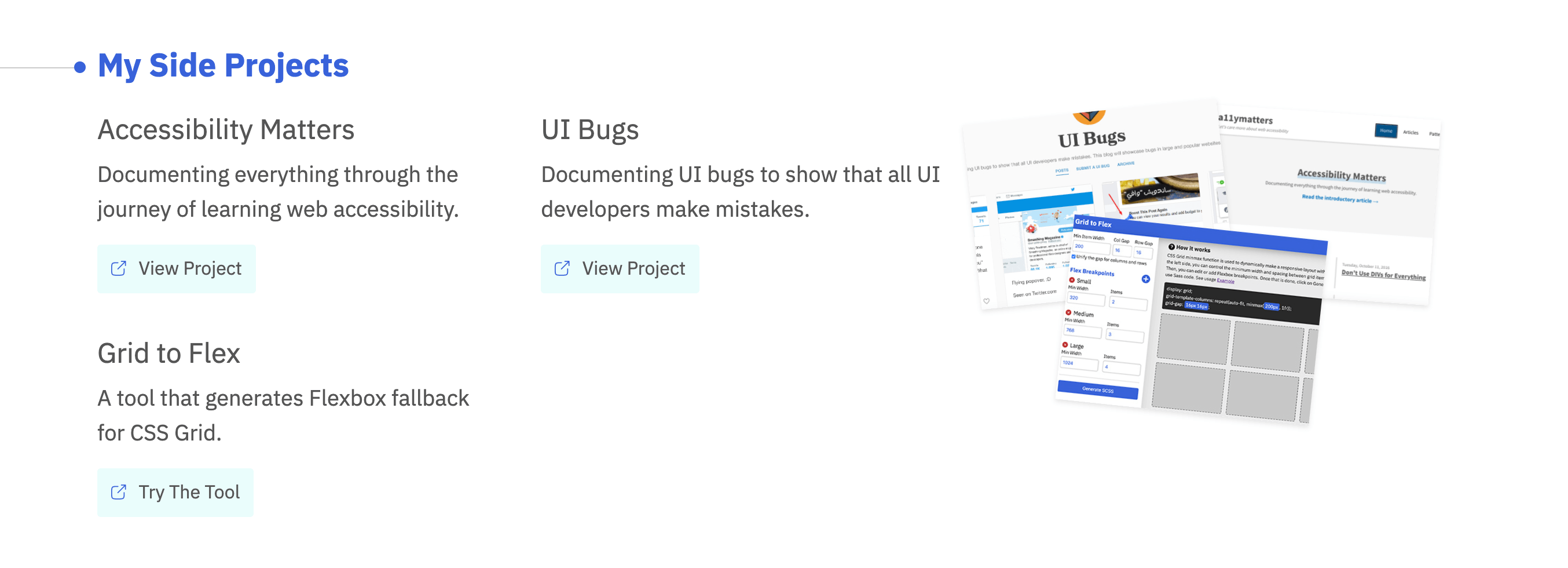
If you are curious, go to the home page of my website and check the “My Projects” section. I have used the above technique.
By adding a pseudo-element to a link, the clickable area around it will get bigger. This is very useful and will enhance the experience for the user. Let’s take an example:
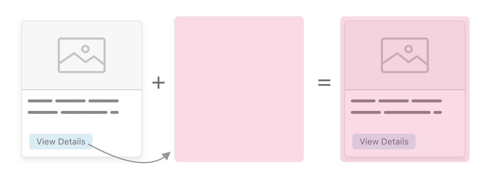
Moreover, it can be used to extend the clickable area of a card component, which has a view more link. Notice that the content of the article like its title and image will be above the pseudo-element, so it won’t affect selecting the text or saving the image. I wrote a detailed article about that topic.
Let’s suppose that there is an element with a background image, and the design has a gradient overlay with blending mode set to color. Pseudo-elements can help with that!
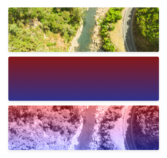
.hero {
  position: relative;
  height: 300px;
  background: url("image.jpg") center/cover;
}

.hero:after {
  content: "";
  position: absolute;
  left: 0;
  top: 0;
  width: 100%;
  height: 100%;
  background-image: linear-gradient(180deg, #851717 0%, #30328c 100%);
  mix-blend-mode: color;
}
See the Pen Pseudo-elements: Example 2 by Ahmad Shadeed (@shadeed) on CodePen.
I’m not sure if the naming is correct, but this is what I got. Back in the days, I used to create a shadow that is skewed at the edges. It has a little subtle effect. Guess what! It’s possible to do them with pseudo-elements.
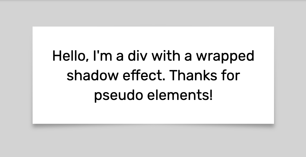
I created a div element with regular styles as below.
.elem {
  position: relative;
  display: flex;
  align-items: center;
  max-width: 400px;
  background: #fff;
  padding: 2rem 1rem;
  font-size: 1.5rem;
  margin: 2rem auto;
  text-align: center;
  box-sizing: border-box;
}

Then, I added :before and :after pseudo-elements with a width of 50% for each of them (I added a different background for each one for explaining purposes).
.elem:before,
.elem:after {
  content: "";
  position: absolute;
  top: 2px;
  width: 50%;
  height: 100%;
}

.elem:before {
  left: 0;
  background: grey;
}

.elem:after {
  right: 0;
  background: #000;
}
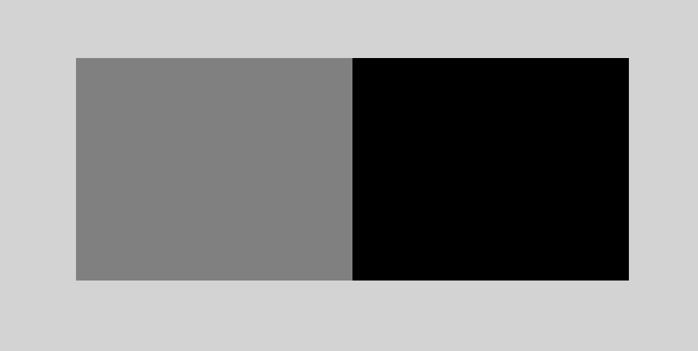
Next, I will add transform: skew(x) where X is 2 degrees. For one of them, X should be negative to achieve the desired effect.
.elem:before {
  transform: skew(-2deg);
}

.elem:after {
  transform: skew(2deg);
}
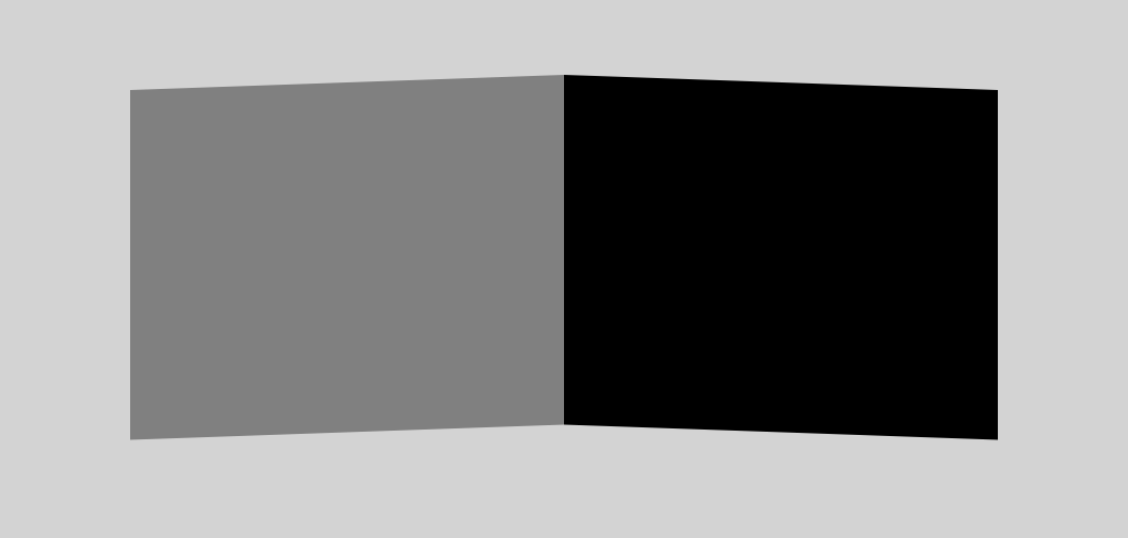
Next, I will add z-index: -1 to each pseudo-element to move it behind its parent.
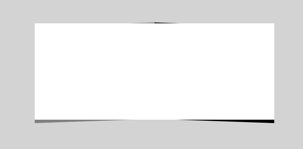
Once that is done, I did the following:
filter: blurFinal Code
.elem {
  position: relative;
  display: flex;
  align-items: center;
  max-width: 400px;
  background: #fff;
  padding: 2rem 1rem;
  font-size: 1.5rem;
  margin: 2rem auto;
  text-align: center;
  box-sizing: border-box;
}

.elem:before,
.elem:after {
  content: "";
  position: absolute;
  top: 3px;
  width: 50%;
  height: 100%;
  z-index: -1;
  background: linear-gradient(to bottom, transparent, #000);
  filter: blur(3px);
  opacity: 0.3;
}

.elem:before {
  left: 0;
  transform: skewY(-2deg);
}

.elem:after {
  right: 0;
  transform: skewY(2deg);
}
There is another option, which is to swap the skewY values between the :before and :after pseudo-elements. That will result in a different effect.
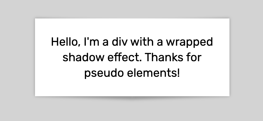
See the Pen Pseudo-elements: Example 3 by Ahmad Shadeed (@shadeed) on CodePen.
:after vs :beforeIn a recent Twitter discussion, I learned that it’s better to use :before instead of :after. Why? Because when using :after, it might require us to add z-index to other nested elements so the pseudo-element won’t overlap them. Let’s take a real-life example.
Here is a simple card that consists of a thumbnail and title. If you notice, there is a gradient overlay below the text to make the text clearer in case the thumbnail is too light.

<article class="card">
  <img src="article.jpg" alt="" />
  <h2>Title here</h2>
</article>
To add the gradient overlay under the text, I will need to use a pseudo-element. Which one will you pick? :before or :after? Let’s explore both.
In that case, the title will appear underneath the pseudo-element overlay like the below.

The solution to that is to add z-index to the card title. Even if this is an easy and quick solution, it’s not the correct thing to do.
.card-title {
  /*Other styles*/
  z-index: 1;
}
When using a :before element for the overlay, it works by default! It’s not needed to add z-index to the card title. The reason is that when using :before, the element won’t appear above the other sibling items while it will appear in case the element was :after.
See the Pen Pseudo-elements: Example 4 by Ahmad Shadeed (@shadeed) on CodePen.
If there is a link that has a PDF file, for example, it’s possible to add a PDF icon to make it more clear for the user.
Here is an example of how to show a PDF icon for a link:
<p><a href="example.pdf">Download PDF</a></p>
<p><a href="example.doc">Download Doc</a></p>
a[href$=".pdf"]:before {
  content: "";
  display: inline-block;
  vertical-align: middle;
  margin-right: 8px;
  width: 18px;
  height: 18px;
  background: url(https://s3-us-west-2.amazonaws.com/s.cdpn.io/182774/np_pdf_377198_000000.svg)
    center/20px no-repeat;
  padding: 3px;
}
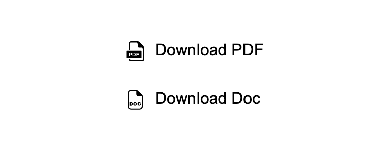
See the Pen Pseudo-elements: Example 5 by Ahmad Shadeed (@shadeed) on CodePen.

For this example, there is a separator with “or”. At each side, there is a line. It’s possible to do that with pseudo-elements and Flexbox.
<p>Or</p>
p {
  display: flex;
  align-items: center;
}

p:before,
p:after {
  content: "";
  height: 2px;
  background: #c5c5c5;
  flex-grow: 1;
}

p:before {
  margin-right: 10px;
}

p:after {
  margin-left: 10px;
}
See the Pen Pseudo-elements: Example 6 by Ahmad Shadeed (@shadeed) on CodePen.
It turned out that there is a better way to do this. Mr. Scott Zirkel pointed out that it’s better to use an <hr> for that kind of thing. Check out the CodePen Demo for more details.
And that’s a wrap. Do you have a comment or a suggestion? Please feel free to ping me on @shadeed9.
Thank you for reading.
此内容由惯性聚合(RSS阅读器)自动聚合整理,仅供阅读参考。 原文来自 — 版权归原作者所有。