


I spent years teaching CSS layout on this blog. I put everything I know into The Layout Maestro course: 70+ lessons and 150+ interactive examples that teach you how to think CSS layouts, not just memorize syntax.
Have you often thought about whether to implement a mobile-first or a desktop-first approach? Recently, I shared a Twitter poll about how many uses mobile-first vs desktop-first, and the results were interesting.
The total number of votes is 648, and here are the stats:
In this article, I will explore with you what each method means, and I will try to discover and see if it’s still relevant for today, along with some tips for responsive design today.
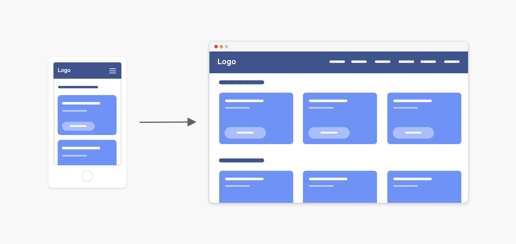
The term Mobile-First means that when developing a website, we start writing the CSS for smaller viewport sizes first, and then use CSS media queries to alter the experience for larger ones (e.g: tablets or desktops).
Consider the following example.
.section {
  padding: 2rem 1rem;
}

@media (min-width: 62.5rem) {
  .section {
    display: flex;
    align-items: center;
    gap: 1rem;
    padding: 4rem 2rem;
  }
}
We have a section that has padding for mobile, and when the viewport is large enough, it should be a flex wrapper with larger padding.
This is a simplified example. Imagine this on the scale of a whole website or web app.
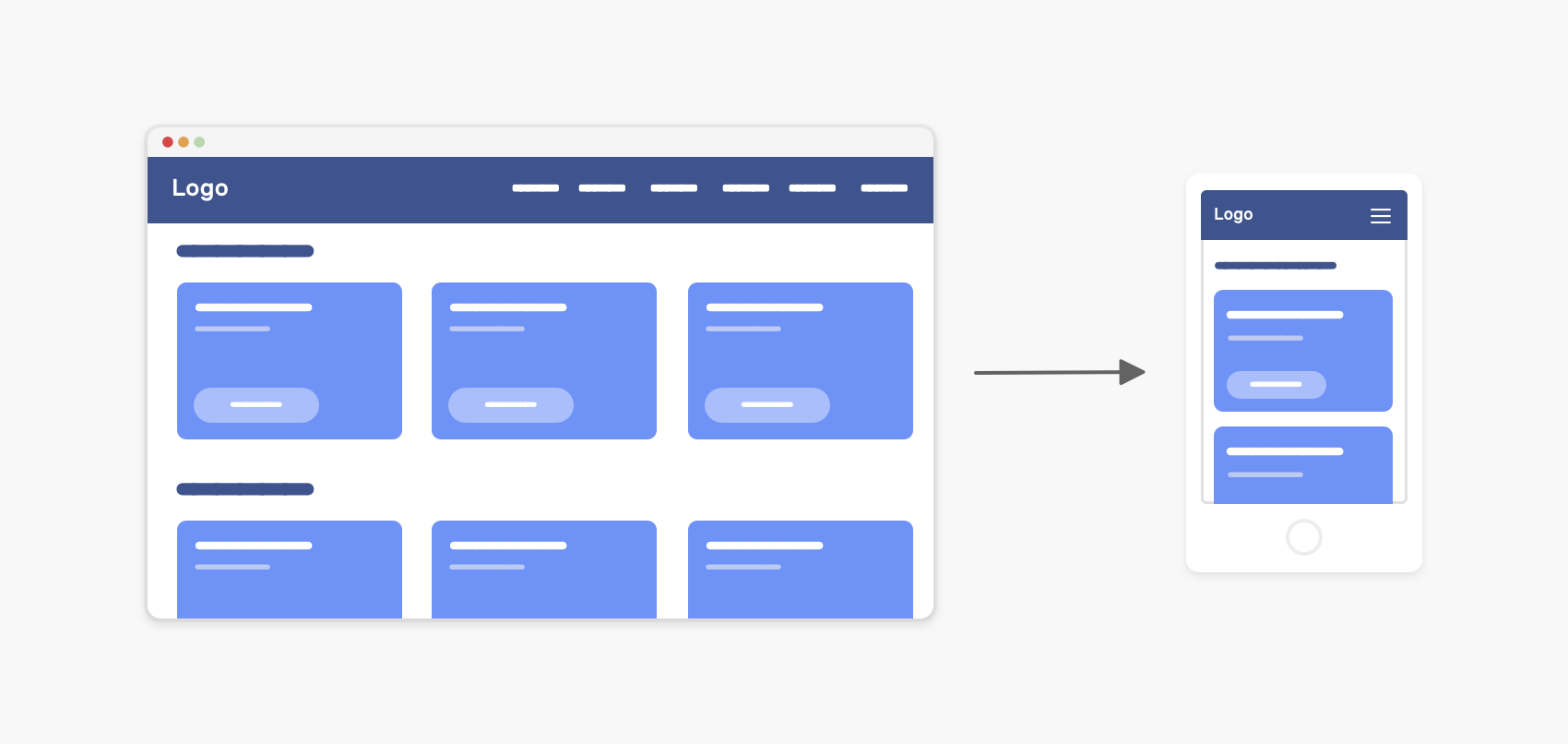
On the other hand, when we day Desktop First, it’s the other way around.
.section {
  display: flex;
  align-items: center;
  gap: 1rem;
  padding: 4rem 2rem;
}

@media (max-width: 62.5rem) {
  .section {
    display: block;
    padding: 2rem 1rem;
  }
}
We write CSS for larger viewport sizes first and then use a CSS media query to alter the CSS for smaller ones.
Do you open the DevTools and start development from there without even looking at the desktop size? Or should you do it in sync? i.e: write CSS mobile-first and enhance for the desktop at the same time?
I can think of two scenarios:
Which one do you usually use? For me, the second one is better. I prefer to handle each component/section separately so that I can focus on it. Also, this process will reduce making mistakes while writing CSS.
When you start mobile-first and then enhance for desktop, there is a possibility that you will rewrite CSS for tablet and desktop. Consider the following figure:
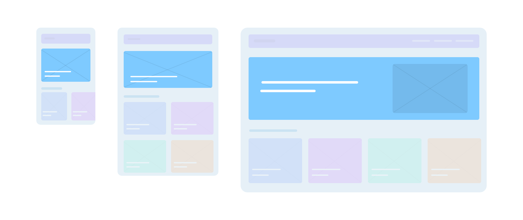
Let’s take the hero section as an example.
.hero {
  display: flex;
  align-items: flex-end;
  background-image: url("hero.jpg");
  background-size: cover;
  background-repeat: no-repeat;
}

.hero__title {
  font-size: 1rem;
}

.hero__thumb {
  display: none;
}

@media (min-width: 60rem) {
  .hero {
    align-items: center;
    background-image: initial;
    background-color: #7ecaff;
  }

  .hero__title {
    font-size: 2rem;
  }

  .hero__thumb {
    max-width: 320px;
    display: block;
  }
}
On mobile, the hero has a background image, while on desktop, the background is a solid color, and there is an image that is positioned at the far right. As you see, the CSS is mobile-first and we don’t have many overrides except for the font-size and background.
What about the navigation? How it will look like with the mobile-first approach? Here it is.
.nav {
  position: fixed;
  left: 0;
  top: 0;
  width: 100%;
  height: 100%;
  overflow-y: auto;
  padding-top: 2rem; /* Space for the toggle */
}

.nav__toggle {
  position: absolute;
  right: 1rem;
  top: 1rem;
}

.nav__item {
  padding: 1rem;
  display: block;
}

.nav__item:not(:last-child) {
  border-bottom: 1px solid #fff;
}

/* Desktop styles */
@media (min-width: 60rem) {
  .nav {
    position: initial;
    width: initial;
    height: initial;
    overflow-y: initial;
    display: flex;
    align-items: center;
    padding-top: 0;
    background-color: blue;
  }

  .nav__toggle {
    display: none;
  }

  .nav__item:hover {
    color: blue;
    background-color: initial;
  }

  .nav__item:not(:last-child) {
    border-bottom: 0;
    border-left: 1px solid #fff;
  }
}
Do you see the amount of CSS overrides in there combined with CSS for the desktop view? This isn’t a good thing.
Not only that, but this might cause CSS specificity issues as well. Suppose that a developer wants to remove the border-bottom from the .nav__item by using the following CSS.
.nav__item {
  border-bottom: 0;
}
It won’t work since the :not pseudo-class has higher specificity in that case.
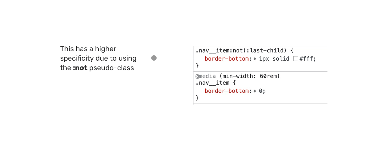
It will only work if you use one of the followings:
.nav .nav__item {
  border-bottom: 0;
}

/* Or */

.nav__item:not(:last-child) {
  border-bottom: 0;
  border-left: 1px solid #fff;
}
Based on the same previous example, we will flip things around and explore the desktop-first solution.
.nav {
  display: flex;
  align-items: center;
  background-color: blue;
}

.nav__toggle {
  position: absolute;
  right: 1rem;
  top: 1rem;
}

.nav__item {
  padding: 1rem;
  display: block;
}

.nav__item:hover {
  color: blue;
  background-color: initial;
}

.nav__item:not(:last-child) {
  border-bottom: 0;
  border-left: 1px solid #fff;
}

@media (max-width: 25rem) {
  .nav {
    display: block;
    position: fixed;
    left: 0;
    top: 0;
    width: 100%;
    height: 100%;
    overflow-y: auto;
    padding-top: 2rem; /* Space for the toggle */
  }

  .nav__toggle {
    display: block;
  }

  .nav__item:not(:last-child) {
    border-bottom: 1px solid #fff;
  }
}
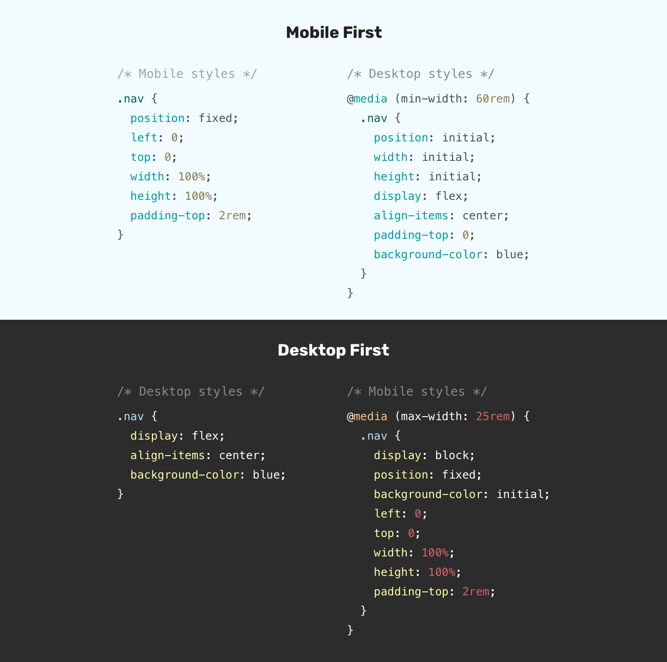
With this approach, we have fewer overrides than using the mobile-first one. Isn’t that interesting? The reason is that by using a max-width media query, we are scoping a specific design to a specific viewport width.
Instead of writing the CSS for mobile-first, and then overriding them for desktop, we do it the other way around.
Here is a visual comparison, side by side. Notice that the desktop-first looks shorter and doesn’t have duplication (Well, it has, but a little).
Tip: make sure to test for layout flickering.
Yes, there is. For me, I prefer to not stick to a specific approach. Instead, I like to mix them both. That means, we need to write the base styles first and then we start thinking about what will happen for mobile and desktop. I like how Elad Shechter is calling it basics first in this great article.
Let’s take an abstract example.
.nav {
  /* Base styles: not related to any viewport size */
}

/* Desktop styles */
@media (min-width: 800px) {
  .nav {
    ...;
  }
}

/* Mobile styles */
@media (max-width: 799px) {
  .nav {
    ...;
  }
}
As you see, the styles are scoped per viewport size. That means we don’t need to do any overrides. This approach is useful for components that look completely different on mobile versus desktop size. In our case, it’s the navigation.
However, for something like a <section>, using the mixed approach isn’t useful since the mobile and desktop styles are very similar.
.section {
  padding: 1rem;
}

/* Desktop styles */
@media (min-width: 800px) {
  .section {
    padding: 2rem 1rem;
  }
}
At some point, I feel that the mobile-first vs desktop-first discussion won’t be that important. Modern CSS provides us with ways to build responsive layouts with media query-less CSS.
With that being said, I think the mobile/desktop-first debate will be only about showing or hiding certain elements at specific viewport sizes (e.g: a navigation toggle button on mobile) except for complex components with big differences across viewport sizes.
Let’s take a real-life example to demonstrate the concepts.
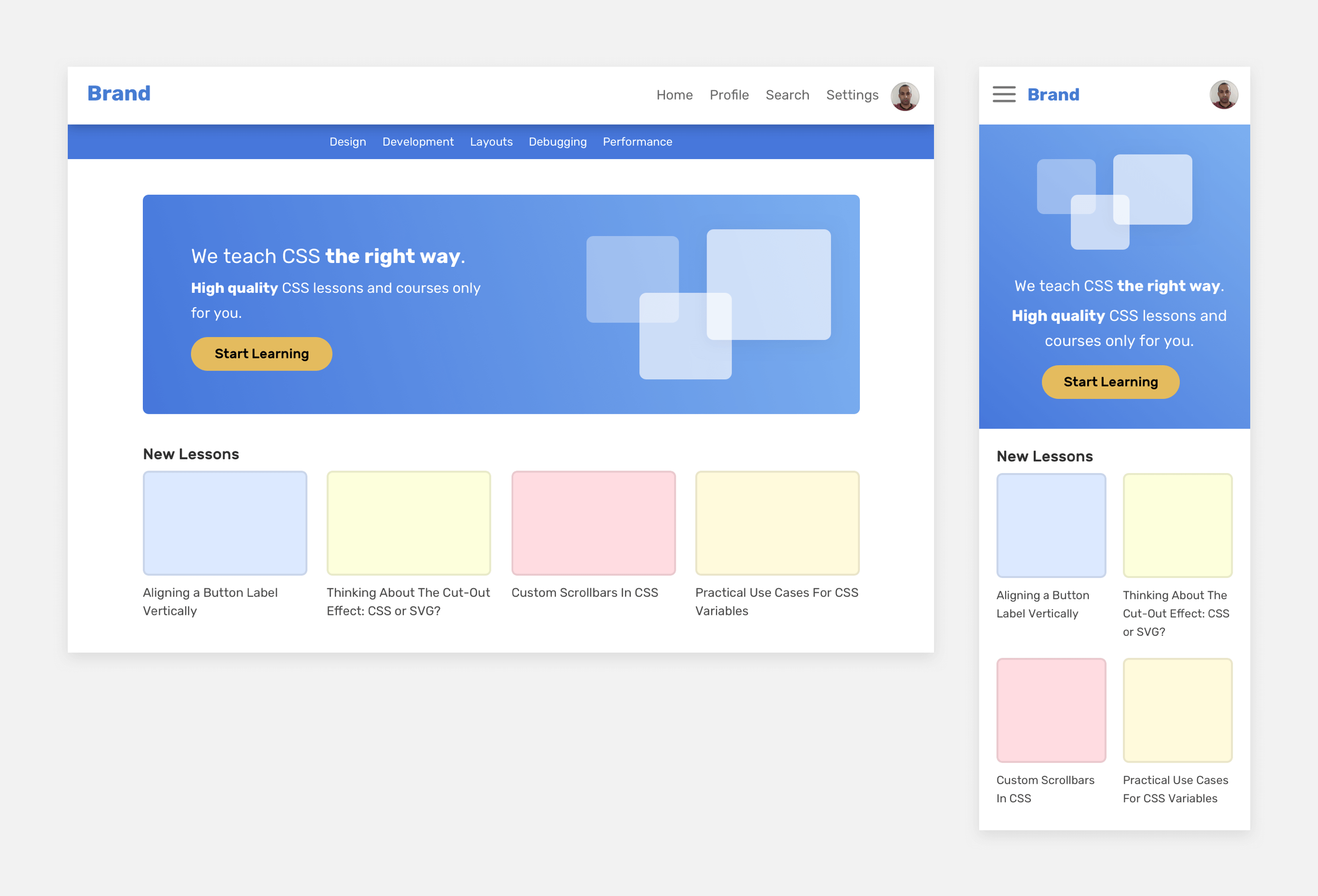
The components that have a lot of differences on mobile versus desktop are the header and navigation. The rest have some slight differences. For the header, we can use a mix of min-width and max-width media queries to scope each design for its desired viewport size.
However, the hero section and the articles grid can have a base style, and then min-width can be used if necessary.
Do you see the kind of thinking for such a design? There is nothing strict here. It’s about the design we have at our hands. Okay, let’s show some more details.
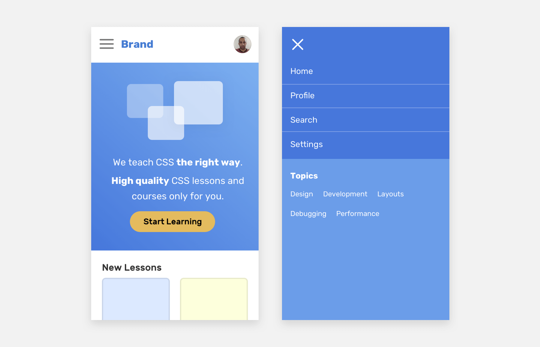
If the mobile-first concept were adopted for the header and navigation, we will end up with lots of CSS overrides (AKA duplication). This isn’t good. Here is how I imagine the CSS for the header and navigation:
.header {
  /* Base styles */
}

/* Desktop styles */
@media (min-width: 1000px) {
  .nav__toggle,
  .nav__close {
    display: none;
  }
}

/* Mobile styles */
@media (max-width: 999px) {
  .nav {
    position: fixed;
    left: 0;
    top: 0;
    width: 100%;
    height: 100%;
    background-color: #4777db;
  }
}
For the hero section, we can use flexbox to handle the row versus column style, and also for reordering or moving elements.
<section class="hero">
  <div class="wrapper">
    <img src="thumb.jpg" alt="" />
    <h2><!-- Headline --></h2>
    <p><!-- Description --></p>
  </div>
</section>
.hero {
  display: flex;
  flex-direction: column;
}

@media (min-width: 1000px) {
  flex-direction: row;
}

@media (max-width: 999px) {
  .hero__thumb {
    order: -1;
  }
}
Notice that I wrote the order: -1 only once by scoping it with a max-width media query. I could have done something like that:
.hero__thumb {
  order: -1;
}

@media (min-width: 1000px) {
  .hero__thumb {
    order: initial;
  }
}
But do you see the duplication? Also, beware of using the order in flexbox as the visual order doesn’t match the order of the elements in the HTML source (The DOM).
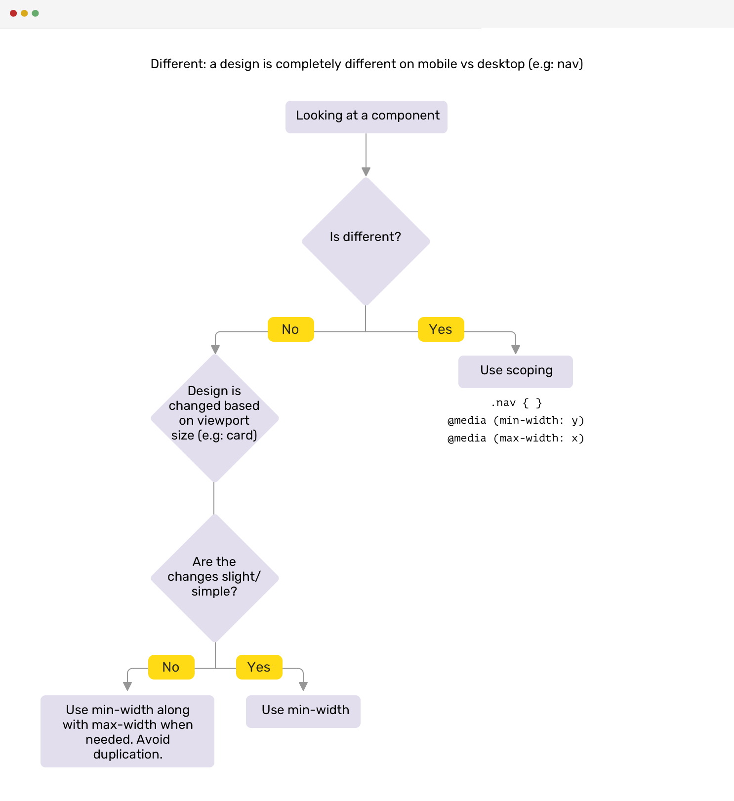
Here is a visual chart that explains my process.
Using the same value for min-width and max-width media queries can lead to an issue that is hard to notice/debug.
@media (max-width: 500px) {
  .nav {
    display: none;
  }
}

@media (min-width: 500px) {
  .nav__toggle {
    display: none;
  }
}
These media queries might look good to you. However, 99% of the time, you’ll forget to test an important breakpoint: 500px, that 1-pixel gap between the two breakpoints. At this breakpoint, neither the navigation nor the toggle would be visible.
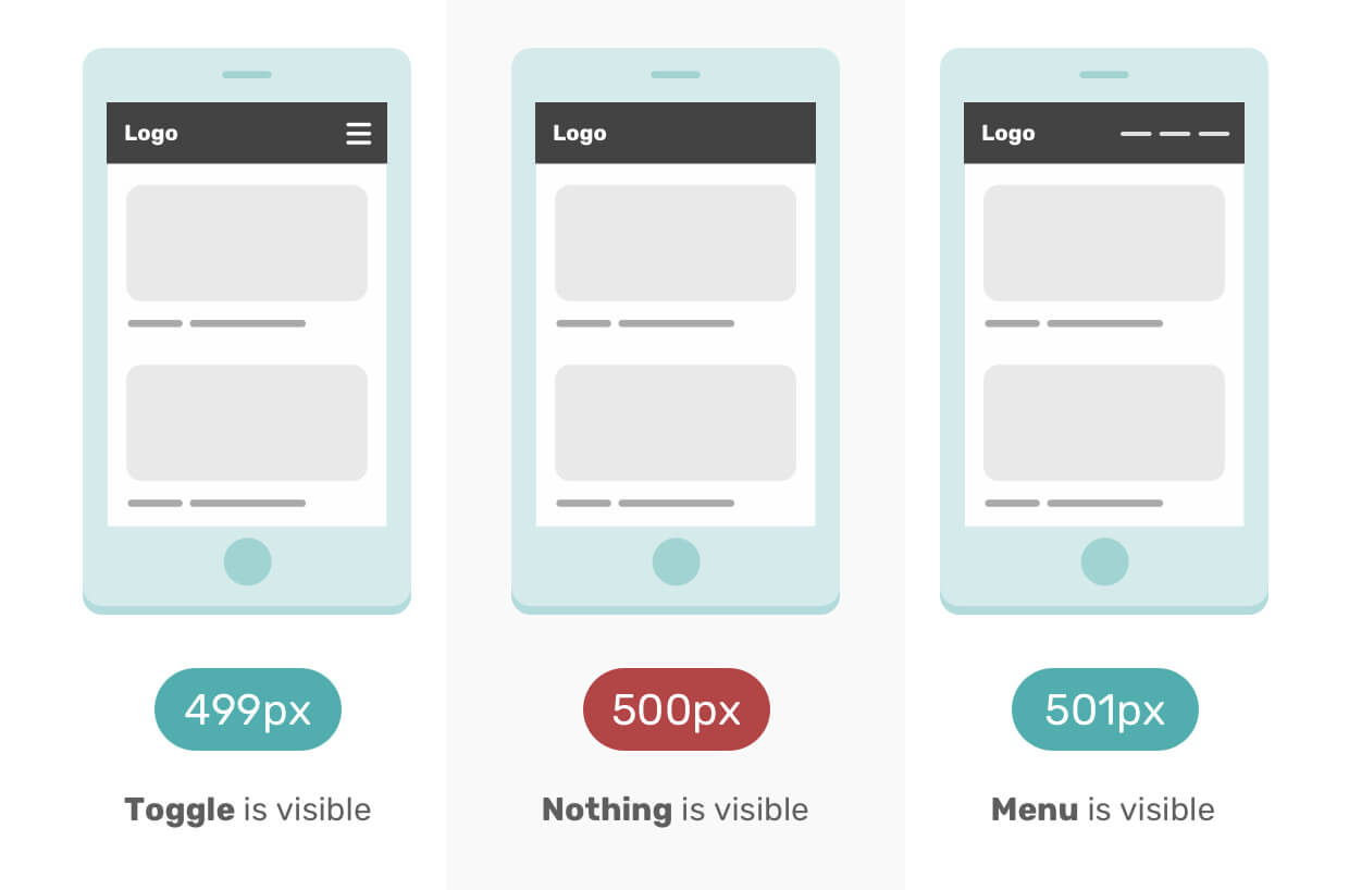
The 1 pixel is hard to debug without manually entering a value for a 500px media query in DevTools mobile mode. To prevent this issue, avoid using the same value in two media queries.
@media (max-width: 499px) {
  .nav {
    display: none;
  }
}

@media (min-width: 500px) {
  .nav__toggle {
    display: none;
  }
}
This issue has been borrowed from my Debugging CSS book, page 43.
I’m a designer myself, and I don’t like to design mobile-first for different reasons:
On the other hand, designing desktop-first is much better, at least for me. It gives me a way to try and experiment with ideas quickly, and I can see a broader view of the whole design without scrolling up and down (if I’m designing mobile-first).
We can start desktop-first, and then alter the design for mobile. From there, we have a good starting point and I don’t mind doing the rest of the pages mobile-first. However, for a fresh new project, I don’t prefer to start designing mobile-first.
It’s never been better to write CSS than these days. We have lots of current and upcoming CSS features that will make the responsive design much easier to do.
In his article How to Make a Media Query-less responsive Card Component, Geoffrey Crofte explored how to make a responsive card component without using media queries. I will explain the basic concept of it, and you can read the article for more details.
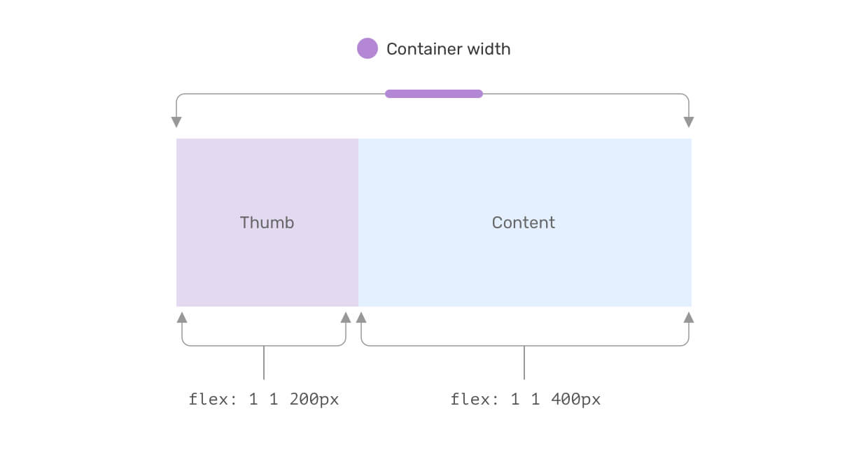
When setting a fixed flex-basis value, and allowing the item to grow and shrink when needed, this can achieve a media query-less component.
Here is an example of how the card will look when there isn’t enough space.
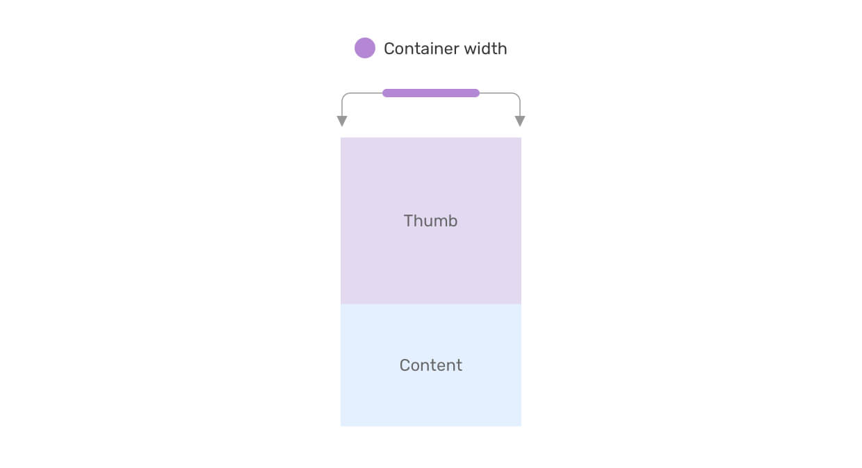
Thanks to CSS grid, we can have a responsive grid layout that doesn’t depend on CSS media queries. Consider the following example:
.wrapper {
  display: grid;
  grid-template-columns: repeat(auto-fit, minmax(200px, 1fr));
  grid-gap: 1rem;
}
This is a responsive grid that gives each item a minimum width of 200px. Without CSS grid, we will need to use media queries to alter the width based on the viewport size.
Learn more about CSS grid minmax() in this article.
Using CSS viewport units combined with CSS comparison functions can reduce the need to alter things like font size, padding, margin, and the size of some elements.
.title {
  font-size: clamp(16px, (1rem + 5vw), 50px);
}

.hero {
  padding: clamp(2rem, 10vmax, 10rem) 1rem;
}

.sidebar {
  flex-basis: max(30vw, 150px);
}
Do you know that CSS container queries are now available behind a flag in Chrome Canary? With them, we can do so many things without using any media queries.
Consider the following example:
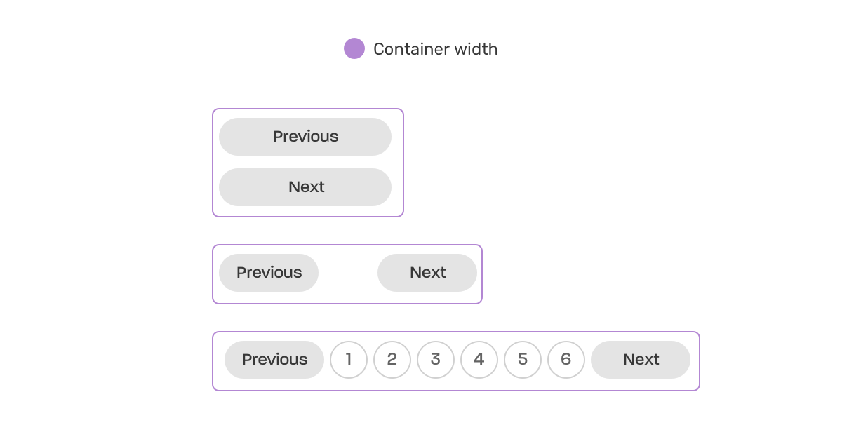
This is a responsive pagination that works based on its container width. No media queries are needed!
.wrapper {
  contain: layout inline-size;
}

@container (min-width: 250px) {
  .pagination {
    display: flex;
    flex-wrap: wrap;
    gap: 0.5rem;
  }

  .pagination li:not(:last-child) {
    margin-bottom: 0;
  }
}

@container (min-width: 500px) {
  .pagination {
    justify-content: center;
  }

  .pagination__item {
    display: block;
  }
}
Check out the demo on Chrome Canary.
This is just the start. As you have just seen, modern CSS allows us to create responsive layouts without even using media queries. So the question is, do we need to think that much about whether to choose mobile-first versus desktop-first?
I hope you enjoyed the article. Thanks for reading!
此内容由惯性聚合(RSS阅读器)自动聚合整理,仅供阅读参考。 原文来自 — 版权归原作者所有。