


I spent years teaching CSS layout on this blog. I put everything I know into The Layout Maestro course: 70+ lessons and 150+ interactive examples that teach you how to think CSS layouts, not just memorize syntax.
I might be late to the game, but I decided to make a dark color version of my website. It becomes necessary now as Apple recently added this feature natively to iOS 13. More users will expect dark layouts over time. In this article, I’ll show you how I worked on the dark color version of ishadeed.com, my blog.
The article includes methods and considerations to keep in mind when building such a thing. I tried to include everything I know.
As Apple said, it’s the idea of making foreground colors stand out against its darker backgrounds. For example, a UI might look different depending on the time of the day, or the user preferences. Here is an example:
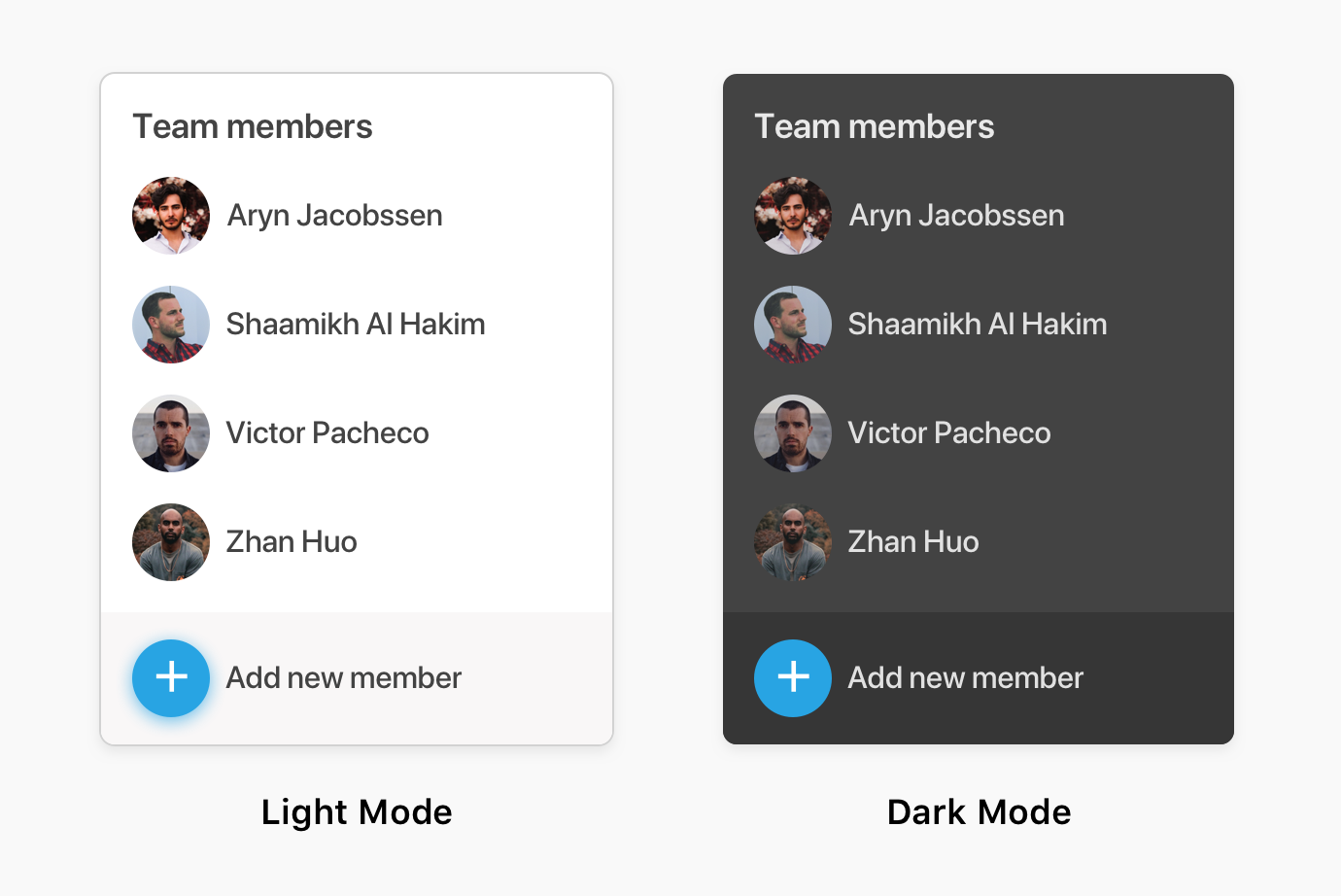
Is dark mode better for eyes? There is an argument about that, but what I think is that dark mode at least reduces the amount of light. When I want to use my phone in the dark, I usually lower the brightness to about 20% to be able to use it. Otherwise, my eyes can’t handle the amount of light.
To check if dark mode is activated, a media query should be used @media (prefers-color-scheme: dark). Here is the support table from caniuse
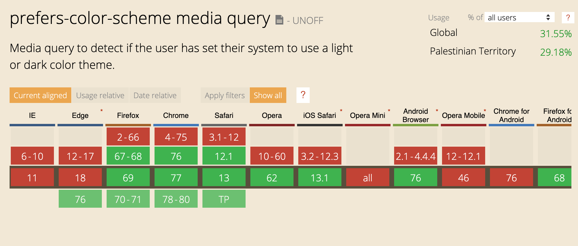
I got a lot of benefit from using them in the process of making this dark theme. Base colors for the normal them could be set on the <html> element, and then when dark mode is activated, they will be changed.
:root {
  --color-1: red;
  --color-2: blue;
}

@media (prefers-color-scheme: dark) {
  :root {
    --color-1: white;
    --color-2: grey;
  }
}
Making a theme work in dark doesn’t mean that the background color should be black, and the foreground color for content is white, which is terrible for the eyes. The correct way to handle that is by using a dark version of your brand color, and if that doesn’t work, you will need to choose an average color between black and grey.
For me, this is the first thing that I will add when working on a dark version layout. It gives you a clear idea about the elements that need to be edited.
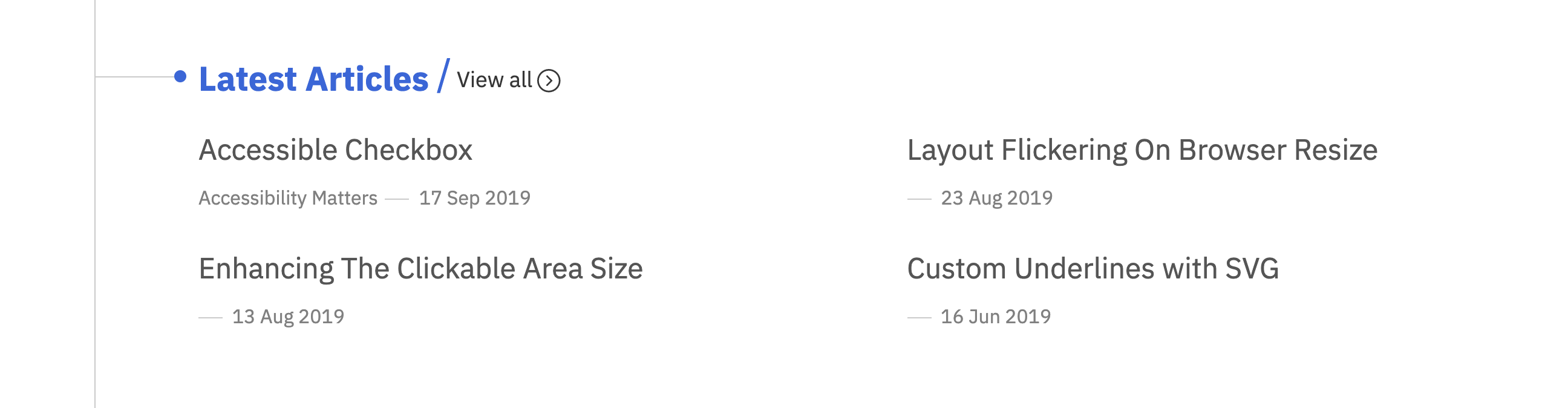
If you noticed, there is a line across the whole page from top to bottom. I made this line with CSS Gradients as below:
body {
  background: linear-gradient(
    to right,
    transparent 80px,
    #cbcbcb 0,
    #cbcbcb 81px,
    transparent 0,
    transparent 100%
  );
}
I have two options to make this dark:
1- Add a background color to the root element <html>
2- Tweak the color values that are added to the <body> element
The first solution is less work, so I will go with it once I choose the color.
How I choose the dark color?* There is no rule of thumb for that, but for my case, I have different options:
I applied the dark color to the <html>.
@media (prefers-color-scheme: dark) {
  html {
    background-color: var(--bg-color-page);
  }
}
Option 1: Dark Grey
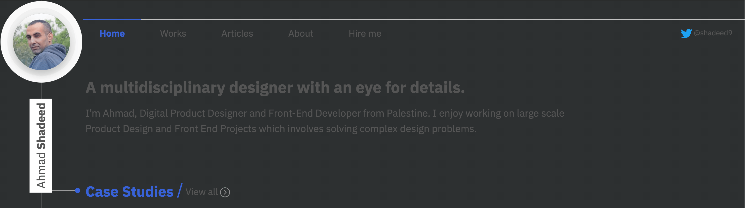
Option 2: Dark Blue
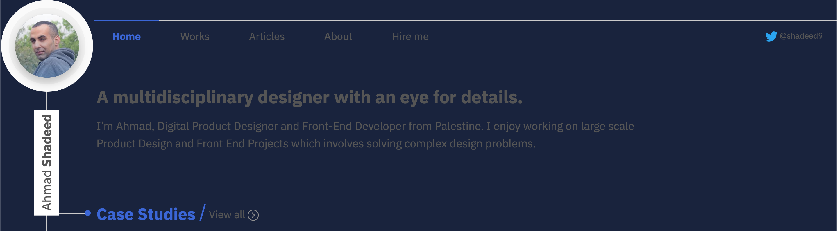
Option 2 (dark blue) looks more related to the website brand color, so I will stick with it for now and might change it later if it didn’t work.
The next step is to replace all colors for text and images. Content includes text and images.
When choosing a color for headings and titles, try not to choose a very light color, since it will be hard on the eyes. Choose a color that looks comfortable and doesn’t shine too light.
Here is an example that demonstrates that issue:
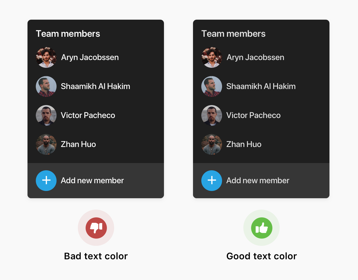
It’s important to dim images in a dark mode. They might affect the experience since too light images might be confusing and not comfortable for the user.
I added the following style to images:
@media (prefers-color-scheme: dark) {
  img {
    opacity: 0.65;
  }

  img:hover {
    opacity: 1;
  }
}
On hover, the opacity will be reverted to 1 to show it entirely to the users. Having dark mode doesn’t mean to dim the images without giving the reader the ability to see them in their original look.
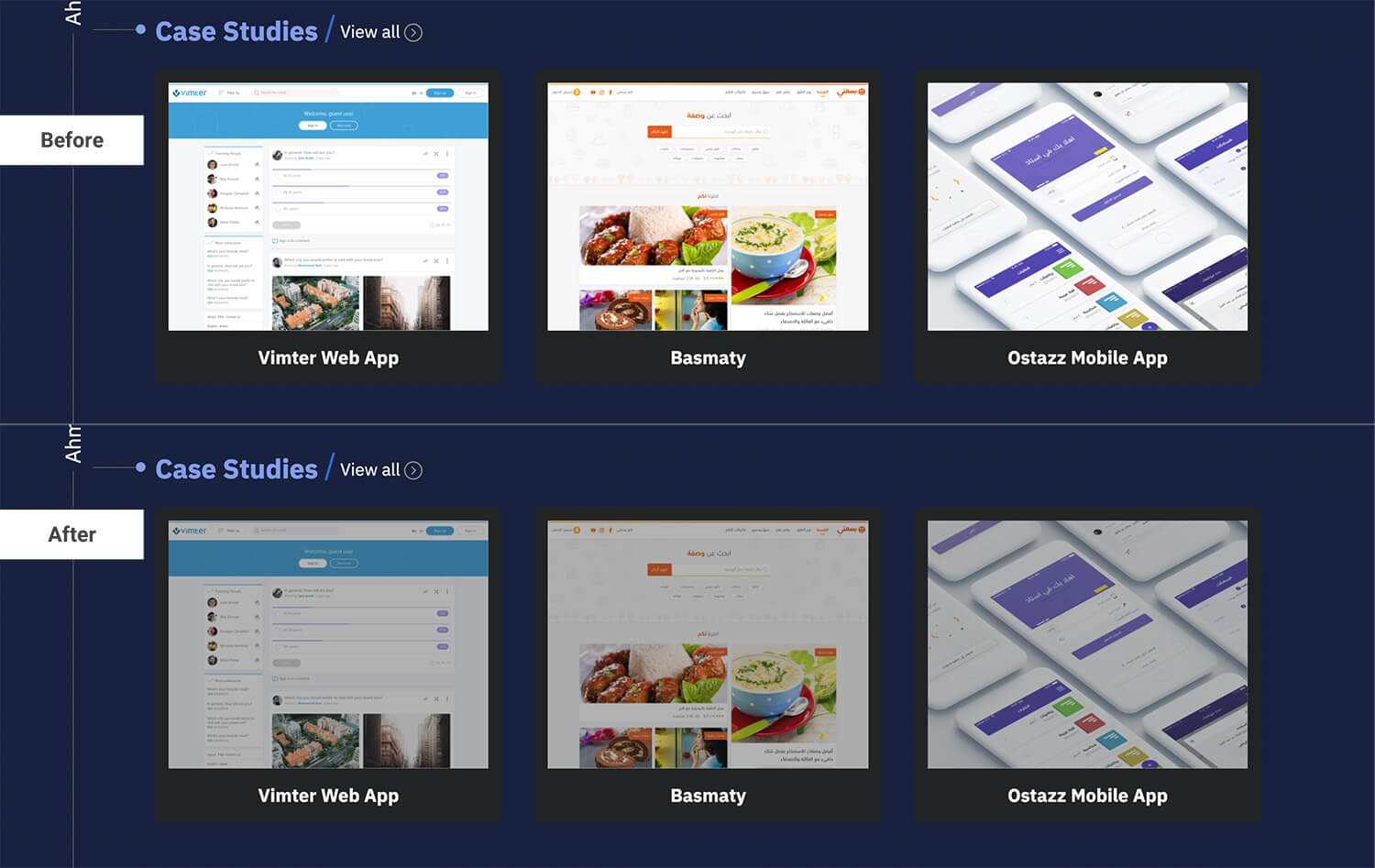
After I worked on this, I learned about a technique that can make the image look less shiny by a note that Jeremy Keith shared from attending a talk for Melanie Richards.
@media (prefers-color-scheme: dark) {
  img {
    filter: brightness(0.8) contrast(1.2);
  }
}
I applied that to all images and videos on the website, and it’s working like a charm.
When choosing text colors, it’s important to test and see if they’re accessible. I started testing and noticed a couple of issues that I will list here:
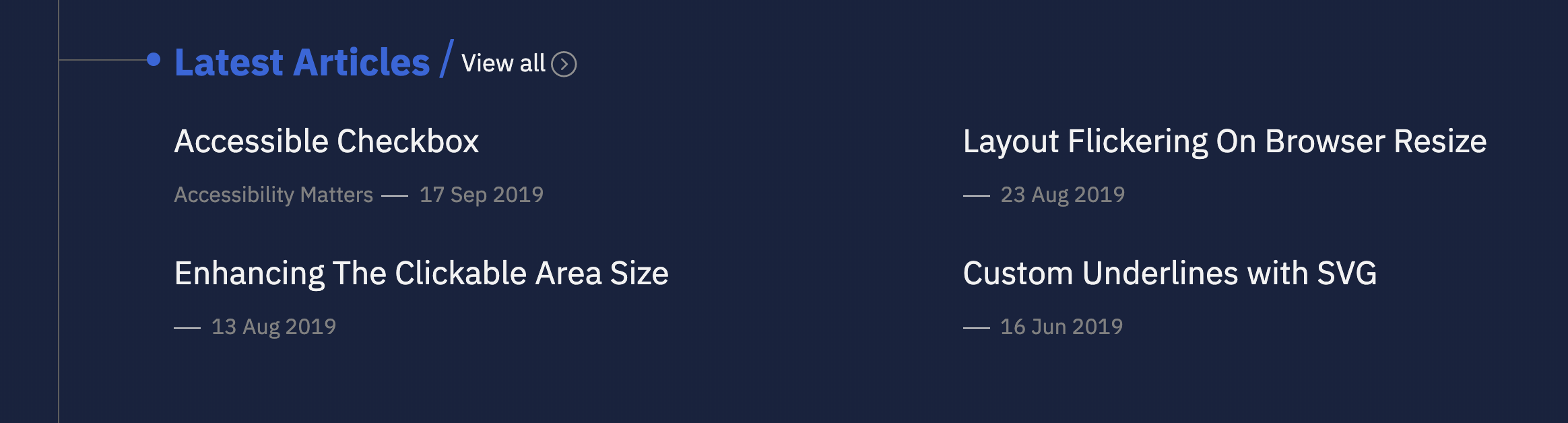
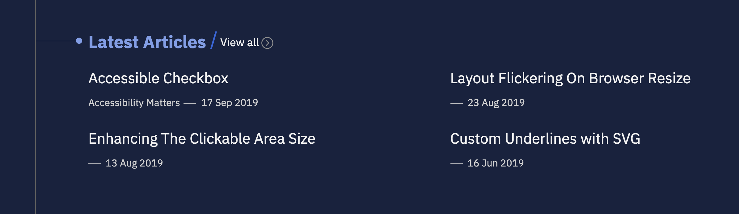
The color in “Latest articles” is not accessible as per WCAG. Here is the test result as per the WebAIM contrast checker tool.
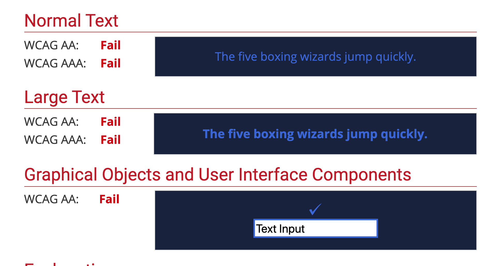
This color passed in case the text was big and bold, which is different from our case.
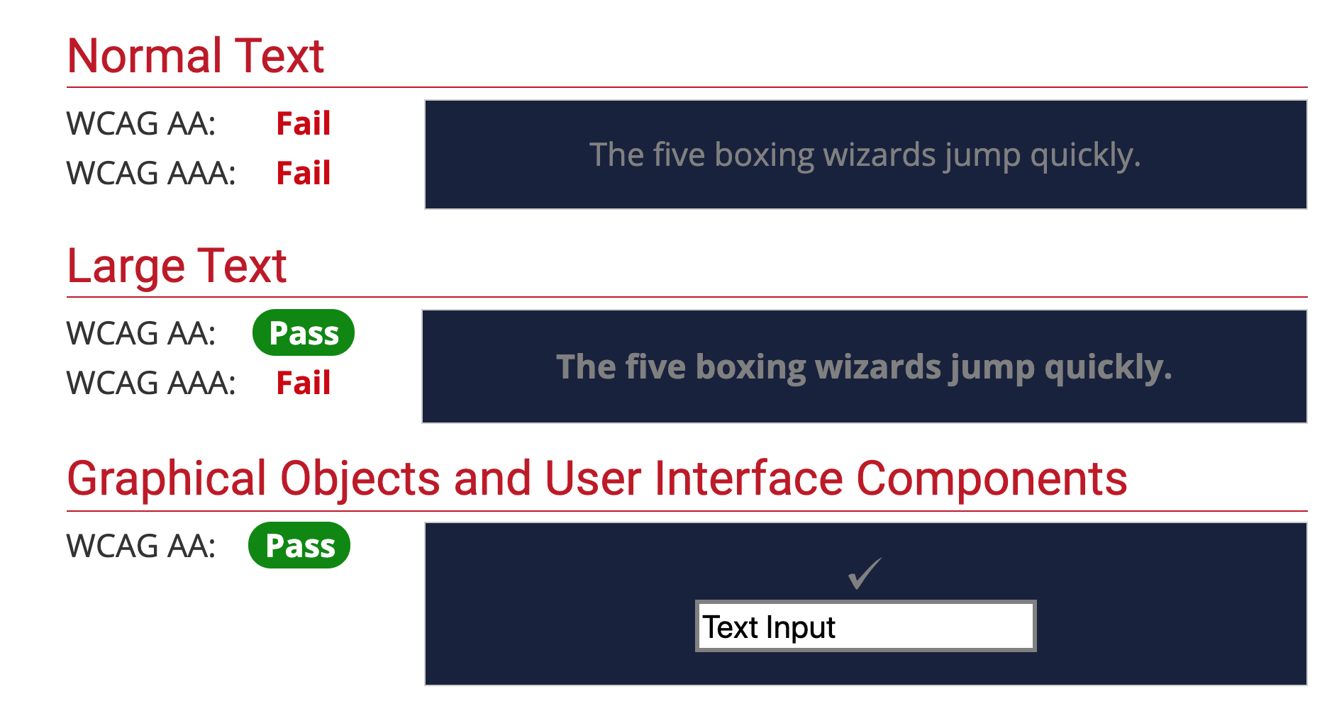
As you see, I’m using inaccessible colors. I used a lighter version of the brand color and a darker color for the text. It’s much easier now to read them.
While working on the article page, I noticed a note component that needs to be fixed. Here is how I discovered and fixed the issue with Chrome Devtools contrast check.
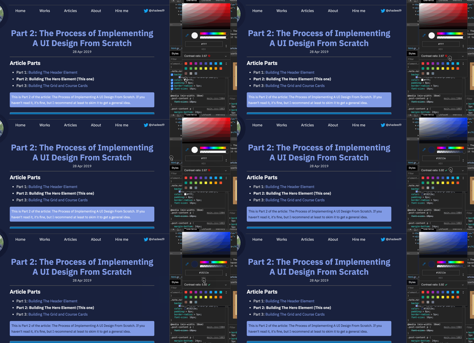
The above might not be practical for everything, but it helps well.
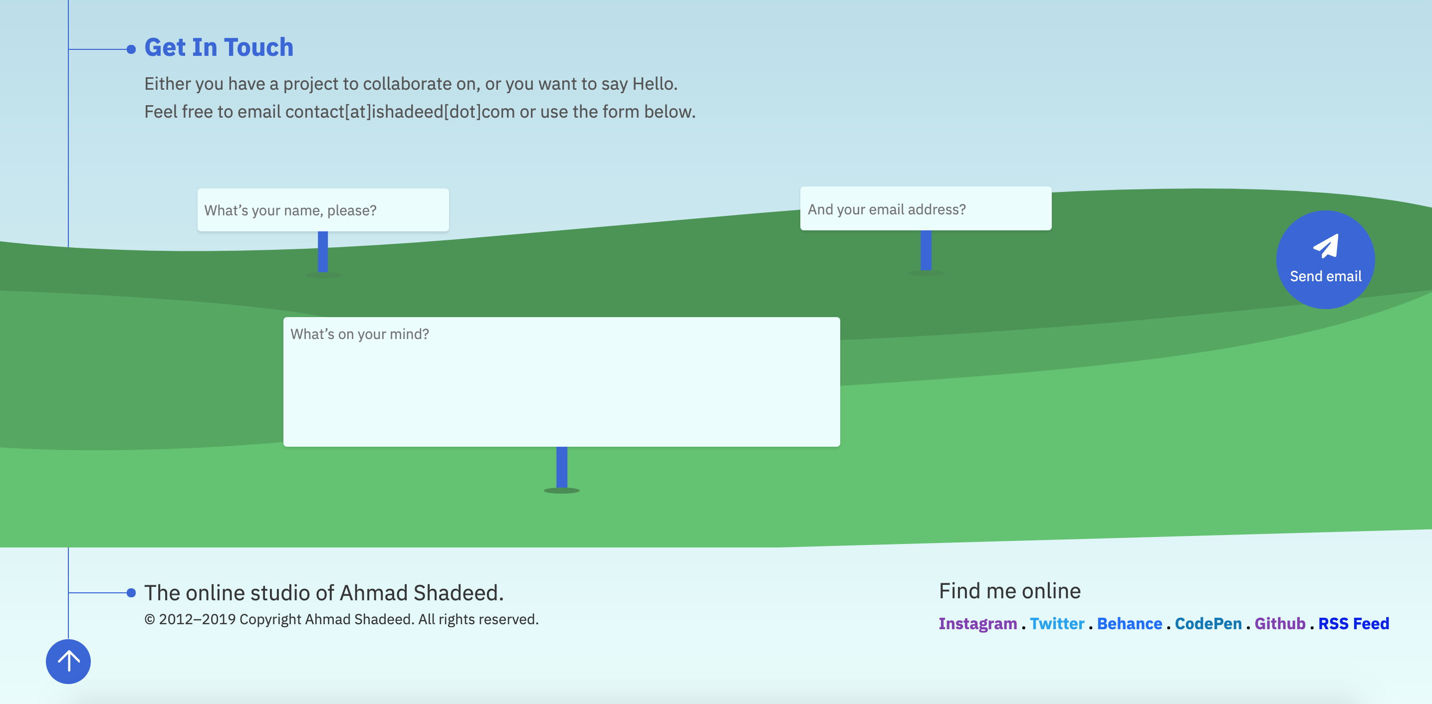
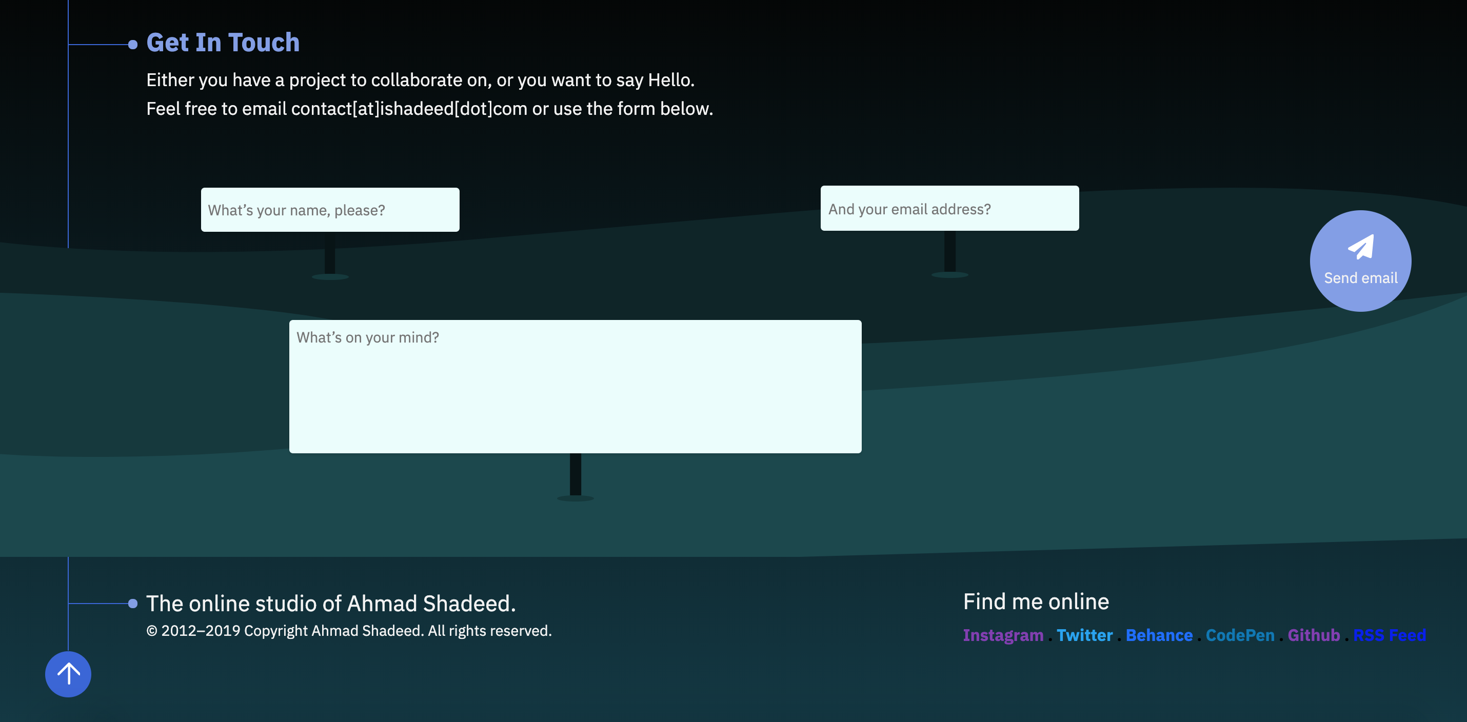
The footer on my website has an Illustration that at first, made me think that it will be hard to make it look good in the dark. However, I managed to change the colors of it to Midnight blue.
Before
After
I thought about playing a Crickets when the footer is reached. This idea will be useful to strengthen my skills in HTML Audio and IntersectionObserver API.
<audio id="crickets" src="assets/crickets-sound.mp3"></audio>
let targetElement = document.querySelector(".c-section--footer")
let cricketsAudio = document.querySelector("#crickets")

const options = {
  root: null,
  rootMargin: "0px",
  threshold: 0,
}

function callback(entries, observer) {
  entries.forEach((entry) => {
    if (entry.isIntersecting) {
      cricketsAudio.play()
    } else {
      cricketsAudio.pause()
    }
  })
}

let observer = new IntersectionObserver(callback, options)
observer.observe(targetElement)
Check out the below video. Warning: you might not like the sound ;)
However, I asked some friends, and they said that the idea is not right, as it might be confusing or shocking to some readers, so I removed it.
Since I have my avatar at the top left with a line coming from it to all page down. I thought that this is a good fit for a lamp animation.
Here is how it should look for light and dark modes.

Things I need to do:
My name is added as a <span> element. I changed the opacity to zero to hide it. Then, I worked on the lamp with CSS as below:
@media (prefers-color-scheme: dark) {
  .c-logo span {
    opacity: 0;
  }

  .c-lamp {
    position: absolute;
    top: 110px;
    left: 62px;
    z-index: 1;
    width: 5px;
    height: 200px;
    background: transparent;
    animation: lampHeight 2s 1s forwards;

    &:before {
      content: "";
      position: absolute;
      top: 0;
      left: 0;
      width: 5px;
      height: 100%;
      background: #acad87;
      z-index: 1;
      border-radius: 3px;
      transform-origin: top;
      transform: scaleY(0.1);
      animation: scaleMe 2s forwards;
    }

    &:after {
      content: "";
      position: absolute;
      left: -7px;
      z-index: 1;
      bottom: 0;
      width: 20px;
      height: 30px;
      border-radius: 20px 20px / 34px 31px;
      background: #e1e2b1;
      transform: translateY(-180px);
      animation: moveMe 2s forwards;
    }
  }
}
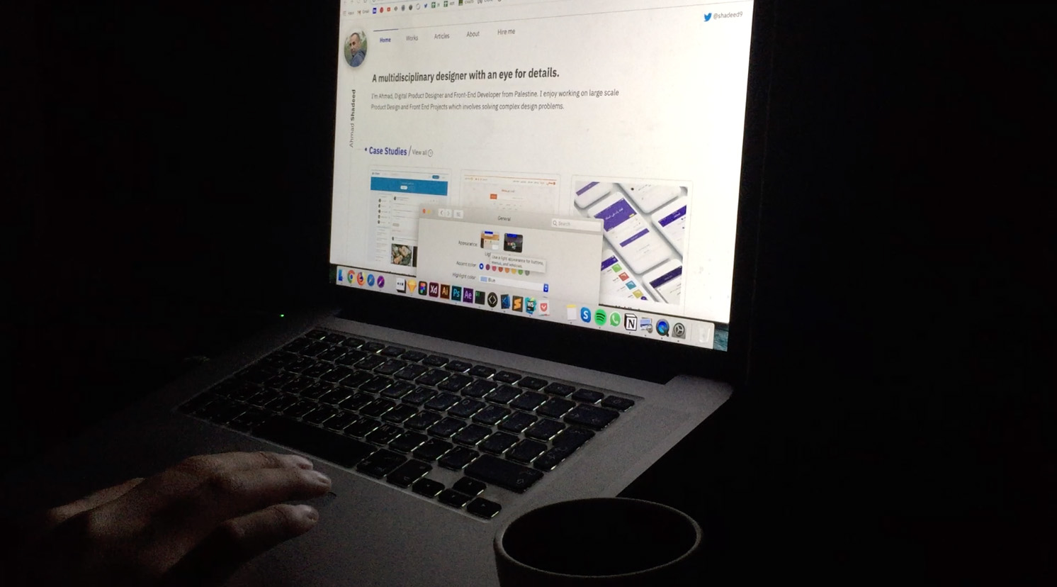
To make sure that the dark mode is comfortable, I turned the light off and recorded a video of the light and dark version.
Notice how the laptop and coffee mug are easier to see in light mode, wherein dark it’s harder.
And that’s a wrap. Do you have a comment or a suggestion? Please feel free to ping me on @shadeed9.
Thank you for reading.
此内容由惯性聚合(RSS阅读器)自动聚合整理,仅供阅读参考。 原文来自 — 版权归原作者所有。