


I spent years teaching CSS layout on this blog. I put everything I know into The Layout Maestro course: 70+ lessons and 150+ interactive examples that teach you how to think CSS layouts, not just memorize syntax.
Here we go again. For this time, I’m curious to check the CSS behind the Twitter website. If you read my previous article about Facebook CSS, this one will be similar. Almost one year ago, the new Twitter design was introduced. There are some cool and weird things that I will go through in the article. Are you ready?
I noticed an interesting implementation for the user avatar in the profile page using the CSS aspect ratio technique.
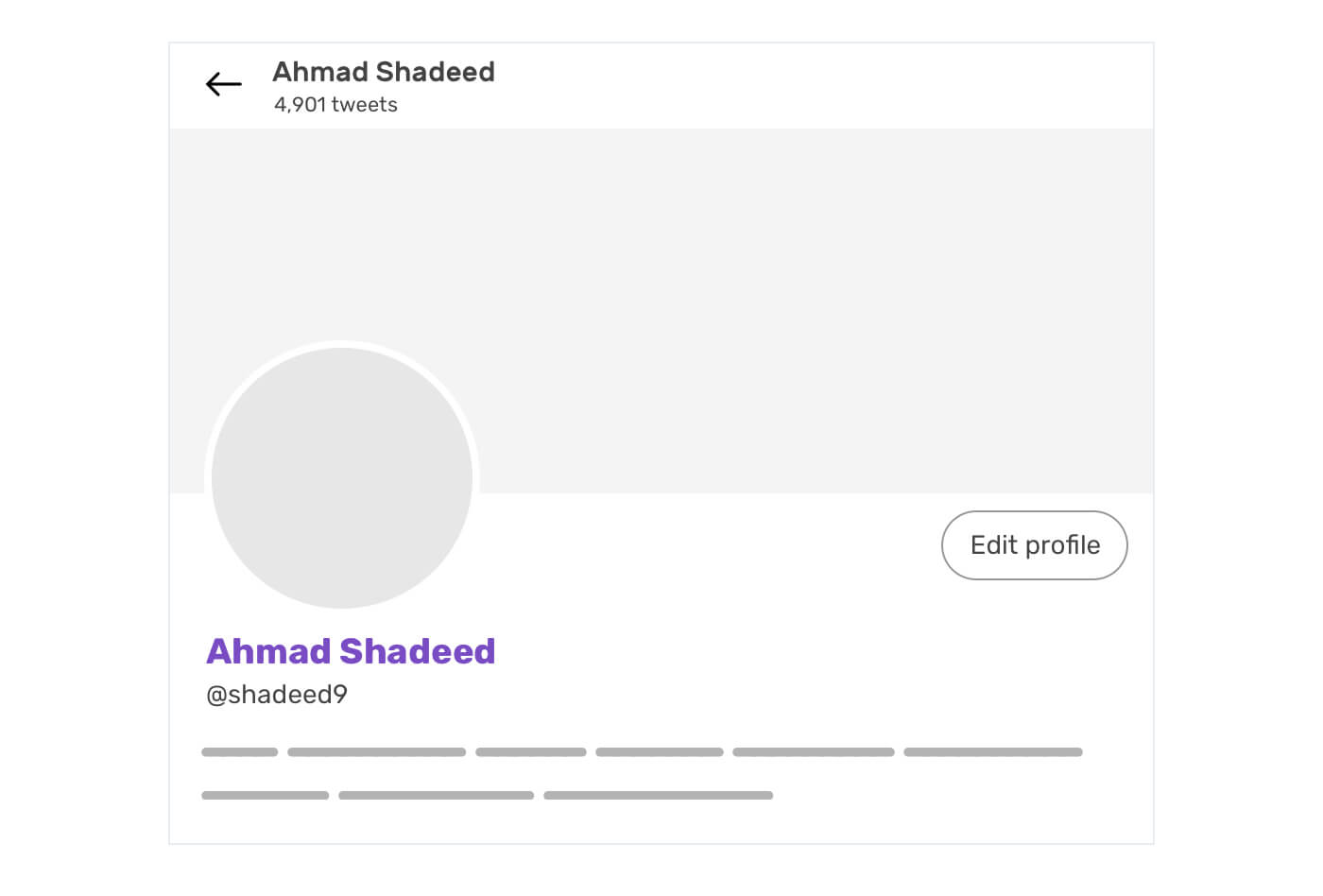
See the below HTML and CSS for how it’s implemented:
<a href="#" class="avatar">
  <div class="avatar-aspect-ratio"></div>
  <img alt="" src="me.jpg" />
</a>
.avatar {
  position: relative;
  width: 25%;
  display: block;
}

.avatar-aspect-ratio {
  width: 100%;
  padding-bottom: 100%;
}

.avatar img {
  position: absolute;
  top: 0;
  right: 0;
  bottom: 0;
  left: 0;
  width: 100%;
  height: 100%;
}
The aspect ratio technique works because when an element has vertical padding (padding-bottom or padding-top), it will depend on the element’s width. Consider the following example:
.element {
  width: 250px;
  padding-bottom: 100%;
}
The computed value of padding-bottom is 250px, which means we have a perfect square. The Twitter team used the exact same technique, but with an <img> element that is positioned absolutely to its parent. You ask why? Well, here is the reason.
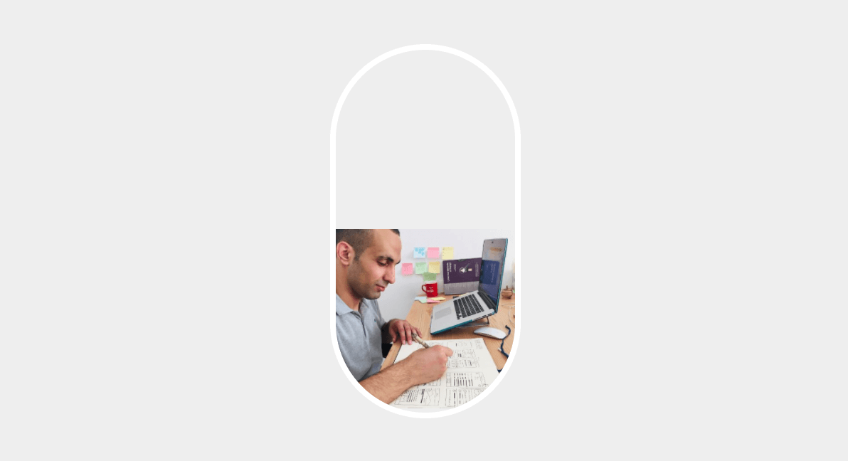
When the image is not positioned absolutely, it will look like the mockup above. It must be positioned with a width and height of 100%. That way, it can be sized as per its wrapper dimensions.
Now that I explained the core concept behind this, let’s go back to Twitter’s implementation of it.
The width: 25% is based on its wrapper width, which is 600px for my screen. I asked myself, why did they choose that technique? After digging more in the CSS, I noticed that the same component is being used in the Edit Profile modal. However, it’s a bit smaller there because they added this:
.avatar {
  max-width: 8rem; /* 112px instead of 150px (25%) */
}
I really like the idea of controlling an image’s dimensions by controlling the width property only. See the video below:
To make the user avatar overlap the cover photo, a negative percentage margin is added as below:
.avatar {
  margin-top: -18%;
}
However, for the Edit profile modal, the margin used is margin-top: -3rem. Notice that the margin in the modal is in rem unit, which was used as a max-width as well.
I noticed that some buttons have the following CSS:
.button {
  min-width: calc(45.08px);
}
What’s the point of using one value only inside calc()? It has no benefits, and even the number 45.08 is not rounded to 45. The width of the button is very small. In an RTL language, like Arabic, it will look too small when translated.

The calc is added as an inline CSS, so I expect that this is a dynamic style using React.
I noticed in multiple places that there is a mix of CSS background images and HTML images. Consider the following example:
<div style="background-image: url(me.jpg);"></div>
<img alt="" src="me.jpg">
I have seen this in the user profile, and in the media grid component. The interesting thing is that the <img> has an opacity of 0. The active image is coming from the background-image, and it also has background-size: cover to avoid distorting the image.
When I tried to make the opposite, which is to show the <img> element and hide the CSS background one. I made a comparison for the media grid, the first one is a background image, and the latter is an HTML image.
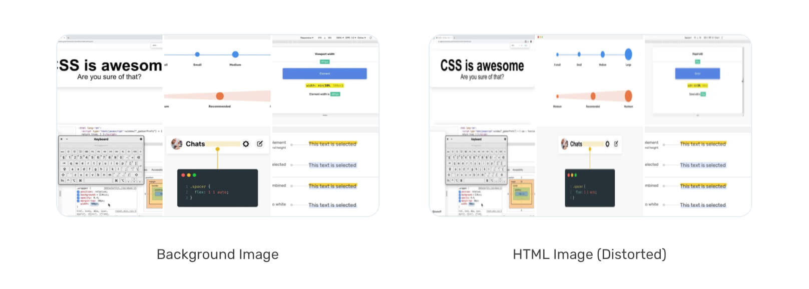
The image is distorted! I don’t know why the team didn’t use the CSS property object-fit: cover to avoid distorting the image. I’m interested to hear an answer to why there are two images?
I noticed a pattern while digging in the CSS, which is the heavy use of a CSS class that is being added to <div> elements, with the CSS below:
.css-1dbjc4n {
  align-items: stretch;
  border: 0 solid black;
  box-sizing: border-box;
  display: flex;
  flex-basis: auto;
  flex-direction: column;
  flex-shrink: 0;
  margin-bottom: 0px;
  margin-left: 0px;
  margin-right: 0px;
  margin-top: 0px;
  min-height: 0px;
  min-width: 0px;
  padding-bottom: 0px;
  padding-left: 0px;
  padding-right: 0px;
  padding-top: 0px;
  position: relative;
  z-index: 0;
}
The above CSS is literally used for every <div> element on the page. Why is that? Isn’t a CSS reset enough here?
I might say OK to some of the above resets, like min-width: 0, for example. Since it has some relation with CSS flexbox. But what about the padding, margin, and border? Why a <div> element needs a reset when it doesn’t have those properties in the first place?
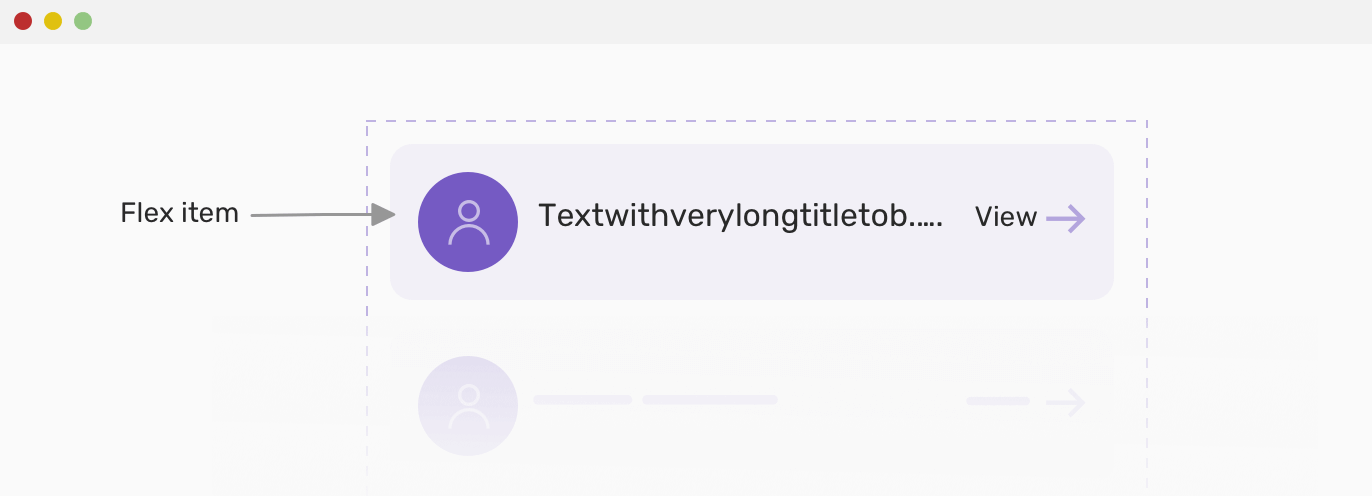
min-width: 0The default value for min-width is auto, which is computed to zero. When an element is a flex item, the value of min-width is equal to the size of its contents. Allowing that behavior can break a layout in case the content is bigger than its wrapper.
To avoid this issue from happening, we need to reset min-width for flex child items.
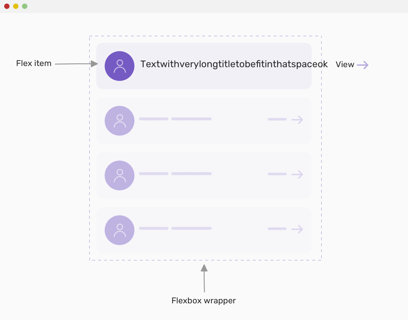
The mockup above shows what can happen when the content is too long. Notice how the text is out of its wrapper. When the min-width: 0 is added, it will look like this:
For the right sidebar (media trends, who to follow), I noticed the use of position: sticky. What looks interesting for me is the use of bottom and top values when I scroll. The default is like this:
.sidebar {
  position: sticky;
  width: 350px;
  bottom: -470.5px;
}
When I scroll down, the bottom attribute is replaced with top: -480.5px. I expect that the reason good be to allow the user to scroll to the end of the sidebar first, and then top is added.
Similar to the Facebook article, the team at Twitter used spacer elements in multiple places, and all of them are flex items that have their width set with flex-basis property.
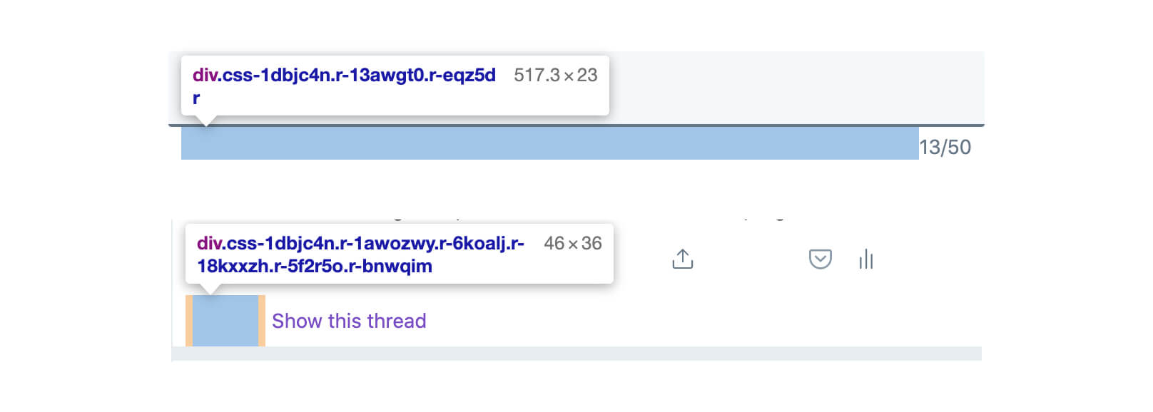
The first one is using flex-grow: 1 for the spacer, while the latter is using a fixed pixel width.
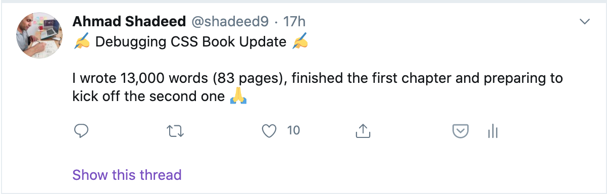
Here is a tweet I wrote. From the first glance, you might think that this is a <p> or <span> element with the whole text within it. It turned out that each emoji is considered as a <span> element, and if a text comes between two emojis, it’s also added as a <span> element.
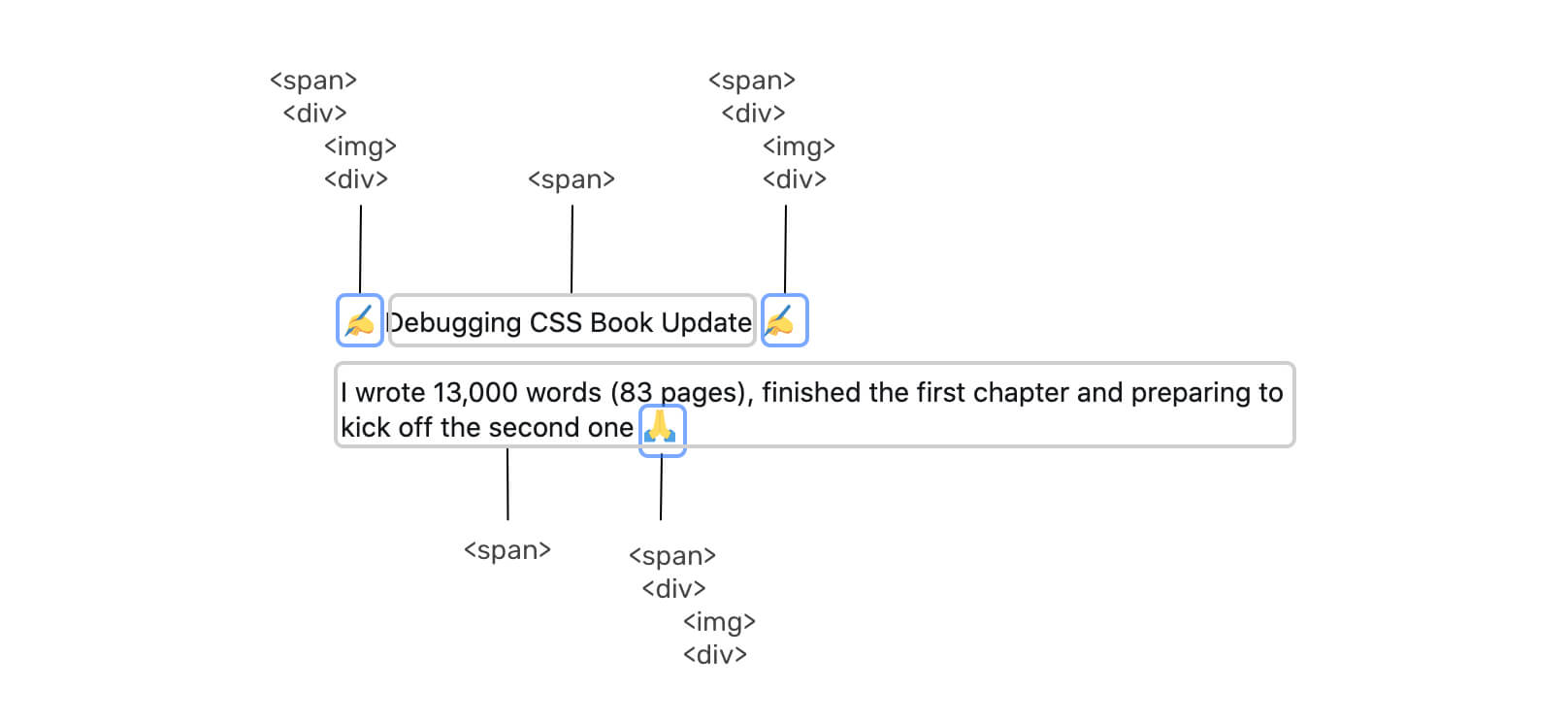
The emoji is a <span>, which has a <div>, and the <div> includes two images, the first is a CSS background and the latter is an HTML image.
Since the first sentence is wrapped in a <span>, there should be a vertical spacing between it and other siblings. They added a new line at the beginning of the second sentence to occupy a space.


When you search on Twitter or open your profile page, there is a back button. This button is offset with a margin-left: -4px margin but the way it’s calculated got my attention.
.back-button {
  margin-left: calc(5px + (-1 * (39px - 1.5em)) / 2);
}
The margin above computes to -4px. I wonder, why not use an explicit -4px value? Isn’t it better than using CSS calc() in that case?
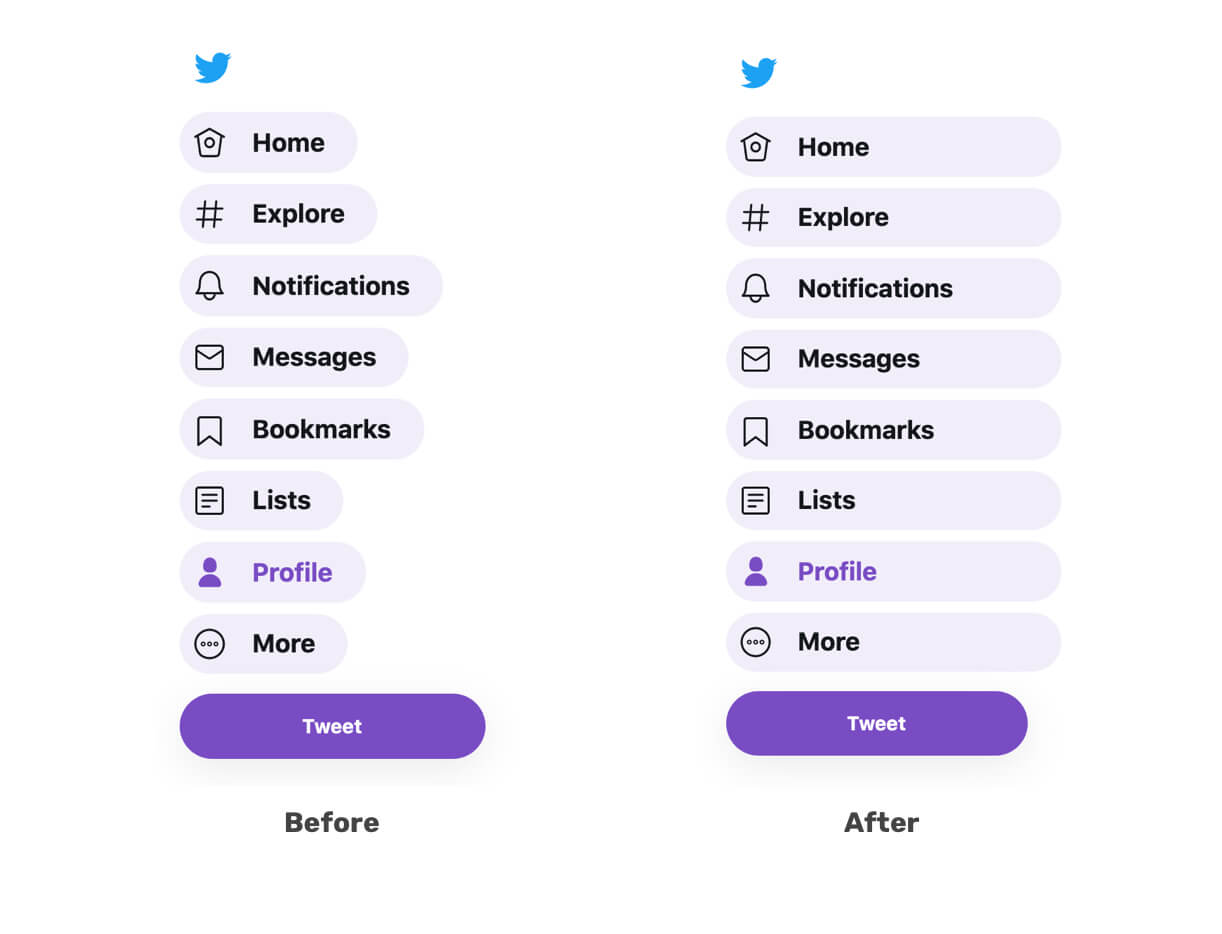
From the first day I interacted with the navigation bar links, I noticed that on hover, each one width is equal to its content. I wonder, why not make icon and label take the full width of the navigation item?
Something caught my eyes here is using flex-direction: column for each item of the navigation. Why? Is it really needed when there is one child item only?
I like to call this Just In Case, which is a margin added for preventing an unwanted design behavior. I noticed it being used two times on Twitter. Let’s explore them.
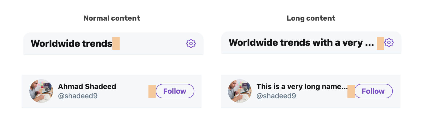
Notice how when the content is long: 1) The text is truncated 2) There is a margin between elements. The margin acted as a stopping point for the other element to prevent it from taking up all the space. Accounting for that early one can avoid any unexpected issues. Always try to test with long content!
I was trying to check the edit profile modal, and at certain height, you can’t access the save button of the modal. See the figure below:
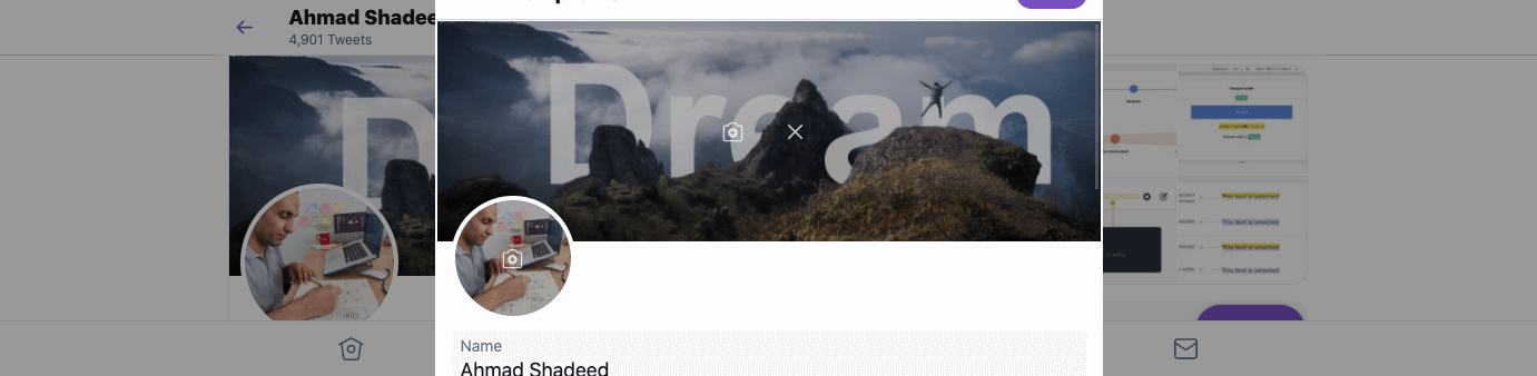
Because the modal is not scrollable, I’m unable to reach the save button. However, for the modal that controls the display, its height is dynamic. See below:
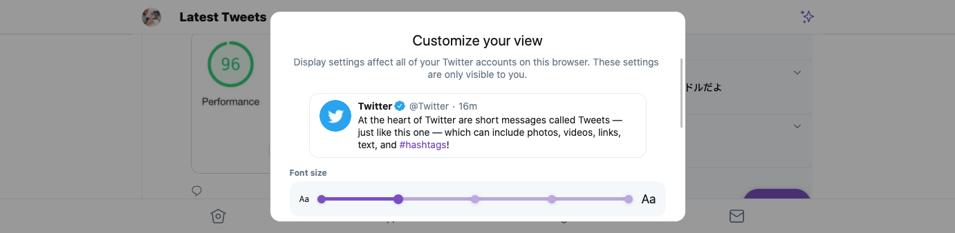
Why the display modal is scrollable, while the edit one is not? I wonder, which one of them is more important? For me, it’s the edit profile one.
That’s a wrap. Do you have a comment or a suggestion? Please feel free to ping me on @shadeed9.
此内容由惯性聚合(RSS阅读器)自动聚合整理,仅供阅读参考。 原文来自 — 版权归原作者所有。