


I spent years teaching CSS layout on this blog. I put everything I know into The Layout Maestro course: 70+ lessons and 150+ interactive examples that teach you how to think CSS layouts, not just memorize syntax.
You might come across a UI component that has text above an image. In some cases, the text will be hard to read depending on the image being used. There are some different solutions like adding a gradient overlay, or a tinted background image, text-shadow, and others. I got encouraged to write this article after seeing this tweet from Addy Osmani.
In this article, I will explore the different approaches and solutions for this problem, and how to communicate the UI with a front-end developer to make sure that it’s implemented as per the design mockup since some details can be easily missed in CSS.
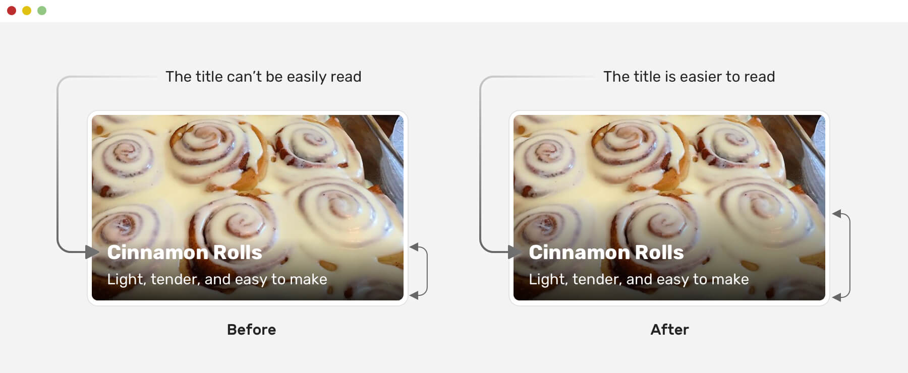
Each solution is supposed to solve a problem. Let’s explore the problem for our case. When designing a component that has text above an image, we should take care of making the text easy to read.
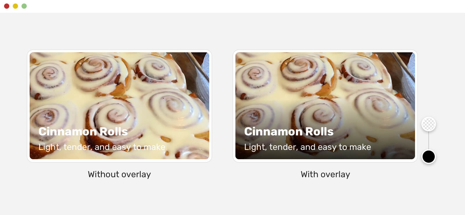
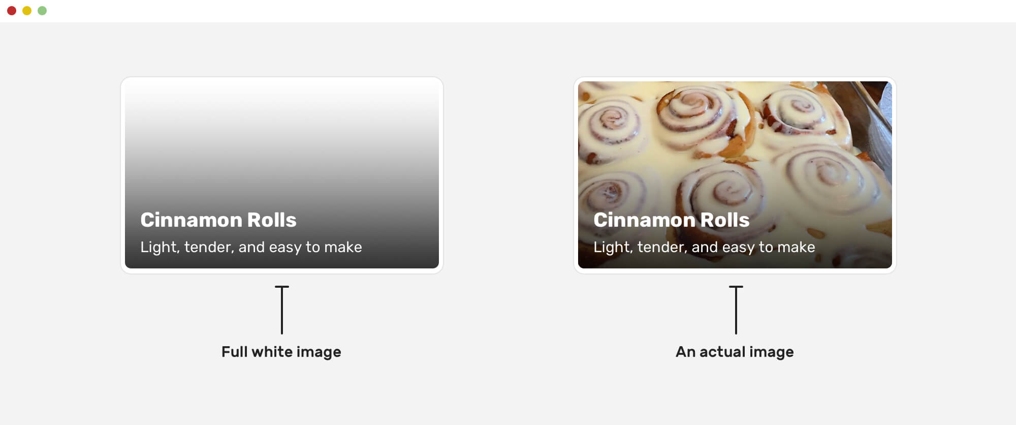
Notice that the version without a gradient overlay is barely readable. This isn’t good for the user. To solve this, we need to add a layer below the text so that it can be easy to read. Adding that layer can be challenging, and I have seen many who implement this solution without taking accessibility in mind.
There are different solutions for making the text easier to read. Let’s get an overview of them.
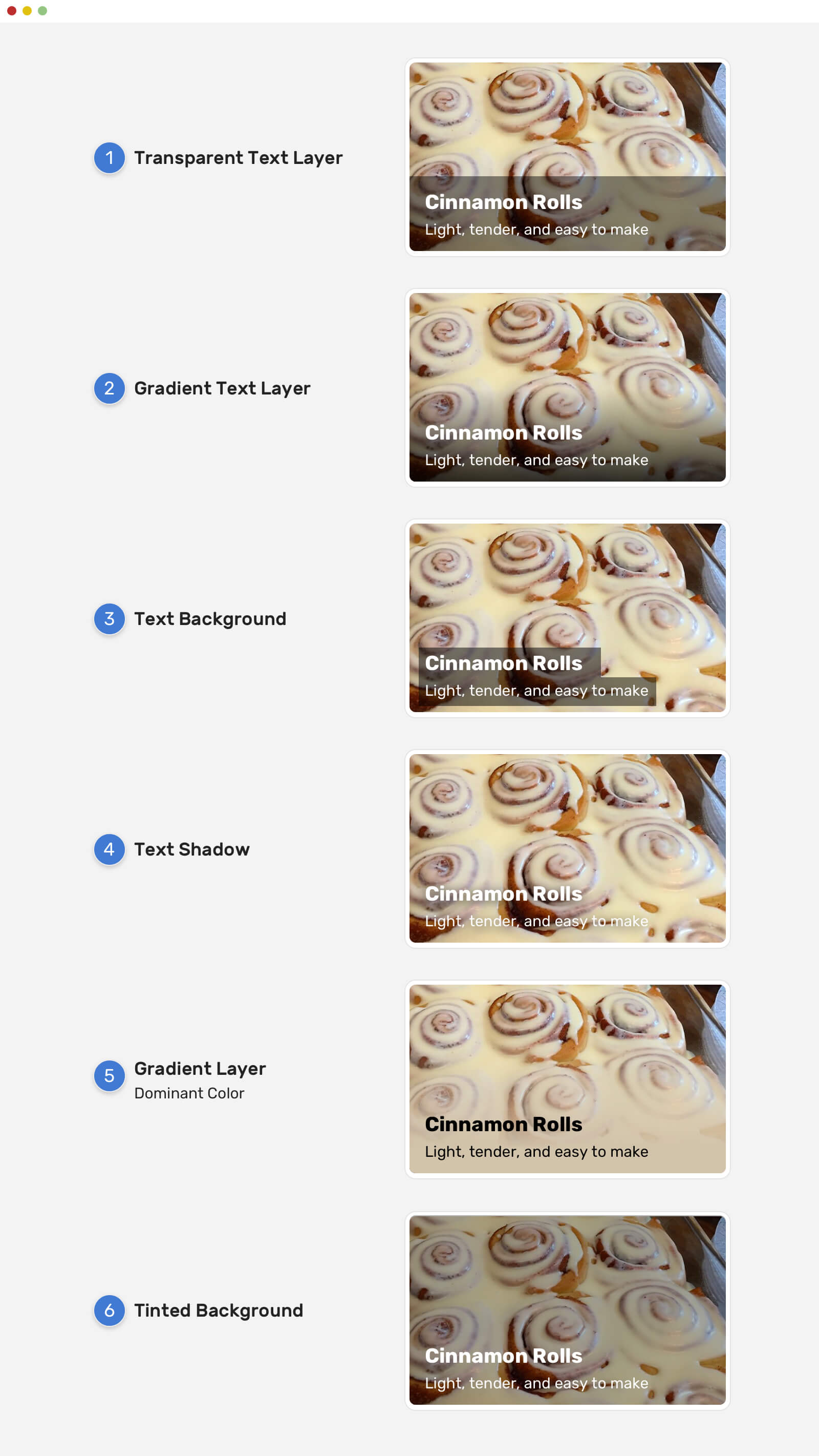
As you’ve seen, there are different solutions to the problem. The ones that need more care are the gradient solutions. Why? Because it’s so easy to add a gradient layer and the text won’t be accessible.
Generally speaking, the gradient overlay is the most common solution for making the text on an image much clearer. Given that, I will focus a bit more on it.
When implementing the gradient overlay, we have two options:
<div>)Each one of the above has its pros and cons, let’s go through them.
The content element is positioned absolutely, and it has a gradient as a background image. That means the gradient size is equal to the element’s height.
.card__content {
  position: absolute;
  /* other styles (left, top, right, and padding) */
  background: linear-gradient(
    to top,
    rgba(0, 0, 0, 0.85),
    transparent
  );
}
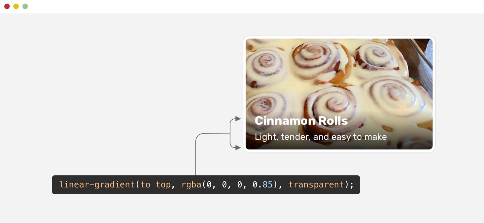
From the first glance, you might think that the gradient is good and it’s doing the job. This isn’t correct. I tested the same gradient with more images and here is the result.
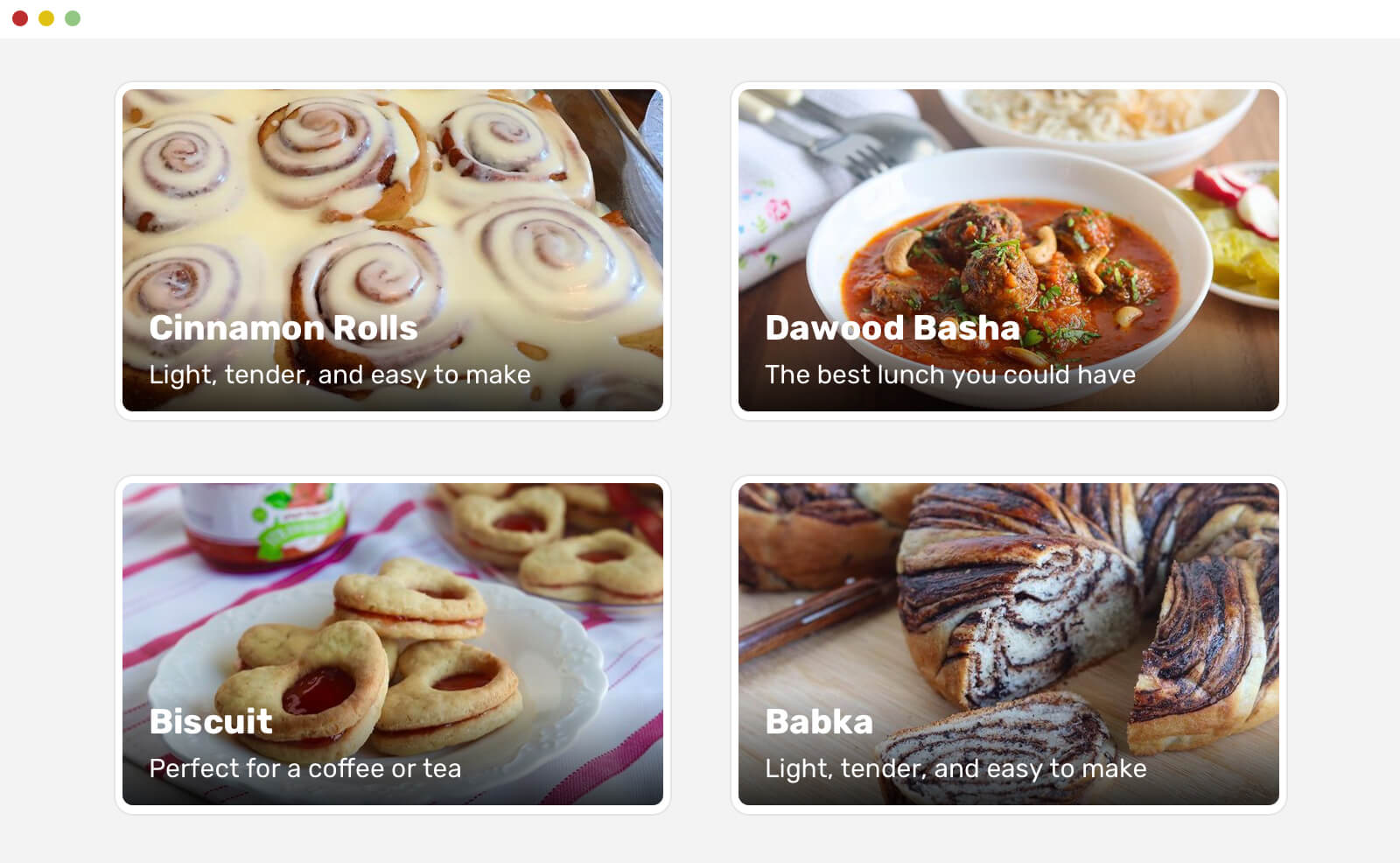
Notice that the contrast between the white text and the images is not always clear. This might be readable for some, but it’s a huge mistake to use such a gradient as it won’t be accessible.
The reason is that the gradient should cover more space vertically, so it needs to be larger in height. Having the gradient equal to the size of the content won’t work in all cases. To solve this, we can either use min-height as the below:
min-height to the .card__content element..card__content {
position: absolute;
/* other styles (left, top, right, and padding) */
display: flex;
flex-direction: column;
justify-content: flex-end;
background: linear-gradient(
to top,
rgba(0, 0, 0, 0.85),
transparent
);
}
Another solution is to simply use a large padding-top, and we don’t need the min-height and flexbox.
.card__content {
  position: absolute;
  padding-top: 60px;
  background: linear-gradient(
    to top,
    rgba(0, 0, 0, 0.85),
    transparent
  );
}
Notice the difference between the left and the right card. The gradient is larger in height.
Alright, that looks good. Can we do better? Yes, definitely!
If you look closely, you will notice that it’s clear where the gradient ends, which results in a thing called hard edge.
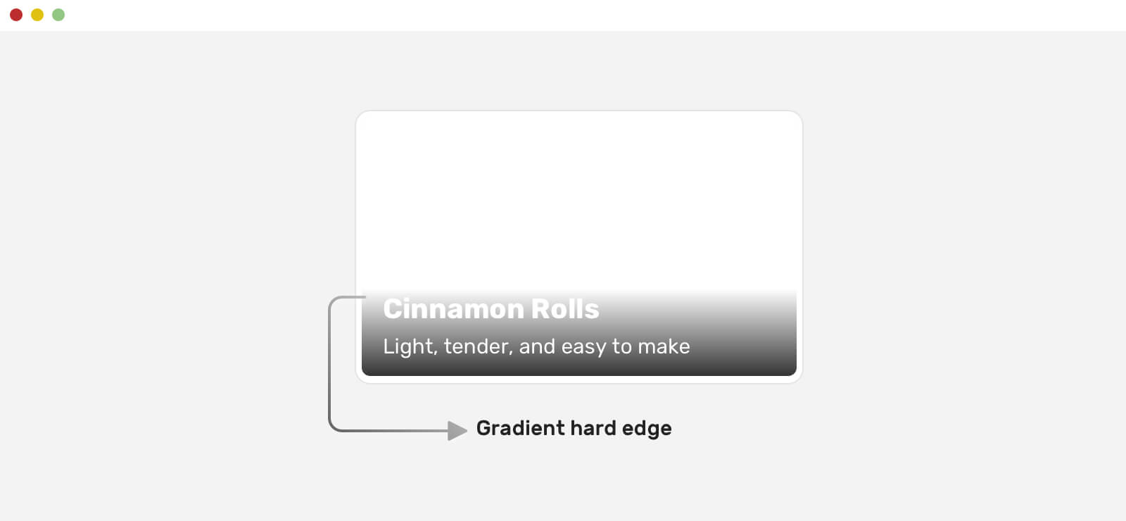
To make this better, we can apply the easing concept to the gradient. That way, the gradient will appear more natural, and you won’t notice a hard edge at the end of it.
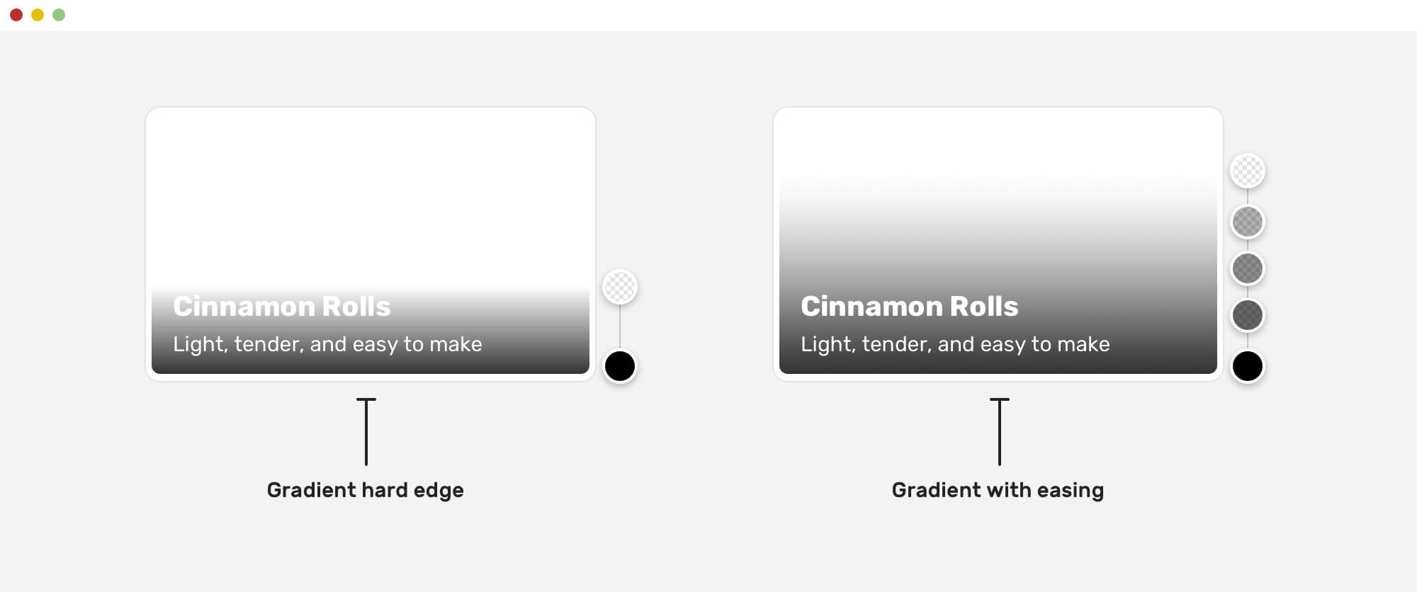
In CSS, we need to have multiple gradients stops to achieve the easing, as there is no native way of doing this at the time of writing this article. The good news is that the CSS working group is discussing the possibility of implementing easing in CSS gradients, but it’s not obvious when that will happen.
Thankfully, Mr. Andreas Larsen created a handy PostCSS and Sketch plugins that help in converting a normal gradient to an eased one.
Here is the CSS gradient for the above example:
.card__content {
  background-image: linear-gradient(
    0deg,
    hsla(0, 0%, 35.29%, 0) 0%,
    hsla(0, 0%, 34.53%, 0.034375) 16.36%,
    hsla(0, 0%, 32.42%, 0.125) 33.34%,
    hsla(0, 0%, 29.18%, 0.253125) 50.1%,
    hsla(0, 0%, 24.96%, 0.4) 65.75%,
    hsla(0, 0%, 19.85%, 0.546875) 79.43%,
    hsla(0, 0%, 13.95%, 0.675) 90.28%,
    hsla(0, 0%, 7.32%, 0.765625) 97.43%,
    hsla(0, 0%, 0%, 0.8) 100%
  );
}
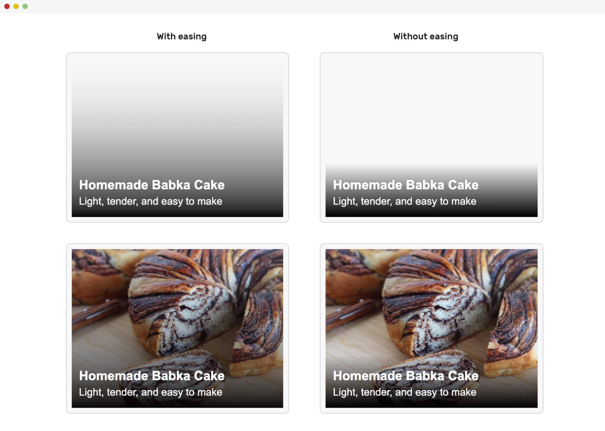
Here is a comparison between an eased and non-eased card.
Handling text over an image can’t be only vertical, but we can also use them as a horizontal gradient. Take for example a hero section. It needs a horizontal gradient in that case.

Here is the CSS gradient for the hero section above. I used the tool mentioned previously to generate an eased gradient.
background: linear-gradient(
  to right,
  hsl(0, 0%, 0%) 0%,
  hsla(0, 0%, 0%, 0.964) 7.4%,
  hsla(0, 0%, 0%, 0.918) 15.3%,
  hsla(0, 0%, 0%, 0.862) 23.4%,
  hsla(0, 0%, 0%, 0.799) 31.6%,
  hsla(0, 0%, 0%, 0.73) 39.9%,
  hsla(0, 0%, 0%, 0.655) 48.2%,
  hsla(0, 0%, 0%, 0.577) 56.2%,
  hsla(0, 0%, 0%, 0.497) 64%,
  hsla(0, 0%, 0%, 0.417) 71.3%,
  hsla(0, 0%, 0%, 0.337) 78.1%,
  hsla(0, 0%, 0%, 0.259) 84.2%,
  hsla(0, 0%, 0%, 0.186) 89.6%,
  hsla(0, 0%, 0%, 0.117) 94.1%,
  hsla(0, 0%, 0%, 0.054) 97.6%,
  hsla(0, 0%, 0%, 0) 100%
);
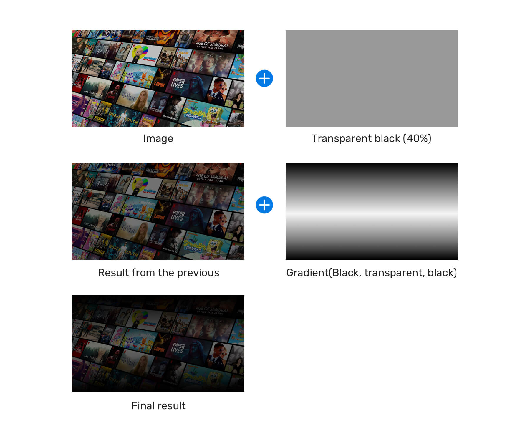
I learned about this pattern from Netflix website. On the home page for a non-logged user, there is a headline with a large background image.

I like it, but it hides a lot of the image details. Make sure to use this only when the image is meant to be decorative (doesn’t provide an actual benefit to the end-user).
<div class="hero">
  <img src="cover.jpg" alt="" />
  <div class="hero__content">
    <h2>Unlimited movies, TV shows, and more.</h2>
    <p>Watch anywhere. Cancel anytime.</p>
  </div>
</div>
.hero:after {
  content: "";
  position: absolute;
  left: 0;
  top: 0;
  width: 100%;
  height: 100%;
  background-color: rgba(0, 0, 0, 0.4);
  background-image: linear-gradient(
    to top,
    rgba(0, 0, 0, 0.8),
    rgba(0, 0, 0, 0) 60%,
    rgba(0, 0, 0, 0.8) 100%
  );
}
Here is a visual explanation of how this pattern works.
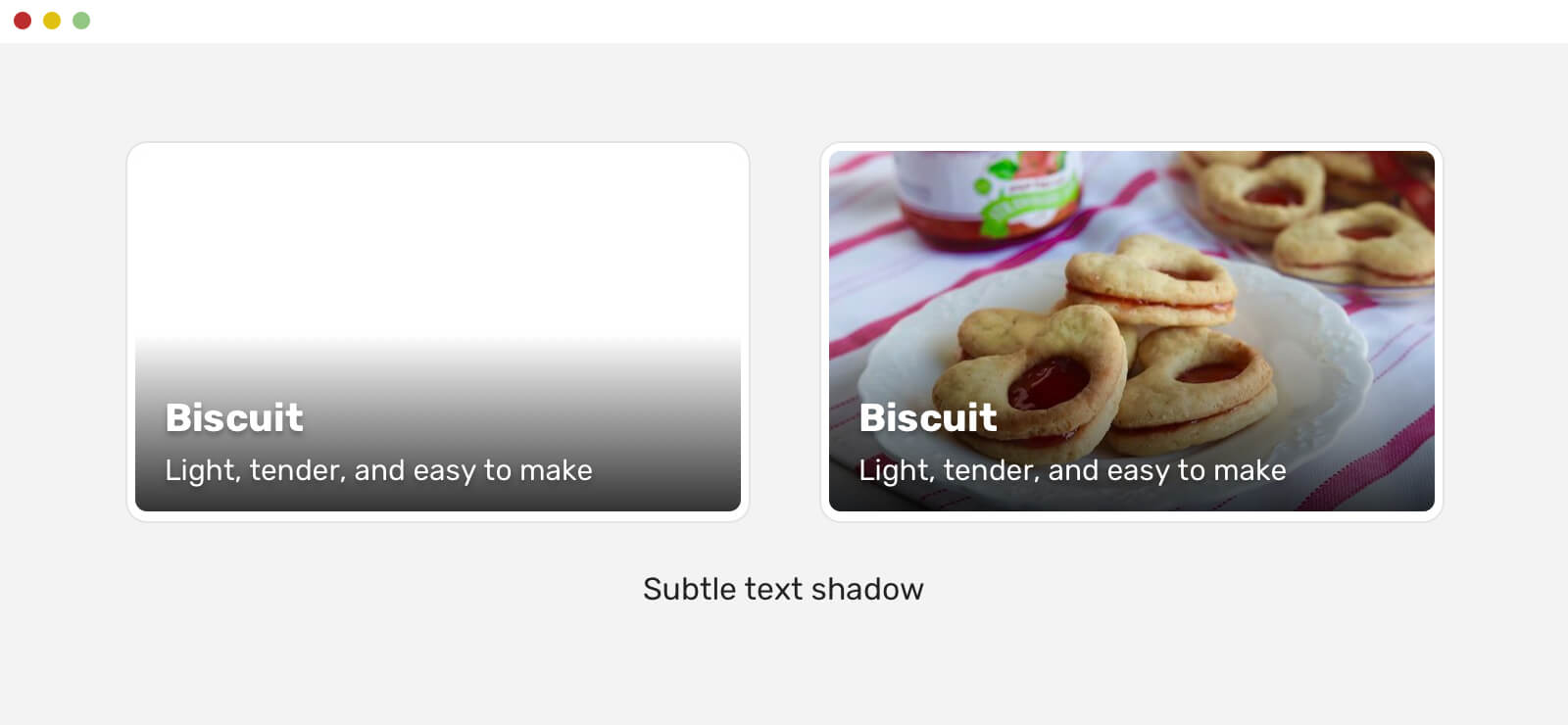
There is a useful little touch that can make text over images even better. It’s all about adding a subtle text-shadow for the text. Even if this might not be easy to notice, it can be very useful in case the image fails to load.
Consider the following example.
.whatever-text {
  text-shadow: 0 2px 3px rgba(0, 0, 0, 0.3);
}
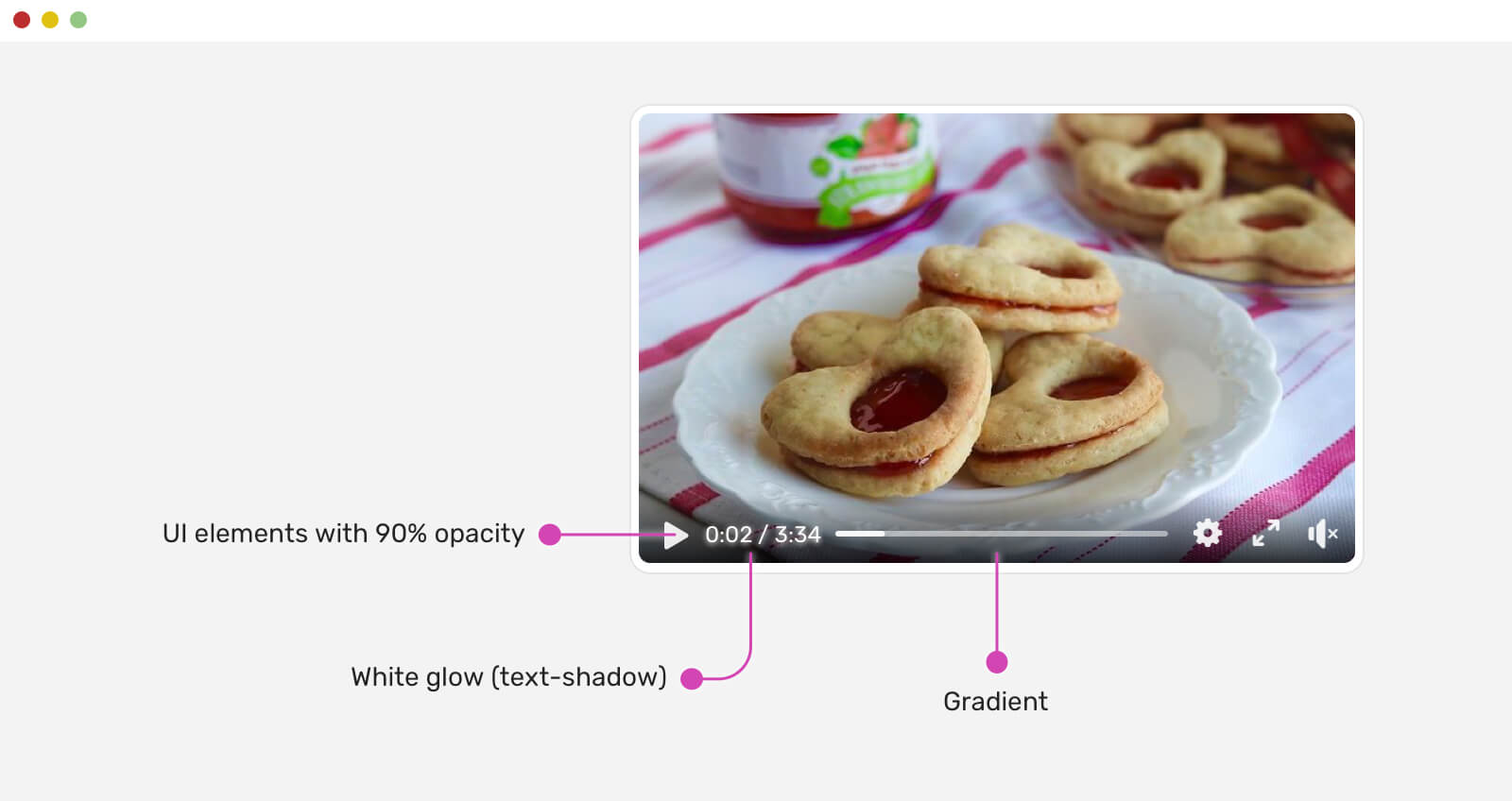
This is a pattern that I noticed on Facebook’s video player. I like that they used multiple techniques to make text (and other UI elements) clear. When dealing with a video player, it’s very important to ensure that an element over it should be noticeable.
.player__icon {
  opacity: 0.9;
}

.player__time {
  color: #fff;
  text-shadow: 0 0 5px #fff;
}
What’s new in this is that the icons and the player have opacity: 0.9. This will help in making them blend with the background underneath them. It gives a feeling that the controls are blended.
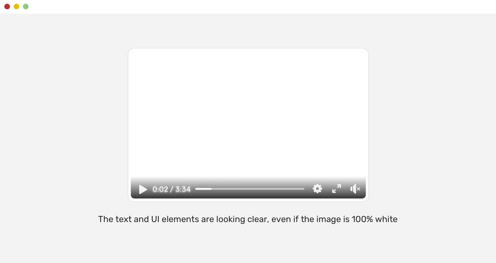
Also, using a white text-shadow for white text is an effective way to make the text more clear. Do you want proof that the above will work, even if the background is a fully white image? Here you go.
Youtube is doing a similar thing with their videos, too.

Here is what I liked about Youtube’s approach:
An interesting solution that I learned about from Netflix is using a radial gradient. Here is how it works:
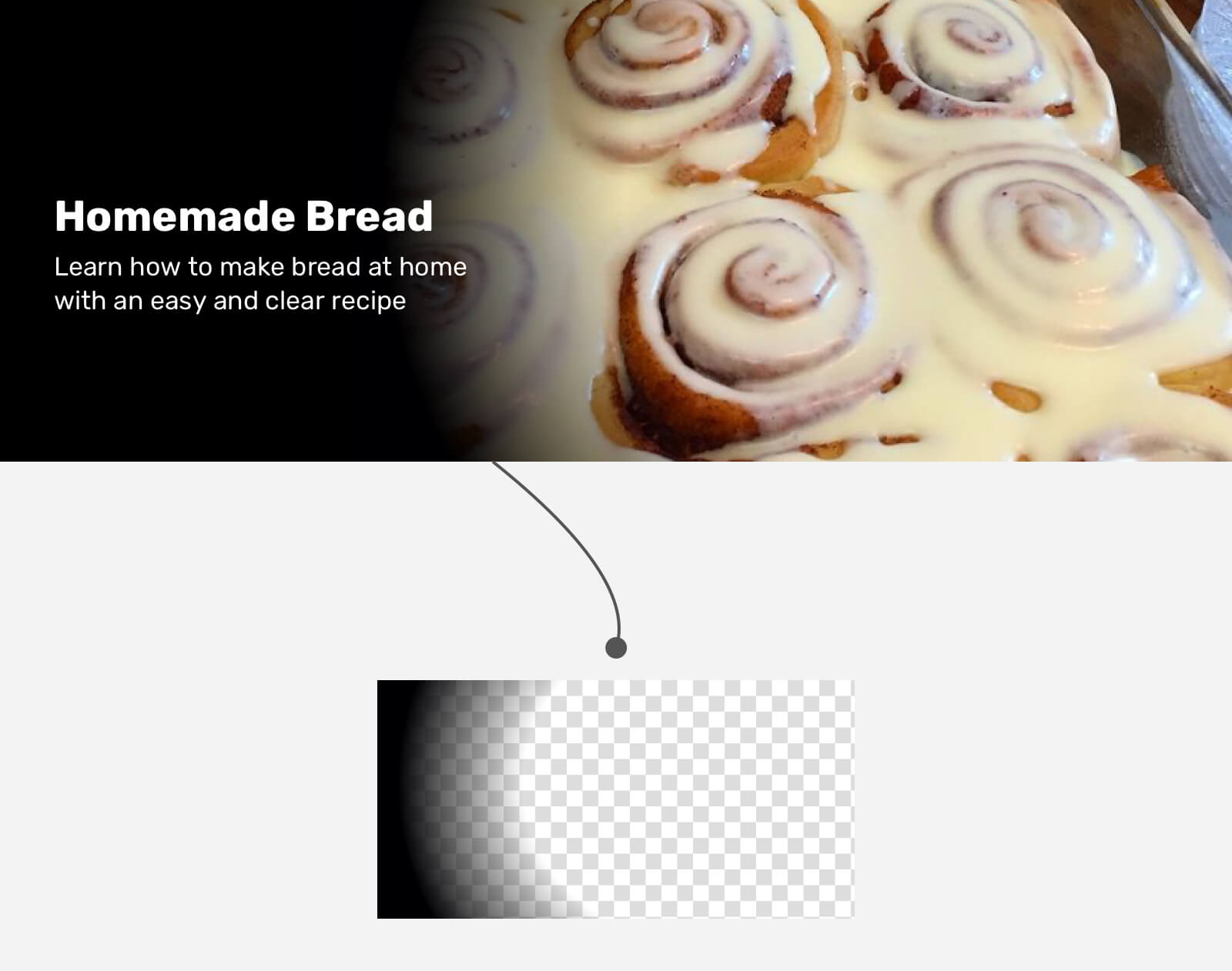
.hero {
  background-color: #000;
  min-height: 300px;
}

.hero__image {
  position: absolute;
  right: 0;
  top: 0;
  width: 75%;
  height: 100%;
  object-fit: cover;
}

.hero:after {
  content: "";
  position: absolute;
  right: 0;
  top: 0;
  width: 75%;
  height: 100%;
  background: radial-gradient(
    ellipse 100% 100% at right center,
    transparent 80%,
    #000
  );
}
Though, the Netflix team used a .png image for the overlay. I’m not sure about the reason. It could be a cross-browser issue or something since I didn’t heavily test the radial gradient solution.
This is a great tool that helps us in picking the right overlay opacity based on the image. Check it out on Codepen. An interesting challenge is to handle the accessibility for a gradient.
Generally speaking, if you make sure that the gradient overlay fills the text correctly, and it has a decent color contrast, you’re good to go.
A solution can’t be considered good until it’s tested, right? One way that I use to test a gradient overlay is to add a white background below it. If the text is readable, then the gradient will work with whatever image you use. If not, you need to tweak and enhance it.
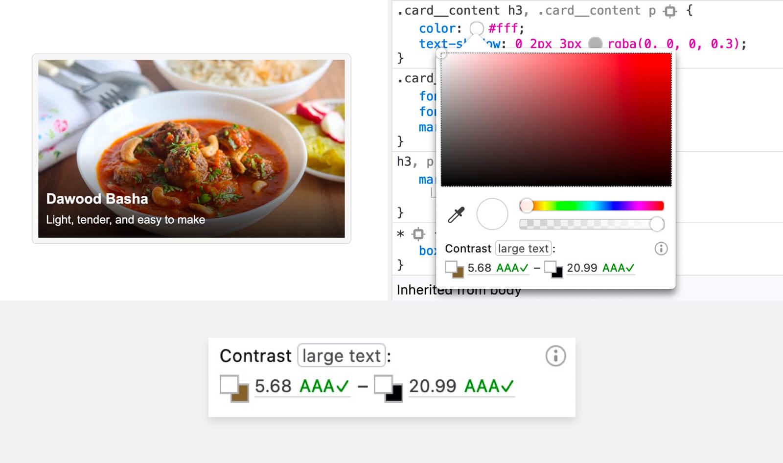
For the example above, I picked the solid color under the title, and the contrast ratio is 4.74, which is considered good.
Thanks to Gijs Veyfeyken for letting me know about Firefox can do a color contrast test on gradients. That’s a great feature.
I’m excited to let you know that I wrote an ebook about Debugging CSS.

If you’re interested, head over to debuggingcss.com for a free preview…
此内容由惯性聚合(RSS阅读器)自动聚合整理,仅供阅读参考。 原文来自 — 版权归原作者所有。