


I spent years teaching CSS layout on this blog. I put everything I know into The Layout Maestro course: 70+ lessons and 150+ interactive examples that teach you how to think CSS layouts, not just memorize syntax.
I know, I know. You might be thinking about why did I choose such a title for a blog post. Responsive height design, seriously? Well, the term Responsive Web Design is often known as checking the browser on multiple viewport widths and device sizes. We always test horizontally by reducing the width, but I rarely see some consideration for testing vertically by reducing the browser height. There’s a question in the back of your mind: Do we need to reduce the browser height? Yes, and I will convince you in this article.
When we work on a website implementation, making assumptions without depending on real-world data is not good. Taking responsibility for testing both horizontally and vertically is extremely important.
That’s a good question. Before diving into examples and use-cases, I want to illustrate the issue so you can have an idea about the kind of problems we will explore.
For a designer, an invalid assumption is one of the factors that play a vital role in ruining a website design. For example, assuming that a user will browse a website by using the full width and height of a screen is incorrect. Instead, you need to account for the worst.
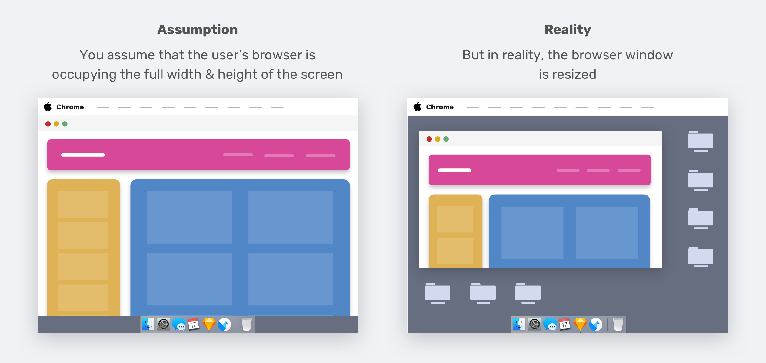
Do you see what I mean? The reality is that not all users use their web browsers as you expect. I’ve seen websites that looks bad when the browser height is reduced.
Resizing the browser (vertically) is not the only way to change the viewport height. When you open the browser DevTools, they will also take vertical space from the browser’s height.
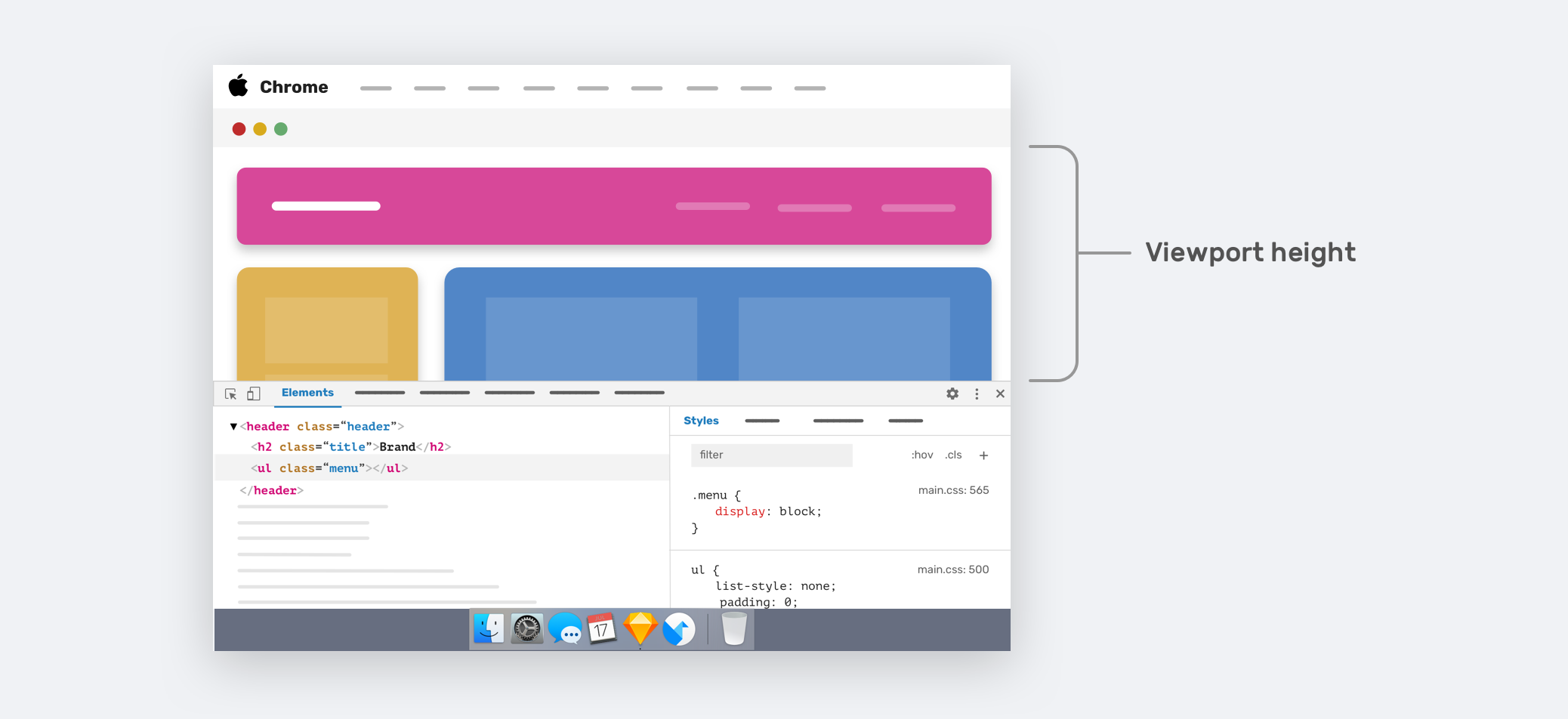
This can break up a design or can shed light on issues that you didn’t account for. The arrowed area in the figure above represents the current viewport height. For smaller laptop screens, you will only see a small portion of the web page.
The real question is: Can we enhance the user experience when the viewport height is small? Yes, it’s possible. Enough theory, let’s learn how to think vertically in CSS.
As designers and developers, some of us only focus on the width variations of a design, putting behind the importance of testing versus the viewport height. For example, you’re working on a page design, and you provided how a specific component will look across different viewport widths. But, what about different viewport heights?
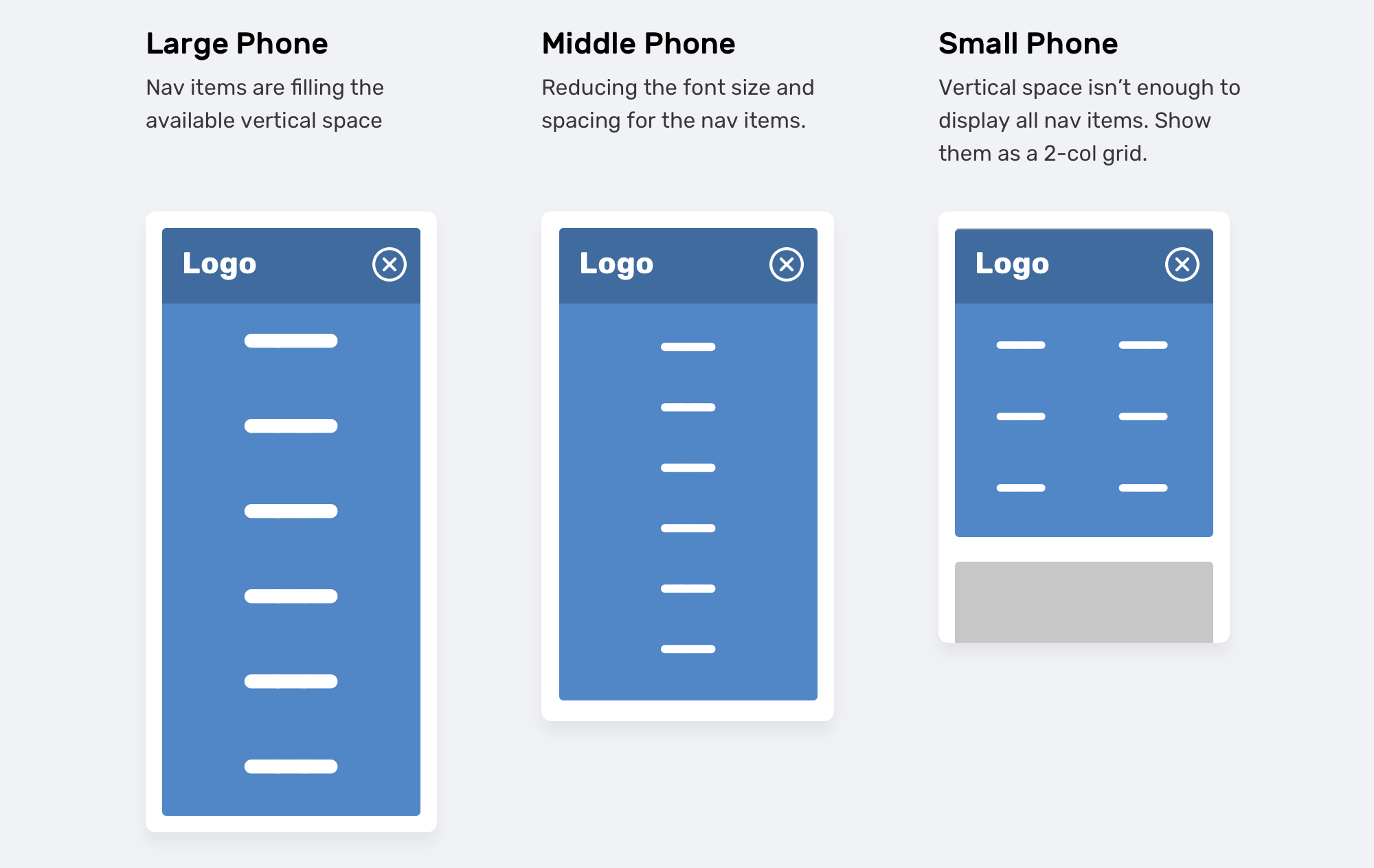
In the figure above, we have a navigation menu that is being tweaked based on the viewport height. The navigation items are displayed to fill the whole screen. When the size is smaller, the font size and spacing is reduced. If the viewport size is small (Say, iPhone 5), the navigation items will be displayed as a 2-column grid. That type of thinking is often put aside, leaving such important things to be either completely forgotten or to be done when someone reports a bug in their web browser.
CSS can help us in applying the above by mainly using two different techniques:
As you already know, we can use width media queries in CSS.
@media (min-width: 700px) {
  .element {
    /* do something.. */
  }
}
The less used is the vertical media queries, which checks against the viewport height.
@media (min-height: 500px) {
  .element {
    /* do something.. */
  }
}

/* or */

@media (orientation: landscape) {
  .element {
    /* do something.. */
  }
}
Using viewport units can help in providing a better experience for the user. As an example, controlling the vertical spacing between elements based on the viewport height.
.hero__title {
  margin-bottom: calc(10px + 5vh);
}
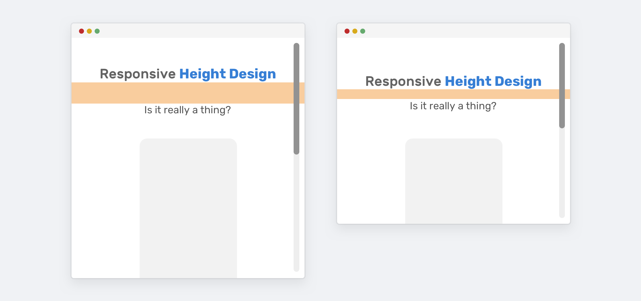
That’s all fun and games until we view the example above on a large display, like an iMac 27”. The viewport height will be too large. Thankfully, we have two ways of constraining the margin-bottom from becoming too large:
The first way (media queries) is more supported, of course. We need to set a maximum value for the margin-bottom if the screen size is large.
@media (min-width: 2200px) {
  .hero__title {
    margin-bottom: 40px;
  }
}
The other way is by using CSS clamp() comparison function. Basically, we need to set 10px is the minimum margin, and 50px is the maximum. The in-between is on the browser!
.hero__title {
  margin-bottom: clamp(10px, 5vh, 40px);
}
I wrote about CSS viewport units and CSS comparison functions in detail. You can read them below:
In the coming section, we will explore different use-cases for CSS vertical media queries.
In this example, there is a hero section with a headline and an illustration. The hero section height is 100vh, which is equal to 100% of the viewport height.
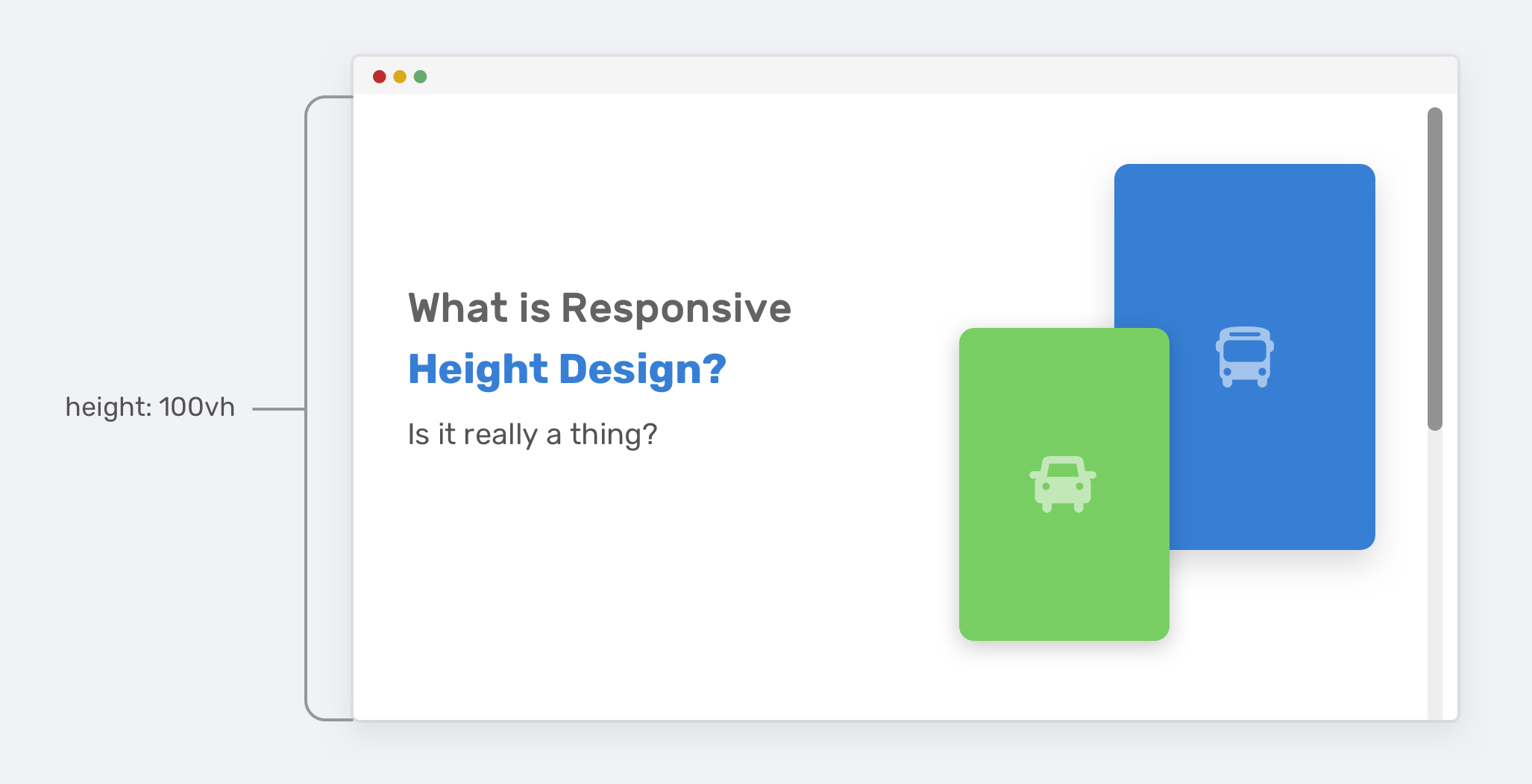
Everything looks great until the viewport height gets smaller. The height of the hero section won’t be enough to contain the illustration and text content. As a result, it will overlap with other sections on the page.
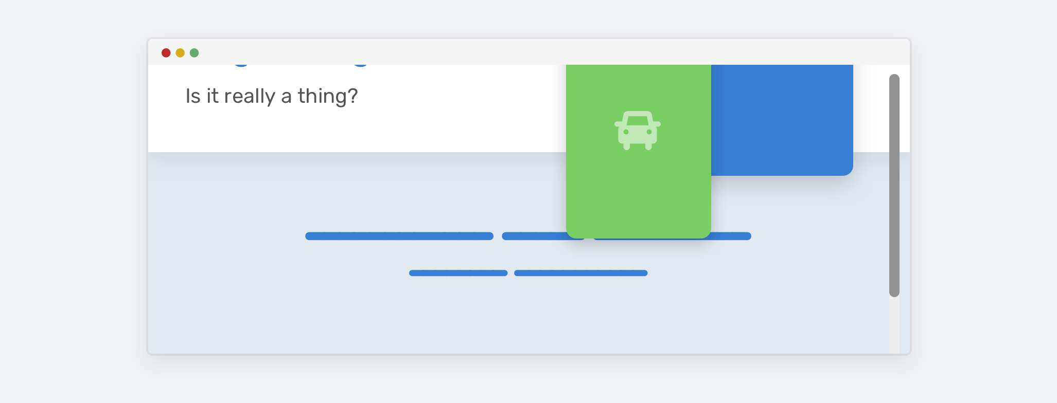
Notice how the illustration is overlapping with the section below it. That is happening because there is enough vertical space for it. Let’s look at the HTML and CSS.
<div class="hero">
  <div class="hero__wrapper">
    <div class="hero__content"><!-- content --></div>
    <img class="hero__thumb" src="figure.png" alt="" />
  </div>
</div>
.hero {
  height: 100vh;
}

.hero__thumb {
  flex: 0 0 550px;
  width: 550px;
}
Here is a possible solution to solve this kind of problem:
width only. The absence of height will keep the problem.height: 100vh only when the viewport height is greater than 700px (The media query value can differ based on the context).We can combine both for a stronger solution.
.hero__thumb {
  width: 400px;
  height: 300px;
  object-fit: contain; /* To avoid compressing the image */
}

@media (min-height: 700px) {
  .hero {
    height: 100vh;
  }
}
Ok, now we agreed that using a vertical media query is better. However, using 100vh is risky because even if you constrained the size of the illustration, you might not be able to do the same for the text content. If the text content got longer, the same issue will happen again. See the figure below.
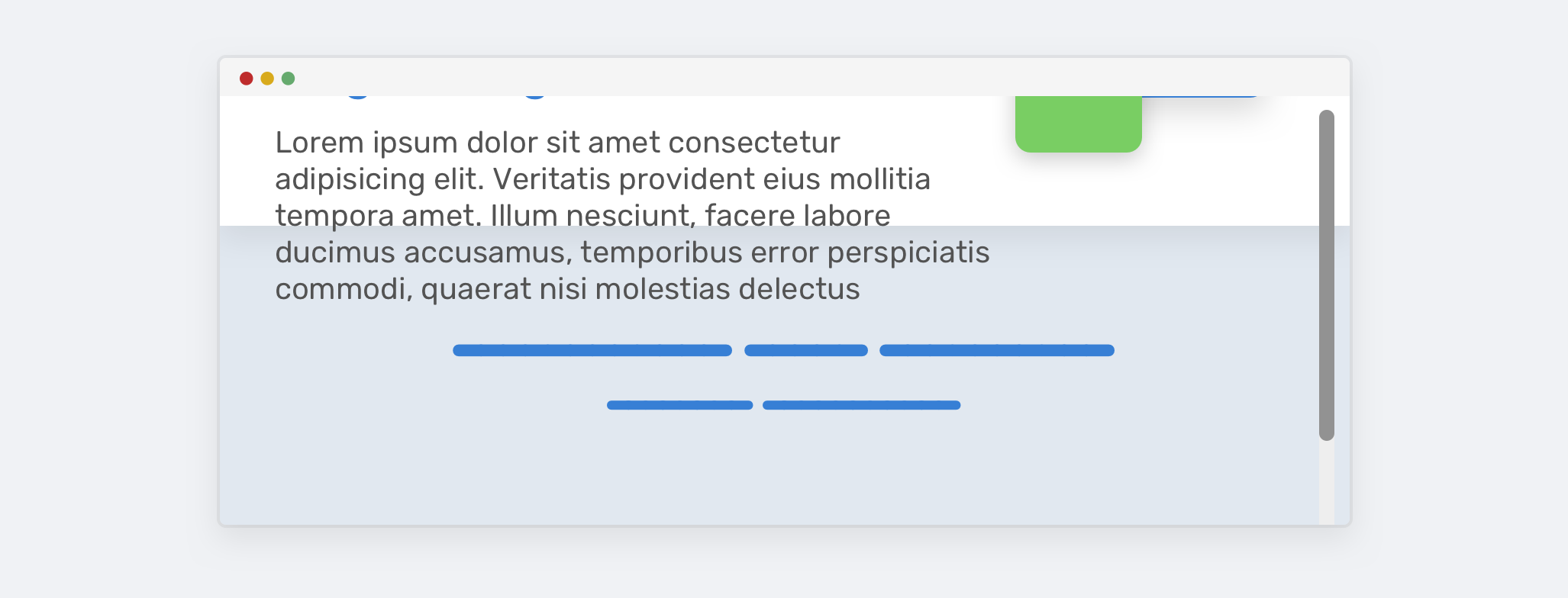
To fix that, we can use min-height instead of height. That way, if the content got longer, the height will expand and there will be no overlap.
@media (min-height: 700px) {
  .hero {
    min-height: 100vh;
  }
}
It’s not a bad thing to make a header fixed on scrolling, but you need to make sure that it’s fixed only with the vertical space is good enough.
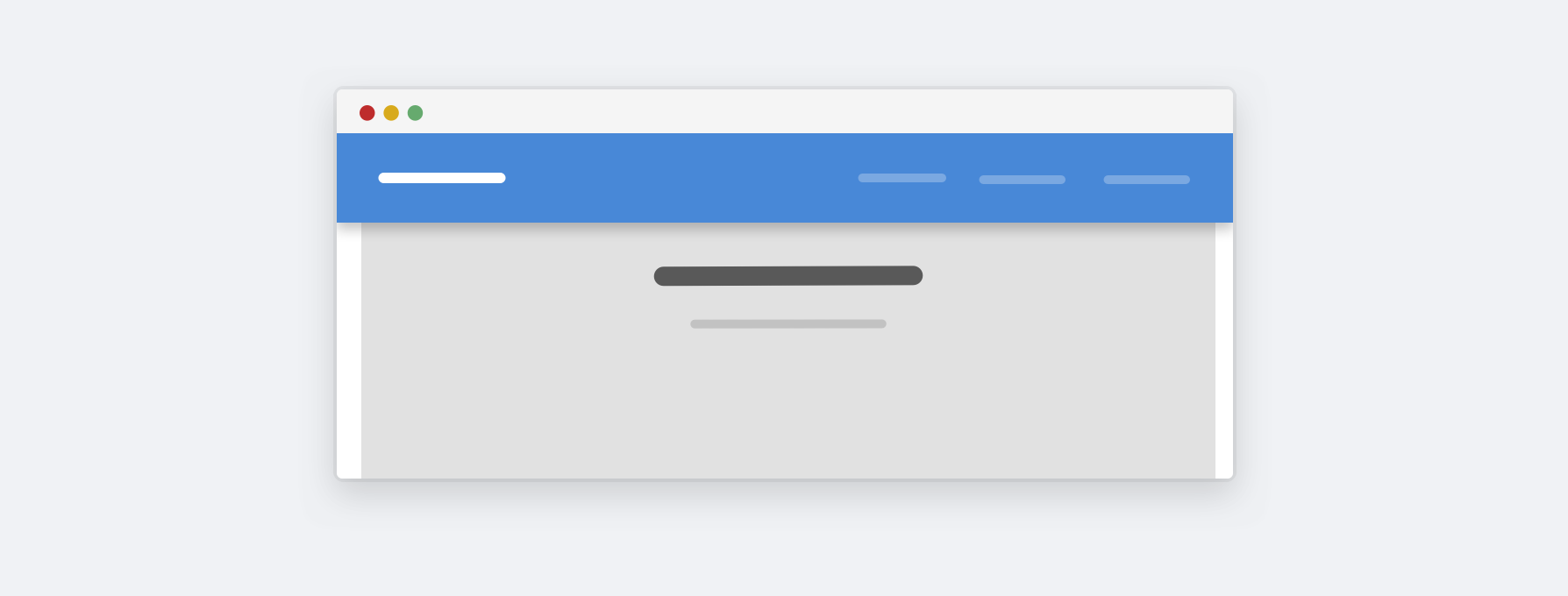
Here is a website on the landscape mode. Notice how the header is taking too much vertical space. Is it really important for the user? Most of the time, the answer is no. We can enhance this with vertical media queries:
@media (min-height: 700px) {
  .site-header {
    /* position: fixed or position: sticky */
  }
}
With that, the header won’t be fixed in the landscape mode.
I noticed this pattern on Twitter.com navigation. The idea is to combine vertical media queries and the Priority+ pattern.
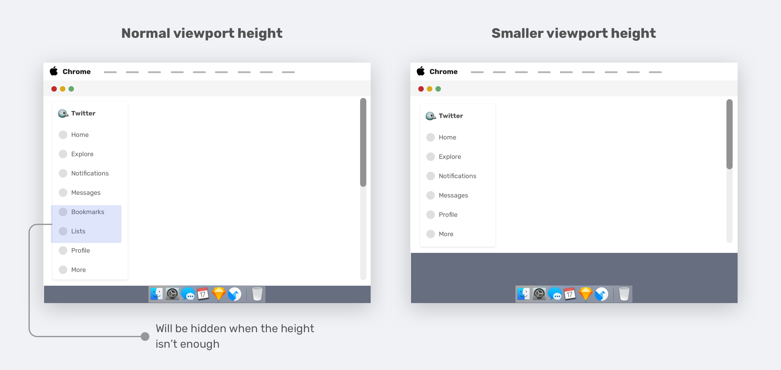
When the viewport height is resized, the less-important elements (Bookmarks and lists) will be removed and appended to the “More” menu. This is a good use-case for vertical media queries.
.nav__item--secondary {
  display: none;
}

@media (min-height: 700px) {
  .nav__item--secondary {
    display: block;
  }
}
And here is the actual Twitter implementation as a video.
— Ahmad Shadeed (@shadeed9) September 29, 2020I like the idea of reducing space based on the viewport height.
Here is how Twitter implemented this:
1- Reduce the space to 0 instead of 4px between each nav item.
2- Remove "bookmarks" and "lists" and append them to the more menu.Lovely 😍 pic.twitter.com/bjGxXRFLfS
Well, this is related to the previous example. We have vertical navigation (AKA sidebar or aside). When the viewport height is small, we can reduce the vertical spacing between the navigation items a bit, which will enhance the overall design a bit.
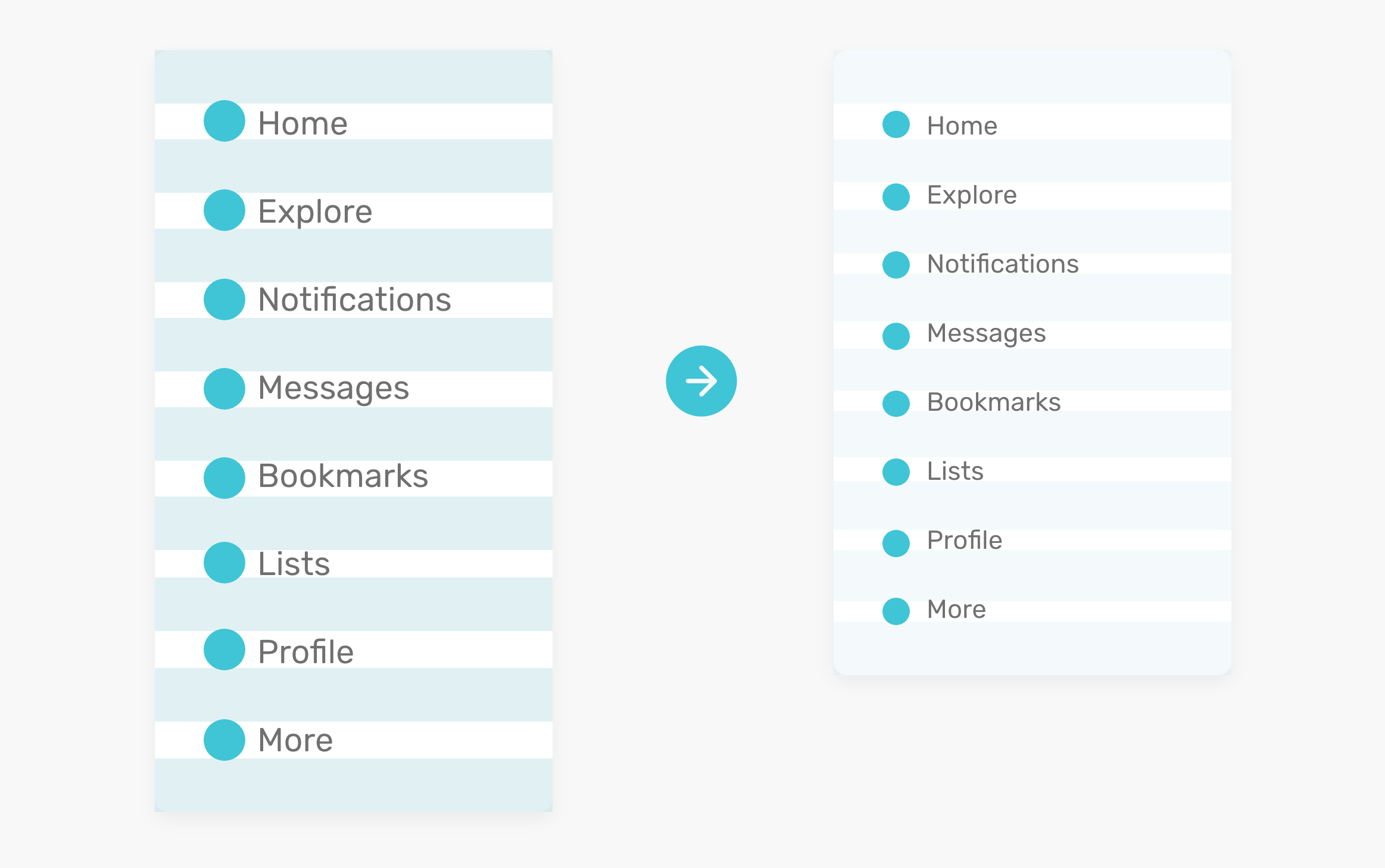
.nav__item {
  padding-top: 4px;
  padding-bottom: 4px;
}

@media (min-height: 700px) {
  .nav__item {
    padding-top: 10px;
    padding-bottom: 10px;
  }
}
Here is a video animation as well:
Adding on that, the font size can also be reduced a bit. Thus, creating even more vertical space.
A hero needs vertical spacing to give it some breathing space. The spacing can be reduced depending on the viewport height.
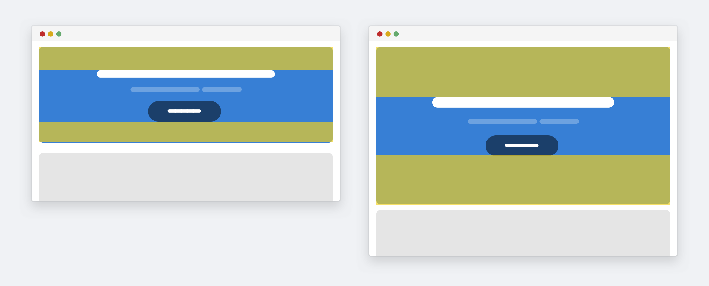
.hero {
  padding-top: 24px;
  padding-bottom: 24px;
}

@media (min-height: 700px) {
  .hero {
    padding-top: 40px;
    padding-bottom: 40px;
  }
}
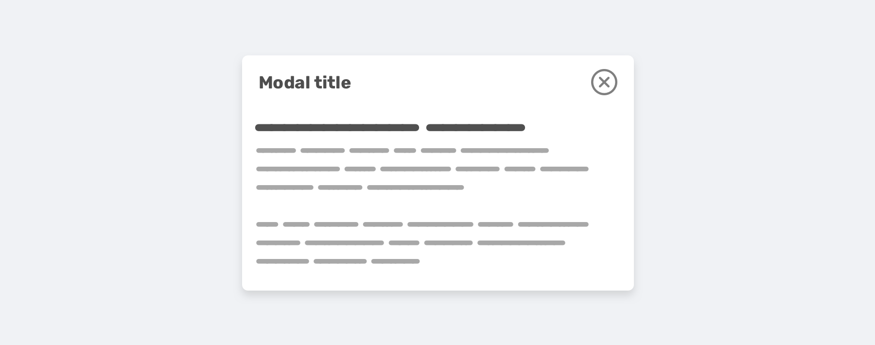
As you might already know, a modal component is expected to be centered horizontally, at least. However, you might need the modal to be centered vertically as well. It’s possible, but it will make bugs happen faster when the content changes. How? That’s what we are going to explore.
With perfect content, the modal looks like the below. All good till now.
.modal__body {
  position: absolute;
  left: 50%;
  top: 50%;
  transform: translate(-50%, -50%);
  width: 500px;
}
However, things will get messy when the content gets longer. The modal will fill the screen vertically, and the user won’t be able to scroll it.
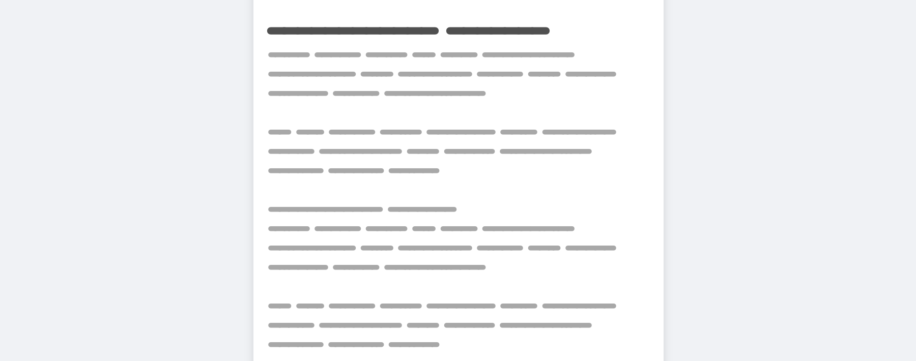
In that case, the reason for that issue is the following:
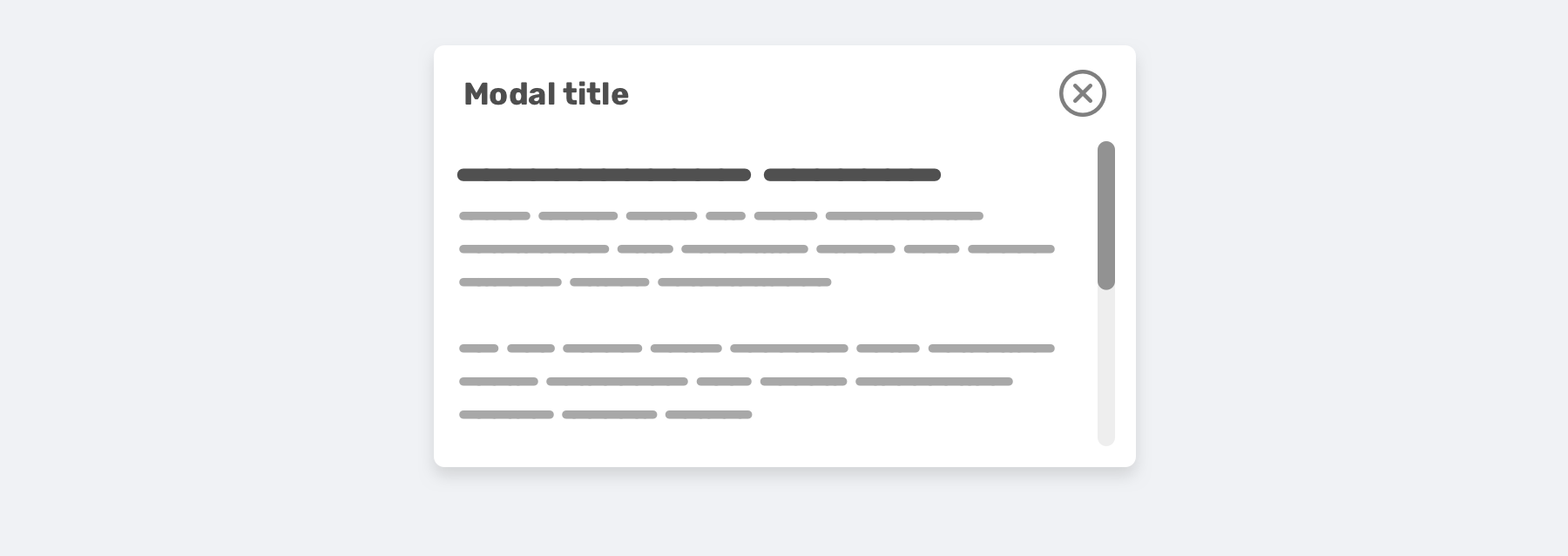
Here is the updated CSS.
.modal__body {
  position: absolute;
  left: 50%;
  top: 3rem;
  transform: translateX(-50%);
  width: 500px;
  min-height: 200px;
  max-height: 500px;
  overflow-y: auto;
}

@media (min-height: 700px) {
  .modal__body {
    top: 50%;
    transform: translate(-50%, -50%);
  }
}
Notice that I used min-height and max-height. The first is to keep the modal looks good even if the content is short, and the latter is to constraint its height with a specific value rather than adding a fixed height.
When designing an experience, it’s better to think of it in terms of width and height. It might be weird to resize the browser vertically, but it will pay itself. In this article, I discussed how testing vertically is important, and how we can do it, and finally, I proposed some examples and use-cases. I hope you found it useful!
Thank you for reading.
I’m excited to let you know that I’m writing an ebook about Debugging CSS.

If you’re interested, head over to debuggingcss.com and subscribe for updates about the book.
此内容由惯性聚合(RSS阅读器)自动聚合整理,仅供阅读参考。 原文来自 — 版权归原作者所有。