


I spent years teaching CSS layout on this blog. I put everything I know into The Layout Maestro course: 70+ lessons and 150+ interactive examples that teach you how to think CSS layouts, not just memorize syntax.
There are a lot of tutorials and guides out there that teach CSS grid in general, and I wrote about it multiple times. However, I noticed that there is a misunderstanding of the minmax() function as most of the articles are generic or don’t provide enough explanation and real-world use-cases. The minmax() is very powerful and useful. For that specific reason, I thought that writing a complete guide about minmax() will help to close that gap.
In this article, we will deep dive into the minmax(), learn how, when, and why to use it. At the end of the article, I expect that you will have a complete understanding of it. Let’s dive in!
minmax()As per the CSS spec, the definition of minmax(min, max) is as the following:
Defines a size range greater than or equal to min and less than or equal to max.
We can use minmax() as a value for a grid column or row. Let’s take a basic example:
.o-grid {
  display: grid;
  grid-template-columns: minmax(200px, 500px) 1fr 1fr;
  grid-gap: 1rem;
}
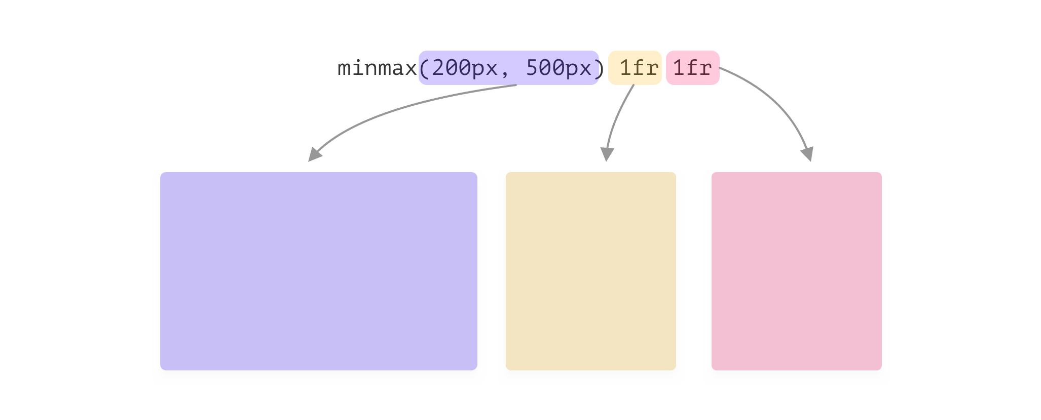
Let’s analyze the above:
minmax(200px, 500px). The minimum value is 200px, and the maximum value is 500px.1fr each. That means, they will take the available remaining space.Moving on with the example, we should think about different viewport sizes. What happens when the viewport size is too small? The short answer is horizontal scrollbar. I think no one likes to see a scrollbar on a web page, until it was done on purpose, of course.
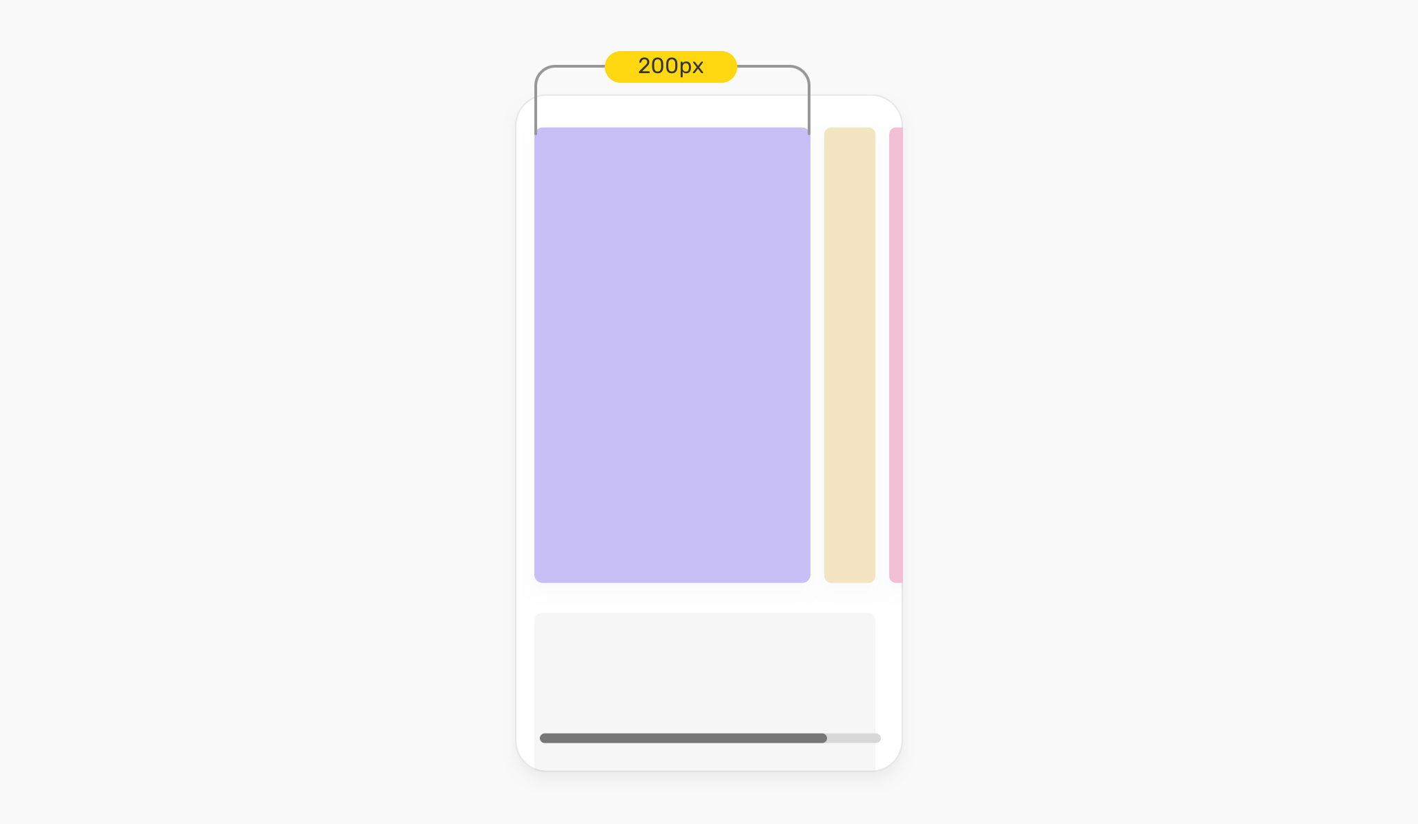
That means, minmax() can’t handle responsive design by itself. We need to handle that by ourselves, and I will come to this later in the use-cases section.
minmax() ValidationIf the min value in minmax(min, max) is larger than the max, then the max will be ignored. The minmax(min, max) will be treated as a min value.

Also, it’s important to keep in mind that using 1fr for the min value will be invalid. It only works for the max value. This is worse than the min being larger than the max! The whole declaration will be ignored.
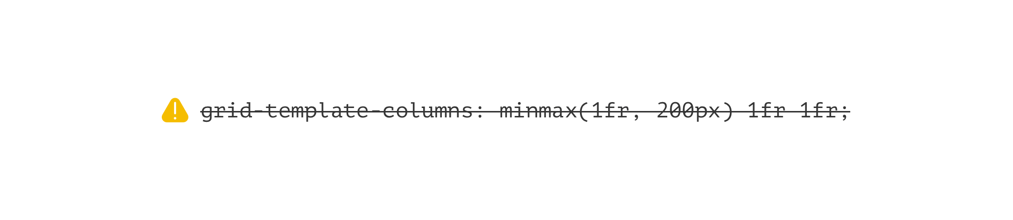
minmax()What will happen if we use minmax(0, 500px)? You guises it! The width will be at least zero, and it won’t go above 500px. That means, if the viewport width is not enough, the column width will resize.
Let’s suppose that we want to create a 3-columns grid. We will do the following:
.o-grid {
  display: grid;
  grid-template-columns: minmax(200px, 1fr) minmax(200px, 1fr) minmax(200px, 1fr);
  grid-gap: 1rem;
}
A column width will have a minimum width of 200px. Here is how the items will look:
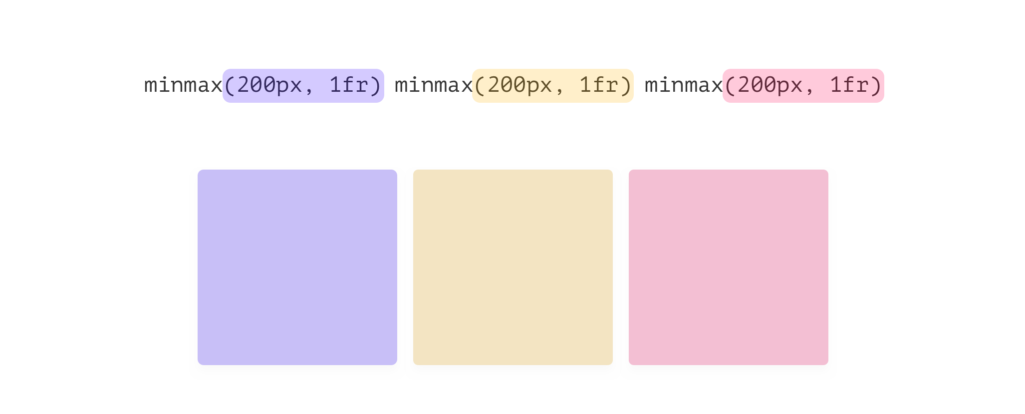
Note that we can use the repeat() function to avoid repeating the minmax() three times.
.o-grid {
  display: grid;
  grid-template-columns: repeat(3, minmax(200px, 1fr));
  grid-gap: 1rem;
}
Even though the above works, but it’s not recommended. Let’s explore why.
If the number of columns needed to be different, then we need to manually change the number of columns. For me, that doesn’t make sense. CSS Grid is capable of more of that!
Since we are explicitly defining the number of columns, the browser can’t make them wrap when the viewport width is small. As a result, this will cause a horizontal scrollbar.
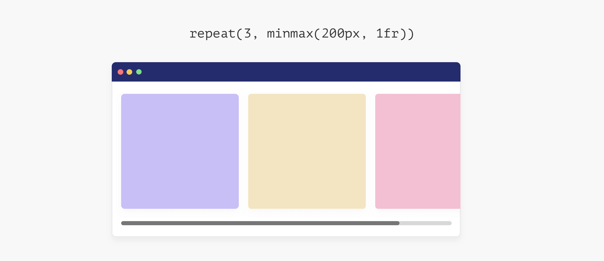
How to fix the horizontal scrollbar? Well, we need to let the browser know that the number of columns should reduce if the viewport width isn’t enough.
In flexbox, we do that by adding flex-wrap: wrap to the flexbox parent.
.parent {
  display: flex;
  flex-wrap: wrap;
}
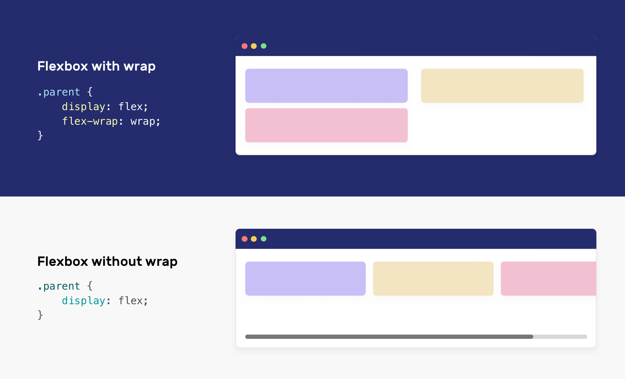
In CSS grid, we can use either the auto-fill or auto-fit keywords.
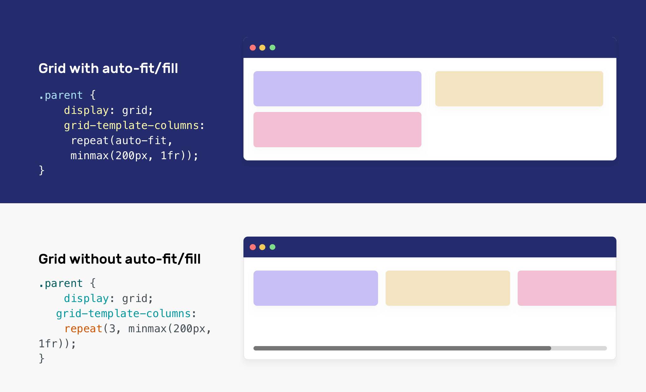
auto-fit or auto-fill keywordsTo avoid tweaking the issues mentioned above, we can get the benefit of the auto-fit or auto-fill keywords. The difference between auto-fit and auto-fill is tricky.
In short, auto-fit will expand the grid items to fill the available space. While auto-fill won’t expand the items. Instead, auto-fill will keep the available space reserved without altering the grid items width.
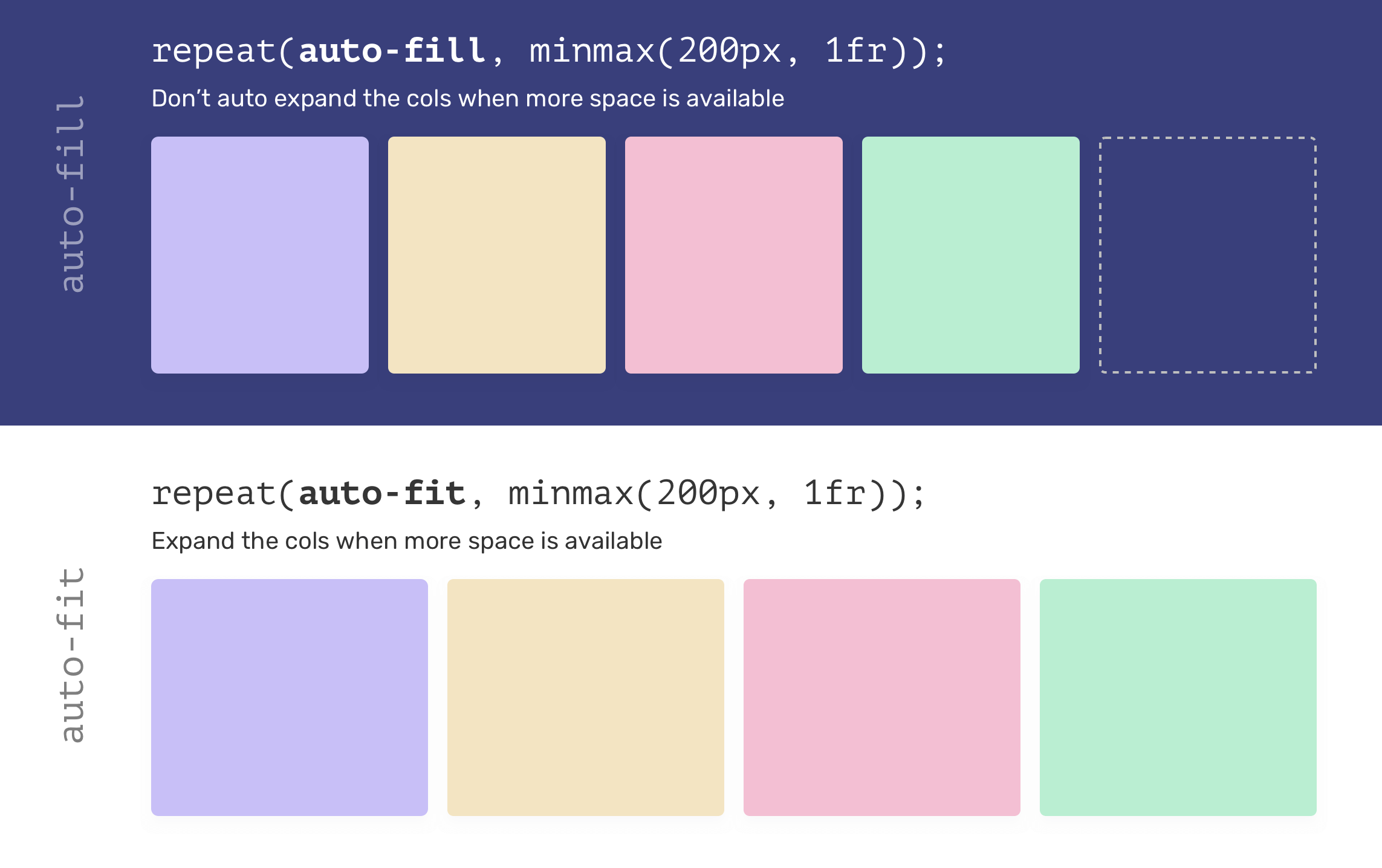
When using auto-fill/fit, you might get the same result depending on the viewport size. However, you won’t notice that similarity until you resize the viewport. See the following video:
auto-fitIn the video below, the dotted rectangle represents the additional space. When the viewport is bigger, the browser collapse the rectangle and distribute its width between the other grid items.
For auto-fill, the browser deals with that differently. When the viewport size is bigger, the grid items width won’t expand, and an empty grid item will be there (The dotted one).
Now that I explained how minmax() works, let’s explore some examples and use-cases.

I think this is the most common use-case for the minmax(), which is creating a responsive cards wrapper.
.wrapper {
  display: grid;
  grid-template-columns: repeat(auto-fill, minmax(250px, 1fr));
  grid-gap: 1rem;
}
When I started learning CSS grid, reading the value of grid-template-columns in this use-case was scary. It’s important to pay attention to viewports below 250px, as there will be a horizontal scrollbar.
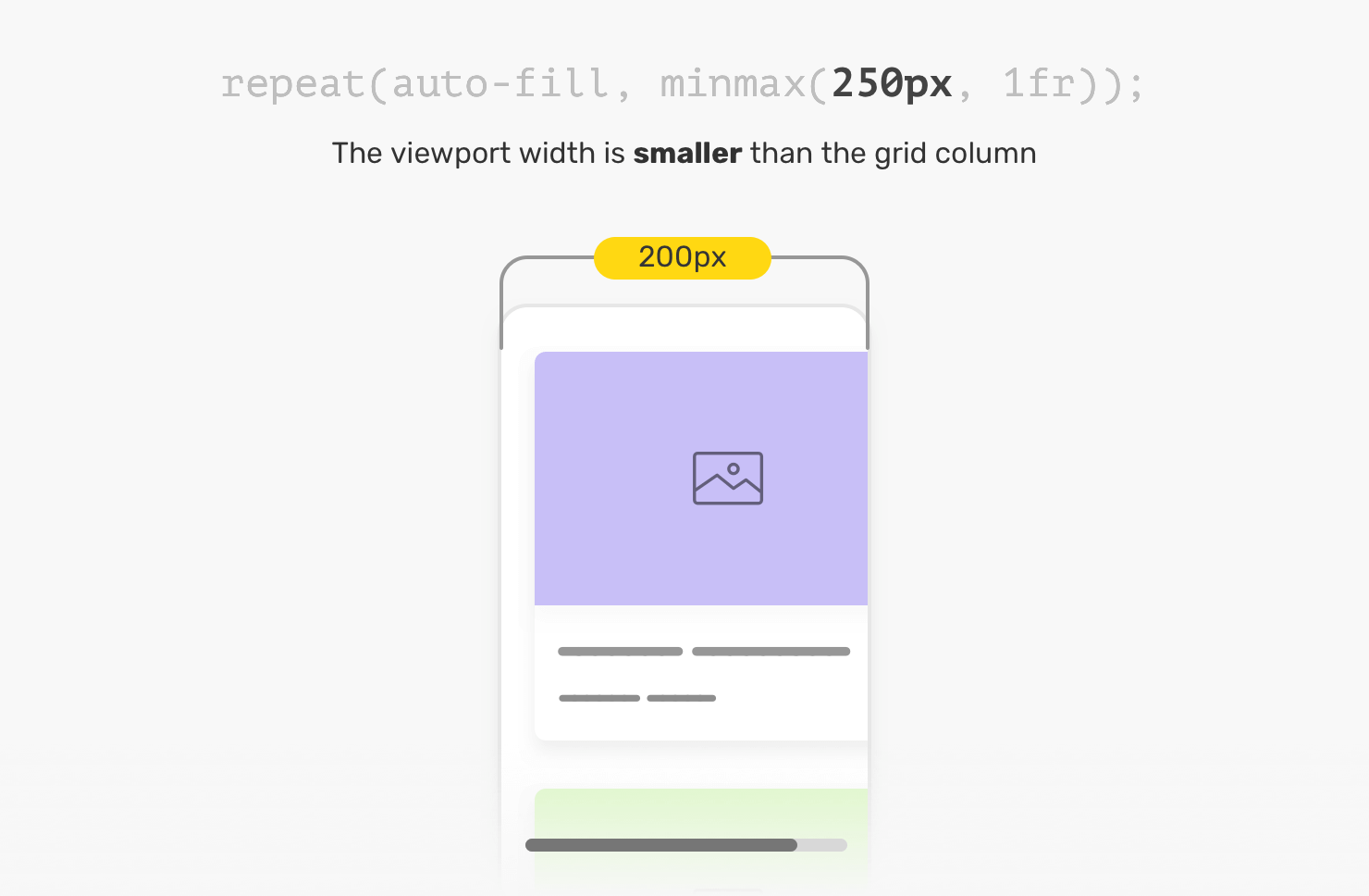
To solve this, we have two solutions. The first one is using CSS media queries. The idea is to set the grid-template-columns to 1fr, and when the viewport width is big enough, we will apply the minmax().
.wrapper {
  display: grid;
  grid-template-columns: 1fr;
  grid-gap: 1rem;
}

@media (min-width: 300px) {
  .wrapper {
    grid-template-columns: repeat(auto-fill, minmax(250px, 1fr));
  }
}
The second solution is to use CSS comparison functions. This solution is modern, and you need to check for browser support before using it.
.wrapper {
  display: grid;
  grid-template-columns: repeat(
    auto-fill,
    minmax(min(100%, 250px), 1fr)
  );
  grid-gap: 1rem;
}
I used the min() comparison function as the first value for minmax(). Here is what’s happening:
250px, then the first value of the minmax() function will be 100% of the parent width.250px, then the first value of the minmax() will be 250px.We achieved a better solution, with less CSS. If you want to learn more about CSS comparison functions, I wrote a detailed article about them.
ch unit for a content wrapperAn interesting use case for minmax() is using it to create an article layout. For this example, the content is horizontally centered.
.wrapper {
  display: grid;
  grid-template-columns: minmax(1rem, 1fr) minmax(auto, 70ch) minmax(1rem, 1fr);
  grid-gap: 1rem;
}
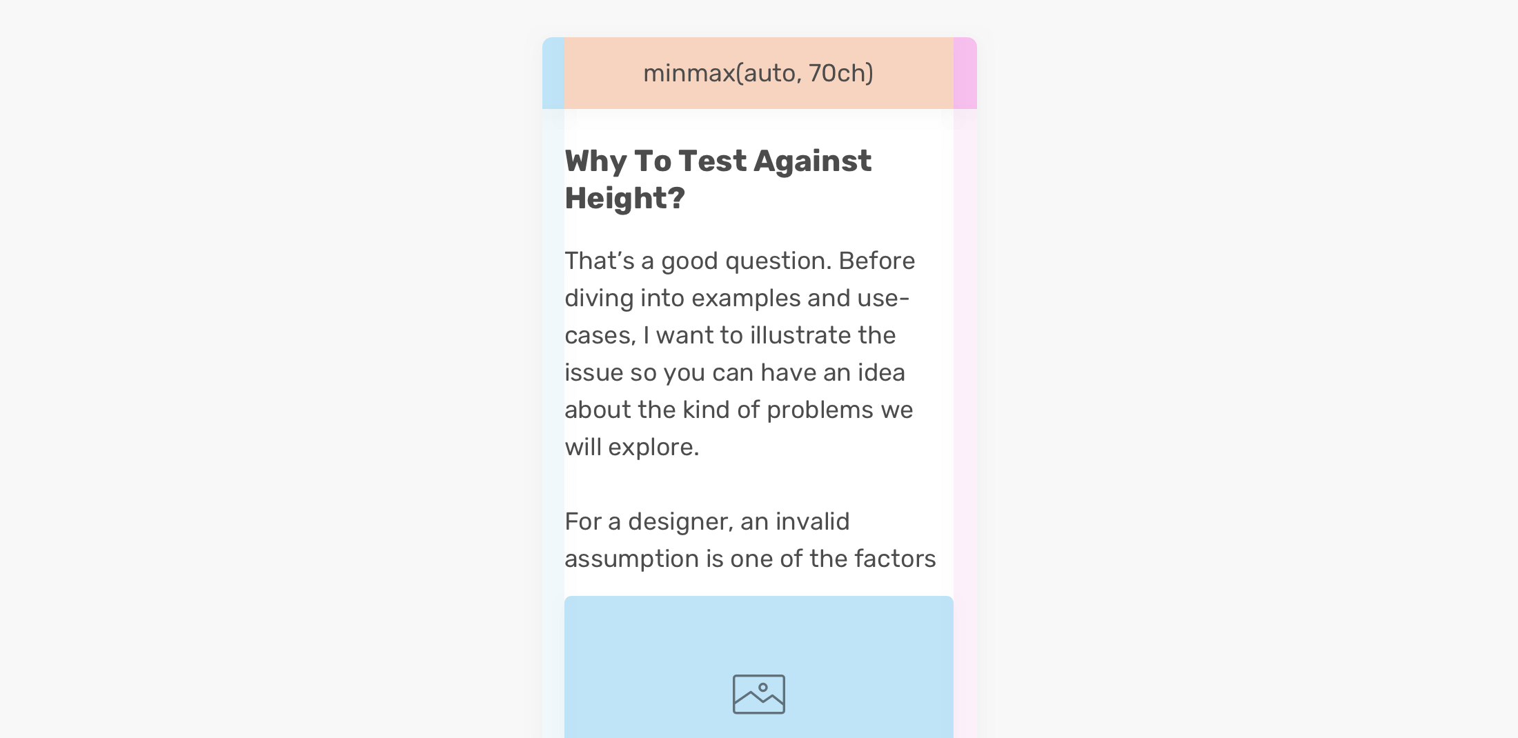
The first and last columns act as a gutter. The middle one is our focus. Notice that it has minmax(auto, 70ch). That means, the maximum width for this column is 70 characters per line. This is an ideal character length for better readability.
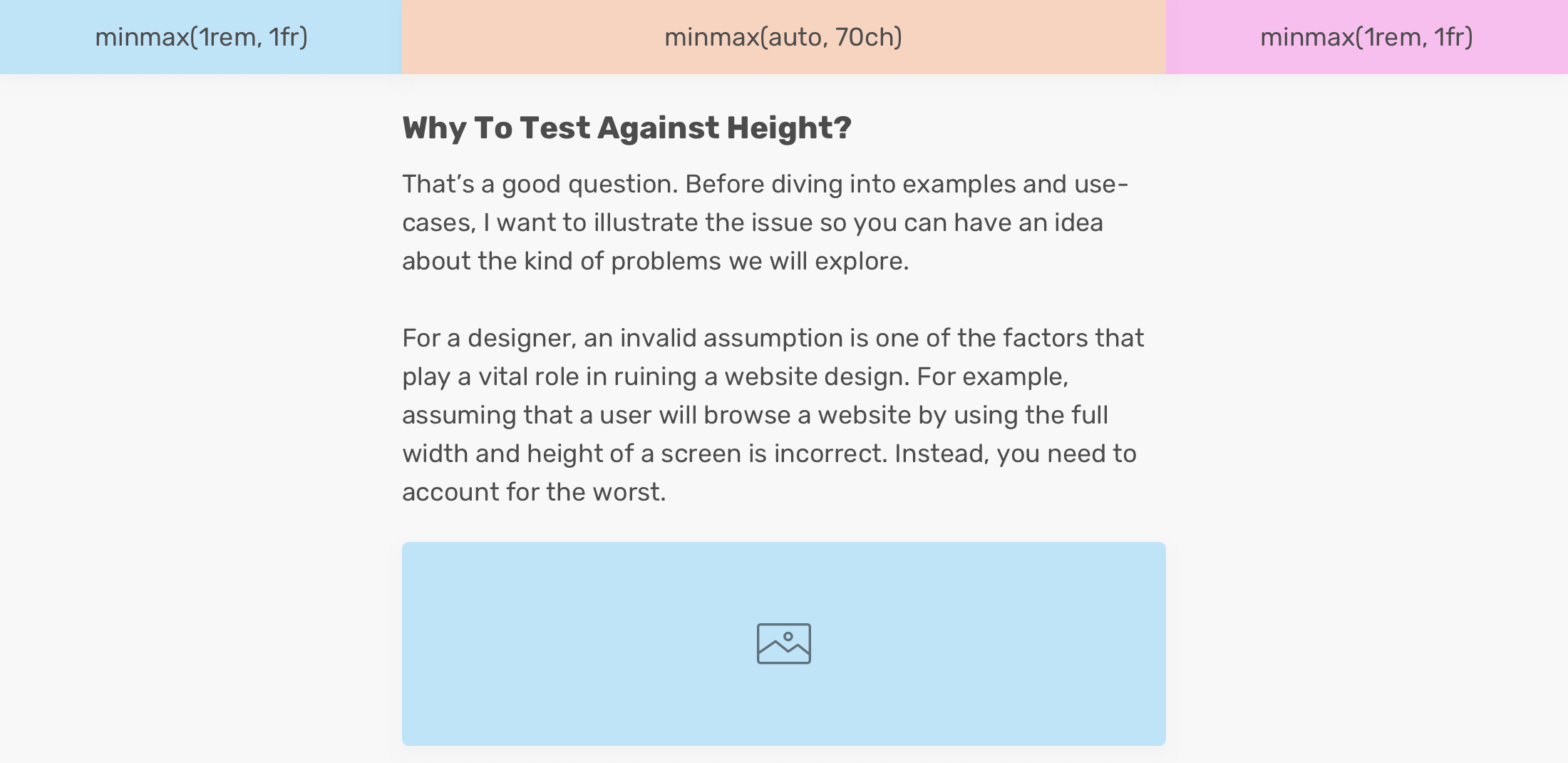
This can work great for mobile, as the first and last columns will collapse with a minimum width of 1rem. See the figure below:
auto-fit irresponsiblyIt might be tempting to use auto-fit. The downside is that when the content is dynamic and you don’t have control, things might break.
.wrapper {
  display: grid;
  grid-template-columns: repeat(auto-fit, minmax(250px, 1fr));
  grid-gap: 1rem;
}
A grid of cards that looks perfect when we have four columns. However, when there is only one card only, it will expand to fill the available remaining space.

This is not good. The reason is that if the card component has an image with text, for example, it will expand the image to fill the full width, which makes the image look extremely bad. Here is a visual example that illustrates the issue.

Do you see the issue now? Please use auto-fit responsively. It might be okay to use it when you don’t have an image. However, if the component you’re working on has an image, I don’t recommend using it.
I’m excited to let you know that I wrote an ebook about Debugging CSS.

If you’re interested, head over to debuggingcss.com for a free preview.
此内容由惯性聚合(RSS阅读器)自动聚合整理,仅供阅读参考。 原文来自 — 版权归原作者所有。