


I spent years teaching CSS layout on this blog. I put everything I know into The Layout Maestro course: 70+ lessons and 150+ interactive examples that teach you how to think CSS layouts, not just memorize syntax.
Custom scrollbars are getting more popular nowadays, and I’m very keen to dig into them. There are different reasons why to customize a scrollbar. For example, the default scrollbar can make an app UI look inconsistent across multiple operating systems, and here we can get the benefit of having a unified style.
I have always been interested in learning about how to customize a scrollbar in CSS but didn’t get the chance to do so. In this article, I will take the opportunity and learn about them and document this journey.
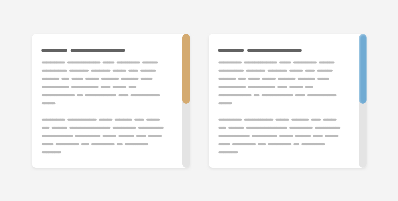
The first thing that I want to explain is the components or the parts of a scrollbar. A scrollbar contains the track and the thumb. Here is a visual that shows them:
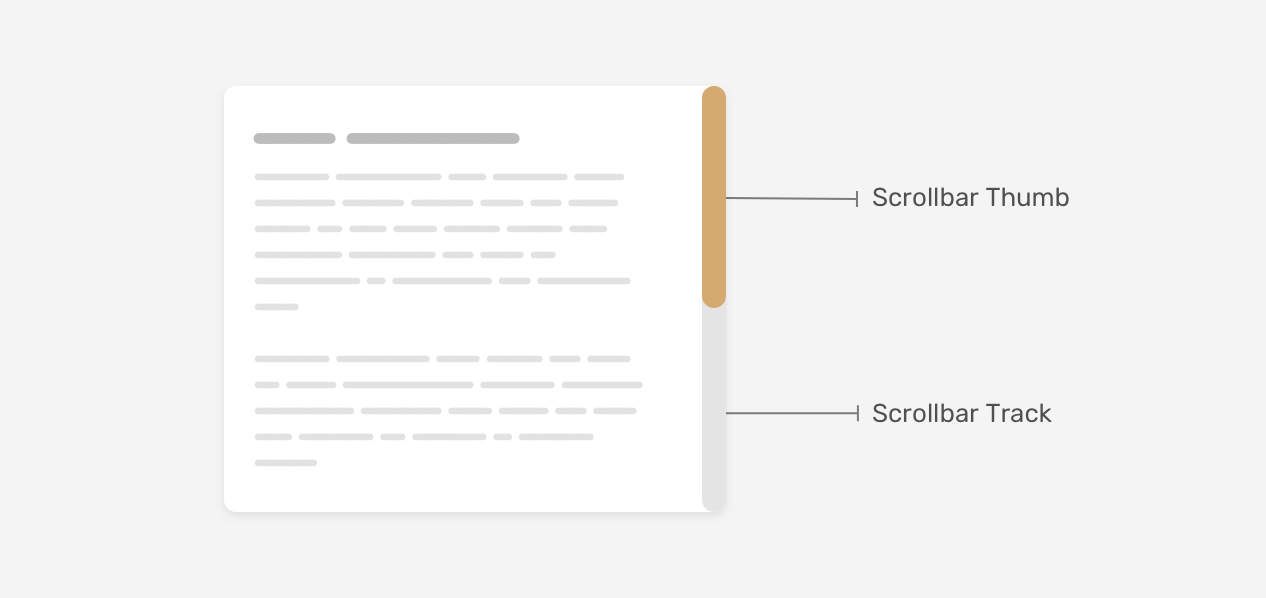
The track is the base of the scrollbar, where the thumb is what the user drag to scroll within a page or a section.
There is one important thing to keep in mind that a scrollbar can work horizontally or vertically, depending on the design. Also, that can change while working on a multilingual website that works in both left-to-right (LTR) and right-to-left (RTL) directions.
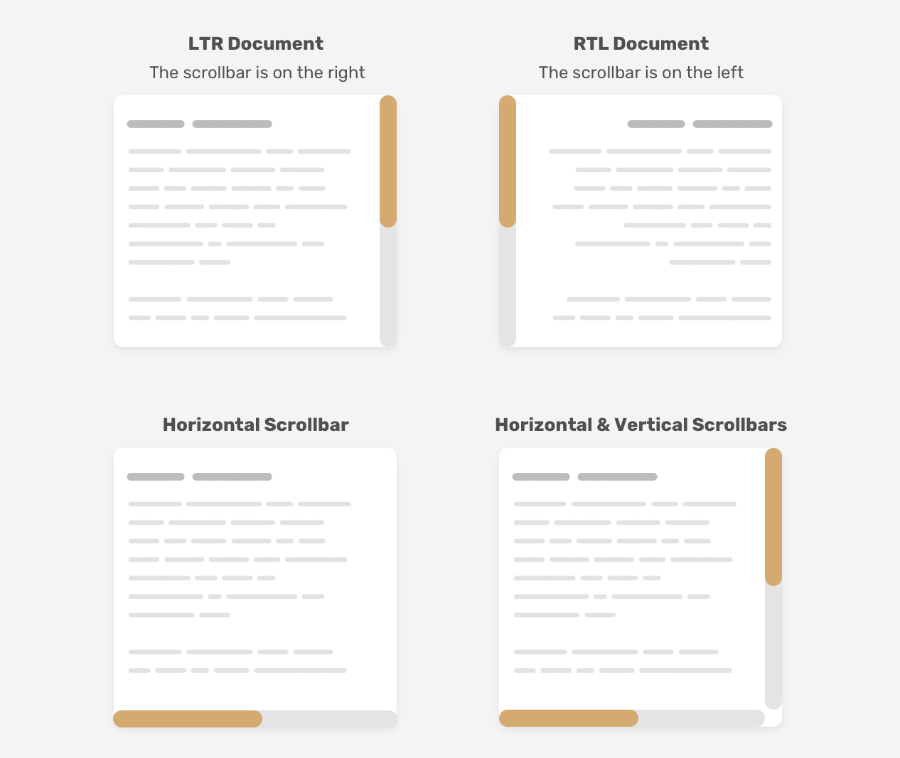
Having a custom scrollbar used to be webkit only so Firefox and IE were out of the game. We have a new syntax that works only in Firefox and will make things easier for us when it’s fully supported. I will go through the old Webkit syntax, and then the new one.
First, we need to define the size of the scrollbar. This can be the width for vertical scrollbars, and the height for horizontal ones.
.section::-webkit-scrollbar {
  width: 10px;
}
With that set, we can style the scrollbar itself.
This represents the base of the scrollbar. We can style it by adding background colors, shadows, border-radius, and borders.
.section::-webkit-scrollbar-track {
  background-color: darkgrey;
}
Once we have the base of the scrollbar ready, we need to style the scrollbar thumb. That is important as the user might drag this thumb to interact with the scrollbar.
.section::-webkit-scrollbar-thumb {
  box-shadow: inset 0 0 6px rgba(0, 0, 0, 0.3);
}
With that, we have covered the old way of styling a custom scrollbar in CSS. Let’s explore the new syntax.
As it says, this defines the scrollbar width and the values we care about most are auto and thin. Unfortunately, we can’t define a specific number like in the webkit syntax.
.section {
  scrollbar-width: thin;
}
With this property, we can define a color for both the scrollbar track and thumb as pair values.
.section {
  scrollbar-color: #6969dd #e0e0e0;
  scrollbar-width: thin;
}
As simple as this new syntax is, but it’s limiting. We can only apply solid colors. We can’t add shadows, gradients, rounded edges, or anything like that. What we’re allowed to customize is the colors only.
Have you ever wondered about how we can avoid layout changes when the content grows in a scrolling container? Let’s take the following case.
.box {
  padding: 1rem;
  max-height: 220px;
  overflow-y: auto;
}
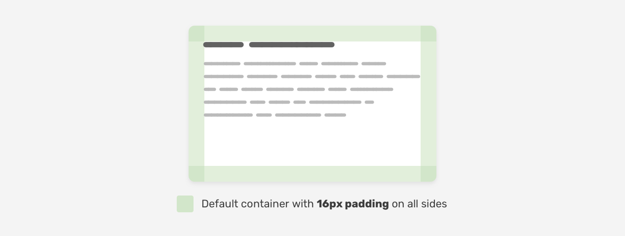
We have a container with 16px padding on all sides. Until now, the content is short and the scrollbar isn’t shown because overflow-y: auto is used (A friendly reminder: when auto is used for overflow-y, it won’t show a scrollbar until the content is long).
When the content grows, the scrollbar will be shown and thus the space available for the content will be reduced.
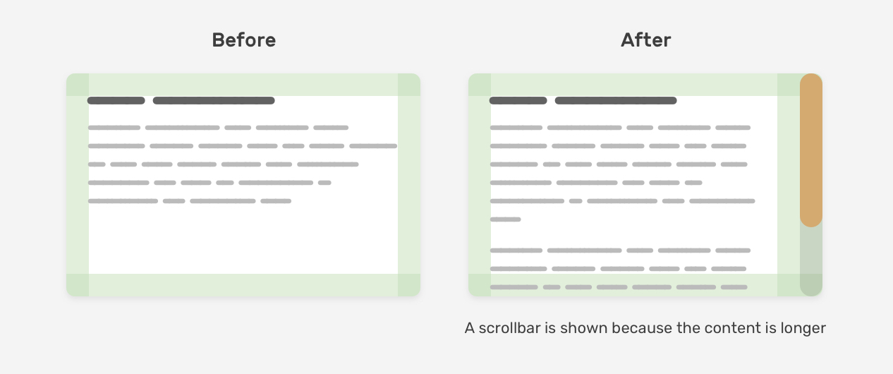
Notice how the content shifted when there is a scrollbar. That’s because the browser should reserve a space for the scrollbar.
Thankfully, this can be solved now with scrollbar-gutter (supported in Chromium-based browsers, v94+). It works in a way that lets us reserve the space in advance. The default value is auto, and the other value is stable. It’s also worth mentioning that there is an optional value both-edges which shows the gutter on both sides.
.box {
  padding: 1rem;
  max-height: 220px;
  overflow-y: auto;
  scrollbar-gutter: stable;
}
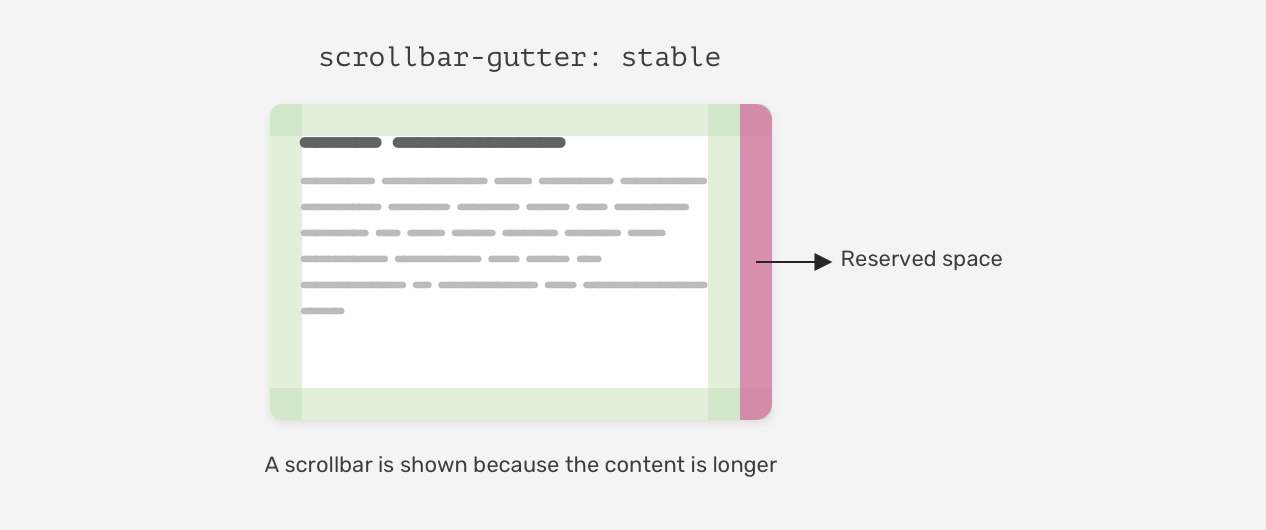
That way, when the content grows, it won’t shift because the browser already reserved a space for it. Here is a visual that shows the two cases (Short content vs long content).
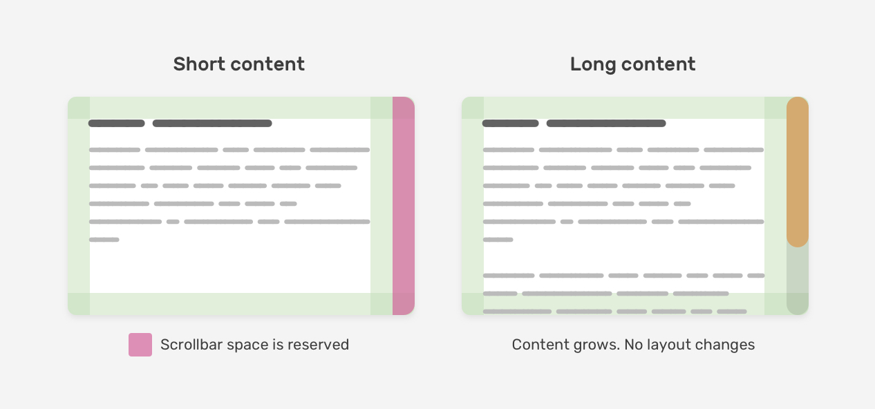
To make things more clear, I worked on an interactive demo that shows how a gutter is added to a container.
See the Pen Scrollbar Gutter - Demo by Ahmad Shadeed (@shadeed) on CodePen.
An important thing to know is that where to customize the scrollbar. Do you want the style to be generic and work for all scrollbars on the website? Or do you want it for specific sections only?
With the old syntax, we can write the selectors without attaching them to an element, and they will be applied to all scrollable elements.
::-webkit-scrollbar {
  width: 10px;
}

::-webkit-scrollbar-track {
  background-color: darkgrey;
}

::-webkit-scrollbar-thumb {
  box-shadow: inset 0 0 6px rgba(0, 0, 0, 0.3);
}
However, if you want to apply for a specific section only, you need to append the element before the selectors.
.section::-webkit-scrollbar {
  width: 10px;
}

.section::-webkit-scrollbar-track {
  background-color: darkgrey;
}

.section::-webkit-scrollbar-thumb {
  box-shadow: inset 0 0 6px rgba(0, 0, 0, 0.3);
}
For the new syntax, it’s almost the same. The thing that I noticed is that if you want a generic style, it should be applied to the <html> element, not the <body>.
html {
  scrollbar-color: #6969dd #e0e0e0;
  scrollbar-width: thin;
}
I tried adding the above for the <body> but it didn’t work as expected.
Now that we know how the old and new syntax work, let’s get into customizing some scrollbar designs.
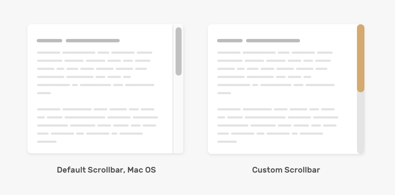
Before diving into customizing the scrollbar, it’s worth talking about the default style in Mac OS. Here is how it looks:
For windows, it’s a bit different.
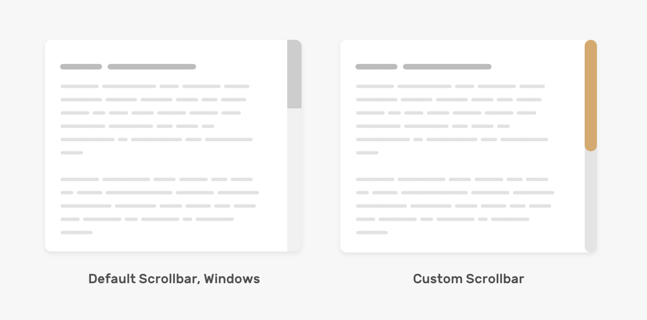
Here is how we can customize the scrollbar based on the mockup above.
.section::-webkit-scrollbar {
  width: 16px;
}

.section::-webkit-scrollbar-track {
  background-color: #e4e4e4;
  border-radius: 100px;
}

.section::-webkit-scrollbar-thumb {
  background-color: #d4aa70;
  border-radius: 100px;
}
Adding the border-radius for both the track and thumb is necessary, as it won’t work on the ::webkit-scrollbar.
With the new syntax, we can’t adjust the width of the scrollbar, and what’s only possible is to change the track and thumb background color.
.section {
  scrollbar-color: #d4aa70 #e4e4e4;
}
Note: the next examples only work with the webkit syntax. For a real-life project, you can add both the webkit and the new syntax.
For this example, the design is a bit heavier as it contains gradients and shadows. Is that doable? Yes, we can apply inner shadows and gradients to mimic that effect. Let’s see how!

.section::-webkit-scrollbar-thumb {
  background-image: linear-gradient(180deg, #d0368a 0%, #708ad4 99%);
  box-shadow: inset 2px 2px 5px 0 rgba(#fff, 0.5);
  border-radius: 100px;
}
See the Pen Custom Scrollbar - 2 by Ahmad Shadeed (@shadeed) on CodePen.
We can also add borders to the thumb and track, which can help us with some tricky designs.
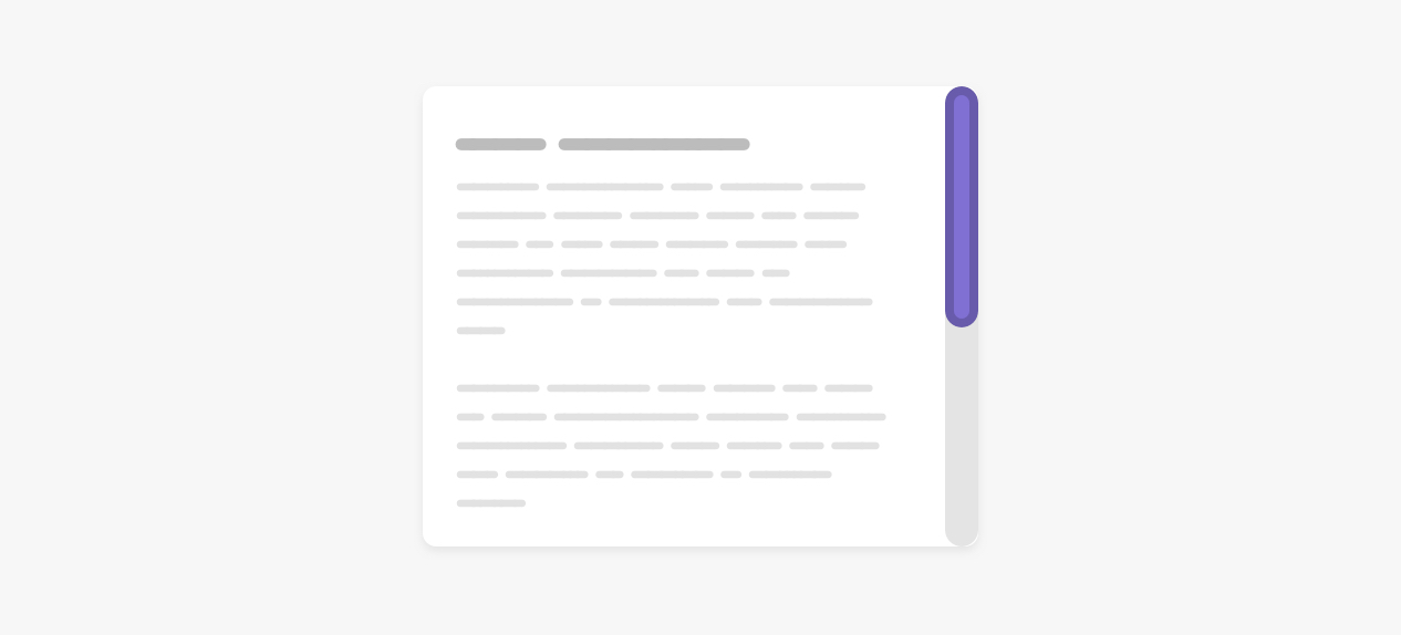
.section::-webkit-scrollbar-thumb {
  border-radius: 100px;
  background: #8070d4;
  border: 6px solid rgba(0, 0, 0, 0.2);
}
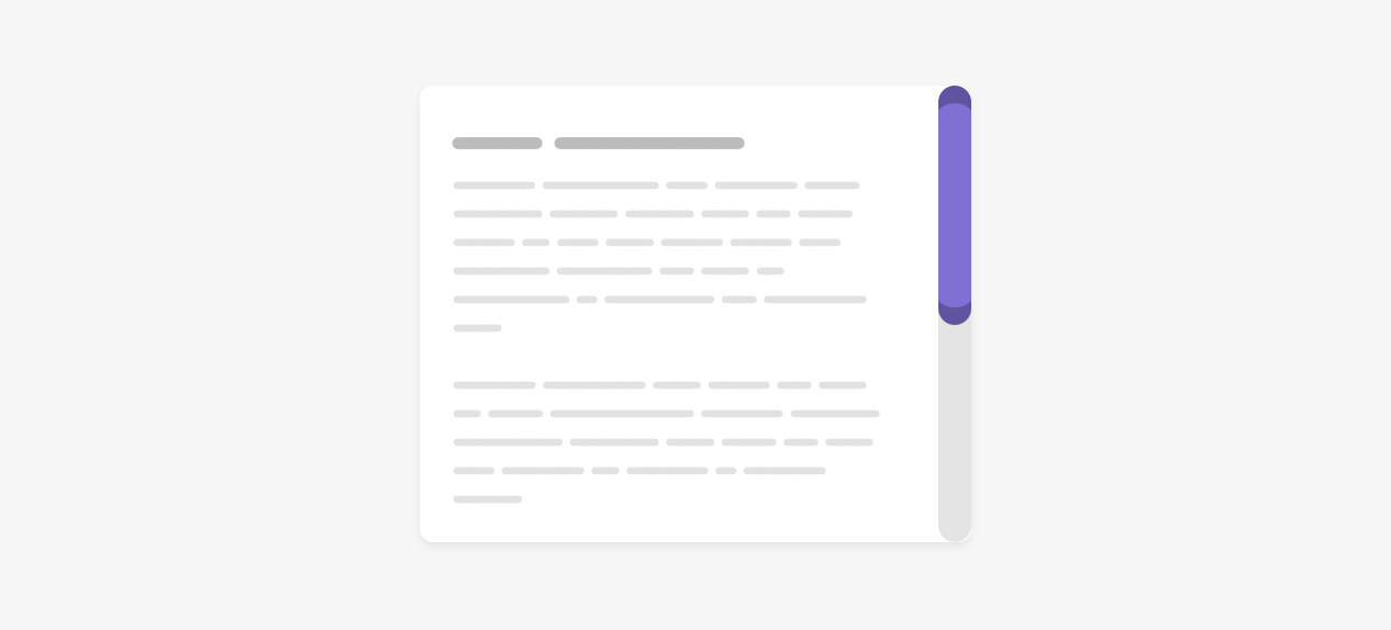
Based on the same example, we can reset the top and bottom borders to zero and get an interesting effect for the thumb. Notice those little elements at the top and bottom of the thumb.
See the Pen Custom Scrollbar - 3 by Ahmad Shadeed (@shadeed) on CodePen.
In this example, we want the scrollbar thumb to have an offset from all sides. Since it’s not possible to use padding with the scrollbar properties, we need a hack around that using CSS borders and background-clip. I learned about this idea from this great article by Gabriel Romualdo.

By default, when an element has a background and border, the browser will clip the border-box.
Consider the following example:

.button {
  min-width: 100px;
  border: solid 6px #000;
  box-sizing: border-box;
  background-color: #5749d2;
}
We have a button with a 6px black border. It doesn’t have padding for the sake of explaining the concept. Suppose that box-sizing is set to border-box, the border will be included within the size of the button. As a result, the border is appearing above the background.
Now, when we apply background-clip: content-box, the background will only appear around the content.
.button {
  min-width: 100px;
  border: solid 6px #000;
  box-sizing: border-box;
  background-color: #5749d2;
  background-clip: content-box;
}
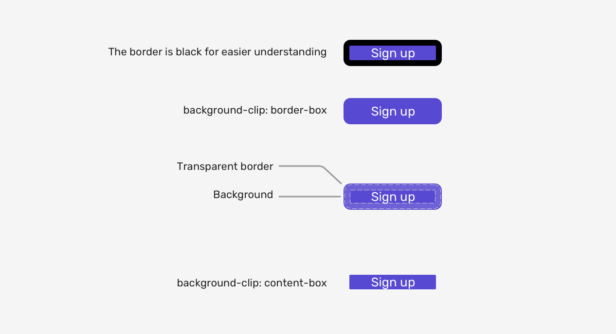
I hope the idea is clear. Let’s get back into the scrollbar thumb. To mimic the effect, we need to add the following:
.section::-webkit-scrollbar-thumb {
  border: 5px solid transparent;
  border-radius: 100px;
  background-color: #8070d4;
  background-clip: content-box;
}
And we’re done.
See the Pen Custom Scrollbar - 4 by Ahmad Shadeed (@shadeed) on CodePen.
With that, we have explored how to customize different scrollbar designs. For Firefox, we can use the new syntax but again, it’s limited only to the thickness and solid colors.
Yes, we can add a hover effect to the scrollbar thumb for the old and new syntax.
/* Old Syntax */
.section::-webkit-scrollbar-thumb:hover {
  background-color: #5749d2;
}

/* New Syntax */
.section {
  scrollbar-color: #d4aa70 #e4e4e4;
  transition: scrollbar-color 0.3s ease-out;
}

.section:hover {
  scrollbar-color: #5749d2;
}
With the new syntax, we can add transitions, whereas with the old one, we cannot. This isn’t a big deal to me.
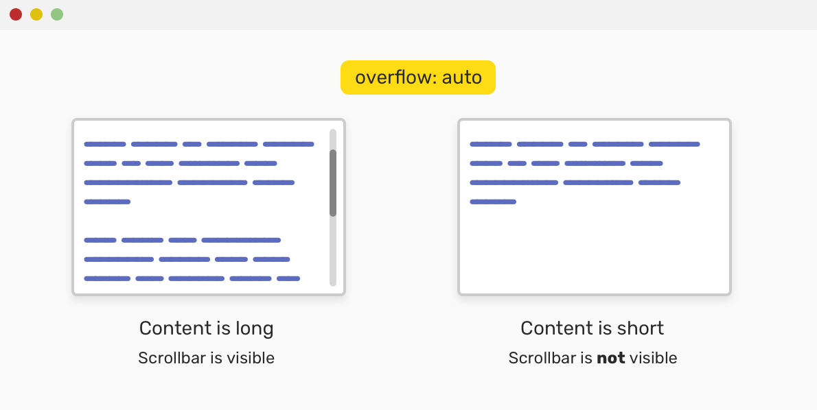
Creating a scrollable element is possible by adding a value other than visible to the overflow property. It’s recommended to use the auto keyword as it will only show the scrollbar if the content exceeds its container.
.section {
  overflow-y: auto;
}
While customizing a scrollbar design, please keep in mind to have good contrast between the thumb and the track, so it can be easy to be noticed by the user.
Consider the following “bad” example for a custom scrollbar.
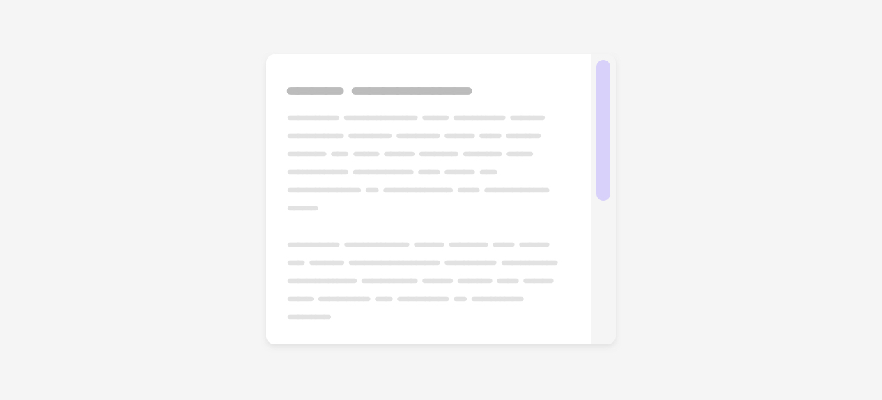
The thumb color is barely noticeable. This is not good for the user as it will make it harder in case they are used for scrolling via the thumb.
Thank you for reading!
I’m excited to let you know that I wrote an ebook about Debugging CSS.

If you’re interested, head over to debuggingcss.com for a free preview.
此内容由惯性聚合(RSS阅读器)自动聚合整理,仅供阅读参考。 原文来自 — 版权归原作者所有。