


I spent years teaching CSS layout on this blog. I put everything I know into The Layout Maestro course: 70+ lessons and 150+ interactive examples that teach you how to think CSS layouts, not just memorize syntax.
In late August, Meta released the full web experience for the Threads app. By “full”, I mean an experience that lets you interact and post on threads. The previous web version was read-only. I wrote about my initial findings here.
In this article, I will take another look and see if there are interesting things that I found along the way.
Are you ready? Let’s dive in.
I found it interesting to look at how other engineers approach building a web layout. Let’s take a look at the main layout of Threads’ home page.
It’s important to remember that anything you see on the screen is a box, even if it’s a circle or a 1px separator. Everything is a box.
I added the following CSS to every element on the page:
*,
*:before,
*:after {
  outline: solid 0.5px #db6a7d;
  border: 0;
}
An outline with 0.5px width. I picked half a pixel so that it’s easier to look at the boxes. I also removed all borders as they cause confusion.
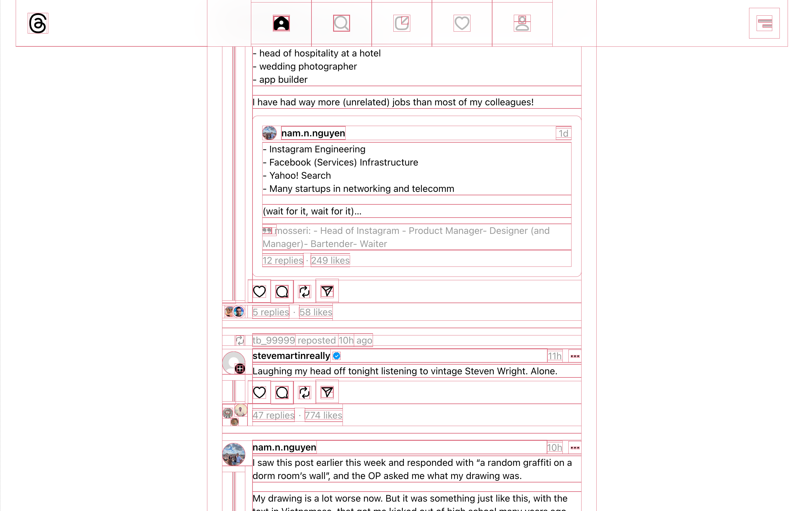
Since this is a web app, the CSS I added won’t be removed as the page won’t be refreshed. That means I can navigate to other pages and get an overview of its boxes.
Here is a video of me doing that:
Interesting, right? I like to use that for a couple of reasons:
Let’s take a few examples from Threads.
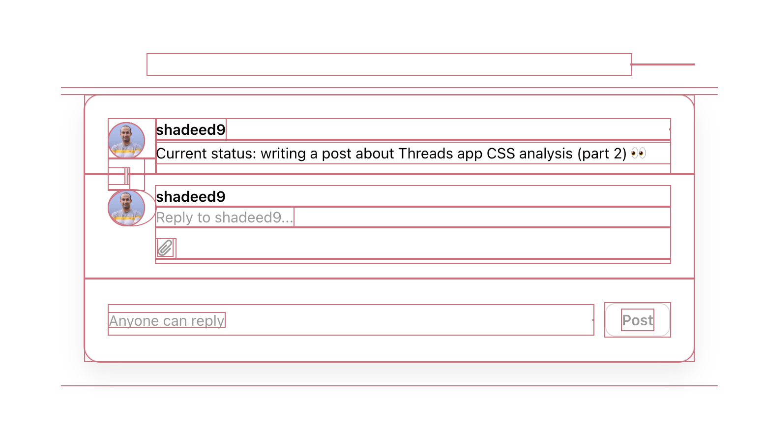
In this example, you can spot a few interesting stuff happening. Let me highlight two of them.
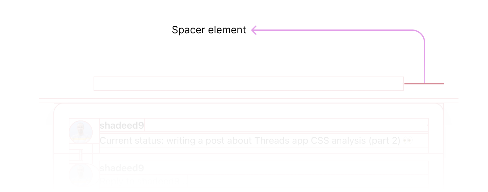
The first one is that there is a spacer element with a 1px height in the modal header. Without outlining the UI, this isn’t easy to spot until you inspect the HTML deeply.
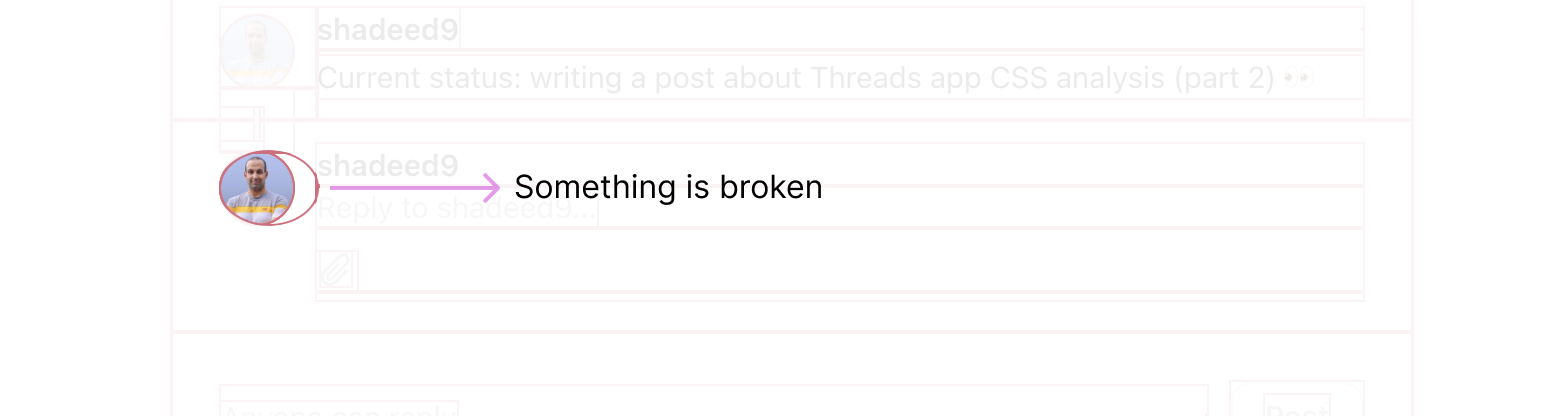
And the second thing is what seems to be a bug in the user’s avatar. There is an oval-like shape.
You see? Outlining a UI is very helpful.
From the outlines I added, I noticed that the main content is contained within a wrapper along with the header.
<body>
  <div class="loader"></div>
  <header></header>
  <div class="page"></div>
</body>
.loader {
  /* Styles for the loading indicator at the very top of the page. */
}

header {
  position: fixed;
  /* other styles */
}
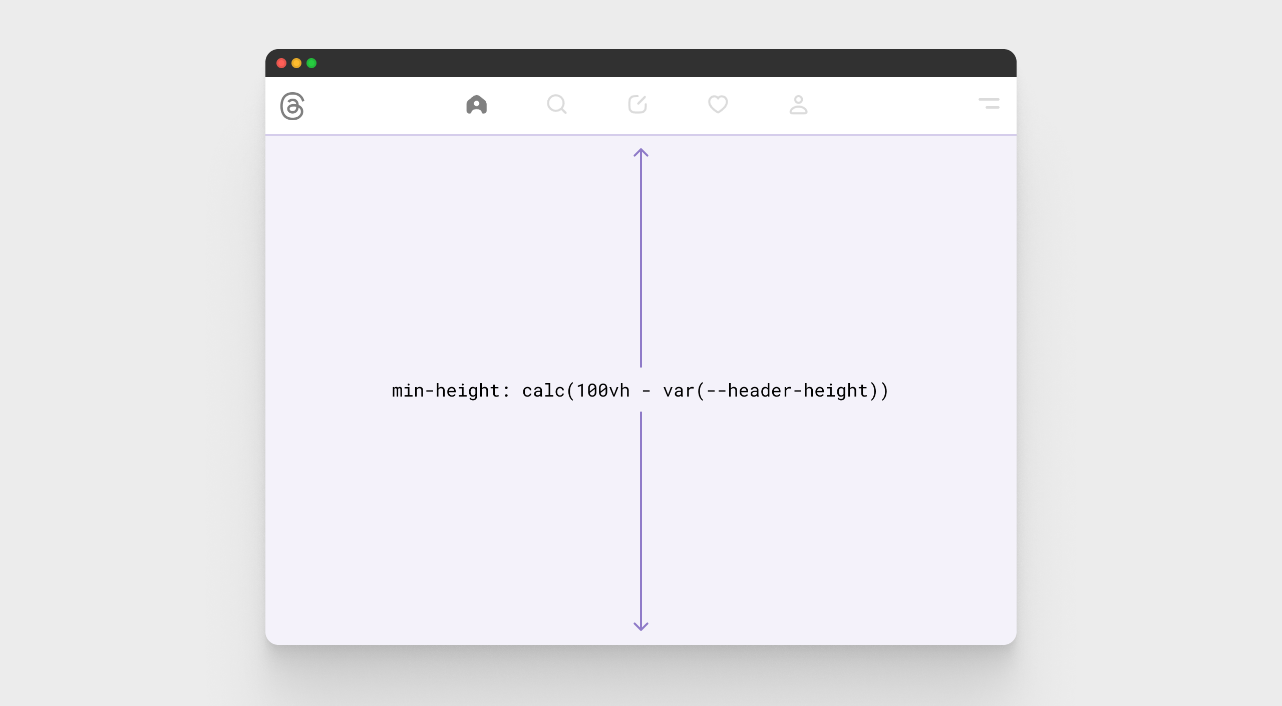
It’s common to spot lots of wrapping around an element in Meta’s CSS. The above HTML is simplified. Hear what’s inside the .page element.
<div class="page">
  <div>
    <div>
      <div>
        <div>
          <div>
            <div>
              <div>
                <div class="feed"></div>
                <div class="following"></div>
                <footer></footer>
              </div>
            </div>
          </div>
        </div>
      </div>
    </div>
  </div>
</div>
That’s too much. Isn’t it? I’m keen to learn more about why that happens. I suspect that this has something to do with coding guidelines that require wrapping stuff in specific containers/layouts which ends up in having a lot of <div>s.
But.. doesn’t that increase the DOM size?
The CSS for the layout isn’t something new or unique, but it’s different from what I’d have done.
<header></header>
<div
  class="page"
  style="--header-height: var(--barcelona-desktop-header-height);"
>
  <div class="page-content">
    <div class="feed"></div>
    <div class="following"></div>
    <footer></footer>
  </div>
</div>
:root {
  --barcelona-desktop-header-height: 74px;
}

header {
  position: fixed;
  height: var(--barcelona-desktop-header-height);
  /* other styles */
}

.page-content {
  position: relative;
  top: var(--header-height);
  min-height: calc(100vh - var(--header-height));
}
Usually, if I’m building something like the above, I will use padding-top with a value of the header height to offset the main content. The team used the top property instead.
Something like this:
.page-content {
  padding-top: var(--header-height);
}
I like the idea of creating a new CSS variable --header-height and reassigning it with the already created variable --barcelona-desktop-header-height.
This is useful in case the assigned variable --barcelona.. got changed for some reason. Upon resizing the viewport, I noticed that the variable is changed to --barcelona-mobile-header-height on mobile.
That’s the reason why the variable is reassigned. Having a single source of truth would reduce the work needed.
There are two CSS variables: the desktop and mobile size.
:root {
  --barcelona-desktop-header-height: 74px;
  --barcelona-mobile-header-height: 60px;
}
Since that the variable is needed for multiple CSS properties, it’s not logical to do this.
.page-content {
  position: relative;
  top: var(--barcelona-desktop-header-height);
  min-height: calc(100vh - var(--barcelona-desktop-header-height));
}
Why? Because when the variable should change, both the top and min-height should be modified.
The best is to do what Meta’s team did. Reassign the CSS variable using an inline CSS. Since CSS variables can be scoped, we only need to do that once on the parent.
<div class="page" style="--header-height: var(--desktop-var);">
  <!-- other elements -->
</div>
And when needed, we just change the value of --header-height:
<div class="page" style="--header-height: var(--mobile-var);">
  <!-- other elements -->
</div>
Better, right?
I would always add a fallback for a CSS variable, as a defensive CSS approach.
Here is an example:
.page-content {
  top: var(--header-height, 74px);
}
You never know what could go wrong. Accounting for that upfront yields more future-proof.
In my previous article about threads, I explored how the team build the layout with CSS grid.
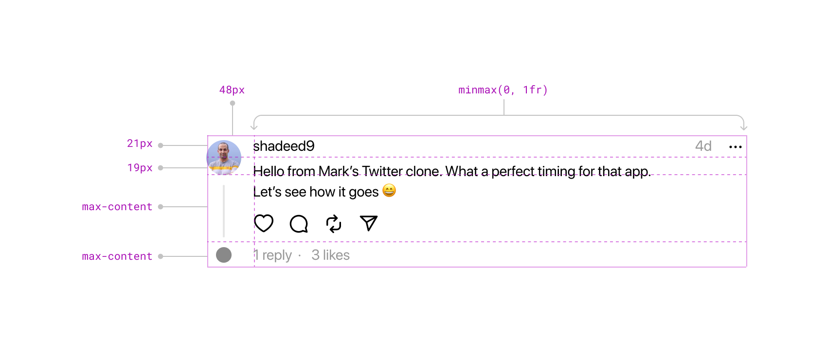
Nothing has changed in the full web preview. I highly recommend checking the article and exploring how it was built and a few thoughts.
This is the container that has all the threads when you browse the home page. Nothing new here, but what caught my attention was using width: 100vw.
.feed {
  width: 100vw;
  max-width: var(--barcelona-large-screen-max-width);
  padding-left: var(--barcelona-desktop-page-horizontal-padding);
  padding-right: var(--barcelona-desktop-page-horizontal-padding);
  margin-left: auto;
  margin-right: auto;
  flex-grow: 1;
}
As per my knowledge, this is buggy. I opened up the DevTools and noticed a horizontal scrolling bar. The 100vw works perfectly if your scrolling settings in your system are set to “When scrolling”.
Here is a video of me changing the scrolling settings, and as a result, the issue appears and disappears.
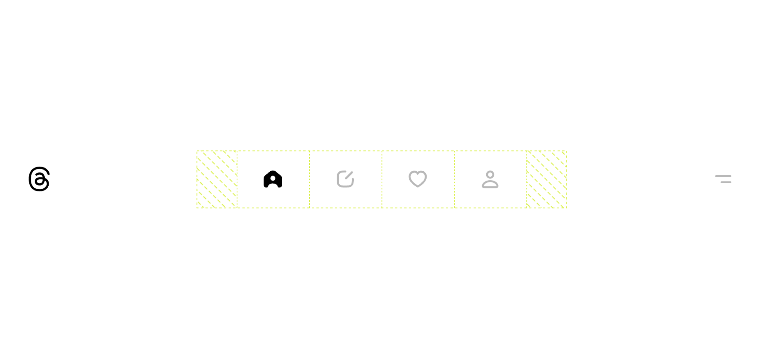
Oh, here things start to get more interesting for me. The first thing that I noticed is using CSS grid to lay out the navigation items.
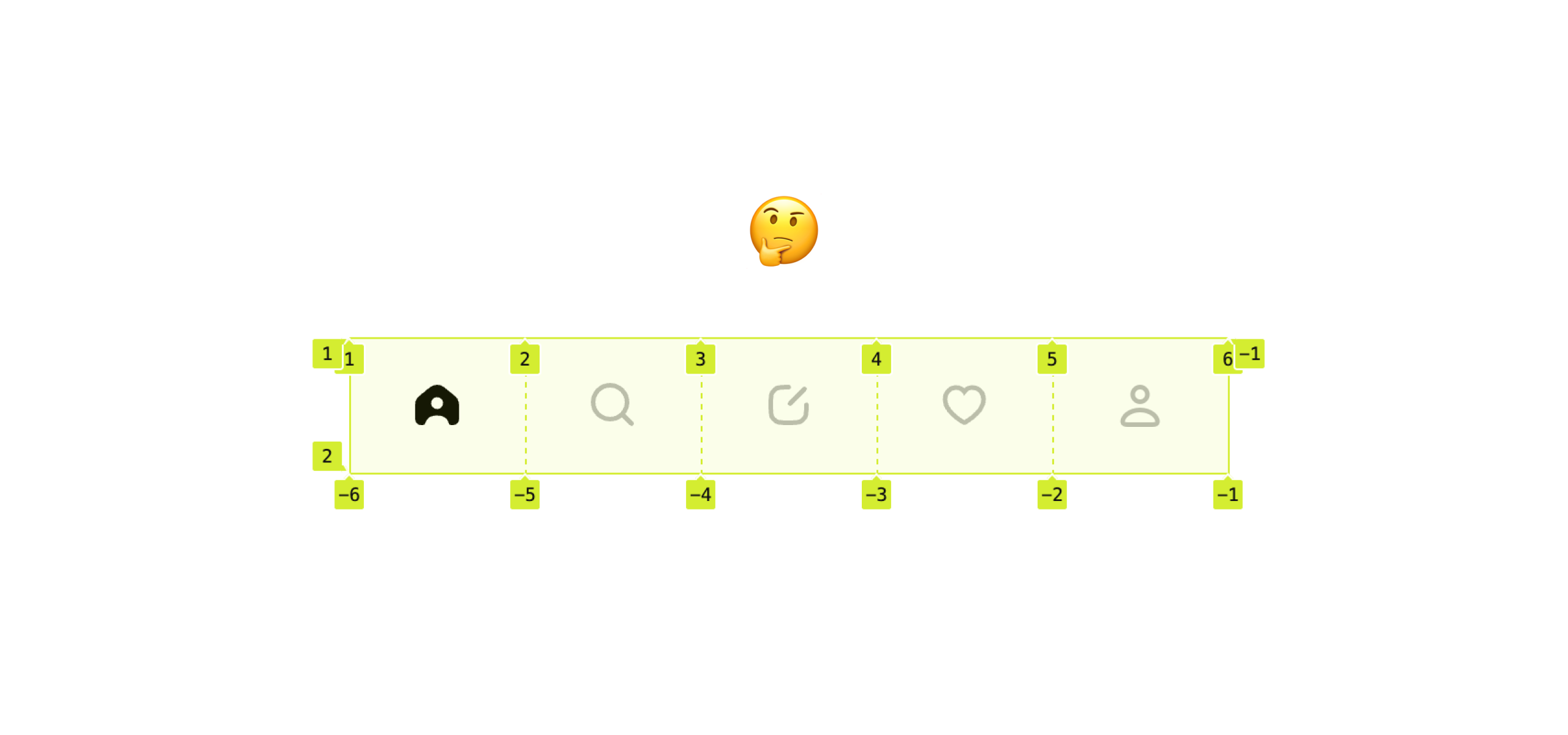
nav {
  grid-template-columns: repeat(5, 20%);
}
Since the column numbers are fixed, removing a navigation item will make the navigation look unbalanced.
Here is an example.
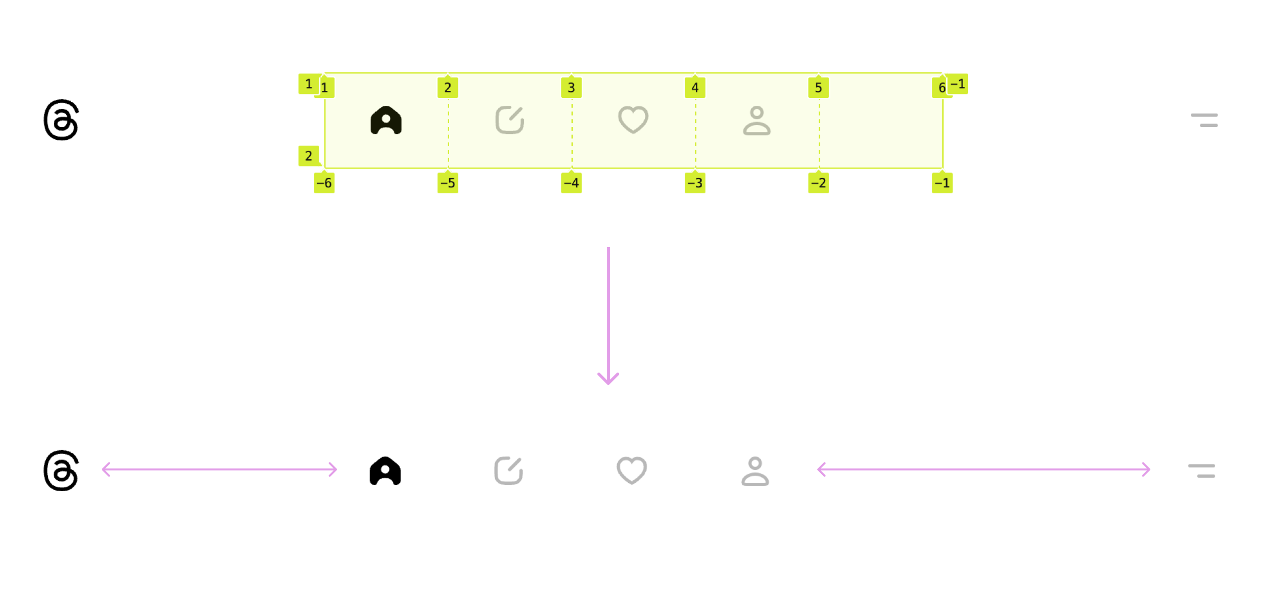
I continued inspecting the CSS to try and find an answer to my question. The team could’ve simply used flexbox for that.
nav {
  display: flex;
  justify-content: center;
}
There is no specific reason that I could find or analyze.
When expanding a thread, the navigation items will animate (they become closer to each other).
See the following video:
And here is a figure, if you prefer that:
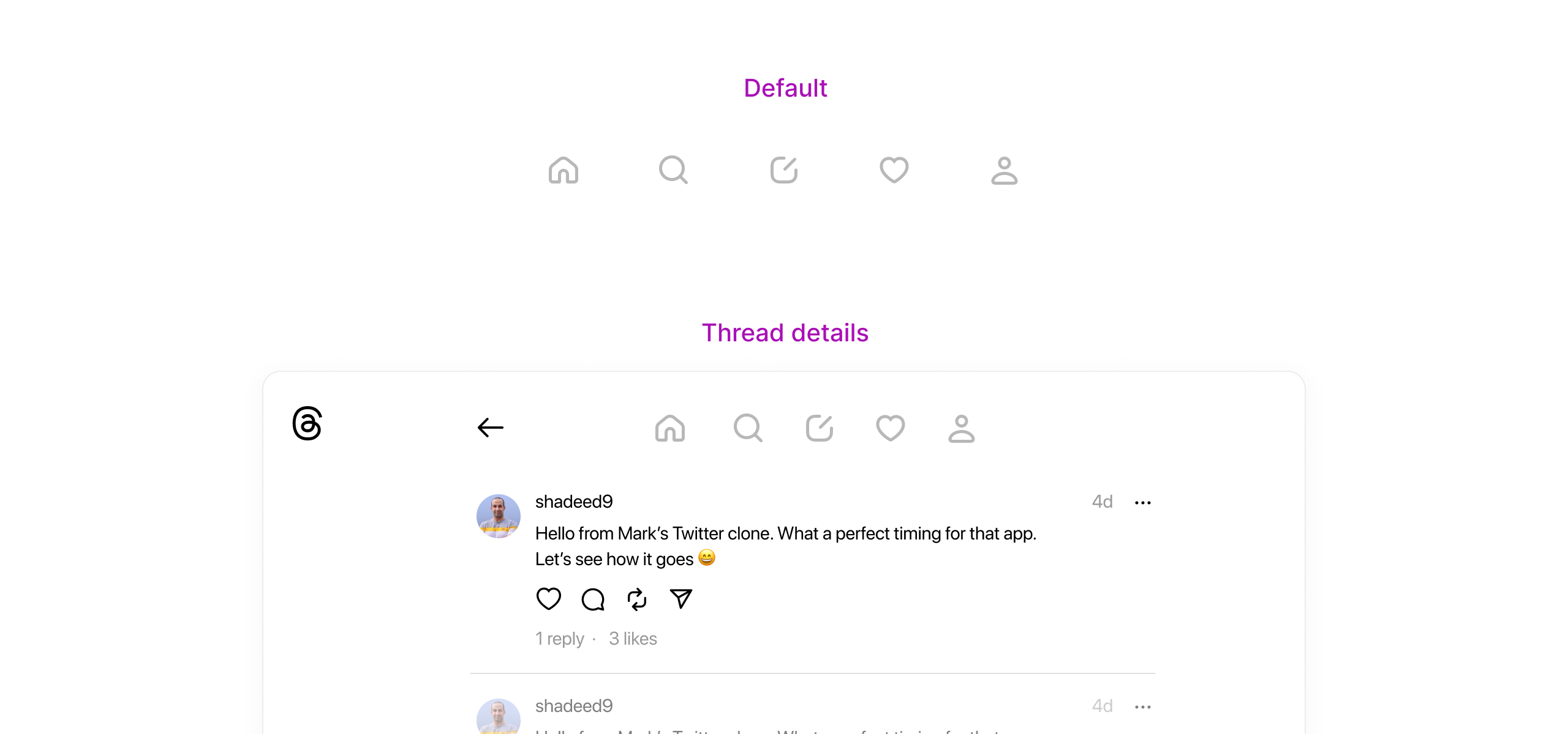
The team did that by animating each navigation item individually using the CSS transform property. I suspect this is due to performance.
.home {
  transform: translateX(52px);
}

.search {
  transform: translateX(26px);
}

.activity {
  transform: translateX(-26px);
}

.profile {
  transform: translateX(-52px);
}
It works, and nothing is wrong. If you build such a thing and publish it on Codepen or any other platform, you should expect replies like: “What? You can animate the gap, padding..” But why animate each item individually?
These are details that we rarely see in trending CSS-only animation articles. This is a real-life problem that focuses on performance rather than the number of lines of code.
Here are other solutions that I thought of:
nav.collapsed {
  grid-template-columns: repeat(5, 16%);
  transition: 0.2s ease-out;
}

nav-item.collapsed {
  padding-inline: 1rem;
  transition: 0.2s ease-out;
}
Here is an example of animating the navigation by changing the padding property. I used the same transitions as Threads.
See the Pen Threads navigation by Ahmad Shadeed (@shadeed) on CodePen.
I’m a big fan of this approach and I’ve seen it applied in some cases of the Threads CSS. In the following section, I will explore and show you the interesting usage of CSS grid and flexbox.
But first, I want to be clear about what I mean by grid for layouts, flexbox for components. The idea is that we use grid when there is a layout that contains columns and rows and flexbox for one-dimensional layouts.
Even though in Threads, the use of flexbox and grid doesn’t seem consistent to me, I’m fine with all the use cases (except the navigation).
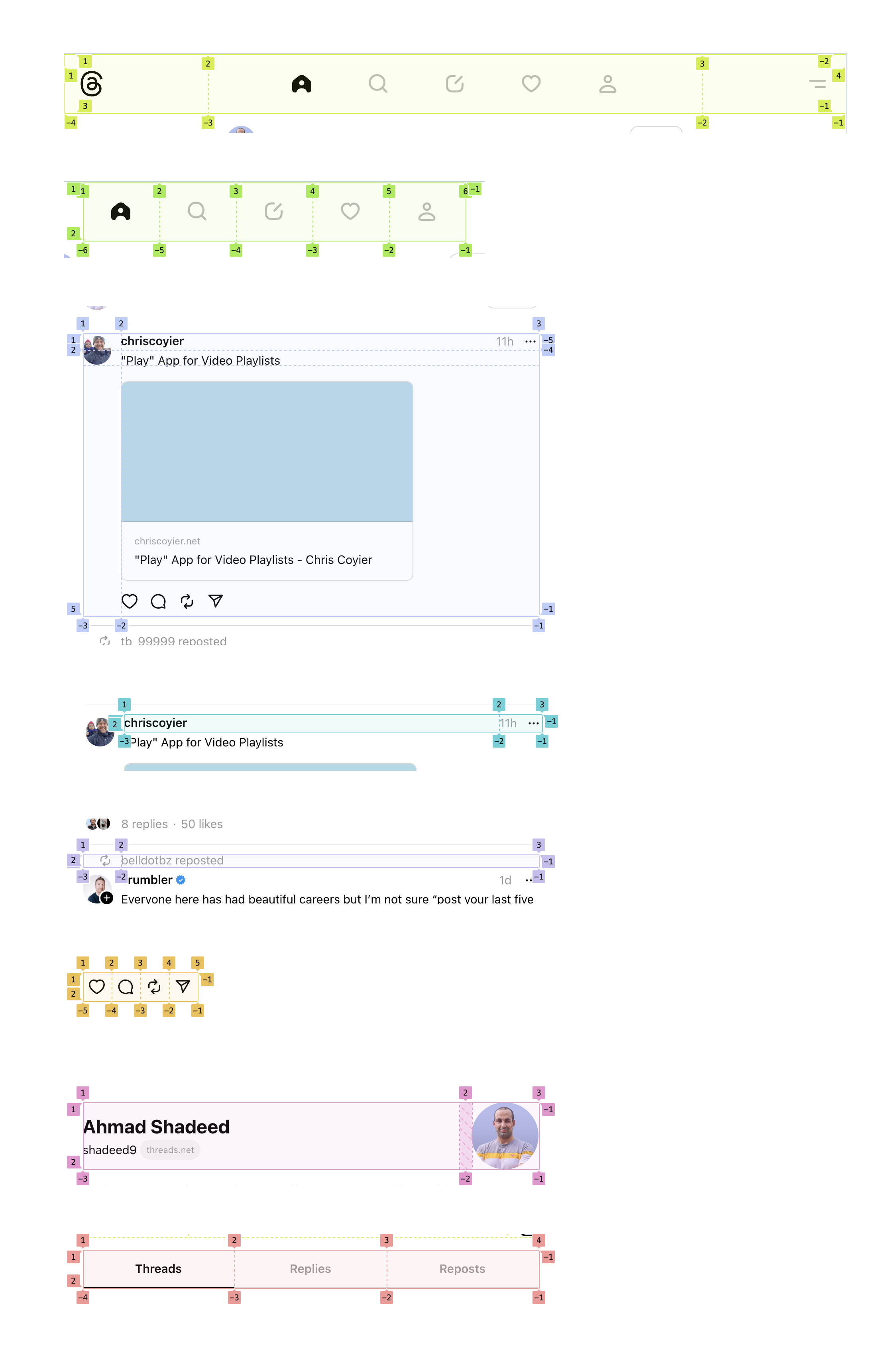
Here are some use cases for CSS grid:
And flexbox:
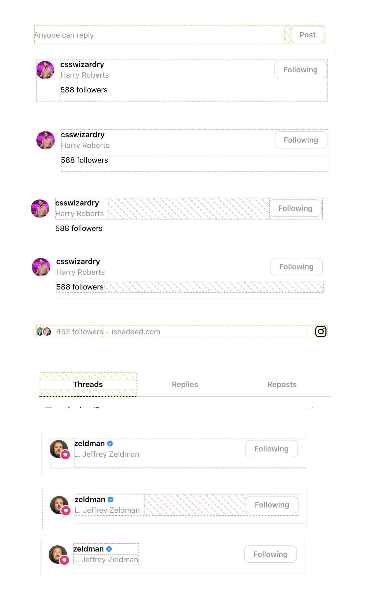
If you look closely at each use case, you might notice some inconsistency or at least a question will be raised in your head.
Here is an example:
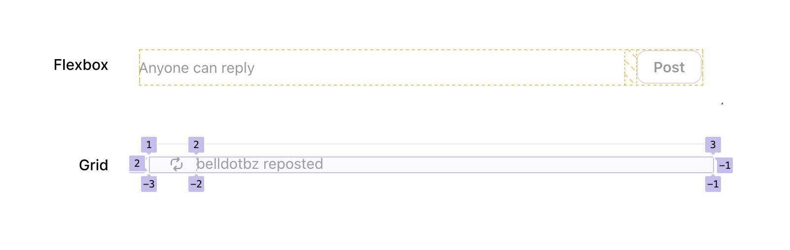
At first glance, it seems inconsistent and you might say: “Why use grid here, when it’s just two elements?”
Here is the CSS:
.post {
  display: grid;
  grid-template-columns:
    var(--barcelona-threadline-column-width)
    minmax(0, 1fr);
  grid-template-rows: 21px 19px max-content max-content;
}

.repost {
  display: grid;
  grid-template-columns:
    var(--barcelona-threadline-column-width)
    minmax(0, 1fr);
}
Okay, I understand now. The reason for using CSS grid was to make it consistent with the post layout grid.
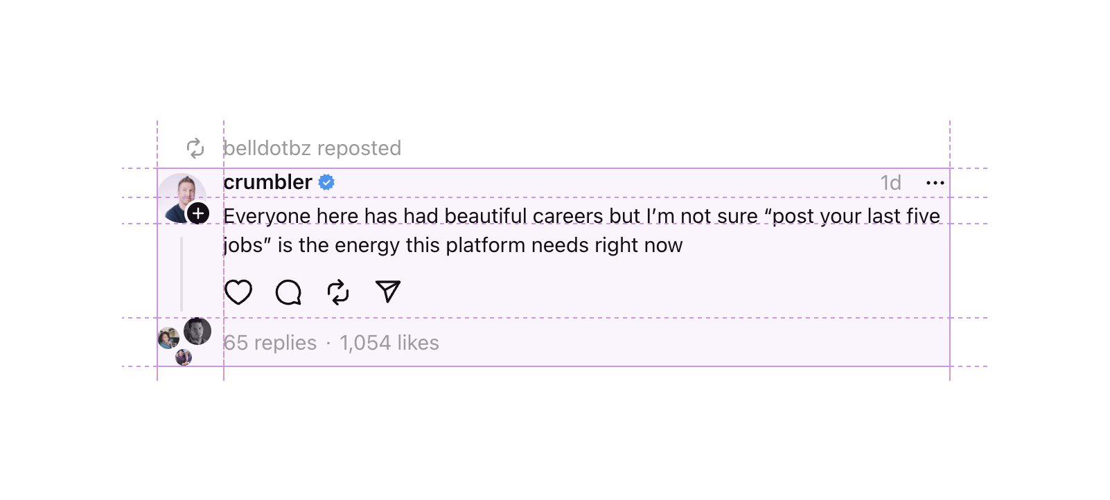
I enjoy seeing such proof on an app like Threads, which explains nothing but the idea of being flexible while building a UI. It doesn’t need to be flexbox or grid for everything. Do what you see fit for your context.
This menu goal is to change the content that is displayed on the feed. It’s positioned at the bottom left corner.
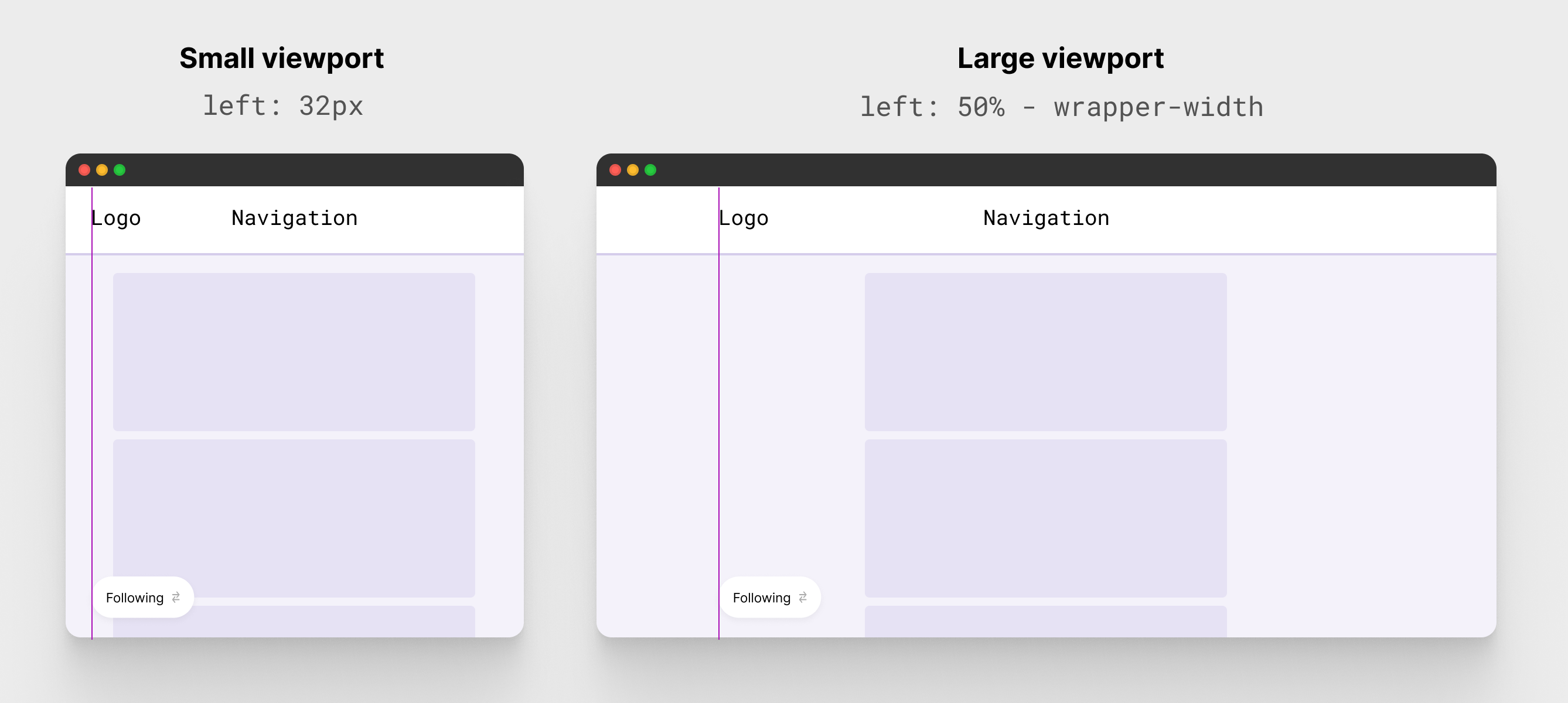
This is how it’s done in Threads.
.menu {
    position: fixed;
    left: 32px;
}

@media (min-width: 1230px)
    .menu {
        left: calc(50% - 615px + 19px);
    }
}
It works, but we can do better.
This is the perfect use case for the clamp() comparison function. I wrote a condition that toggles between 32px or a dynamic value based on the viewport size.
.menu {
  --wrapper-width: var(--barcelona-large-screen-max-width);
  position: fixed;
  left: clamp(32px, (50% - 32px) * 9999, 50% - var(--wrapper-width));
}
This solution is inspired by the conditional border-radius that I found in Facebook’s CSS two years ago.
When replying to a thread, there is a maximum number of characters. I like that the team used tabular-nums to prevent the count number from jumping each time a new chatterer is added.
.char-count {
  font-variant-numeric: tabular-nums;
}
In a modal UI, I noticed that over 500+ CSS variables are defined as inline styles on the parent of the modal.
Here is an example:
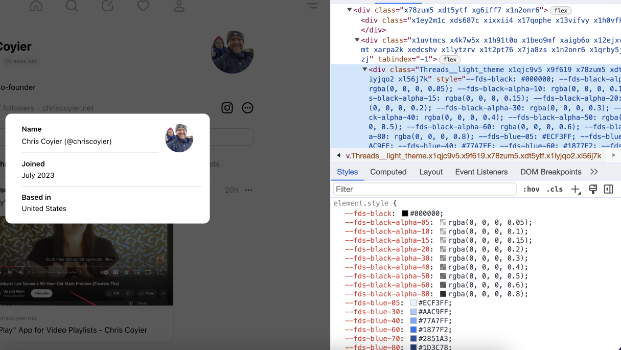
Those are already defined on the root element, so why redefine them again?
When scrolling the feed, each feed item that is out of the view will get a fixed height. See the following video:
I can’t think of a reason for that. What do you think?
Here is an interesting usage of contain-intrinsic-size for the likes modal box. See the following figure:
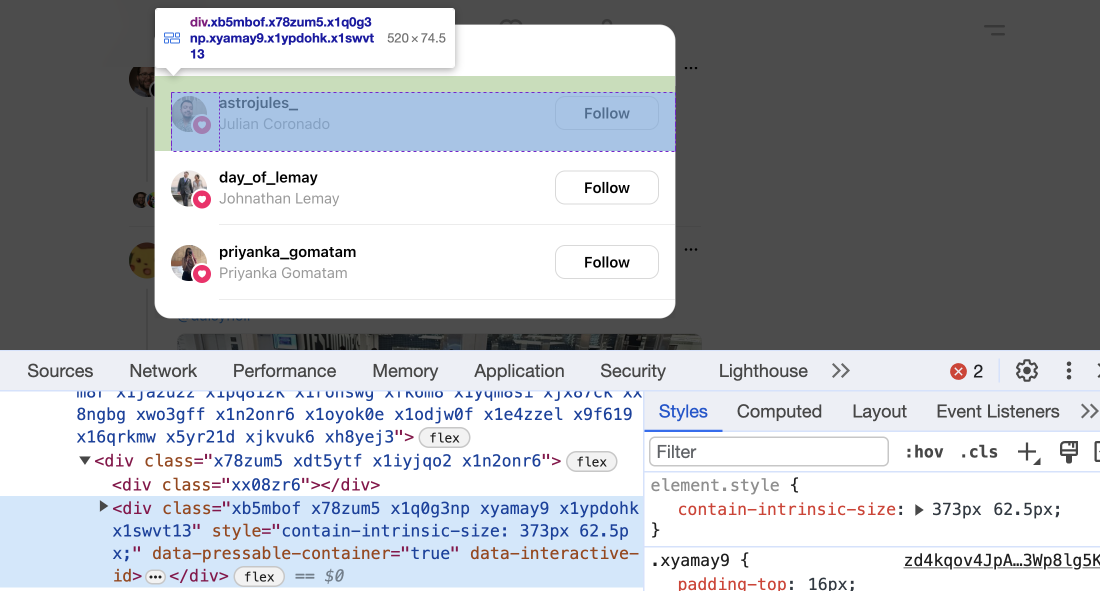
According to MDN:
Size containment allows a user agent to layout an element as though it had a fixed size, preventing unnecessary reflows by avoiding the re-rendering of child elements to determine the actual size (thereby improving user experience)
I like that. I haven’t used this feature before and it’s interesting to see it in the use.
The end. I wrote this article while I was on vacation and had fun doing it. I hope you have learned something new!
此内容由惯性聚合(RSS阅读器)自动聚合整理,仅供阅读参考。 原文来自 — 版权归原作者所有。