


I spent years teaching CSS layout on this blog. I put everything I know into The Layout Maestro course: 70+ lessons and 150+ interactive examples that teach you how to think CSS layouts, not just memorize syntax.
As a part of my curious UI inspection, I thought about why not to look at popular websites and see how they implemented the comment component layout. At first, I thought this will be an easy task, but it wasn’t.
I spent a lot of time trying to understand how this works and how we can do it better with modern CSS like :has, size container queries, and style queries. In this article, I will walk you through my thought process and share my findings along the way.
Let’s dive in!
Here is the layout that we will build. At first glance, it might be simple, but there are a lot of tiny details.
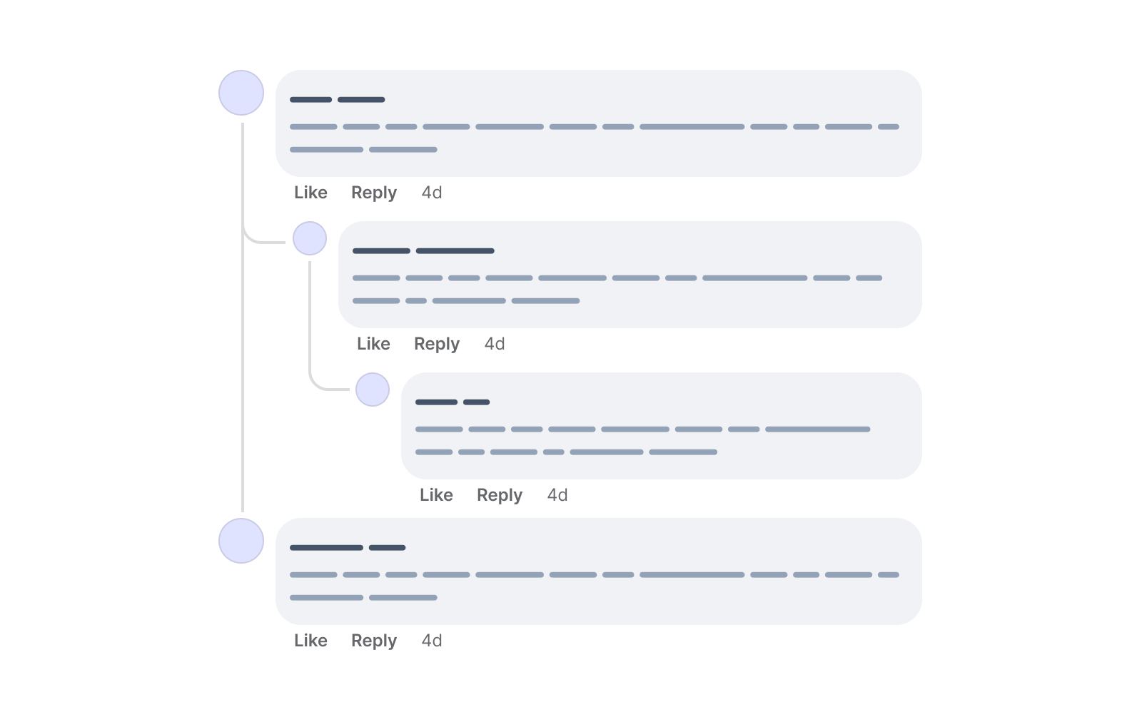
We have a comment that can be nested into two more levels. I will call those “depths” in the article.
Consider the following figure.
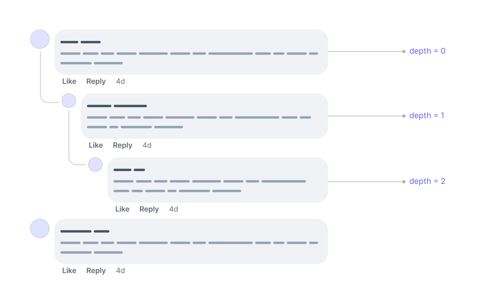
It shows how the depth is changed based on the level of nesting for each comment.
Before diving into the fine details, I prefer to work on the layout first and make sure it works great. The goal of this practice is to explore the potential of modern CSS to solve that problem for me.
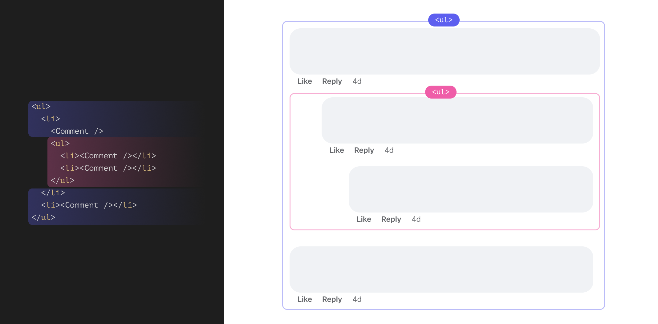
The first to keep in mind is the HTML markup. The structure of the comments is a good fit for an unordered list <ul>.
<ul>
  <li>
    <Comment />
  </li>
  <li>
    <Comment />
  </li>
</ul>
The <Comment /> acts as a placeholder for the comment component. That is the HTML for a list of two comments without any replies.
If we have a reply or more to one of the comments, then a new <ul> will be appended.
<ul>
  <li>
    <!-- Main comment -->
    <Comment />
    <ul>
      <!-- Comment reply -->
      <li>
        <Comment />
      </li>
    </ul>
  </li>
  <li>
    <Comment />
  </li>
</ul>
From a semantic point of view, the above sounds logical.
I called the title “comment wrapper” to not confuse the meaning of the comment component itself. In the following section, I will explain my thinking on building the layout to handle the indentation or spacing for the comment replies.
Consider the following markup:
<ul>
  <li>
    <!-- Main comment -->
    <Comment />
    <ul>
      <!-- Comment reply -->
      <li>
        <Comment />
      </li>
    </ul>
  </li>
  <li>
    <Comment />
  </li>
</ul>
We have two main comments and one reply. From a visual point of view, it will look like the following:
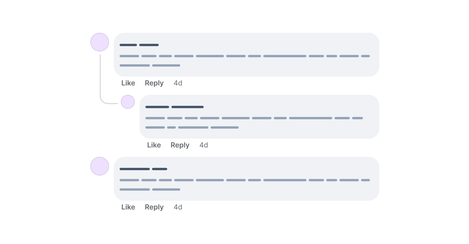
I prefer to keep all the spacing and indentation stuff to the <li> items only, as they act as a home for the comment component.
The first thing I thought about is using data attributes on the <ul> and <li> elements.
<ul>
  <li nested="true">
    <!-- Main comment -->
    <Comment />
    <ul>
      <!-- Comment reply -->
      <li>
        <Comment />
      </li>
    </ul>
  </li>
  <li>
    <Comment />
  </li>
</ul>
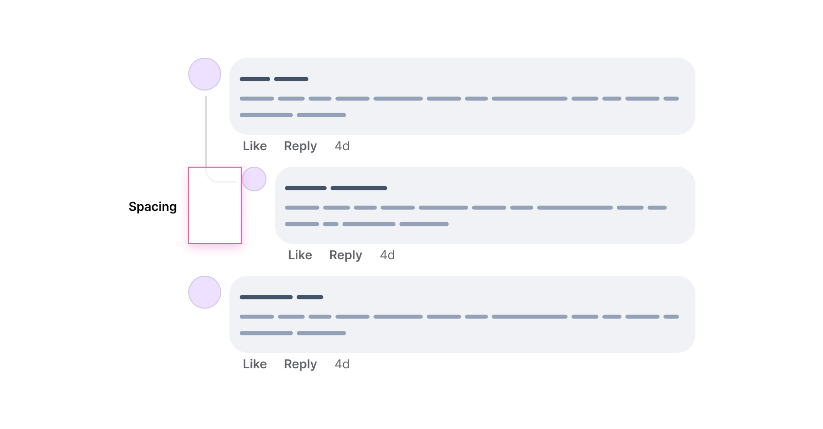
We can call the <ul> and do specific styling as needed. In the figure below, the first reply has a spacing on the left to indicate that it’s visually related to the first comment.
In CSS, we can do something like this:
li[data-nested="true],
li[data-nested="true]
  li {
  padding-left: 3rem;
}
While that might work, we can do much better with CSS variables and style queries.
We can check if the CSS variable --nested: true is added to the container and style the child items based on that.
Consider the following markup where I added an inline CSS variable --nested: true to the <ul> elements.
<ul>
  <li style="--nested: true;">
    <!-- Main comment -->
    <Comment />
    <ul style="--nested: true;">
      <!-- Comment reply -->
      <li>
        <Comment />
      </li>
    </ul>
  </li>
  <li>
    <Comment />
  </li>
</ul>
With style queries, I can check if the CSS variable is there and style the <li> element based on that. This is supported in Chrome Canary only, for now.
@container style(--nested: true) {
  /* Add spacing to the 2nd level <li> items. */
  li {
    padding-left: 3rem;
  }
}
Here is why I prefer style queries over data attributes:
@container, and the plain words say it. If the container has the --nested: true CSS variable, then apply the following stuff.Another solution is to use CSS subgrid to build the nested comments layout. Let me be honest with you, it will be more CSS code, but it’s cool to explore the potential of new CSS features.
I will explain about subgrid in a brief to give you an idea. Consider the following CSS grid:
<ul>
  <li class="main">
    <!-- Main comment -->
    <Comment />
    <ul>
      <!-- Comment reply -->
      <li>
        <Comment />
        <ul>
          <li>
            <Comment />
          </li>
        </ul>
      </li>
    </ul>
  </li>
</ul>
li.main {
  display: grid;
  grid-template-columns: 3rem 3rem 1fr;
}
This will be added to the first direct <li> element of the <ul> list. That grid will look like this:
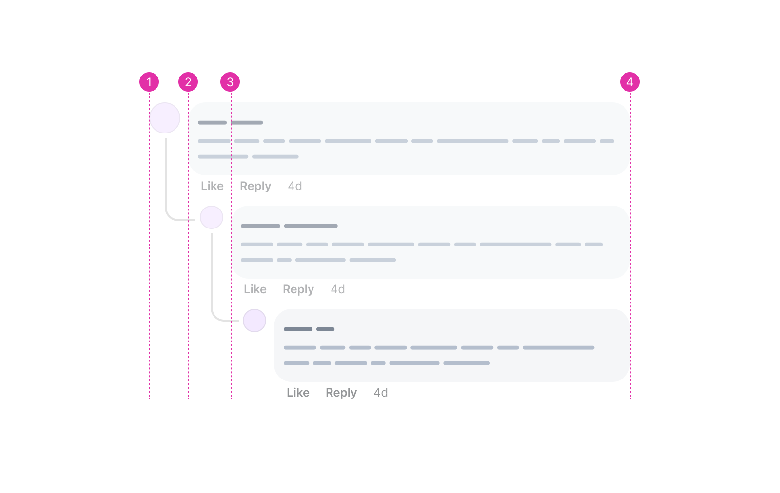
Currently, in CSS grid, it’s not possible to pass the main grid to the child items. In our case, I want to pass the grid columns to the first <ul>, and then to the <li> of that <ul>.
Thanks to CSS subgrid, this is possible now. It’s available only in Firefox and Safari. Chrome is on the way!
Consider the following figure:
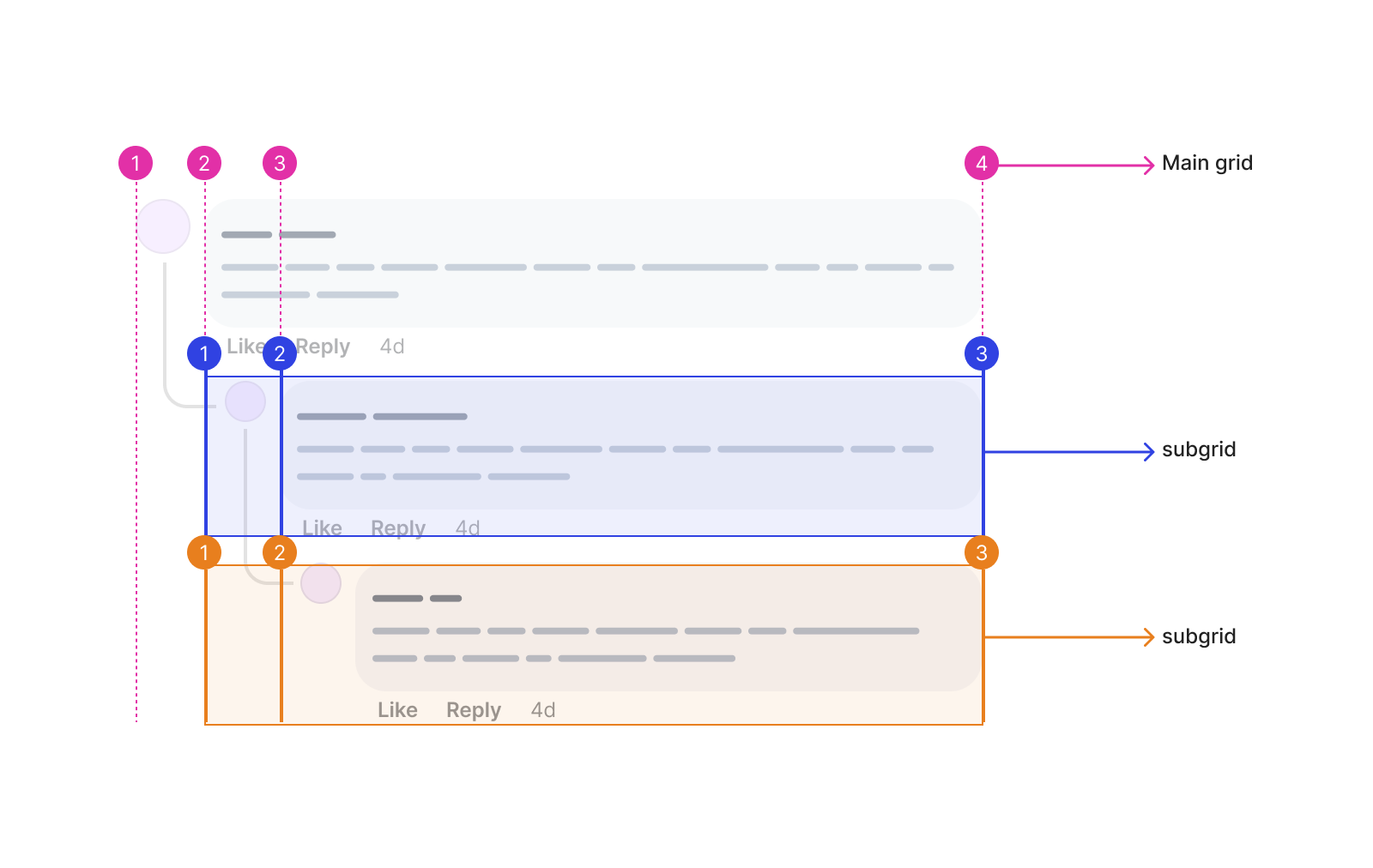
First, we need to set up the main grid as follows. We have 3 columns.
@container style(--nested: true) {
  li.main {
    display: grid;
    grid-template-columns: 3rem 3rem 1fr;

    .comment {
      grid-column: 1 / -1;
    }
  }
}
The .comment component will always span the full width. That’s why I added grid-column: 1 / -1. It means: “span the comment from the first to the last column”. This is helpful to avoid entering the column number manually for each depth in the nesting. Something like this:
/* Not good */
@container style(--nested: true) {
  li.main .comment {
    grid-column: 1 / 4;
  }

  ul[depth="1"] .comment,
  ul[depth="2"] .comment {
    grid-column: 1 / 3;
  }
}
Cool. The next step is to position the depth=1 comments within the main grid, and then add subgrid and position the inner <li>.
@container style(--nested: true) {
  ul[depth="1"] {
    grid-column: 2 / 4;
    display: grid;
    grid-template-columns: subgrid;

    > li {
      grid-column: 1 / 3;
      display: grid;
      grid-template-columns: subgrid;
    }
  }
}
Finally, we need to position the depth=2 list.
@container style(--nested: true) {
  ul[depth="2"] {
    grid-column: 2 / 3;
  }
}
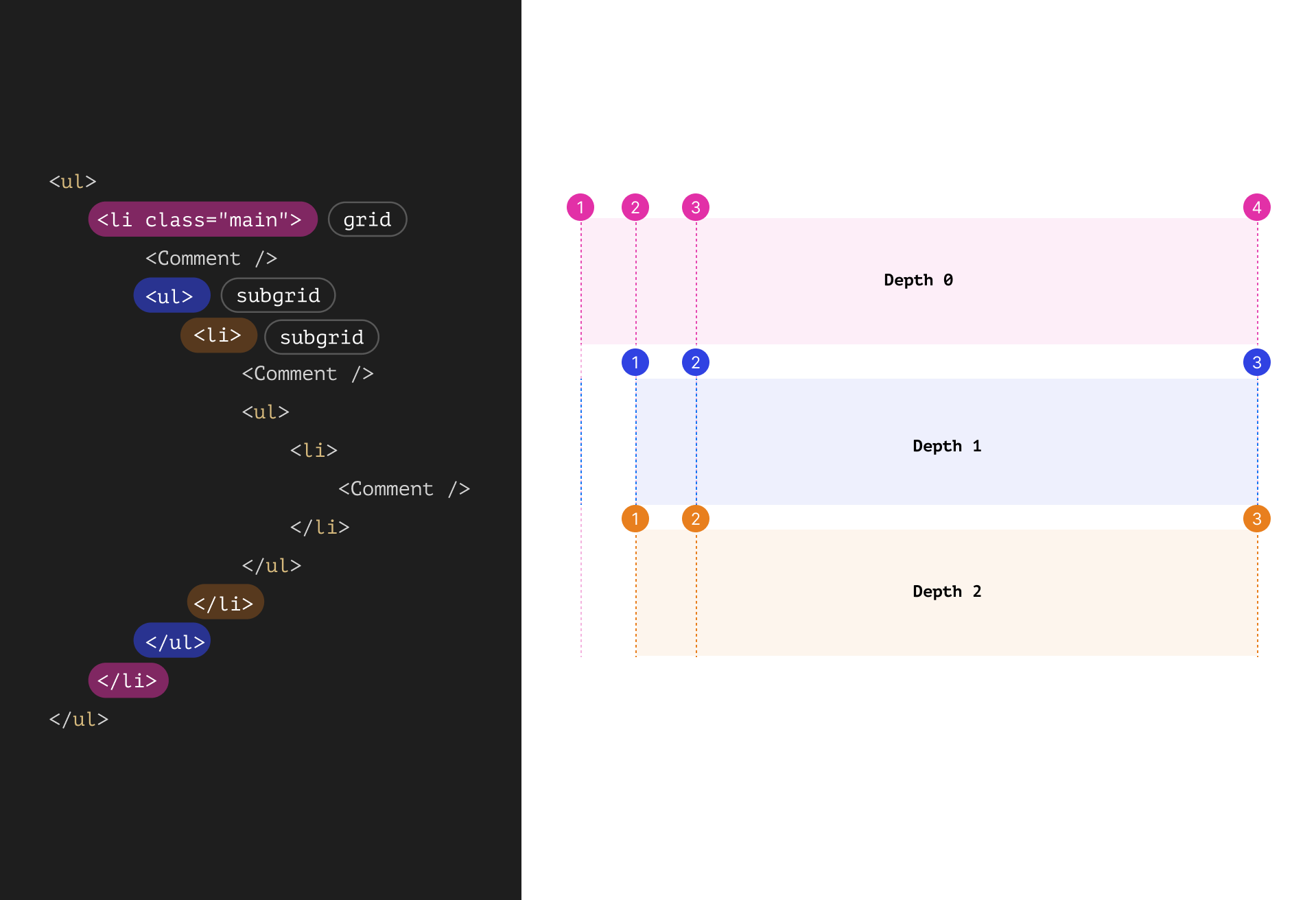
That solution works, but I’m not a fan of all of that details. A simple padding can fix it.
Still not sure about how it works? See the following video which shows me inspecting the grid in the DevTools.
Check out the Codepen demo.
That’s it! Now we have comments with spacing that reflects their relationship.
To make it more clear that there is a reply to a comment, there are connecting lines between the main comment and replies. The Facebook team used a <div> to handle the lines. Can I do something different?
Consider the following figure:
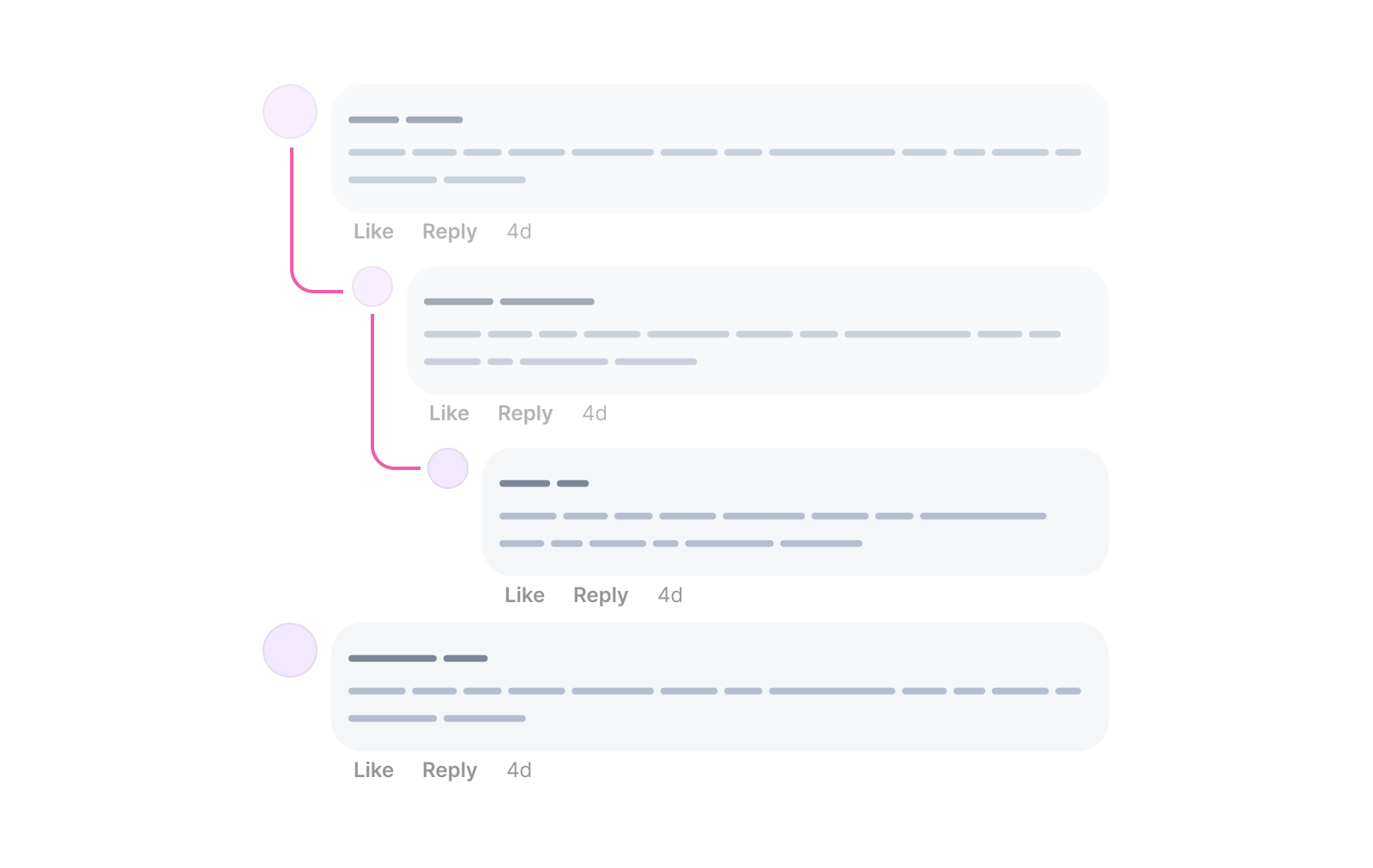
At first, your mind might try to trick you into: “Hey, this looks like a rectangle with a left and bottom border and a border radius on the bottom left corner”.
li:before {
  content: "";
  width: 30px;
  height: 70px;
  border-left: 2px solid #ef5da8;
  border-bottom: 2px solid #ef5da8;
  border-bottom-left-radius: 15px;
}
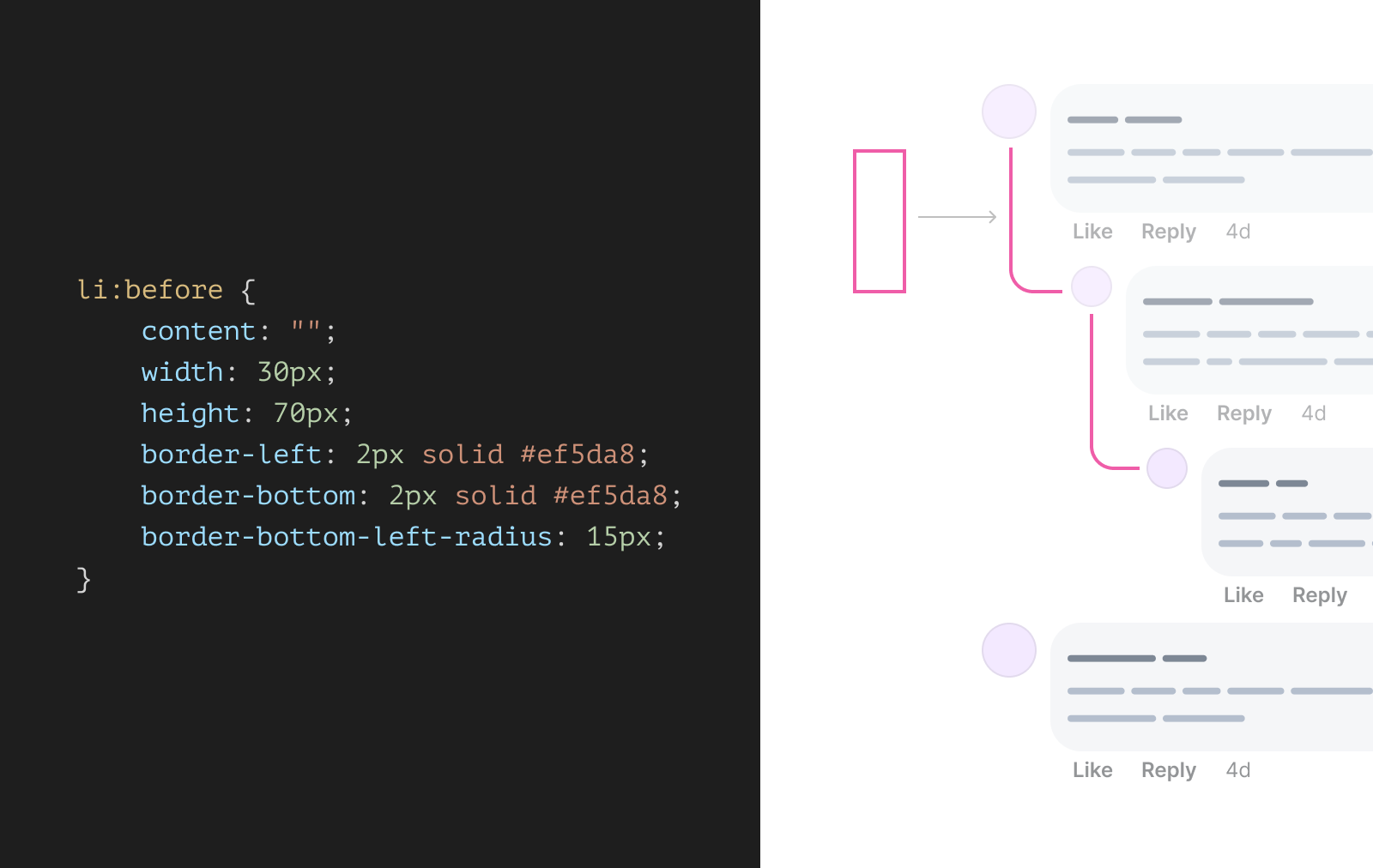
The moment I typed height:.. in the above CSS, I realized that this won’t work. How would I know the height? It’s not possible with CSS, why? Because I need to make the bottom edge of the line aligned to the first reply avatar.
Then, I thought about using pseudo-elements for that purpose. What if that curved line can be divided into two parts?
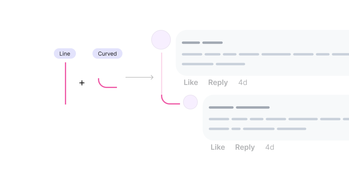
The line can be added to the main comment, and the curved element is for the reply.
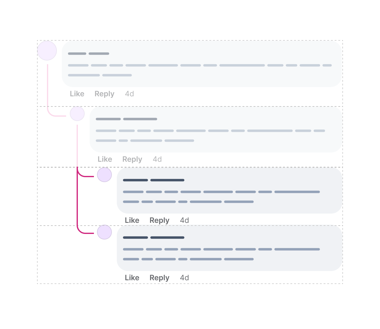
Well, what if we have another reply to the first reply? Here is a visual that shows how the lines will work:
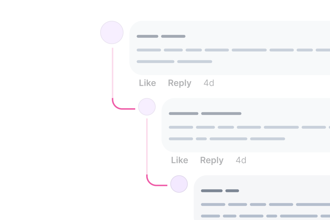
In CSS, we need to use pseudo-elements to achieve the line effect. Before diving into the CSS to implement that, I want to highlight that the line or the curve will be positioned according to the full row.
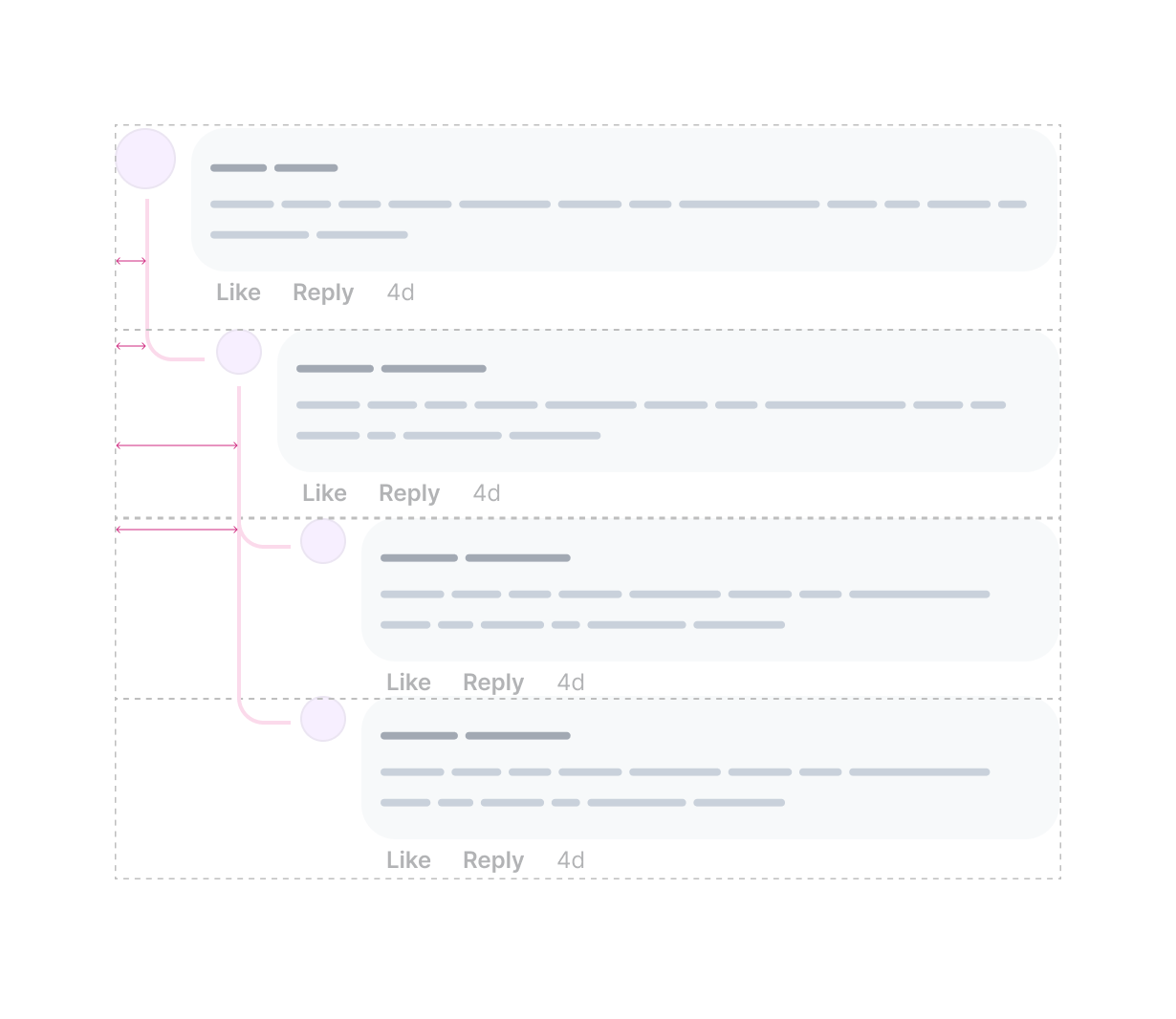
This is the first challenge to tackle. We need to add a line to the first comment if it has replies. How to do that? Thanks to CSS :has, we can check if an <li> contains a <ul>, and if yes, we apply the CSS needed.
Consider the following HTML:
<ul style="--depth: 0;">
  <li style="--nested: true;">
    <Comment />
    <ul style="--depth: 1;">
      <li>
        <Comment />
      </li>
    </ul>
  </li>
  <li>
    <Comment />
  </li>
</ul>
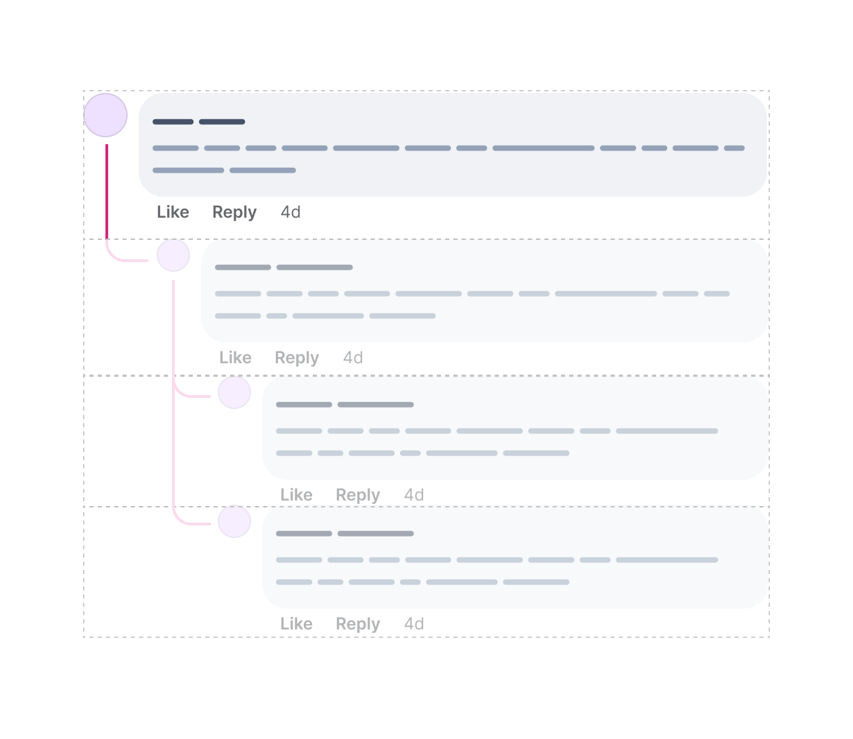
We need to style every <Comment /> with the following conditions:
<li><li> has a <ul> as a childdepth: 0 or depth: 1Here is how the above translate to CSS. CSS variables + style queries + has = a powerful conditional styling.
@container style(--depth: 0) or style(--depth: 1) {
  li:has(ul) > .comment {
    position: relative;

    &:before {
      content: "";
      position: absolute;
      left: calc(var(--size) / 2);
      top: 2rem;
      bottom: 0;
      width: 2px;
      background: #222;
    }
  }
}
The above is just an example of why I prefer using style queries over HTML data attributes for handling the depth of the comment and replies.
Next, we need the line and curved element for the depth: 1 replies. This time, the <li> will use both the :before and :after pseudo-elements.
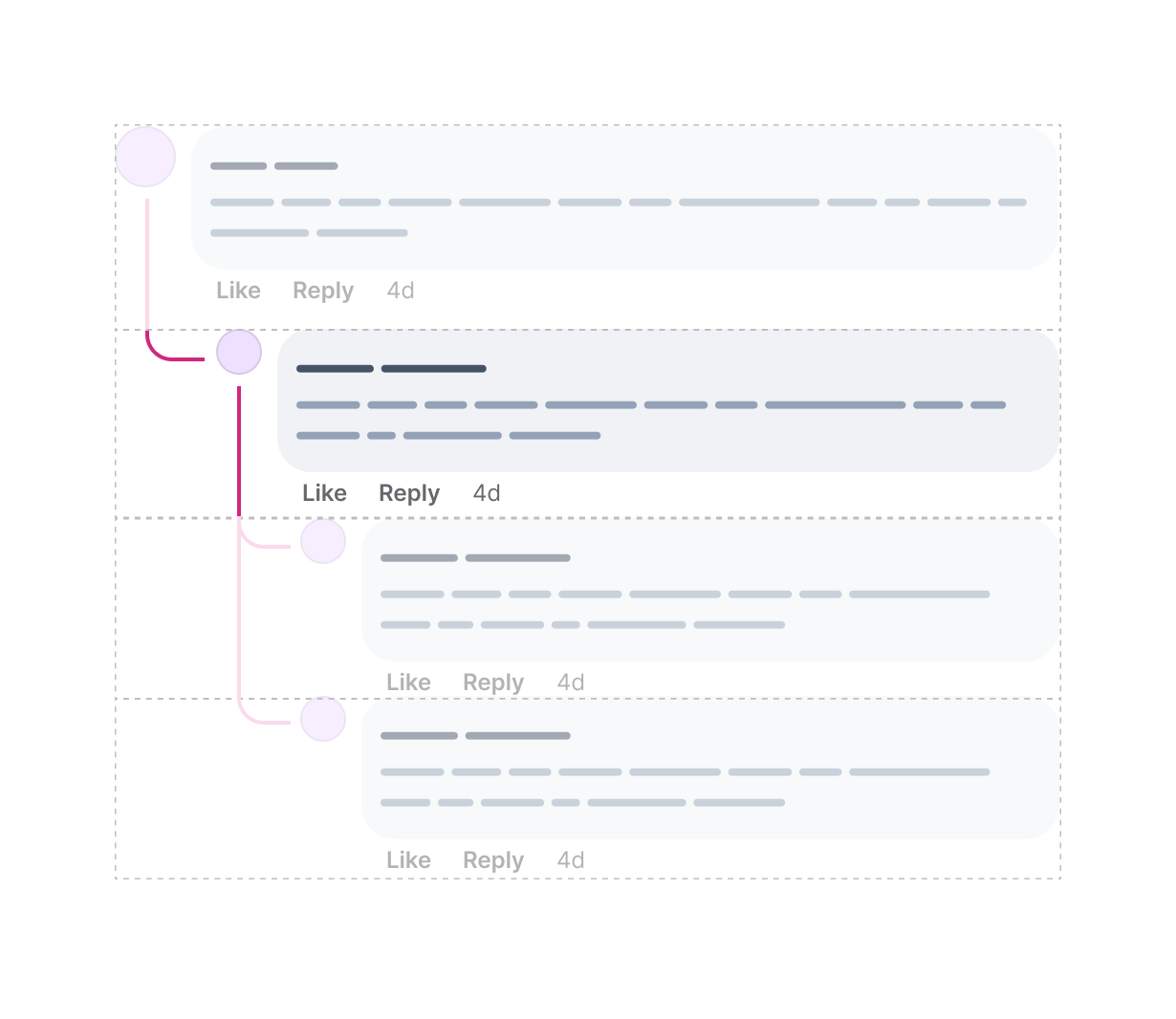
@container style(--depth: 1) {
  li:not(:last-child) {
    position: relative;

    &:before {
      /* Line */
    }
  }

  li {
    position: relative;

    &:after {
      /* Curved element */
    }
  }
}
Finally, We need to add the curved element to each <li> of depth: 2, and the line to all <li>s except the last one. We need to do the following logic:
<li> in depth: 2.<li> except the last one in depth: 2.The curved line is a rectangle with a border and radius on the bottom left. Let me explain that:
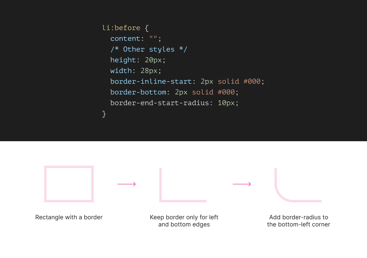
@container style(--depth: 2) {
  li {
    position: relative;

    &:after {
      content: "";
      position: absolute;
      inset-inline-start: 15px;
      top: -2px;
      height: 20px;
      width: 28px;
      border-inline-start: 2px solid #000;
      border-bottom: 2px solid #000;
      border-end-start-radius: 10px;
    }
  }

  li:not(:last-child) {
    &:before {
      /* Line */
    }
  }
}
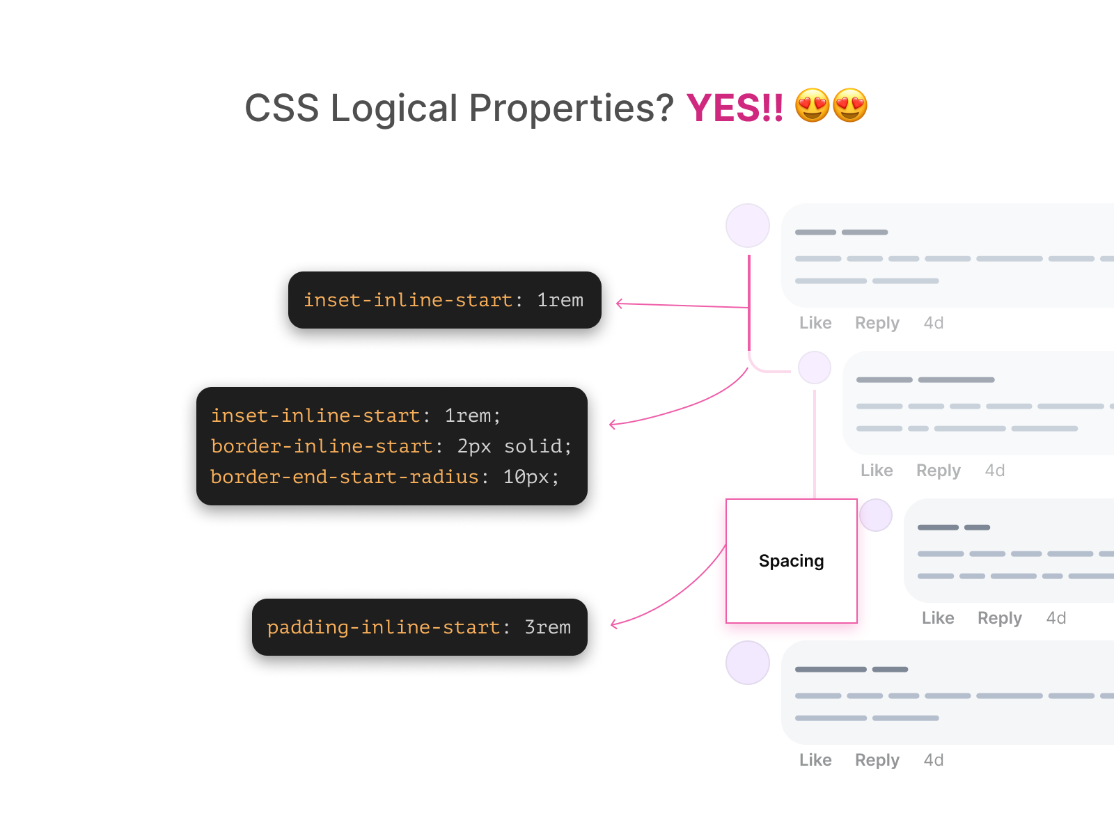
Notice that I’m using logical properties for the border and border-radius. This is useful to make the UI dynamically flip when the document language is RTL. I will come to this later in the article.
Check out the Codepen demo.
What if for some reason we need to hide connecting lines? Well, thanks to style queries, this is simple as toggling on and off a CSS variable.
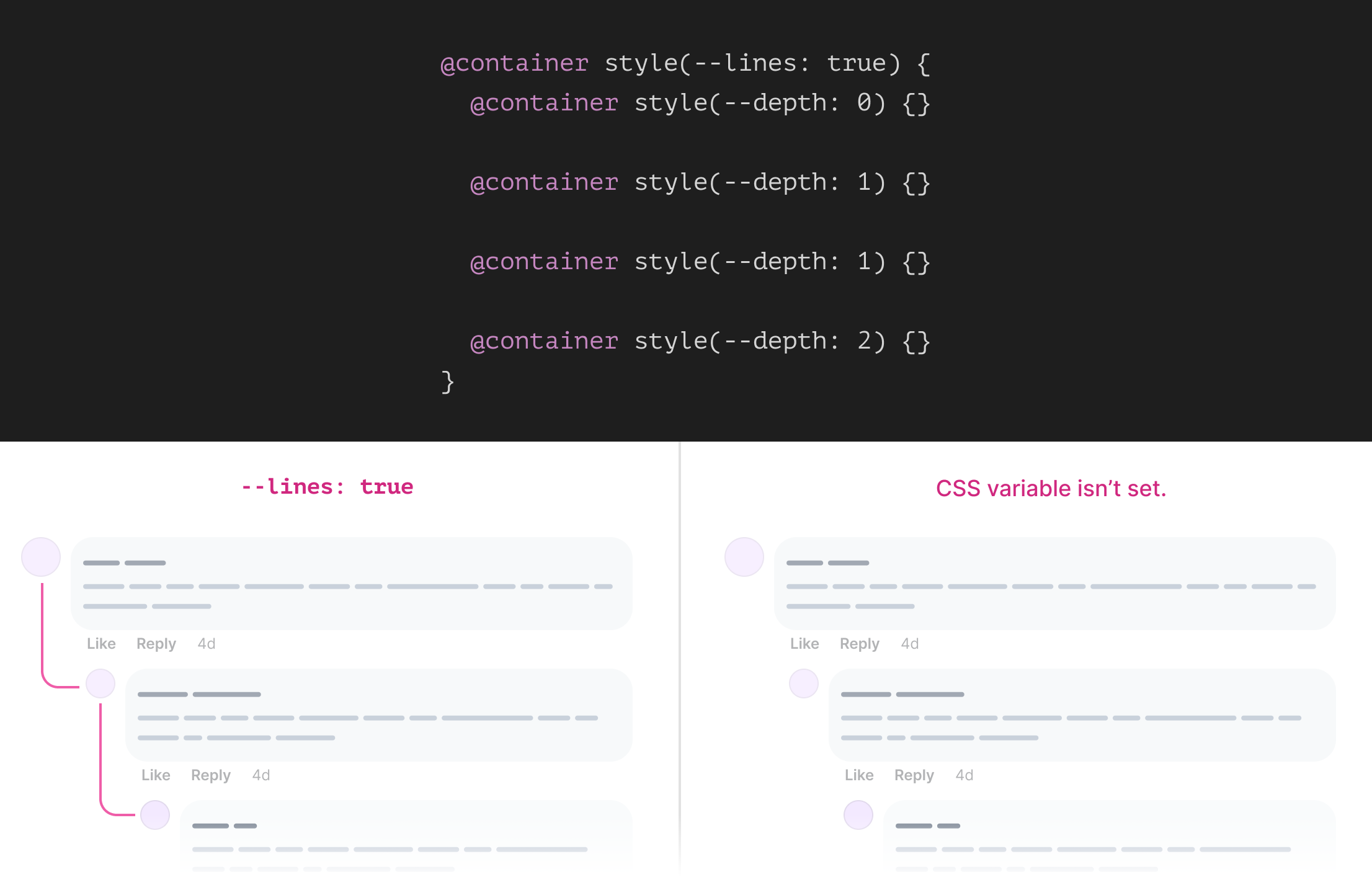
By nesting all the depth related style queries within the --lines: true one, we can ensure that the limes will be shown only when the CSS variable is set.
@container style(--lines: true) {
  @container style(--depth: 0) {
  }

  @container style(--depth: 1) {
  }

  @container style(--depth: 1) {
  }

  @container style(--depth: 2) {
  }
}
Checkout the following video:
You might be thinking that all of the above is just for the main containing layout and lines. Yes, that’s correct! I haven’t even thought about the comment component yet.
Let’s talk a closer look:
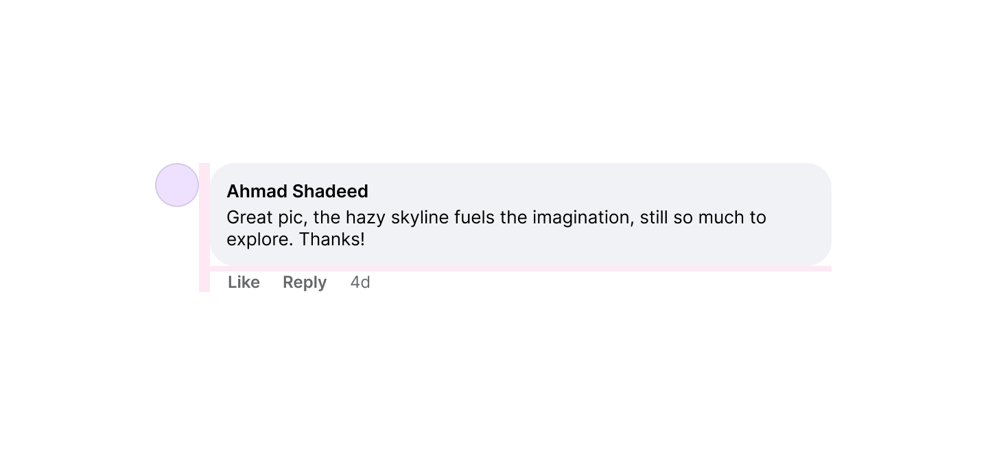
At first glance, this is a perfect case for flexbox. We can have flexbox to display the avatar and comment box in the same line.
<div class="comment">
  <div class="user"></div>
  <!-- Because an additional wrapper doesn't hurt. -->
  <div>
    <div class="comment__body"></div>
    <div class="comment__actions">
      <a href="#">Like</a>
      <a href="#">Reply</a>
    </div>
  </div>
</div>
Please note that the HTML above is very basic. It doesn’t reflect a production-level code, and it is just there to help explain the CSS stuff.
.comment {
  --size: 2rem;
  display: flex;
  gap: 0.5rem;
}

.avatar {
  flex: 0 0 var(--size);
  width: var(--size);
  height: var(--size);
  border-radius: 50%;
}
That’s the basic layout, but we have a lot more than that. However, in this article, I will focus only on the things that are unique and important to explain.
Next are a few considerations for the comment body component.
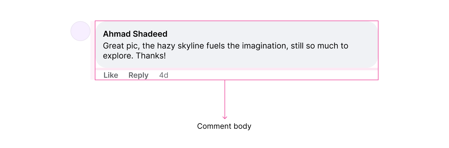
This part alone of the comment component will need to handle:
I won’t be able to highlight all of the above in this article, as I might end up writing a book.
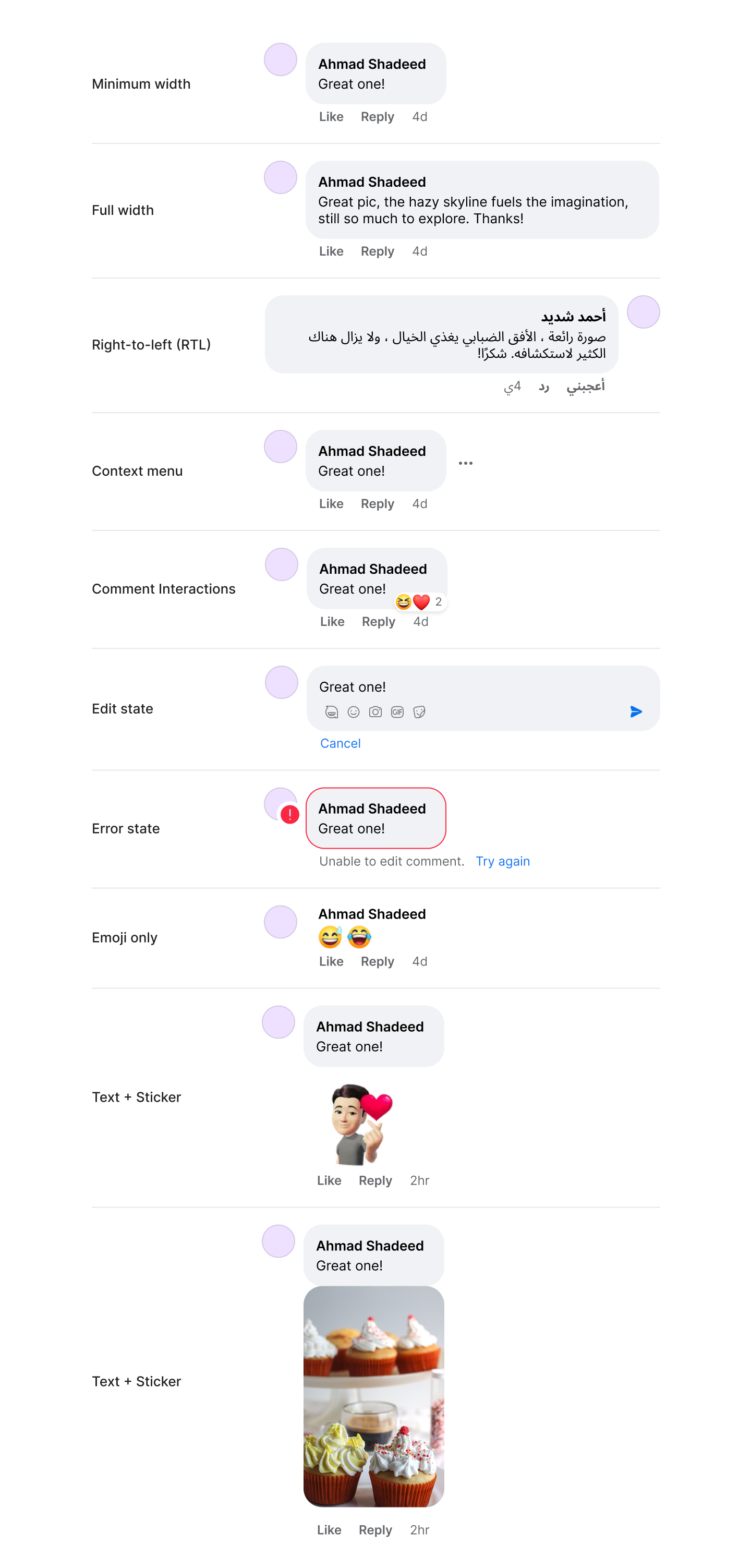
What I will highlight are some bets that I found interesting to be a good candidate for modern CSS.
When a reply is nested within a comment, the user avatar size will become smaller. This is good to make it visually easy to distinguish between a main comment and a reply.
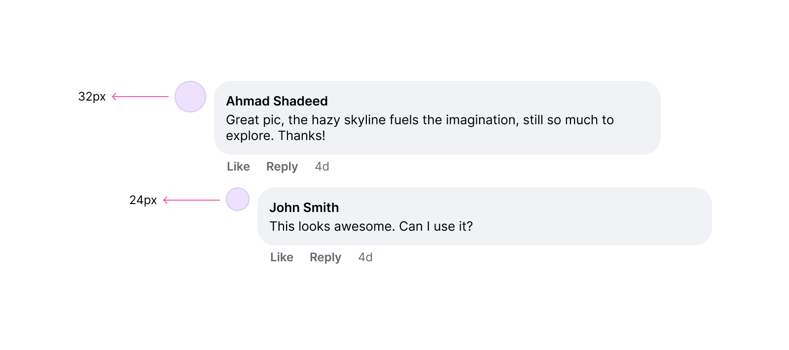
Using style queries is perfect for that.
.user {
  flex: 0 0 var(--size);
  width: var(--size);
  height: var(--size);
}

.comment {
  --size: 2rem;

  @container style(--depth: 1) or style(--depth: 2) {
    --size: 1.5rem;
  }
}
A comment might contain a left-to-right (LTR) or right-to-left (RTL) language. The text alignment should be different based on the content language. Thanks to dir=auto HTML attribute, we can let the browser do that for us.
<div class="comment">
  <div class="user"></div>
  <div>
    <div class="comment__body">
      <p dir="auto"></p>
    </div>
    <div class="comment__actions"></div>
  </div>
</div>
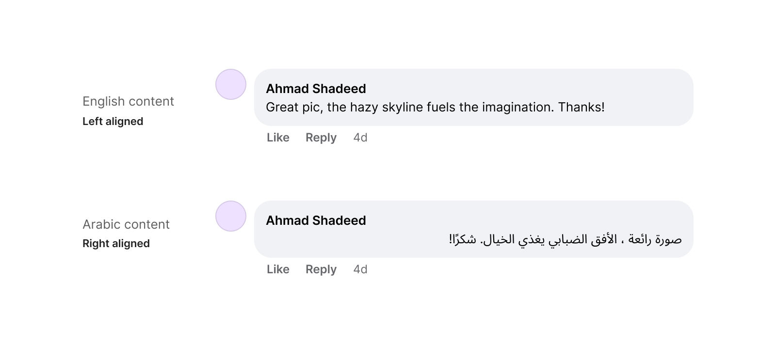
By using CSS logical properties, we can build the comment component in a way that changes based on the document direction. The same applies to the connecting lines, too.
Check out the following video. Notice how it makes switching from LTR to RTL a breeze!
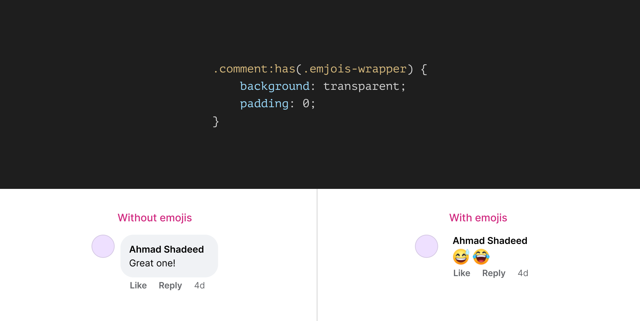
When the user adds a comment that consists of emojis only, the containing wrapper will change a bit:
This is a perfect use-case for CSS :has.
.comment:has(.emjois-wrapper) {
  background: var(--default);
  padding: var(--reset);
}
It’s always thrilling of what can be done with modern CSS. Trying to think about a component or a layout that is already built in a new ways is a great way to learn new stuff. I learned a lot of new things and enjoyed the whole process.
Thank you for reading.
此内容由惯性聚合(RSS阅读器)自动聚合整理,仅供阅读参考。 原文来自 — 版权归原作者所有。