


Dies ist der zweite Teil meiner Serie über 3D-Transformationen mit CSS. Den ersten Teil findet Ihr hier.
Auf einmal waren sie da: mit der Einführung von CSS3 befand sich plötzlich ein obskures Werkzeug in unserem Werkzeugkoffer aber keiner wusste so recht, was er damit anfangen sollte: die Transformationsmatrix. Wie konnte sich dieses mathematische Gebilde, das offensichtlich ein verrückter Nerd mit einer Vorliebe für 90ies Science-Fiction erfunden hatte auf einmal in einen CSS-Standard verirren?
Open ExampleDie gute Nachricht zuerst: „Transformationsmatrix” mag ein kompliziertes Wort sein, schwer zu verstehen ist das Prinzip aber nicht. Besser noch: wenn man nicht will, muss man sie nicht einmal verstehen, kann sie aber trotzdem einsetzen! Wenn man sich aber die Mühe macht, sie zu begreifen, hat man ein wirklich machtvolles Werkzeug zur Hand um DOM-Elemente zu verändern. Flash-Entwickler haben hier (mal wieder) einen Vorteil: Transformationsmatrizen wurden schon vor Jahren mit Flash 8 eingeführt.
Leider ist die Dokumentation dieser Gebilde nur dünn, im Falle der 3 dimensionalen Transformationsmatrizen ist fast keine Information bei den üblichen Quellen zu finden. Aus diesem Grunde dieses kleine Tutorial. Ich hoffe, es bringt dem einen oder anderen etwas Klarheit.
Was sind Matrizen?
Matrizen sind wie der Warp-Antrieb in Star-Trek: von außen wird die Raumzeit verändert, aber die Leute im Raumschiff merken nichts davon.
Matrizen stammen aus der Vektorrechnung (wer sich darunter jetzt nichts vorstellen kann: sucht den Mathelehrgang Eurer Wahl auf. Ihr solltet auf jeden Fall wissen, dass die grünen Pfeile in den Diagrammen auf dieser Seite die Vektoren darstellen). Wer sich schon einmal mit Spieleprogrammierung beschäftigt hat weiss, dass Vektoren und Matrizen hier ein sehr wichtiges Werkzeug sind. Warum? Nun, man kann mit einer Matrize ein 2- oder 3-dimensionales Objekt verändern und trotzdem bleiben seine „inneren” Eigenschaften erhalten. Stellen wir uns ein Flugzeug vor: wir drehen es mit der Spitze nach links. Es soll in die Richtung fliegen, in die seine Spitze zeigt, darum befehlen wir ihm anschließend „fliege nach links”. Ändert sich die Flugrichtung, wiederholen wir das ganze: erst drehen wir das Flugzeug, merken uns die Richtung, in die die Nase zeigt und passen die Bewegung an. Diese Art der Steuerung kann im 3-dimensionalen Raum schnell sehr kompliziert werden. Nehmen wir mal an, wir wollten das Flugzeug zick-zack fliegen lassen. Dann müsste das Programm unentwegt verfolgen, in welche Richtung die Nase des Flugzeugs denn jetzt schon wieder zeigt, um die Steuerung anzupassen. Mit Matrizen können wir dieses Problem vermeiden: ich wende eine Matrixtransformation auf das Flugzeug an und mein Programm muss dem Flugzeug nur befehlen geradeauszufliegen. Es wird immer seiner Nase nach fliegen und die Matrix sorgt dafür, dass die Nase in die richtige Richtung zeigt.
Weitere Vorteile von Matrizen:
- Viele unterschiedliche Manipulationen (Drehen, Scheren, Skalieren, Verschieben entlang unterschiedlicher Achsen) lassen sich in einen Transformationsvorgang zusammenfassenn. Gerade bei komplexen CSS-Animationen und Transformationen hilft das den Code übersichtlich zu halten und gleichzeitig CPU zu sparen. Schließlich müssen wir schon jeden Transform mit einem herstellerspezifischen Präfix versehen. Fasst man also verschiedene Transformationen in einer Matrix zusammen, kann das einiges an Codezeilen einsparen.
- Es ist relativ unaufwändig, mit Matritzen zu rechnen. Die Grundrechenarten reichen dafür schon aus.
Wie sieht eine Matrix aus?
Eine Matrix ist eigentlich einfach nur eine Zahlenfolge und wird normalerweise in einem Array gespeichert: [0.5, 4, 2.3, 1.5] wäre zum Beispiel eine einfach kubische 2-dimensionale Matrix. Da diese Schreibweise aber schwer zu lesen ist, gilt die Konvention, sie zeilenweise zu notieren:.
Was bedeuten diese Zahlen?
Stellen wir uns ein Quadrat auf einem Blatt Papier vor. Der Mittelpunkt des Quadrates befindet sich auf dem Blatt an einer X und an einer Y-Koordinate. Die beiden Spalten dienen dazu, die Verzerrung der jeweiligen Koordinate vorzunehmen.
Jede Spalte steht für einen Vektor und dieser hat wiederum einen x- und einen y-Wert. Dies sind die „inneren” Koordinaten des Quadrates. Wenn ich das Quadrat unverzerrt auf meinem Blatt darstellen will, heisst das, dass ich auf der X-Koordinate nur den x-Wert und auf der Y-Koordinate nur den y-Wert meines Quadrates um den Faktor „1” skalieren darf. Die entsprechende Matrix nennt man „Identitätsmatrix”:
Wollen wir das Quadrat um die Hälfte verschmälern, sähe die entsprechende Matrix so aus:
Jetzt wollen wir das Quadrat einmal auf der X-Achse scheren, so wie wir es in Illustrator mit dem „Verbiegen”-Werkzeug machen. Dazu müssen wir auch den y-Wert des „inneren” (lokalen) Vektors verändern:
Eine Matrix kann auch dazu verwendet werden, das Quadrat zu rotieren. In diesem Fall ist es wichtig, dass alle Werte im richtigen Verhältnis zueinander stehen. Wer sich mit Trigonometrie auskennt, ist im Vorteil:
| cos(α) | sin(α) |
| -sin(α) | cos(α) |
„α” ist in diesem Falle der Winkel (wichtig: in Radiant, nicht Grad), um den gedreht wird. Die Herleitung spare ich mir, es gibt schließlich Wikipedia.
Das, was wir hier an einer 2-dimensionalen Matrix gezeigt haben, gilt natürlich ebenso für den dreidimensionalen Raum. Allerdings brauchen wir dazu noch eine weitere Spalte für die Z-Achse und eine für die z Werte der einzelnen Vektoren.
Wir haben gelernt, dass die Vektoren in der unverzerrten, der Identitätsmatrix auf ihren Achsen immer den Wert „1” haben müssen. Die Identitätsmatrix für eine 3D Transformation sieht also folgendermaßen aus:
| 1 | 0 | 0 | 0 |
| 0 | 1 | 0 | 0 |
| 0 | 0 | 1 | 0 |
| 0 | 0 | 0 | 1 |
Diese kleine Demo ermöglicht, mit den einzelnen Werten herumzuspielen (funktioniert nur mit einem geeigneten Browser):
Moment - wieso auf einmal eine 4 x 4 Matrix? Würde eine 3x3 Matrix nicht reichen?
Wir haben in unseren Beispielen bisher mit einer vereinfachten Matrix gearbeitet. Tatsächlich enthält eine Matrix neben den Koordinaten für die einzelnen Vektoren aber auch noch weitere Angaben:
| x | x | x | Wx |
| y | y | y | Wy |
| z | z | z | Wz |
| Tx | Ty | Tz | W |
Die Reihe T erlaubt es den Transformationsmittelpunkt zu verschieben, wir können mit dem T-Vektor das Objektalso auf der entsprechenden Achse bewegen.
Die Reihe W ist Tricky. Hier wird eine Perpektivprojektion bestimmt. W... ist die Koordinate des Blickpunktes auf der jeweiligen Achse. Im Regelfall wird man diese Einstellungen bis auf die Letzte auf 0 setzen. Ihr könnt in der Demo mit den Werten spielen, falls Ihr Euch die volle Packung geben wollt, googelt mal nach „homogenes Koordinatensystem” ;-).
Beispiel: Coverflow in CSS
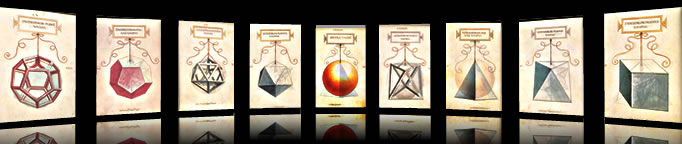
Wir wollen nun mal an einem Beispiel den Einsatz von CSS Matrizen demonstrieren: Eine Bildergalerie im Stil von Apples Coverflow. Ich spare mir hier die Erklärungen und beschränke mich darauf, nur die entscheidenden Selektoren des CSS zu posten. Das Beispiel funktioniert ganz ohne Javascript und zusätzliche Hintergrundgrafiken. Dass wir die Rotation mit einer Matrix anstelle mit „rotateY” vornehmen dient lediglich der Demonstration. Achtet darauf, dass Ihr zum Betrachten den richtigen Browser verwendet. Für diejenigen, die kein Safari auf Leopard, bzw. Webkit haben gibt's ein Video:
Open Example
div#stage{
	-webkit-perspective: 600px;
}

img {
	-webkit-transition-property: -webkit-transform;
  	-webkit-transition-duration: 0.7s;
	-webkit-transform: matrix3d(0.7109, 0, -0.703279, 0,
                               0, 1, 0, 0,
                                0.703279, 0, 0.7109, 0,
                               0, 0, 0, 1);
	-webkit-box-reflect:below 15px
   -webkit-gradient(linear, left top, left bottom, from(transparent),
    color-stop(0.7, transparent), to(#ff0000));
}

img:hover {
	-webkit-transition-property: -webkit-transform;
  	-webkit-transition-duration: 0.7s;
	-webkit-transform: matrix3d(1, 0, 0, 0,
                              0, 1, 0, 0,
                              0, 0, 1, 0,
                              0, 0, 200, 1);
}
That's it. wo früher 50 Zeilen Javascriptcode nötig gewesen wären reichen nun einige CSS-Angaben. Ist technischer Fortschritt nicht etwas wunderbares?
This is the second part of a mini-series covering css 3d-transformations. If you missed the first part, you can read it here.
Suddenly they were here: with the increasing adoption of CSS3 in modern web-browsers a strange instument showed up in our toolbox, but nobody knew exactly how to use it: transformation-matrices. How could this mathematical object, obviously invented by some crazy geek with a bias for 90ies science-fiction movies happen to get lost in a CSS-proposal?
Open ExampleThe good news first: even though "transformation-matrix" may be difficult to spell, it's less difficult to grasp the concept. Even better: If you don't want to, you don't need to understand it and still can use it anyway. But if you take your time to get the principle behind it you will have a really powerful method at your fingertips to manipulate DOM elements. Flash developers do have an advantage again, as they are already familiar with transformation matrices since flash 8.
Unfortunately there is not too much documentation on the web regarding transformation-matrices for mathematical illiterate folks like us designers. Therefore this little tutorial. Hopefully it is useful for some of you.
What are Matrices?
Matrices are like the warp engine in star-trek: space-time-continuum is changed from the outside, but the people in the star-craft don't notice anything.
Matrices are used for vector calculations (if you don't have any clue what this is, consult a math tutorial near you. At least you should be aware that the green arrows in the graphics on this page are vectors). Programmers do know that vectors and matrices are an important part of game programming. Why? Well, it is possible to alter an object with matrices and still keep its "inner" properties. Think of an airplane: we turn the airplane to the left. Now we want it to fly into the direction of its head, so we command "fly left". We have to do this every time the direction is altered: turn the plane first, then store the new direction and adjust the movement. This can quickly become a complicated task, i. e. if the airplane has to fly a complex path. Here matrices can be really helpful. It is enough to put the airplane into a matrix. From then on we simply tell the airplane to fly straight ahead and apply all the positioning, turning and twisting to the matrix.
Matrices do have some more advantages:
- Its possible to accomplish a lot of manipulations (turning, scaling, shearing, moving) at the same time. And as we have to add vendor specific prefixes for every transformation, it doesn't harm that we can "compress" them into one matrix. This will help keeping our code lean and saving CPU at the same time.
- It is quite easy to combine matrices by using low level math operations: addition, subtraction, multiplication.
How does it look?
A matrix is a sequence of numbers that usually will be stored within an array: i. e. [0.5, 4, 2.3, 1.5] is a simple cubic two-dimensional matrix. As this kind of syntax is difficult to read, it is common to list them line by line:
What's the meaning behind these numbers?
Let's think of a square on a piece of paper. Every point within the square has an x- and an y-coordinate. The first row in our Matrix represents the x-vector, the second one the y-vector. Each vector determines how this point will be transformed along the corresponding axis.
The matrix of an undistorted square must scale it along the x axis by the factor of 1 and along the y-axis by the factor of 1. This is called the "identity-matrix":
This matrix will narrow the square into half:
Now let's shear the square along the x-axis, similar to the "skew"-tool in Illustrator. We have to alter the y-value of the X-vector as well:
You can rotate objects with the matrix as well. In this case it is important to maintain a certain relation of every value in the matrix. Having an idea of trigonometry is beneficial:
| cos(α) | sin(α) |
| -sin(α) | cos(α) |
"α” is the rotation-angle (important: in radian, not degree). Consult Wikipedia for the derivation.
Everything we have demonstrated until now for two dimensional matrices can be applied to three-dimensional space as well. In this case we need one more line for the z-axis and one more column for the z-values of the three vectors in our matrix.
We already learned that the vectors for the undistorted identity-matrix must have a value of "1" along their corresponding axes. Accordingly the identity-matrix for a 3d-transformation will look like this:
| 1 | 0 | 0 | 0 |
| 0 | 1 | 0 | 0 |
| 0 | 0 | 1 | 0 |
| 0 | 0 | 0 | 1 |
I prepared a little demo to play with the values (please use a browser that is capable of displaying 3d CSS transforms):
Open ExampleWait — this is a 4 x 4 matrix. Wouldn't be a 3 x 3 matrix enough?
Until now we used simplified matrices. But usually a matrix will contain some more information besides the vector-coordinates:
| x | x | x | Wx |
| y | y | y | Wy |
| z | z | z | Wz |
| Tx | Ty | Tz | W |
The T-row will re-position the center of the transformation in pixels, allowing us to move the object.
The W-row is tricky. A perspective-projection is determined here. It is our viewpoint along the corresponding axis. Usually you will want this values to be zero except the last one. Play around with this values in the demo. If you're feeling adventurous, google for "homogenous coordinates" ;-).
Example: Coverflow in CSS
Let's test our knowledge with a little example: a picture-gallery in cover-flow style. I will not go into details but post the essential CSS here instead. Everything will work without javascript and additional graphical elements (except the images of course). This special result could be achieved with "rotate-y" as well but, hey, it's a demo, right? Use a CSS 3d capable browser for viewing. Everyone who doesn't have a Webkit nightly on mac, iDevice OS >2 or Safari Leopard can at least watch a video instead:
Open Example
div#stage{
	perspective: 600px;
}

img {
	transition-property: transform;
transition-duration: 0.7s;
	transform: matrix3d(0.7109, 0, -0.703279, 0,
                               0, 1, 0, 0,
                                0.703279, 0, 0.7109, 0,
                               0, 0, 0, 1);
	box-reflect:below 15px
   gradient(linear, left top, left bottom, from(transparent),
    color-stop(0.7, transparent), to(#ff0000));
}

img:hover {
	transition-property: transform;
transition-duration: 0.7s;
transform: matrix3d(1, 0, 0, 0,
                              0, 1, 0, 0,
                              0, 0, 1, 0,
                              0, 0, 200, 1);
}
That's it. Where we usually would have needed some 50 lines of javascript-code, a few CSS-properties are enough right now. Isn't technical evolution a wonderful thing?