


In 2006 I coded up my very first tooltip.
Tooltips are messages that appear when the user hovers over part of an interface — usually an icon — to explain how certain things work or what they mean.
Despite some of the coding challenges, I thought tooltips were a cool way to declutter the UI.
But I didn’t think about their impact on UX:
Here I’ll explain why tooltips are problematic and what to do instead (if you want to give users a good experience).
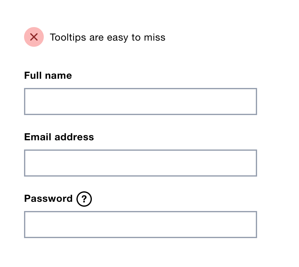
Some users won’t notice a tooltip which means there’s a high risk they’ll never see the content it contains.
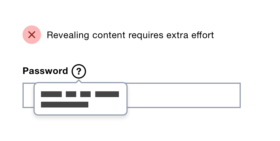
Let’s say users need additional information to help them satisfy a password field with complex rules. Making users reveal the content first is an unnecessary burden.
Tooltips are shown on top of the screen blocking some of the interface.
This means you can’t read the tooltip and operate the rest of the screen at the same time.
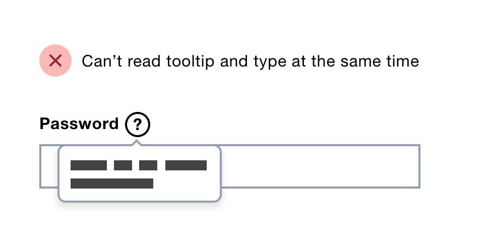
Users have to work hard to remember the hint, or switch between 2 modes of operation repeatedly.
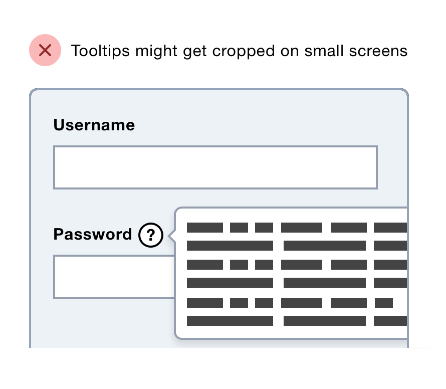
As tooltips are overlaid, there’s a chance they’ll be cropped by smaller viewports.
Tooltips that consist of icons need an accessible label. But even if you have one, voice users have to interpret what they see and guess what it is.
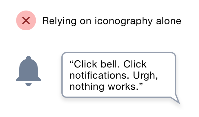
Imagine a bell icon. It’s not clear whether users should say ‘Click bell’, ‘Click notifications’ or something else entirely in order to activate it.
Firstly, you need to use a mouse or other pointing device to use a tooltip which excludes keyboard and touch screen users.
Secondly, hovering is not always an intention to activate a control. The user might move the cursor over a tooltip which accidentally activates it.
Thirdly, it requires fine motor skills to operate. Users have to move their mouse accurately over the hit area and hold it steady to avoid accidentally hiding it.
Fourthly, it’s not possible for screen magnifier users to move their field of view without hiding the tooltip.
Finally, users can’t select or interact with the content within the tooltip.
You could provide a comparable experience for keyboard users by showing the tooltip on focus. But this is unconventional and still excludes touch screen users.
Having content just to help users understand your interface is a sign of bad design.
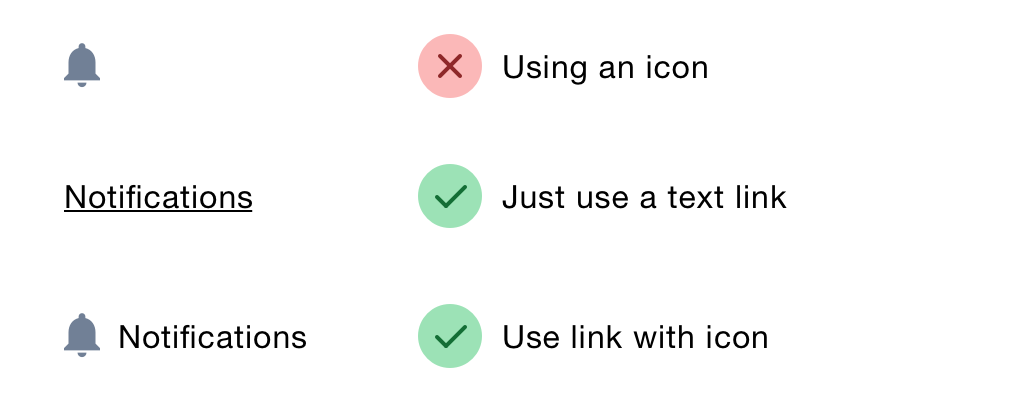
If you’re using an icon to convey meaning, use text instead, or use icons and text together.
If you’ve got one complex question, can you make it simpler by asking several shorter questions?
Either way, do the hard work to make it simple.
If you really do need to provide users with clarification just show the content.
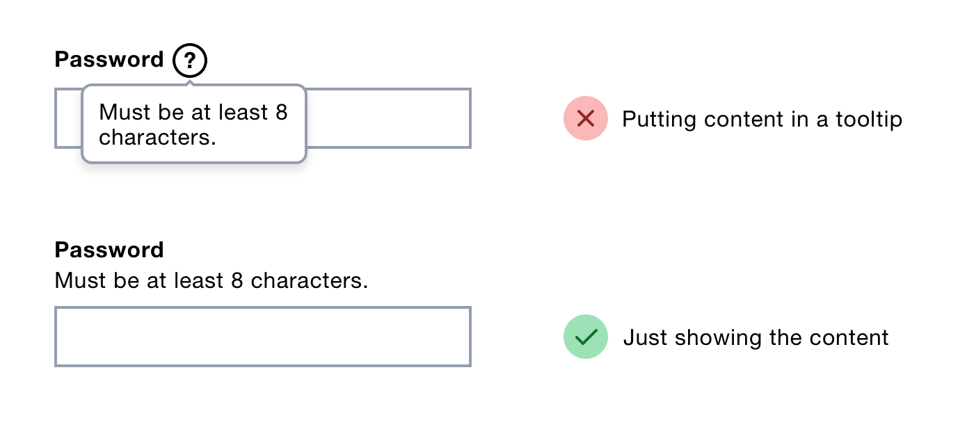
Give users what they need when they need it.
If (1) and (2) don’t work, use an inline toggle component.

This is better because it:
Thanks to Amy Hupe for editing this.
此内容由惯性聚合(RSS阅读器)自动聚合整理,仅供阅读参考。 原文来自 — 版权归原作者所有。