


This post is part of an informal series of small articles focusing on Flow types usages that I’ve discovered and found useful over the past few months.
For the past year, I’ve been using Flow as my static type checker on many of my projects whether they were personal or work-related. In the beginning, I was mainly using it as a replacement to React propTypes as they were difficult to enforce during dev and testing phases which resulted in misusages of some components way too many times.
However, while refactoring an entire codebase by adding proper Flow types, I realized that loosely typed components or functions were both harder to use and caused unwanted changes. That’s why I tried to look a bit more at how I could type them better. One of the main areas that I decided to focus on first was improving the static typing of some styled components. By adding Flow on top of these components, we can tighten their definition thus avoiding misusages before they hit production, and make developers’ and designers’ life easier.
In this short post, we’ll consider a simple example of a styled component with specific design specs and see how Flow can help to enforce these specs when using it.
I was building a simple theme with a series of colors using emotion as well as a Title styled component that would have a color prop. The color will be injected through a theme prop. This prop comes either from a ThemeProvider component that wraps your app or from a withTheme Higher-order Component. I’m not going to detail more about the setup of emotion in this post but you can find all the adequate documentation here.
Here’s the component that we’ll use as an example:
The code of the Title styled-component
1
import styled from 'react-emotion';
3
const Title = styled('h1')(`
4
color: ${(props) => props.theme.colors[prop.color]}
The aim here was the following: to make sure that anyone who uses the Title component could change its color via a prop but only let them pick the blue colors provided by the theme. Code-wise this is what we want to have:
Title component good and bad usage
3
Styled Components are awesome!
8
Styled Components are awesome!
This is one case when I discovered that Flow can surprisingly help to solve this kind of problem. The theme used for this example looks like the following:
Theme used for this example
18
[string]: '#099CEC' | '#6BC3F3' | '#E12B0C' | '#FB786A' | ...
33
const greens: Greens = {
When it comes to color usage, we don’t want to leave the possibility for other developers to use a color outside of the theme. This is why creating a Theme type and the different color types like Blues and Reds (as well as the other properties of your theme) from the start is a good idea so you immediately document the do’s and don’t’s of your theme at the static typing checking level. In the rest of this post we’ll essentially focus on how to leverage these types like Blues to validate props of Title.
In the example above, we can see how enums can be useful: colors is a map of some string value (the name of the color) to one and only one of these 4 colors.
Typing the styled component is the first step**.** I didn’t know how to this at first so I had to do a bit of research on this one and ended up finding this comment on a Github issue which was very helpful. Following the example given in this issue, I wrote this typed implementation of Title:
First typed implementation of the Title component
2
import type { ComponentType } from 'react';
3
import styled from 'react-emotion';
9
const Title: ComponentType<TitleProps> = styled('h1')(`
10
color: ${(props) => props.theme.colors[props.color]}
It’s typed a bit fast but, it’s still better than having no type. Now we can use Title with a color prop as we wanted, but sadly here we can pass any string, i.e. any colors which doesn’t quite help us given what we want to build.
The next step was to type the component better, meaning, to make type it in such a way that it would only accept a subset of colors. The string type is way too generic. All the following examples would pass Flow without any error:
Example of valid but wrong usages of the typed Title component
This is where enums comes into the picture. Indeed, by specifying the subset of the colors of the theme we want for Title we can narrow down which props can be passed to the component.
2
color: 'blue1' | 'blue2',
This would mean that Flow would fail if we use Title with red1 as color:
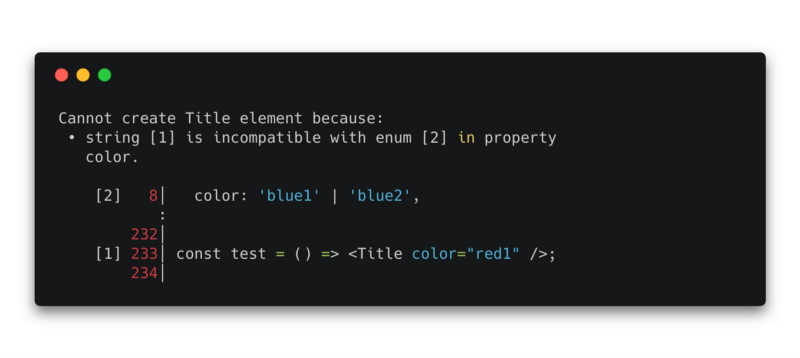
However, whenever the theme gets updated with some extra blue colors, the type will have to be manually updated and we’ll have to add every single color name we want to be usable with Title for Flow not to fail in the future when these will be passed as props. This is ok if we have a limited number of possibilities, but with scalability in mind, it’s not very practical.
We can type our component even better using the $Keys utility type. Here’s how to use it:
Final implementation of the Title component using the $Keys utility function
2
import type { ComponentType } from 'react';
3
import styled from 'react-emotion';
4
import type { Blues } from './theme';
6
type ValidColors = $Keys<Blues>;
12
const Title: ComponentType<TitleProps> = styled('h1')(`
13
color: ${(props) => props.theme.colors[props.color]}
Here’s how$Keys works in our case: it extracted the type ‘blue1' | ‘blue2' from our Blues type by getting its keys. Thus, every time we update our color palette and the respective color types, our Title component will be properly typed. We can thus see that typing this way is more elegant than manually adding items to an enum.
In conclusion, we can see that Flow can be used for more than just typing components for the sake of typing, it can be leveraged to properly define our design-system in our apps which can be game-changing for our development flow. By clearly reflecting the specs requested for this problem as Flow types, we avoid any “bad surprises” in production as any unwanted changes can be now prevented during the testing phase.
This is why, whether the project is big or small, I plan on using Flow even more when working on design-systems and themes in the near future.
此内容由惯性聚合(RSS阅读器)自动聚合整理,仅供阅读参考。 原文来自 — 版权归原作者所有。