







Over the past few months, I've been working a lot on my Design System and one aspect of this work that I enjoyed focusing on is micro-interactions ✨. These can be very tedious to get right, but if built properly they can make components go from good to exceptional!
However, more recently, I brought my attention to something a bit more subtle. While iterating on a button component hover transition, using timing functions such as linear ease-in or ease-out did not feel quite right. The only way I achieved a satisfying result was to set my CSS transition property to the following: cubic-bezier(0.34, 1.56, 0.64, 1), which I copied-pasted from a Codepen without really knowing what those values and function were doing, which, to be honest with you, is the kind of thing that always bothers me 😅. I like to understand the tools I'm using.
So, I went down a rabbit hole of math, animations, and code to have a clear understanding of what cubic-bezier really is, and also what the numbers I passed to that function meant and how they translate to motion. Hence the title of this blog post! We'll first deep dive into the math behind cubic-bezier, then try to visualize how the graphical representation of this function translates into motion and how it relates to other timing functions you might be familiar with. All of that, illustrated through interactive visualizations to allow you to see and tweak the math that's behind these beautiful transitions ⭐️.
First, what's really behind this cubic-bezier function we keep seeing in our CSS codebases? Well, to simply put it, this function defines what is called a Cubic Bézier curve. It's a specific type of curve, that helps represent how a transition goes from an initial state to a final state.
Why Cubic? That is where the math part of this article comes in. To start let's look at the definition of the umbrella term "Bézier curve":
A Bézier curve is a parametric curve defined by a set of control points
We can start our discovery of Bézier curves by looking at their simplest form to understand what these "control points" are, and then slowly make our way up in complexity to reach its cubic form.
Let's consider two distinct points P0 and P1, and another point P that's located between them. In this scenario, P0 and P1 are the control points of the curve, and P is a point that moves between them. We can define the position of P with a value between 0 and 1 named t that is similar to a percentage:
if t = 1, P will move to P1
if t = 0, P will move to P0
any values between 0 and 1 would be a "mix" of P0 and P1
I represented this example in the widget below, where P0 and P1 are at the extremities of the curve, and P is the blue dot moving between them. You'll see that the closer from 1 t is, the closer from the end of the curve P will be.
Linear Bézier Curve / Linear interpolation
This is called a Linear Interpolation.
Let's add another point! We can now have two interpolated points, between each segment, moving respectively on the axis P0 -> P1 and P1 -> P2. If we link these two points (the red dots) with a segment and position an interpolated point (the blue dot) on it as well, we'll obtain something rather interesting:
You can see that the blue dot follows a specific path that resembles a curve. This specifc one is called a Quadratic Bézier curve.
Here's the Javascript version of that formula that I use to get the coordinates x and y of all the positions of the blue dot for 1 second at 60 frames per second to draw the curve above:
1
const quadratic = (P0, P1, P2) => {
12
Math.pow(1 - t, 2) * x0 + 2 * (1 - t) * t * x1 + Math.pow(t, 2) * x2;
15
Math.pow(1 - t, 2) * y0 + 2 * (1 - t) * t * y1 + Math.pow(t, 2) * y2;
20
for (let t = 0; t <= 1; t = t + 1 / 60) {
23
res.push({ x: valX, y: valY });
25
res.push({ x: 1, y: 0 });
Now, if we add a fourth point (so we now have the control points P0, P1, P2, and P3), and follow the same process as before:
we add an interpolated point between each of the segments that link the 4 points (in red below)
we link these interpolated points and define an interpolated point for each of the newly obtained segments (in green)
we link again these points, draw a segment between them, and add yet another interpolated point (in blue)
we finally obtain a the formula representing a Cubic Bézier curve. I know this may sound very complicated at this point, so I hope the visualization below will do a good job at illustrating how this curve is obtained:
Below you'll find the JS version of that formula which, like its quadratic counterpart, will return all the coordinates x and y of all the points describing the position of the blue dot along this Cubic Bézier curve, for 1 second at 60 frames per second:
1
const cubic = (P0, P1, P2, P3) => {
15
Math.pow(1 - t, 3) * y0 +
16
3 * Math.pow(1 - t, 2) * t * y1 +
17
3 * (1 - t) * Math.pow(t, 2) * y2 +
21
Math.pow(1 - t, 3) * x0 +
22
3 * Math.pow(1 - t, 2) * t * x1 +
23
3 * (1 - t) * Math.pow(t, 2) * x2 +
28
for (let t = 0; t <= 1; t = t + 1 / 60) {
31
res.push({ x: valX, y: valY });
33
res.push({ x: 1, y: 0 });
We just did the hard part! 🎉 We broke down the math behind Bézier curves into small bits and slowly combined them to obtain the Cubic Bézier formula and represent its corresponding curve. Now we can see how this Cubic Bézier curve relates to transition and motion in general.
For this part, we consider the Cubic Bézier formula from the previous section and draw its representation but with a twist:
we set the control point P0 with the coordinates x:0, y:0
we set the control point P3 with the coordinates x:1, y:1
The reason behind that is that the cubic-bezier function in CSS uses two implicit points:
P0 represents the initial time x:0 and the initial state y:0. It's the point where our curve starts.
P3 represents the final time x:1 and the final state y:1. It's the point where our curve ends.
Thus, this leaves us with only two control points to define: P1 and P2. Now, remember when I gave the example of a cubic-bezier function I used for one of my transition in the intro?
cubic-bezier(0.34, 1.56, 0.64, 1)
The four numbers passed to this function are the coordinates of the control points P1 and P2: cubic-bezier(P1.x, P1.y, P2.x, P2.y). Setting those points gives us a specific curve representing the motion that the element with this timing function will follow during its transition.
To better illustrate that, I built the little Cubic Bezier visualizer below ✨. With it, you can change the position of P1 and P2 by moving the gray handles and get the Cubic Bézier curve corresponding to those values!
The visualizer also allows you to:
see the position an element (the blue dot in this case) throughout its motion for each frame
project the position of the element to observe the change in y value, i.e. the trace of the motion of the element through time, by toggling Project Points on.
By projecting the positions throughout the transition, we can "see" the motion of our element represented by a Cubic Bézier with these specific control points. This is how the "math becomes motion".
Some interesting things you can observe with the motion of this point:
we render the position of the point at each frame of the motion
the further apart two consecutive points in the trace are, the faster the motion is: the blue dot spends "less time" at a given position.
the more narrow the gap between two consecutive points in the trace is, the slower the motion is: the blue dot spends "more time" at that given position.
Now that we know what is truly behind the cubic-bezier CSS function, you might be wondering how the other timing functions you might be familiar with such as ease-in or linear relate to that. In a nutshell, they are actually Cubic Bézier themselves!
We can describe any of linear, ease-in, ease-out, ease-out in cubic-bézier form. The only thing to do to obtain these specific timing functions is to set the values of the coordinates for P1 and P2 accordingly.
These are just the set of cubic-bezier timing functions available to us out of the box in CSS. There are many types of "ease" transitions that can be represented with specific Cubic Bézier curves. You can visualize some of those below with their corresponding P1 and P2 points:
Thus, not only uncovering the math behind Cubic Bézier helped us understand the cubic-bézier CSS function, but also a large number of easing functions that are used by many on a day-to-day basis!
Another aspect that re-affirms the tight relationship between Cubic Bézier and easing functions can be found in the design choices made in Framer Motion's transition object.
Unlike what we've seen so far with CSS, there's is no cubic-bézier function per se in Framer Motion. To describe this type of transition you just need to pass the values of the coordinates of your P1 and P2 points as an array to the ease property:
Example of cubic-bezier like transition in Framer Motion
1
import { motion } from 'framer-motion';
3
const Button = (props) => {
4
const buttonVariants = {
18
variants={buttonVariants}
20
ease: [0.34, 1.56, 0.64, 1],
Wow, what a ride! We went from looking at cubic-bezier(0.34, 1.56, 0.64, 1) a bit clueless and not knowing what it meant to:
understand the mathematical concepts that govern Bézier curves
being able to draw the graphical representation of Cubic Bézier and understand how it translates to motion
analyze the close relationship between cubic-bézier and the easing functions we've always been familiar with
Yet, despite having learned a lot together, we've just scratched the surface! We only took a look at CSS but Bézier curves, and especially its cubic form, can be found in many other frontend adjacent tools/process like:
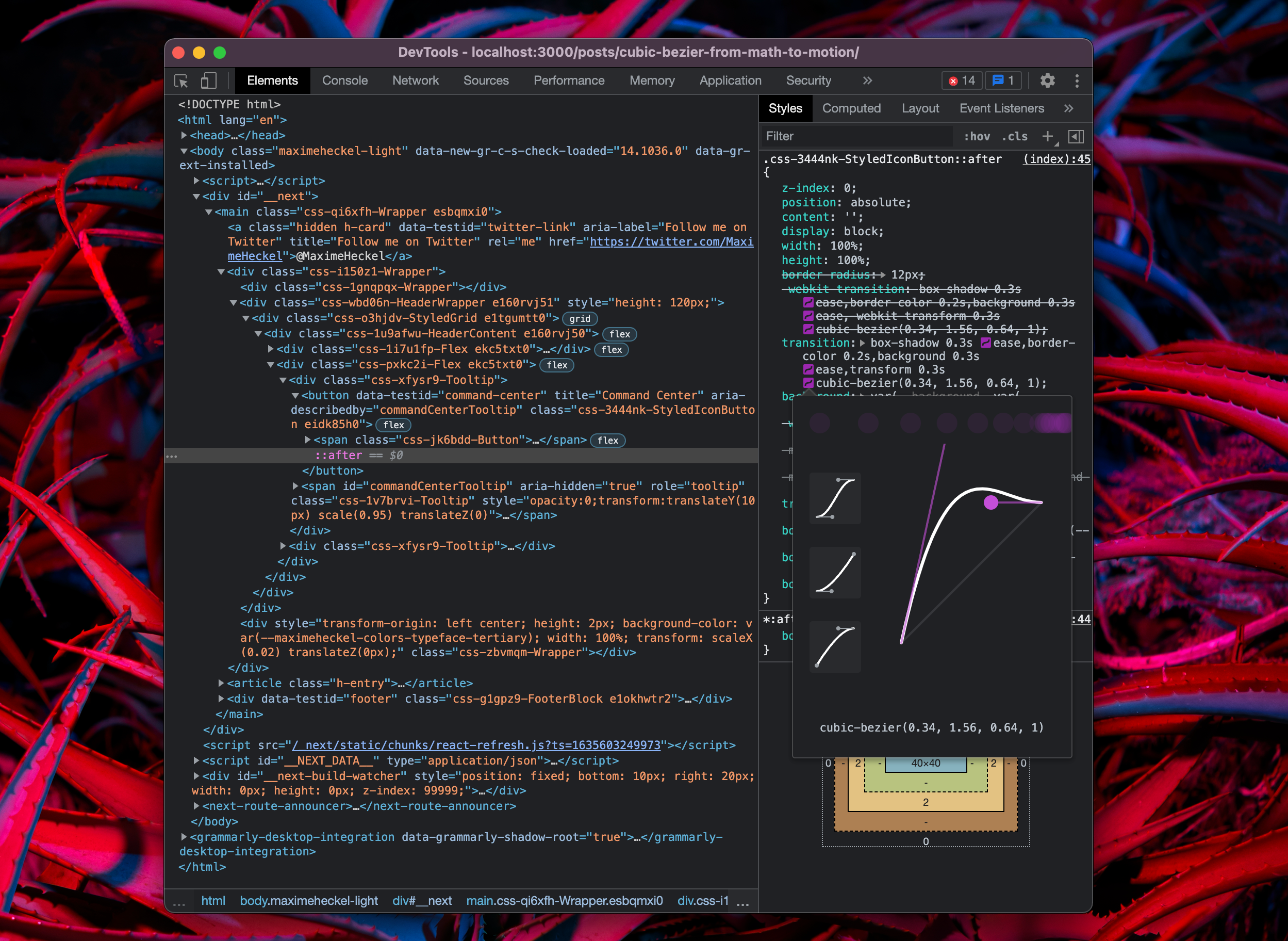
in the Chrome Dev tools or other awesome frontend tools such as Leva
Design tools like Figma, to draw anything from curves, shapes, and even fonts!
I hope this blog post satisfied your curiosity and helped you learn some of the cool things that hide behind the tools we use on a day-to-day basis. You can now play with the cubic-bézier function with confidence in your code and know exactly what to tweak to come up with unique / delightful transitions and animations for your components.
Quick shoutout to 3 awesome people who helped me directly or indirectly to produce this piece by sharing their own creations around this subject:
@pixelbeat who created an awesome Framer prototype to visualize easing curves
@FreyaHolmer who made an absolutely amazing Youtube video about Bézier curves. She goes way further into the weeds than this article, thus I highly recommend checking this video out if you want to go further. Her way of illustrating and explaining these complex concepts is really inspiring.
此内容由惯性聚合(RSS阅读器)自动聚合整理,仅供阅读参考。 原文来自 — 版权归原作者所有。