


This article was based on a previous draft of WCAG 2.2 and is no longer valid. I’m keeping it here for posterity, outlining the good ideas from the previous version, even though it was not thought practical in all cases.
I think it is fair to say that some folks aren’t very happy with the focus-appearance criterion proposed in WCAG 2.2. Hidde thought it adds too much complexity, and Eric didn’t rate it.
I think everyone sees the value of having good focus indicators, so I’m taking the comments as a challenge to provide the easiest possible way of explaining the criterion and how to test it. Eric wants to do a good explanation in an hour, I’m going to aim for 15 minutes.
Below is a video of a presentation on focus appearance, below that is the text equivalent.
You can also view the video on Youtube if the basic video player above doesn’t work well enough.
There are three main things that appear to affect the visibility of a focus indicator, with poor examples shown as the middle item of each:



Without capturing each of these factors in the criterion, it would allow invisible (or poorly visible) indicators.
If you just want to be sure you are passing, sod the detail, these are some safe indicators:
That last one doesn’t have ‘adjacent contrast’, but when you’re adding a 2px thick indicator, the button is getting larger by 4px in height and width. That just crosses over the baseline of visibility we were aiming for.
The full criterion text is in the draft spec of WCAG 2.2. It is in three parts:
The easier to understand bullets say the indicator needs to enclose the component, have a change of contrast (at least 3:1), and adjacent contrast.
If you have a component with a light background, a simple dark outline will work. If the component has a dark background, you’ll need to separate it slightly from the component.

If that’s a reasonable indicator for your site, that’s it, job done.
However, if you wish to use a different form of indicator, you’ll need to read the second part.
The first bullet contains two area calculations, you can use either, the first is:
An area of the focus indicator meets all the following:
- is at least as large as the area of a 1 CSS pixel thick perimeter of the unfocused component or sub-component
It is asking for an area that is proportional to the component, in this case the perimeter. Imagine a 1px line around it, what area is that?
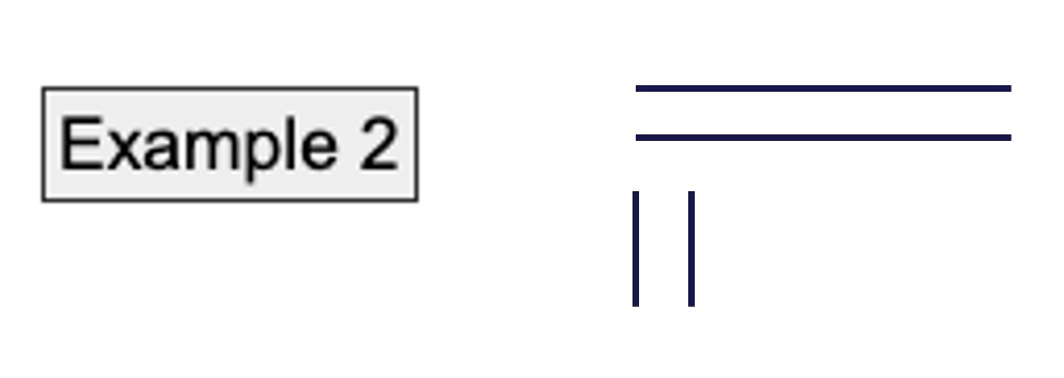
For example, a 25 by 100px button requires an indicator area of 25+25+100+100 = 250px.
Technically we need to take off 4px for the corners as they overlap, so it is 246px. However, if you are relying on 4 pixels you have bigger problems. If it is that close, pick a different indicator!
The second size metric you can use is:
at least as large as a 4 CSS pixel thick line along the shortest side of the minimum bounding box of the unfocused component
This metric is useful for indicators that are quite thick, but not proportional to the length of the control. When the length of the control varies with the text, this type of indicator provides a stable area.
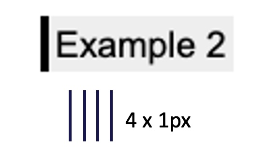
With the same example button, a 25 by 100px button requires an indicator area of 25 x 4 = 100px. This allows some buffer for indicators just under the perimeter metric, e.g. an inner outline.
The “minimum bounding box” aspect is useful for non-rectangular shapes which have a larger perimeter, and to simplify testing. If the shape were a star it would have a large perimeter. On the other hand, a circle actually has a smaller perimeter than the bounding box.
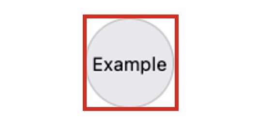
For a circle with a diameter of 100px the perimeter = 100 x 3.14 = 314px. That is less than the 4 times shortest side metric, so a circular outline is probably the best approach.
The last bullet of option 2 is slightly different from option 1:
has a contrast ratio of at least 3:1 against adjacent non-focus-indicator colors, or is no thinner than 2 CSS pixels.
This allows for 2px (or thicker) indicators that do not contrast with the component itself. It does not mean that it can lack change of contrast, only adjacent contrast. It allows for this type of indicator:

There are quite a few indicators that you can see immediately when they pass.
There are quite a few indicators that you can see immediately when they don’t pass.
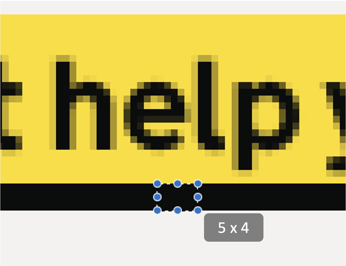
You can establish the size/thickness of most indicators by using the code inspector:
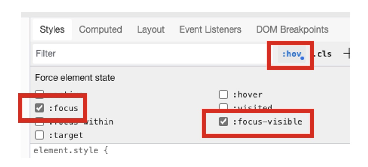
The size in CSS Pixels is reported in the “computed styles”, even if it is defined in other units in the authored CSS.
If the browser default indicator is active (not overridden by the author), you may not find the definitions, or they may not be reported accurately. If it is the default indicator and there is no change of background colour then it passes. If backgrounds have been changed, check the visual output.
Default indicators are:
If you are not familiar with CSS, you can test it visually. These are Mac based commands, but Windows has equivalents.
A couple of tricky examples I came across recently are worth working through. For example, the search input on Gov.uk.
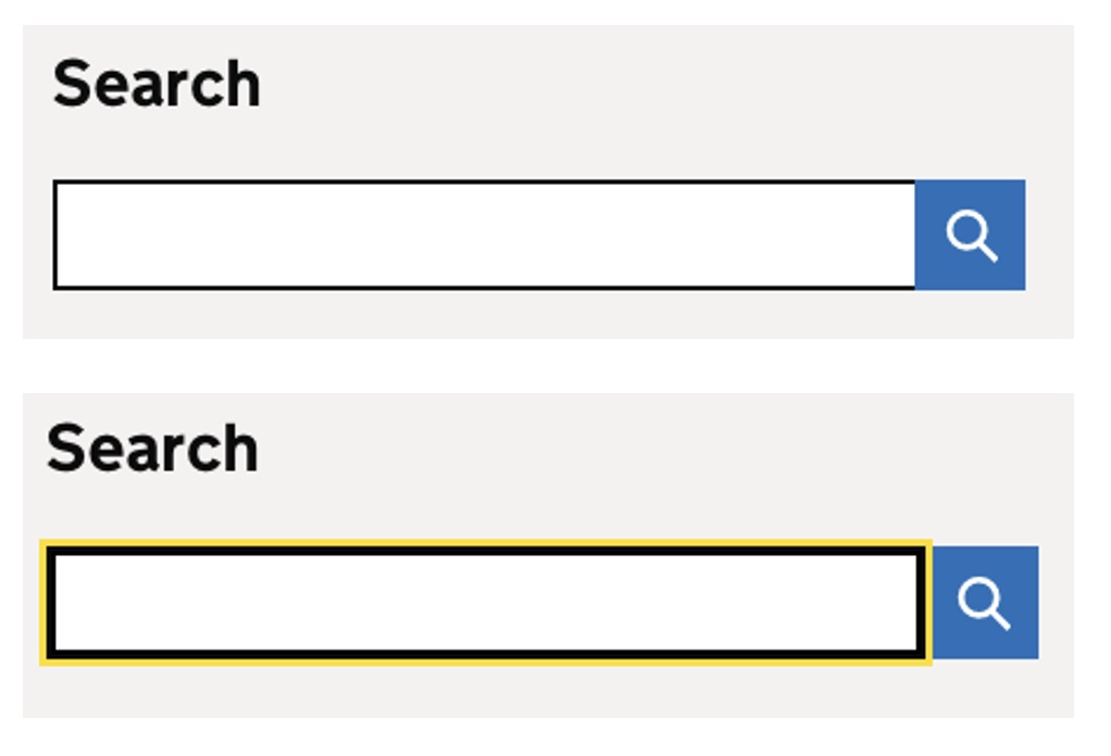
The additional yellow doesn’t have a sufficient “change of contrast”. However, the border gets substantially thicker, we can see from the code:
.search__input[type="search"]:focus {
  outline: 3px solid #fd0;     // yellow
  box-shadow: inset 0 0 0 2px; // additional 2px dark "border"
}
Although it lacks ‘adjacent’ contrast, it is 2px thick so passes.
Taking a ‘half and half’ screenshot to compare the focused / non-focused state also helps:

Another tricky example is using a dashed outline, which Microsoft does on their homepage navigation.

I started testing this in Firefox, and a 1 px dashed outline has 50% coverage of the perimeter (3 pixels ‘on’, 3 pixels ‘off’). It is not continuous, so does not pass using the option 1 bullets. The component is 55px tall by 137px wide.
Trying 4 x shortest edge, the minimum area of the indicator needs to be 55 x 4 = 220px.
The size of the indicator is (137 x 2) + (55 x 2) = 384.
Then divide by 2 due to the coverage of “dashed” indicator, so 384 / 2 = 192px.
So that was a fail, in Firefox. Not far off, but not sufficient. However, then checking in Edge (or Chrome), the dashed indicator has ~66% coverage in Edge/Chrome, so just passes!
So if you’re catering to a broad browser base, then a 1px dashed indicator is not a safe one.
A “safe” indicator would be something that passes no matter the shape of the component, such as a solid contrasting outline, or Gov.uk‘s approach of 4px thick underline.
With that type of indicator no calculations are needed, they will reliably pass.
此内容由惯性聚合(RSS阅读器)自动聚合整理,仅供阅读参考。 原文来自 — 版权归原作者所有。