


One of the great things about Microsoft Edge is that as a developer, you always know what to expect from an upcoming version. Communication is key! The platform status page gives you a by feature list of the current development status, and the Edge user voice allows you to actively influence the developers’ backlog!
I used this privilege to cast my three votes to the “Update CSS Grid” feature request. IE 10 was one of the first browsers to implement the CSS Grid specification. This specification comes from a time where Microsoft pushed the web platform hard to be a fully competitive platform for app development. And for that, it needed a proper layout mechanism. Hello, grid layouts! The original spec was pretty early and has been improved over the years. The new specification has reached candidate recommendation and has been since implement in … well, all major desktop browsers! The only one missing was Edge, until last week, when I got a notification from the Microsoft Edge Developer User Voice:
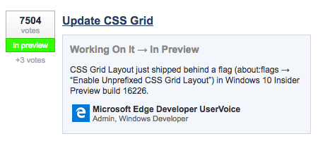
Grid is ready in one of the Edge preview builds behind a flag. So shipping and general availability is just around the corner!
There are a ton of great guides out there that go in depth with CSS grid layout. So let’s do something different and have a quick look at some major concepts. And hopefully, you will get a a good idea of what you’re dealing with before you start fiddling with all the new properties.
With both Flexbox and Grid layout one very particular thing has changed compared to the layout techniques of old. Before Flexbox and Grid we actually didn’t have a proper way to do layout, so like everything in the web, people used things meant for something completely different to achieve their goals. Enter floats and inline-blocks. Both ways were originally envisioned for text flow, but with some tweaks here and there you could bend them to create some much desired column layouts. However, both floats and inline-blocks are happening on a child level. Which is odd, it means that each element knows how it wants to be placed and hopes for its surroundings to have roughly the same idea. Bending it until it breaks.
Flexbox and Grid do it differently. You define the overall layout on a parent level. You create a system with certain rules, and the child elements have to comply. Take this example for instance:
.grid {
  display: grid;
  grid-template-columns: repeat(3, 1fr);
  grid-gap: 1.5rem;
}
The code at the parent level tells us that it wants three columns with one fraction each. And all the elements underneath it know what to do and where to be. Great! (Pen)
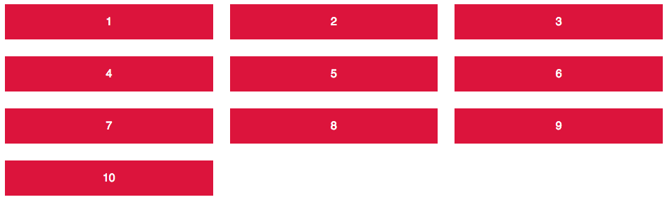
On a child level, you can define exceptions to that rule. You can make the kids rebel, and no !important can change that!
.item:nth-of-type(3) {
  background-color: turquoise;
  grid-column: 1;
  grid-row: 2;
}
The third element is one of those rebels and wants to be placed on column 1 and row 2. The basic configuration sets this item at this exact position and lets the other elements rearrange based on the parent’s rules. (Pen)
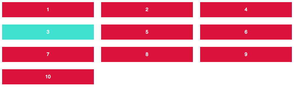
That’s the clue of the new CSS layout: Defining rules, making exceptions. Same goes for flexbox, but we will get to that another time.
Much like Flexbox is not much more than an applied space distribution algorithm (whoa, breath in, breath out), Grid layout includes a few grid cell placement algorithms. Grid’s main purpose is to place items in the rows and columns that have been defined by your CSS rules. Item placement can be done automatically.
The number of rows and columns can be changed on the fly depending on some overall constraints and rules you define. In the examples above, where we just defined some columns, grid layout switched on an automatic generation of grid rows.
This allows for lots of great layouts with no media queries attached. Since the algorithm is so powerful and flexible, it will figure out what to do on its own. Compared to the old layout techniques this is a lot more fuzzy than you might be used to, but it comes along with the flexible nature of the web really, really well.
My most favourite example is where you tell Grid to “just use as many columns as you can get, which have at least 200px”. This can be done using one single grid template:
.grid {
  display: grid;
  grid-gap: 1rem;
  grid-template-columns: repeat(auto-fill, minmax(200px, 1fr));
}
We can achieve this by using a few of the baked in grid functions. “repeat” tells us to, well… repeat this pattern a couple of times. One use case would be to enter a digit telling us how many columns we use. Another one is to use “as many as we can get”: auto-fill. The next function is to select any range between 200px minimum width and 1 fraction of the total width. The result is remarkable:
A fully flexible grid layout with no media queries at all. (Pen)
This is layout heaven! Automatic layout is also the one thing that is hugely different from the previous grid specification that’s available from IE10 onwards. With the old spec you have to place each grid item explicitely on both x- and y- axis, otherwise all items would overlap on the first position. A little bit of extra work, but a good fallback if you have to support those browsers as well. Speaking of which …
When I published the example above on Twitter a couple of weeks ago, one of the first responses were: “Great! But how do I handle that on older browsers?”. Tricky question, my definitive answer would be: “It depends”. First of all: Don’t try to recreate grid layout with other layout techniques (you know, the ones that are bending till it breaks), and even worse: Lots of JavaScript! Better use something that fits your content best.
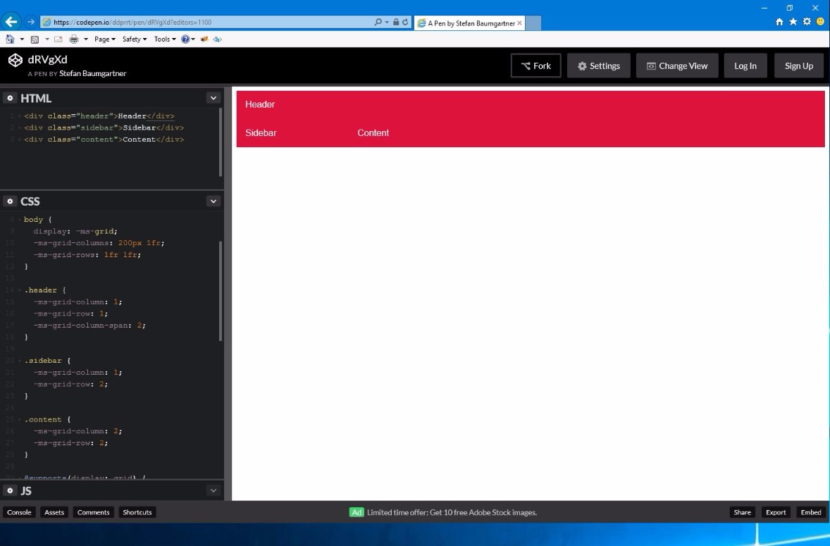
If you create an overall page layout with header, sidebar and content area, you can easily do that with the previous grid layout specification on IE10 and IE11. Arguably with some extra work to it. Check out this pen to see an example.
If you need auto layout for a responsive gallery, you might be able to have a similar effect with something like Flexbox or floats. Just don’t expect the same magic and power that you have with Grid layout. And that’s perfectly okay. If we would be able to recreate grid designs without the new CSS Grid layout, why would we need CSS Grid layout in the first place? This just doesn’t make any sense.
Find something that’s suitable for the content you want to show, but be good with little cuts in look and feel. If 90% of your users can see the work you’ve done with 10% of effort, it’s okay to give the last 10% of your users a less advanced view. Just don’t block them out. Give something their browsers can digest easily.
With that, I invite you to start using CSS Grid layout now! It’s a lot of fun to use and makes layout as easy as possible.
此内容由惯性聚合(RSS阅读器)自动聚合整理,仅供阅读参考。 原文来自 — 版权归原作者所有。