


In modern days we have two primary options for moving an element across the screen:
translate()position:absolute and top/leftChris Coyier was asked why you should use translate. Go read his response which covers well why it’s more logical to move elements for design purposes (with transform) independent of your element layout (with position).
I wanted to answer this with Chrome and get some good evidence on what’s going on. I ended up recording a video on the experience:
It’s a good watch and dives into Chrome DevTools’ Timeline, compositing, paint cost, accelerated layers, and more… but if you want the abbreviated text version, read on:
First thing, Chris made some simple demos to try things out:

This sorta works, but there is such low complexity in this situation that it’s all going to look pretty great. We need something closer to a complex website to properly evaluate the two (thx joshua for the macbook!):


Now we’re starting to get closer, but immediately I get distracted by something.
If you run the demo above you might notice the top edge of the MacBook looks a little bit better in the top/left one. (And here I am writing a post about why translate is better! Preposterous!) So this is due to the absolute positioned macbook sticks to pixel positions, whereas the translate()‘d one can interpolate at sub-pixel positions.
One of the Chrome GPU engineers, James Robinson, called this the “dubstep effect”, as these pixels appear to be getting pounded by bass. Here’s a closeup of the effect… watch the top white edge of the macbook in each:

On the left, you see stair-stepping down three pixels and back up again. This pixel snapping may result in a less distracting transition in this case, though this wouldn’t be so noticeable if you were moving objects with less of a high-contrast situation.
If you run DevTool’s Timeline Frames mode on these two examples here, they start to tell a very different story:
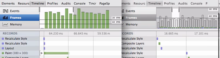
The top/left has very large time to paint each frame, which results in a choppier transition. All the CSS including some big box shadows, are computed on the CPU and composited against that gradient backdrop every frame. The translate version, on the other hand, gets the laptop element elevated onto it’s own layer on the GPU (called a RenderLayer). Now that it sits on its own layer, any 2D transform, 3D transform, or opacity changes can happen purely on the GPU which will stay extremely fast and still get us quick frame rates.
Watch the video above towards the end to see more on how to diagnose paint costs, see what areas are being repainted, and evaluate what elements are on the GPU.
Click through below, try adding more and see how the the framerate reacts. Feel free to open up DevTools, too and explore Timeline:


requestAnimationFrame. Avoid setTimeout, setInterval.animate()-style) if you can, declarative animations in CSS can be optimized by the browser way more.此内容由惯性聚合(RSS阅读器)自动聚合整理,仅供阅读参考。 原文来自 — 版权归原作者所有。