
惯性聚合 高效追踪和阅读你感兴趣的博客、新闻、科技资讯
阅读原文 在惯性聚合中打开

推荐订阅源

WordPress大学
WordPress大学
Security Latest
Security Latest
C
Cisco Blogs
P
Palo Alto Networks Blog
Know Your Adversary
Know Your Adversary
Project Zero
Project Zero
C
Cyber Attacks, Cyber Crime and Cyber Security
NISL@THU
NISL@THU
Exploit-DB.com RSS Feed
S
Secure Thoughts
P
Privacy International News Feed
V
Vulnerabilities – Threatpost
D
Docker
Google Online Security Blog
K
KPMG report finds enterprise disconnect between AI and its ROI | CIO
Recent Announcements
T
The Exploit Database - CXSecurity.com
G
Google Developers Blog
Schneier on Security
小众软件
小众软件
爱范儿
爱范儿
GbyAI
GbyAI
J
Java Code Geeks
T
Tailwind CSS Blog
Cisco Talos Blog
Cisco Talos Blog
The Hacker News
The Hacker News
D
DataBreaches.Net
Blog — PlanetScale
Blog — PlanetScale
TaoSecurity Blog
TaoSecurity Blog
MyScale Blog
MyScale Blog
B
Blog RSS Feed
Cyberwarzone
Cyberwarzone
有赞技术团队
有赞技术团队
Martin Fowler
Martin Fowler
C
CXSECURITY Database RSS Feed - CXSecurity.com
S
Securelist
L
Lohrmann on Cybersecurity
cs.CL updates on arXiv.org
Y
Y Combinator Blog
S
Schneier on Security
Latest news
Latest news
Apple Machine Learning Research
博客园 - 叶小钗
F
Fortinet All Blogs
M
MIT News - Artificial intelligence
PCI Perspectives
PCI Perspectives
V
V2EX
V2EX - 技术
V2EX - 技术
O
OpenAI News
W
WeLiveSecurity

Stuff & Nonsense Blog feed

The camera that took me places - Stuff & Nonsense Last week in the studio (CW27-26) - Stuff & Nonsense Last week in the studio (CW26-26) - Stuff & Nonsense Tracking down a nasty Netlify bandwidth burner - Stuff & Nonsense Last week in the studio (CW25-26) - Stuff & Nonsense Eleventy in a Box. A premium Eleventy start kit - Stuff & Nonsense Migrating from Statamic to Eleventy. This site’s had major surgery - Stuff & Nonsense Last week in the studio (CW24-26) - Stuff & Nonsense Last week in the studio (CW21-26) - Stuff & Nonsense Last week in the studio (CW20-26) - Stuff & Nonsense Last week in the studio (CW19-26) - Stuff & Nonsense Websites shouldn’t need maintenance. They need momentum. - Stuff & Nonsense Making my view options toolbar more intuitive - Stuff & Nonsense Unfinished Business #142: The perfect request for proposal - Stuff & Nonsense Last week in the studio (CW18-26) - Stuff & Nonsense Eleventy in a Box just add water - Stuff & Nonsense Last week in the studio (CW17-26) - Stuff & Nonsense I added a spring mode to my animated SVG landscape - Stuff & Nonsense Last week in the studio (CW16-26) - Stuff & Nonsense Far Right So Wrong; Stop Reform t-shirts are back in my shop - Stuff & Nonsense Last week in the studio (CW15-26) - Stuff & Nonsense I got tired of correcting machines, so I gave them five rules - Stuff & Nonsense How I designed an information-rich website for The Shared Homeland Paradigm - Stuff & Nonsense A bold new website for the Academy of Scoring Arts - Stuff & Nonsense
Militant masthead logo (r)evolution - Stuff & Nonsense
Andy Clarke, Stuff & Nonsense Ltd. · 2026-04-30 · via Stuff & Nonsense Blog feed

Militant masthead logo (r)evolution

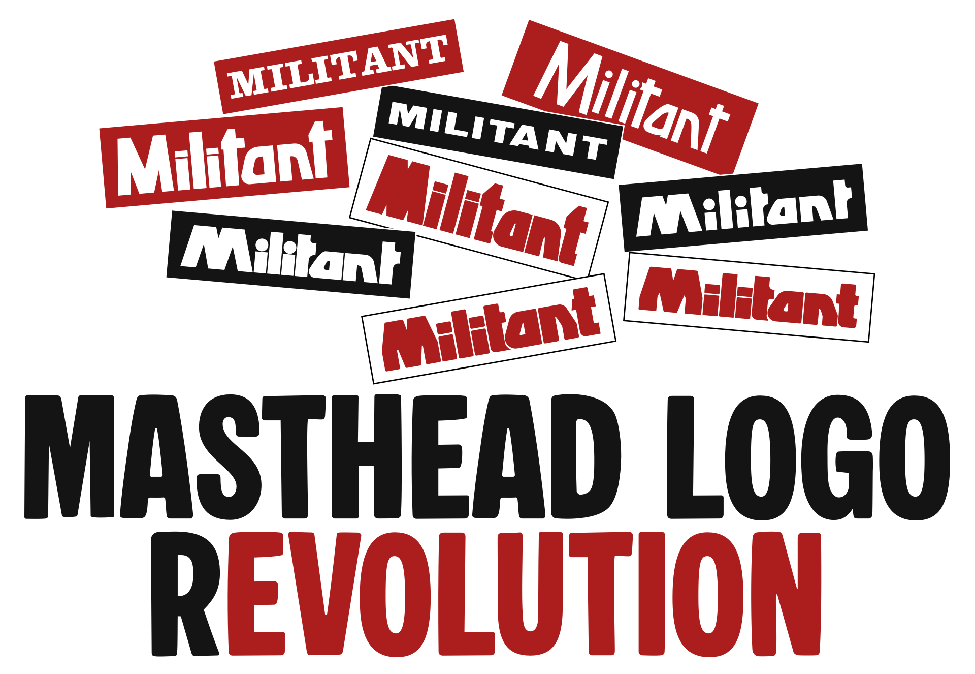
Militant was a British socialist newspaper associated with the Militant ‘tendency,’ a left-wing political movement whose members were ultimately expelled from the mainstream Labour Party. I looked back at how the Militant masthead logo evolved between 1964 and 1997.

I grew up in a steelmaking town during the late seventies and eighties, at a time when Margaret Thatcher’s Tory government was waging its war against trade unions and the working class. So it’s no surprise I embraced socialist politics, and as a teenager, I joined the Labour Party Young Socialists and at weekends I sold its Militant newspaper.
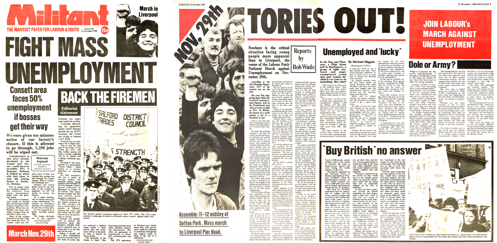
Militant newspaper, published the day after my birthday in November 1980.

The Militant newspaper was launched in 1964 and took its name from the American Socialist Workers Party’s publication. For the first few years, its masthead logo featured a slab serif typeface and the tagline “For Youth and Labour.”

Slab serif Militant masthead logo 1964–65

The slab serif lasted six years; in June of 1970, it was replaced by a bold sans-serif, uppercase, with kerning between the “A” and “N” that you could drive a coal delivery truck through.
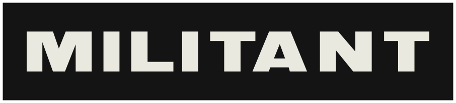
Sans serif masthead logo 1970–71

Less than a year later, in September 1970, the short-lived sans-serif was again replaced with a more characterful, hand-drawn logotype. This included round tittles over the “I”s, one of which cut into the first “T”’s crossbar. Those “T”s are asymmetric, and the lowercase “A” and “N” were slanted.
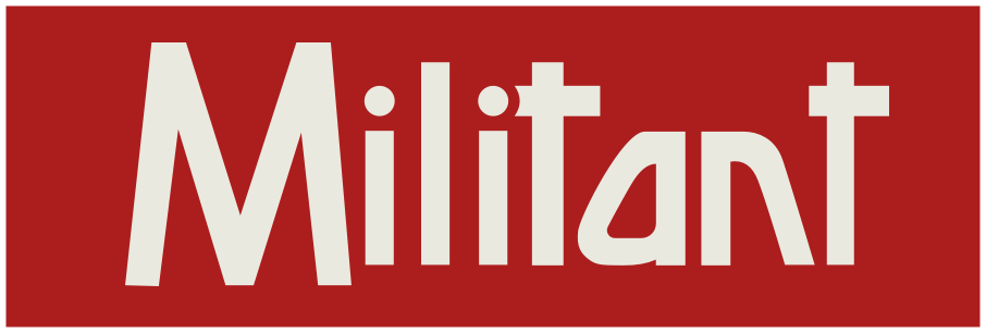
Hand-drawn masthead logo 1971

Strokes were thickened only a few months later, and while the slanted “A” and “N” were retained, the round tittles were replaced with rectangular shapes, and the apex of the “T”s sat on top of shorter crossbars.

Thick-stroked masthead logo 1972

This logotype was revised again a year later in November 1973, with a smaller closed counter in the “A”, tighter tracking, increased x-height, and far smaller open counters around the “M.”
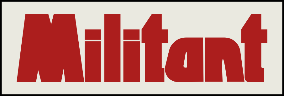
Revised masthead logo 1973

In early 1978, the masthead logo was altered again, adopting a contemporary, rounded look. Round tittles made a comeback, the “M” was widened, and the two “T”s lost one arm of their crossbars. It was a thorough modernisation, with only the slanted “A” and “N” from the previous version remaining.
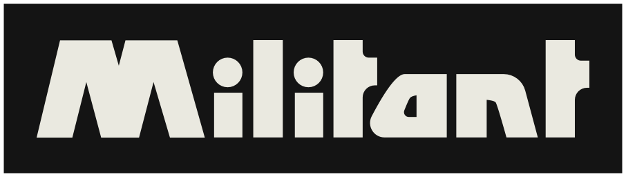
Contemporary masthead logo 1978

Seemingly unable to resist iterating on this design, three months later in June of 1978, Militant tightened the tracking and the corner radii, creating a more graphic, solid-looking logotype.
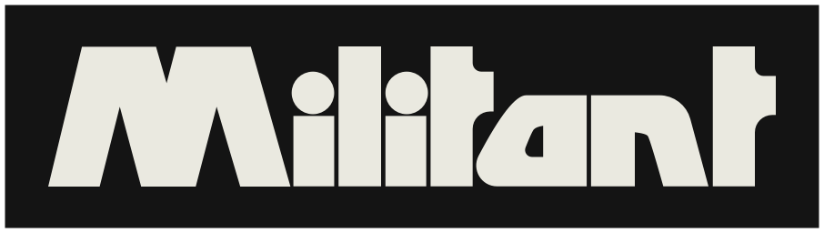
Revised masthead logo 1978

Then, in January of the following year, Militant’s logotype changed again. The circular tittles were gone (again,) and for the first time, there were two different “T” shapes. This time, the first “T” had an asymmetric crossbar to avoid it colliding with the “I”’s now rectangular tittle. Also noticeable was the slight curve at the bottom of its stem to wrap it around the “A.” There was also a new angle added to the “M” and “N”’s strokes.
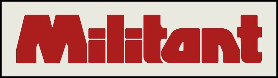
Angular masthead logo 1979

Clearly happy with these refinements, Militant stuck with this version of their logotype for the rest of the newspapers run, before it became The Paper of the Socialist Party in 1997.
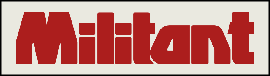
Iconic masthead logo 1979–1997

Only subtle changes to its angles and a more pronounced wrapping of that first “T” underneath the “A” were made over its almost 20-year lifespan.


I know nothing about who designed or worked on Militant’s design over those decades, but I found it fascinating to look back over the choices those people made. If you know anything about Militant’s designers, I’d love to hear from you (or them.)

Note: Marxist.org has an archive of many scanned copies of Militant from its start in 1964 through to 1997.


April 29, 2026 • Andy Clarke • designpolitics, custom

You might also like