





Admin dashboards are one of the most common real-world UI components you will build as a React developer. At the heart of nearly every dashboard is a sidebar, a persistent navigation panel that organizes pages, tools, and features into a clean, scannable structure.
Building a sidebar from scratch involves much more than an <nav> element. You need collapsible submenus, active state tracking across parent and child items, accessible keyboard navigation, a scroll area for long nav lists, and a consistent design system that holds together across screen sizes.
In this tutorial, you'll learn how to build a fully functional, accessible admin dashboard sidebar using shadcn/ui, a collection of beautifully designed, accessible React components, and a pre-built community block from Shadcn Space, which extends shadcn/ui with ready-to-use dashboard UI patterns.
By the end of this tutorial, you'll have a working sidebar that includes:
Grouped navigation sections with uppercase labels
Collapsible parent menu items with child links
Active state tracking across both parent and child items
A floating sidebar with an independent scroll area
A promotional card pinned inside the sidebar footer
Table of Contents
Prerequisites
Before you start, make sure you have the following:
Node.js 18+ installed on your machine
Basic knowledge of React and TypeScript
Familiarity with Tailwind CSS utility classes
A package manager installed (npm, pnpm, yarn, or bun)
You don't need prior experience with shadcn/ui, but it helps to have read through the official docs at least once.
What You Will Build
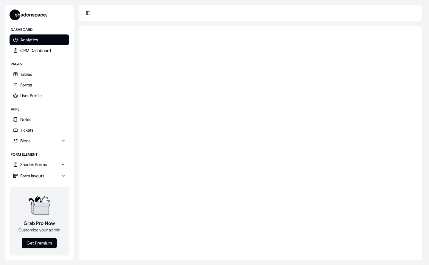
In this article, you'll build a fully functional admin dashboard sidebar with the following features:
Floating sidebar shell: a card-style sidebar with rounded corners, a drop shadow, and a configurable width
Grouped navigation: navigation items organized under section labels like Dashboards, Pages, Apps, and Form Elements
Collapsible submenus: parent items like Blogs and Shadcn Forms that expand on click to reveal child links
Active state tracking: visual highlighting of the selected parent and child item at all times
Sidebar toggle: a trigger button in the page header that opens and closes the sidebar
Promotional card: a "Get Premium" card at the bottom of the sidebar scroll area
shadcn/ui is a collection of beautifully designed, accessible React components built on top of Radix UI and styled with Tailwind CSS.
Instead of installing a traditional component library as a dependency, you copy components directly into your project using a CLI. This gives you full ownership of the code structure and styling. You can read every line, change anything, and the components never break because of a library update you didn't control.
Some key benefits of shadcn/ui include:
Accessible by default, built on Radix and Base UI primitives
Fully styled with Tailwind CSS utility classes
Zero lock-in: the code lives in your project, not inside
node_modulesWorks with Next.js, React, Astro, Vite, and other frameworks
A growing ecosystem of community-built blocks and registries
The Sidebar, Collapsible, ScrollArea, Card, and Button Components you'll use in this tutorial all come from shadcn/ui.
What is Shadcn Space?
Shadcn Space is an open-source library of pre-built UI blocks built on top of shadcn/ui. It provides ready-to-use dashboard layouts, sidebars, tables, cards, and other common admin UI patterns so you don't have to assemble them from individual primitives every time.
Each block in Shadcn Space is installable directly into your project using the shadcn CLI. Once installed, the code is yours: you can read it, extend it, and adapt it to your design system without any runtime dependency on Shadcn Space itself.
For this tutorial, you'll use the sidebar-06 block (it’s free to use), which is a floating admin sidebar with grouped navigation, collapsible submenus, and an integrated scroll area.
Shadcn Space also provides a companion Figma UI Kit that matches the design system used in the blocks, which is useful if you do design work alongside development.
You can explore the full block library and the getting-started documentation in the official Shadcn Space docs.
How to Set Up the Project
Start by creating a new Next.js project if you don't already have one:
npx shadcn@latest init --preset b0 --base base --template next
This command:
Creates a Next.js project
Configures Tailwind CSS
Sets up Base UI as the component foundation
Uses Nova style preset
Configures Lucide icons
Uses Inter font
Applies neutral theme tokens
Follow the prompts to configure your base color, CSS variables, and component output directory. This sets up the components/ui directory and the required Tailwind configuration that all shadcn/ui components depend on.
Once the initialization is complete, your components.json project will be created at the root of your project. This file tells the shadcn CLI where to place components, what path aliases you're using, and which styling configuration to follow.
Add this in components.json:
{
  "registries": {
    "@shadcn-space": {
      "url": "https://shadcnspace.com/r/{name}.json",
    }
  }
}
With shadcn/ui initialized, you can now pull in the sidebar-06 block from Shadcn Space. While Shadcn Space provides components for both Radix UI and Base UI, this tutorial uses the Base UI version. Run one of the following commands depending on your package manager:
npm:
npx shadcn@latest add @shadcn-space/sidebar-06
pnpm:
pnpm dlx shadcn@latest add @shadcn-space/sidebar-06
yarn:
yarn dlx shadcn@latest add @shadcn-space/sidebar-06
bun:
bunx --bun shadcn@latest add @shadcn-space/sidebar-06
This command fetches the block from the Shadcn Space registry and scaffolds all the required component files into your project automatically. It also installs any shadcn/ui primitives the block depends on (such as Sidebar, ScrollArea, Card, Button, and Collapsible) if they aren't already present in your components/ui directory.
You can preview the live block and find the installation command on their shadcn sidebar page.
How to Understand the Folder Structure
After installation, your project will contain the following new files:
app/
  sidebar-06/
    page.tsx                  ← Route entry point
assets/
  logo/
    logo.tsx                  ← Logo component
components/
  shadcn-space/
    blocks/
      sidebar-06/
        app-sidebar.tsx       ← Main sidebar shell
        nav-main.tsx          ← Navigation logic and rendering
Each file has a clearly defined responsibility:
app/sidebar-06/page.tsx: the route entry point that wires the sidebar into a page layout using SidebarProviderassets/logo/logo.tsx: the logo component rendered in the sidebar headercomponents/shadcn-space/blocks/sidebar-06/app-sidebar.tsx: the main sidebar shell, including the header, scroll area, nav data, and promotional cardcomponents/shadcn-space/blocks/sidebar-06/nav-main.tsx: all navigation rendering logic, including section labels, leaf items, collapsible parents, and active state management
You'll work through each of these files in detail in the sections below.
How to Build the Page Layout
Open app/sidebar-06/page.tsx. This file is the entry point for your dashboard page. It uses SidebarProvider to establish sidebar context across the page, and SidebarTrigger to render a toggle button inside the header.
import { SidebarProvider, SidebarTrigger } from "@/components/ui/sidebar";
import { AppSidebar } from "@/components/shadcn-space/blocks/sidebar-06/app-sidebar";

const Page = () => {
  return (
    <SidebarProvider
      className="p-4 bg-muted"
      style={{ "--sidebar-width": "300px" } as React.CSSProperties}
    >
      <AppSidebar />

      {/* Main content area */}
      <div className="flex flex-1 flex-col gap-4">
        <header className="flex h-14 shrink-0 items-center gap-2 rounded-xl bg-background px-4 shadow-sm">
          <SidebarTrigger className="cursor-pointer" />
        </header>
        <main className="flex-1 rounded-xl bg-background" />
      </div>
    </SidebarProvider>
  );
};

export default Page;
Let's break down the key parts of this layout:
SidebarProvider wraps everything on the page. It manages the sidebar's open/closed state and passes it down to child components via React context. Any component that needs to read or change the sidebar state, including SidebarTrigger and AppSidebar, must be a descendant of SidebarProvider.
The --sidebar-width CSS custom property controls the rendered width of the sidebar. It's set inline using a type assertion (as React.CSSProperties) because TypeScript doesn't know about this custom property by default. Setting it here rather than in a CSS file keeps the width configurable on a per-page basis.
SidebarTrigger is a toggle button component that reads the sidebar open/closed state from the nearest SidebarProvider context and flips it on click. It renders in the header so users always have access to the toggle regardless of scroll position.
bg-muted on SidebarProvider creates the light gray outer background that makes the floating sidebar card visually stand out from the page.
Open components/shadcn-space/blocks/sidebar-06/app-sidebar.tsx. This component is the main sidebar shell. It composes shadcn/ui's Sidebar, SidebarHeader, and SidebarContent layout primitives and wraps the scrollable navigation area in a ScrollArea component to handle overflow independently.
"use client";

import {
  Sidebar,
  SidebarContent,
  SidebarHeader,
  SidebarMenu,
  SidebarMenuItem,
} from "@/components/ui/sidebar";
import { ScrollArea } from "@/components/ui/scroll-area";
import { Card, CardContent } from "@/components/ui/card";
import { Button } from "@/components/ui/button";
import Logo from "@/assets/logo/logo";
import { NavItem, NavMain } from "@/components/shadcn-space/blocks/sidebar-06/nav-main";
import {
  AlignStartVertical,
  PieChart,
  CircleUserRound,
  ClipboardList,
  Notebook,
  NotepadText,
  Table,
  Languages,
  Ticket,
} from "lucide-react";
The "use client" directive at the top is required because this component uses React state (through NavMain) and event handlers, both of which require the component to run in the browser rather than being server-rendered by Next.js.
How to Define the Navigation Data
Inside app-sidebar.tsxthe navigation structure is defined as a flat array of NavItem objects. Each item belongs to one of three categories:
A section label marked with
isSection: trueand alabelstring. Renders as an uppercase group heading.A leaf item has a
title, icon, andhref, but nochildren. Renders as a direct navigation link.A parent item has a
title, icon, and achildrenarray of sub-items. Renders as a collapsible trigger.
export const navData: NavItem[] = [
  // Dashboards Section
  { label: "Dashboards", isSection: true },
  { title: "Analytics", icon: PieChart, href: "#" },
  { title: "CRM Dashboard", icon: ClipboardList, href: "#" },

  // Pages Section
  { label: "Pages", isSection: true },
  { title: "Tables", icon: Table, href: "#" },
  { title: "Forms", icon: ClipboardList, href: "#" },
  { title: "User Profile", icon: CircleUserRound, href: "#" },

  // Apps Section
  { label: "Apps", isSection: true },
  { title: "Notes", icon: Notebook, href: "#" },
  { title: "Tickets", icon: Ticket, href: "#" },
  {
    title: "Blogs",
    icon: Languages,
    children: [
      { title: "Blog Post", href: "#" },
      { title: "Blog Detail", href: "#" },
      { title: "Blog Edit", href: "#" },
      { title: "Blog Create", href: "#" },
      { title: "Manage Blogs", href: "#" },
    ],
  },

  // Form Elements Section
  { label: "Form Elements", isSection: true },
  {
    title: "Shadcn Forms",
    icon: NotepadText,
    children: [
      { title: "Button", href: "#" },
      { title: "Input", href: "#" },
      { title: "Select", href: "#" },
      { title: "Checkbox", href: "#" },
      { title: "Radio", href: "#" },
    ],
  },
  {
    title: "Form layouts",
    icon: AlignStartVertical,
    children: [
      { title: "Forms Horizontal", href: "#" },
      { title: "Forms Vertical", href: "#" },
      { title: "Forms Validation", href: "#" },
      { title: "Forms Examples", href: "#" },
      { title: "Forms Wizard", href: "#" },
    ],
  },
];
This flat array approach is intentionally simple to maintain. You don't need a nested tree structure because the NavMain component handles the rendering logic for each item type by inspecting each item's shape. Adding a new section, item, or submenu is as straightforward as appending a new object to the array.
How to Build the NavMain Component
Open components/shadcn-space/blocks/sidebar-06/nav-main.tsx. This file contains all the navigation rendering logic. Start with the type definition and the top-level NavMain function:
"use client";

import * as React from "react";
import { ChevronRight, LucideIcon } from "lucide-react";
import { cn } from "@/lib/utils";
import {
  Collapsible,
  CollapsibleTrigger,
  CollapsibleContent,
} from "@/components/ui/collapsible";
import {
  SidebarGroup,
  SidebarGroupLabel,
  SidebarMenu,
  SidebarMenuButton,
  SidebarMenuItem,
  SidebarMenuSub,
  SidebarMenuSubItem,
  SidebarMenuSubButton,
} from "@/components/ui/sidebar";

export type NavItem = {
  label?: string;
  isSection?: boolean;
  title?: string;
  icon?: LucideIcon;
  href?: string;
  children?: NavItem[];
};

export function NavMain({ items }: { items: NavItem[] }) {
  const [activeParent, setActiveParent] = React.useState<string | null>(
    items.find((i) => !i.isSection)?.title || null
  );
  const [activeChild, setActiveChild] = React.useState<string | null>(null);

  return (
    <>
      {items.map((item, index) => (
        <NavMainItem
          key={item.title || item.label || index}
          item={item}
          activeParent={activeParent}
          setActiveParent={setActiveParent}
          activeChild={activeChild}
          setActiveChild={setActiveChild}
        />
      ))}
    </>
  );
}
activeParent tracks which top-level nav item is currently selected. It initializes to the title of the first non-section item, so the sidebar always has a selection on first render, and you never show the sidebar with nothing highlighted. activeChild tracks which sub-item inside a collapsible menu is selected.
Both state values are passed down as props to each NavMainItem, so every item in the list can read the current selection and trigger updates to it.
How to Handle Active States and Collapsible Menus
The NavMainItem function branches into one of three rendering paths based on the shape of the incoming item.
How to Render Section Labels
if (item.isSection && item.label) {
  return (
    <SidebarGroup className="p-0 pt-5 first:pt-0">
      <SidebarGroupLabel className="p-0 text-xs font-medium uppercase text-sidebar-foreground">
        {item.label}
      </SidebarGroupLabel>
    </SidebarGroup>
  );
}
Section labels use first:pt-0 to remove the top padding from the very first section, so the nav starts flush with the header.
How to Render Collapsible Parent Items
if (hasChildren && item.title) {
  return (
    <SidebarGroup className="p-0">
      <SidebarMenu>
        <Collapsible open={isOpen} onOpenChange={setIsOpen}>
          <SidebarMenuItem>
            <CollapsibleTrigger
              className="w-full"
              render={
                <SidebarMenuButton
                  id={`nav-main-trigger-${item.title.toLowerCase().replace(/\s+/g, '-')}`}
                  tooltip={item.title}
                  isActive={isParentActive}
                  onClick={() => setActiveParent(item.title!)}
                  className={cn(
                    "rounded-md text-sm font-medium px-3 py-2 h-9 transition-colors cursor-pointer",
                    isParentActive ? "bg-primary! text-primary-foreground!" : ""
                  )}
                >
                  {item.icon && <item.icon size={16} />}
                  <span>{item.title}</span>
                  <ChevronRight
                    className={cn(
                      "ml-auto transition-transform duration-200",
                      isOpen && "rotate-90"
                    )}
                  />
                </SidebarMenuButton>
              }
            />
            <CollapsibleContent>
              <SidebarMenuSub className="me-0 pe-0">
                {item.children!.map((child, index) => (
                  <NavMainSubItem
                    key={child.title || index}
                    item={child}
                    activeParent={activeParent}
                    setActiveParent={setActiveParent}
                    activeChild={activeChild}
                    setActiveChild={setActiveChild}
                    parentTitle={item.title}
                  />
                ))}
              </SidebarMenuSub>
            </CollapsibleContent>
          </SidebarMenuItem>
        </Collapsible>
      </SidebarMenu>
    </SidebarGroup>
  );
}
A useEffect inside NavMainItem syncs the local isOpen state with activeParent so that when a different parent is activated, the previously open collapsible stays open until the user explicitly closes it:
React.useEffect(() => {
  if (isParentActive) {
    setIsOpen(true);
  }
}, [isParentActive]);
The ChevronRight icon rotates 90 degrees when the submenu is open, using a Tailwind transition class:
<ChevronRight
  className={cn(
    "ml-auto transition-transform duration-200",
    isOpen && "rotate-90"
  )}
/>
How to Render Leaf Items
if (item.title) {
  return (
    <SidebarGroup className="p-0">
      <SidebarMenu>
        <SidebarMenuItem>
          <SidebarMenuButton
            id={`nav-main-button-${item.title.toLowerCase().replace(/\s+/g, '-')}`}
            tooltip={item.title}
            isActive={isParentActive}
            onClick={() => {
              setActiveParent(item.title!);
              setActiveChild(null);
            }}
            className={cn(
              "rounded-md text-sm font-medium px-3 py-2 h-9 transition-colors cursor-pointer",
              isParentActive ? "bg-primary! text-primary-foreground!" : ""
            )}
            render={<a href={item.href} />}
          >
            {item.icon && <item.icon />}
            {item.title}
          </SidebarMenuButton>
        </SidebarMenuItem>
      </SidebarMenu>
    </SidebarGroup>
  );
}
The render prop on SidebarMenuButton replaces the default button element with an <a> tag. This preserves correct anchor link semantics and accessibility while keeping the button's visual styling. When a leaf item is clicked, activeChild is reset to null since there is no child to track.
The NavMainSubItem function handles sub-items inside a collapsible. When a child is clicked, it sets both activeChild to itself and activeParent to its parent's title so the parent item remains visually highlighted:
if (item.title) {
  return (
    <SidebarMenuSubItem className="w-full">
      <SidebarMenuSubButton
        id={`nav-sub-button-${item.title.toLowerCase().replace(/\s+/g, '-')}`}
        className={cn(
          "w-full rounded-md transition-colors",
          activeChild === item.title ? "bg-muted! text-foreground!" : ""
        )}
        isActive={activeChild === item.title}
        onClick={() => {
          setActiveParent(parentTitle || "");
          setActiveChild(item.title!);
        }}
        render={<a href={item.href}>{item.title}</a>}
      />
    </SidebarMenuSubItem>
  );
}
The child uses a different active style (bg-muted with text-foreground) compared to the parent (bg-primary with text-primary-foreground). This visual distinction makes it easy to see both which section you are in and which specific page is currently active.
Sub-items also support nesting. If a child item itself has a children array, NavMainSubItem renders another Collapsible with a nested SidebarMenuSub, allowing you to build multi-level navigation trees without any changes to the data structure.
The full AppSidebar render function puts all of the pieces together:
export function AppSidebar() {
  return (
    <Sidebar variant="floating" className="p-4 h-full [&_[data-slot=sidebar-inner]]:h-full">
      <div className="flex flex-col gap-6 overflow-hidden">

        {/* Header with Logo */}
        <SidebarHeader className="px-4">
          <SidebarMenu>
            <SidebarMenuItem>
              <a href="#" className="w-full h-full">
                <Logo />
              </a>
            </SidebarMenuItem>
          </SidebarMenu>
        </SidebarHeader>

        {/* Scrollable Navigation Content */}
        <SidebarContent className="overflow-hidden">
          <ScrollArea className="h-[calc(100vh-100px)]">
            <div className="px-4">
              <NavMain items={navData} />
            </div>

            {/* Promotional Card */}
            <div className="pt-5 px-4">
              <Card className="shadow-none ring-0 bg-secondary px-4 py-6">
                <CardContent className="p-0 flex flex-col gap-3 items-center">
                  <img
                    src="https://images.shadcnspace.com/assets/backgrounds/download-img.png"
                    alt="sidebar-img"
                    width={74}
                    height={74}
                    className="h-20 w-20"
                  />
                  <div className="flex flex-col gap-4 items-center">
                    <div>
                      <p className="text-base font-semibold text-card-foreground text-center">
                        Grab Pro Now
                      </p>
                      <p className="text-sm font-regular text-muted-foreground text-center">
                        Customize your admin
                      </p>
                    </div>
                    <Button className="w-fit h-9 px-4 py-2 shadow-none cursor-pointer rounded-xl hover:bg-primary/80">
                      Get Premium
                    </Button>
                  </div>
                </CardContent>
              </Card>
            </div>
          </ScrollArea>
        </SidebarContent>

      </div>
    </Sidebar>
  );
}
Let's walk through the key styling decisions:
variant="floating" gives the sidebar a card-like appearance with rounded corners and a subtle drop shadow. It visually lifts the sidebar off the background rather than making it flush with the page edge like a standard sidebar would.
[&_[data-slot=sidebar-inner]]:h-full is an arbitrary Tailwind variant selector that targets shadcn/ui's internal sidebar slot element. Without this, the sidebar inner container doesn't fill the full available height, which breaks the layout. The data-slot attribute is how shadcn/ui identifies internal sub-elements of compound components.
h-[calc(100vh-100px)] on ScrollArea makes the navigation list independently scrollable. The 100px offset accounts for the sidebar header and padding, so the scroll area doesn't overflow the viewport. The rest of the page layout remains static while the nav scrolls.
The bg-secondary card at the bottom of the scroll area is a common admin dashboard pattern, a soft prompt for an upgrade or onboarding action that lives passively in the sidebar without blocking navigation.
For more details on the Sidebar component's API, variants, and configuration options, refer to the official shadcn/ui sidebar docs.
Live Preview
Summary
Congratulations! You have now built a complete, production-ready admin dashboard sidebar using shadcn/ui and a community block from Shadcn Space.
Here is a recap of everything you covered:
Setting up a Next.js project with shadcn/ui initialized and a pre-built sidebar block installed from Shadcn Space
Using
SidebarProviderandSidebarTriggerto manage the sidebar open/closed state across a page layout through React contextDefining navigation data as a flat array of typed
NavItemobjects covering section labels, leaf items, and collapsible parent itemsRendering all three item types from a single
navDatasource in theNavMainandNavMainItemcomponentsTracking
activeParentandactiveChildstate in a single location and passing them as props so every item can read and update the shared selection stateUsing
Collapsiblewith auseEffectsync to keep parent items open when they are active, and animate the chevron icon on expand and collapseApplying the
floatingvariant, an arbitrary Tailwind slot selector, andScrollAreawith a calculated height to produce a polished, production-appropriate sidebar layout
This pattern scales well beyond what you built here. You can extend NavItem with additional fields like badge counts, permission flags, or external link indicators. You can swap in real href values and connect activeParent and activeChild to your router so the selection always reflects the current URL. You can also add more sections to navData without touching any rendering logic.
For a quick checkout, we have used the Shadcn Space free Shadcn dashboard block in this dashboard shell.
If you want to explore more pre-built admin UI blocks, components, and templates built on top of shadcn/ui, you can browse the full library at Shadcn Space.
Resources
Learn to code for free. freeCodeCamp's open source curriculum has helped more than 40,000 people get jobs as developers. Get started