


Most financial models use analyst consensus as a single forward-looking input: revenue estimate, EPS estimate, EBITDA estimate, or some version of a forward margin assumption.
That works, but it flattens the data.
The average estimate is only the center of the range. Behind it, there is usually a low estimate, a high estimate, and the number of analysts contributing to the view. Two companies can have the same average estimate but very different levels of agreement behind it.
So I wanted to test a simple idea: what happens if we stop treating consensus as one number and start looking at its shape?
Not to predict stock returns or build a trading signal. Just to see whether the range around estimates tells us where analysts actually disagree.
Table of Contents
Prerequisites
The Data I Needed To Test This
Pulling Analyst Estimates Across A Mixed Universe
Turning Estimate Ranges Into Spread Metrics
First View: Analyst Coverage Does Not Guarantee Agreement
A Few Names Made The Pattern Obvious
What This Changes In A Forecasting Workflow
What I Would Not Overclaim
Final Takeaway: Consensus Has Structure
Prerequisites
To follow along, you should be comfortable with basic Python, pandas DataFrames, dictionaries, loops, and simple plotting with matplotlib.
You’ll also need:
Python 3.9 or later
An FMP API key
The following Python libraries:
requests,pandas,numpy, andmatplotlibBasic familiarity with analyst estimates, revenue, EPS, P/E-style forecasting inputs, and analyst coverage
You don't need advanced financial modeling knowledge. The goal is to show how low, average, high estimates, and analyst counts can reveal the shape of consensus instead of treating analyst estimates as one flat number.
The Data I Needed to Test This
To test this properly, the average estimate wasn't enough. I needed the full estimate range.
For each company, I wanted:
revenue low, average, and high
EPS low, average, and high
number of analysts behind the revenue estimate
number of analysts behind the EPS estimate
That gives two useful views. The average shows the center of expectations. The low and high estimates show how wide the expectation range is. The analyst count gives a rough sense of how deep the consensus is.
I also wanted a mixed universe. If the sample only includes mega-cap tech names, the result can easily become too clean because most of those companies are heavily covered. So I used a mix of mega-cap tech, semiconductors, energy, financials, healthcare, consumer names, and higher-uncertainty growth companies.
For the data source, I used FMP’s analyst estimates data because it provides the low, high, average, and analyst count fields needed for this experiment.
Pulling Analyst Estimates Across A Mixed Universe
I started by importing the basic packages and defining the stock universe.
import requests
import pandas as pd
import numpy as np
import matplotlib.pyplot as plt
from datetime import datetime
from time import sleep

api_key = 'YOUR FMP API KEY'
base_url = 'https://financialmodelingprep.com/stable'

tickers = [
    'AAPL', 'MSFT', 'NVDA', 'AMZN', 'META', 'GOOGL',
    'TSLA', 'PLTR', 'COIN', 'RBLX', 'SNOW', 'UBER',
    'AMD', 'INTC', 'MU', 'AVGO', 'QCOM',
    'CAT', 'DE', 'BA', 'GE', 'XOM', 'CVX',
    'WMT', 'COST', 'NKE', 'SBUX', 'MCD', 'TGT',
    'JPM', 'BAC', 'GS', 'MS', 'V', 'MA',
    'UNH', 'PFE', 'LLY', 'MRK', 'ABBV',
    'ROKU', 'SHOP', 'SQ', 'PYPL', 'ZM'
]
The next step was to pull annual analyst estimates for every ticker. I used the nearest usable future estimate period for each company, because estimate endpoints can return multiple periods and some far-out periods may not be fully populated.
all_rows = []

today = pd.Timestamp.today().normalize()

for ticker in tickers:
    url = f'{base_url}/analyst-estimates'

    params = {
        'symbol': ticker,
        'period': 'annual',
        'limit': 10,
        'apikey': api_key
    }

    response = requests.get(url, params=params)
    data = response.json()

    df = pd.DataFrame(data)

    if len(df) == 0:
        print(f'{ticker}: no data')
        continue

    df['date'] = pd.to_datetime(df['date'])
    df = df.sort_values('date')

    df = df[
        (df['date'] > today) &
        (df['revenueAvg'].notna()) &
        (df['revenueLow'].notna()) &
        (df['revenueHigh'].notna()) &
        (df['epsAvg'].notna()) &
        (df['epsLow'].notna()) &
        (df['epsHigh'].notna())
    ].copy()

    if len(df) == 0:
        print(f'{ticker}: no usable future estimates')
        continue

    row = df.iloc[0].copy()
    all_rows.append(row)
    print(f'{ticker} done')

    sleep(0.2)

estimates = pd.DataFrame(all_rows)
estimates.head()
The output gave one usable forward estimate row per company.
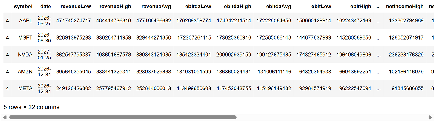
This table is already more useful than a normal average estimate pull. It gives the center of the estimate, the range around it, and the analyst count behind it. That's enough to start measuring the shape of consensus instead of only storing the average.
Turning Estimate Ranges Into Spread Metrics
Once the estimate data was in place, I needed a way to compare estimate ranges across companies.
Raw ranges aren't enough. A \(10 billion revenue range means something very different for a company expected to generate \)50 billion in revenue versus one expected to generate $500 billion. So I normalized the range by the average estimate.
estimates['revenue_spread'] = ((estimates['revenueHigh'] - estimates['revenueLow']) / estimates['revenueAvg'])
estimates['eps_spread'] = ((estimates['epsHigh'] - estimates['epsLow']) / estimates['epsAvg'].abs())
shape_df = estimates[['symbol','date','revenueLow','revenueAvg','revenueHigh','revenue_spread','numAnalystsRevenue',
                      'epsLow','epsAvg','epsHigh','eps_spread','numAnalystsEps']].copy()

shape_df.head()

The logic is simple. revenue_spread tells us how wide the revenue estimate range is relative to the average revenue estimate. eps_spread does the same for EPS.
But EPS needs one extra check. If average EPS is close to zero, even a normal estimate range can create a huge spread. That doesn't always mean analysts are wildly uncertain. Sometimes it just means the denominator is too small.
So I kept the original EPS spread, but created a cleaner version for plotting.
shape_df['eps_spread_clean'] = shape_df['eps_spread']

shape_df.loc[shape_df['epsAvg'].abs() < 1, 'eps_spread_clean'] = np.nan
shape_df.loc[shape_df['eps_spread_clean'] > 3, 'eps_spread_clean'] = np.nan
After that, I checked the widest and tightest ranges.
shape_df.sort_values('revenue_spread', ascending=False)[
    [
        'symbol',
        'revenueLow',
        'revenueAvg',
        'revenueHigh',
        'revenue_spread',
        'numAnalystsRevenue'
    ]
].head(10)

This was the first sign that the idea might be useful. Some names had wide revenue estimate ranges despite meaningful analyst coverage. TSLA had 35 analysts behind revenue estimates, NVDA had 39, and INTC had 31, but their revenue ranges were still relatively wide.
Then I checked the cleaned EPS spread.
shape_df.sort_values('eps_spread_clean', ascending=False)[
    [
        'symbol',
        'epsLow',
        'epsAvg',
        'epsHigh',
        'eps_spread_clean',
        'numAnalystsEps'
    ]
].head(10)

This made the analysis more interesting. Revenue and EPS weren't behaving the same way. TSLA had wide ranges on both. SQ had a very high EPS spread, even though its revenue spread was much tighter. That started to suggest something useful: consensus disagreement can sit in different parts of the model.
First View: Analyst Coverage Does Not Guarantee Agreement
The first thing I wanted to check was whether deeper analyst coverage automatically meant tighter consensus.
So I used two simple dimensions:
number of analysts covering revenue
revenue estimate spread
Then I split the data using median thresholds. This isn't meant to be a formal model. It's just a quick way to separate different consensus shapes.
analyst_threshold = shape_df['numAnalystsRevenue'].median()
spread_threshold = shape_df['revenue_spread'].median()

analyst_threshold, spread_threshold

Then I created coverage and spread buckets:
shape_df['coverage_bucket'] = np.where(
    shape_df['numAnalystsRevenue'] >= analyst_threshold,
    'high coverage',
    'low coverage'
)

shape_df['spread_bucket'] = np.where(
    shape_df['revenue_spread'] <= spread_threshold,
    'low spread',
    'high spread'
)
From there, each company falls into one of four simple categories:
conditions = [
    (shape_df['coverage_bucket'] == 'high coverage') & (shape_df['spread_bucket'] == 'low spread'),
    (shape_df['coverage_bucket'] == 'high coverage') & (shape_df['spread_bucket'] == 'high spread'),
    (shape_df['coverage_bucket'] == 'low coverage') & (shape_df['spread_bucket'] == 'low spread'),
    (shape_df['coverage_bucket'] == 'low coverage') & (shape_df['spread_bucket'] == 'high spread')
]

labels = [
    'tight consensus',
    'watched but uncertain',
    'thin but stable',
    'weak consensus'
]

shape_df['revenue_consensus_shape'] = np.select(conditions, labels)
The split came out more balanced than I expected:

That was useful because the labels weren't collapsing into one obvious bucket. The universe actually had different consensus shapes.
Then I plotted coverage against revenue spread.
plt.figure(figsize=(12, 7))

for label in shape_df['revenue_consensus_shape'].unique():
    temp = shape_df[shape_df['revenue_consensus_shape'] == label]

    plt.scatter(
        temp['numAnalystsRevenue'],
        temp['revenue_spread'],
        s=80,
        label=label,
        alpha=0.8
    )

plt.axvline(analyst_threshold, linestyle='--', linewidth=1)
plt.axhline(spread_threshold, linestyle='--', linewidth=1)

for i, row in shape_df.iterrows():
    if row['revenue_spread'] > spread_threshold or row['numAnalystsRevenue'] > analyst_threshold:
        plt.text(
            row['numAnalystsRevenue'] + 0.3,
            row['revenue_spread'],
            row['symbol'],
            fontsize=9
        )

plt.title('Analyst Coverage vs Revenue Estimate Spread')
plt.xlabel('Number of Analysts Covering Revenue')
plt.ylabel('Revenue Estimate Spread')

plt.legend()
plt.show()

The chart made one thing clear: more analyst coverage doesn't always mean tighter agreement.
MSFT, AAPL, MA, WMT, and META sat closer to the tight consensus area. They had higher coverage and relatively narrow revenue ranges.
But TSLA, AVGO, NVDA, INTC, AMD, MU, and GOOGL were also heavily covered, yet their revenue estimate spreads were wider. These are the “watched but uncertain” names. The market isn't ignoring them. Analysts are looking at them closely, but the forecast range is still wide.
The weaker consensus area was also useful. CVX, XOM, and COIN had wide revenue ranges with lower coverage compared to the mega-cap names. That's a different kind of uncertainty. It's not just disagreement. It's disagreement with less analyst depth behind it.
This first view was helpful, but it still only looked at revenue. The next question was more interesting: does the uncertainty sit in revenue, EPS, or both?
plot_df = shape_df.dropna(subset=['revenue_spread', 'eps_spread_clean']).copy()

plt.figure(figsize=(12, 7))

plt.scatter(
    plot_df['revenue_spread'],
    plot_df['eps_spread_clean'],
    s=plot_df['numAnalystsRevenue'] * 3,
    alpha=0.75
)

for i, row in plot_df.iterrows():
    plt.text(
        row['revenue_spread'] + 0.002,
        row['eps_spread_clean'],
        row['symbol'],
        fontsize=9
    )

plt.title('Revenue Estimate Spread vs EPS Estimate Spread')
plt.xlabel('Revenue Estimate Spread')
plt.ylabel('EPS Estimate Spread')

plt.show()

This was the more useful view.
The chart showed that consensus uncertainty doesn't sit in the same place for every company. Some names had both revenue and EPS clustered tightly. Some had wide ranges across both. And a few had a much more specific kind of disagreement.
SQ was the clearest example. Its revenue spread was low, but its EPS spread was high. That suggests analysts were much closer on the revenue side than on the earnings side.
TSLA showed the opposite kind of extreme. Both revenue and EPS spreads were wide, so the average estimate was hiding disagreement across more than one part of the model.
At this point, I wanted to turn this into a simple classification. Again, this isn't a formal risk model. I used median thresholds only to separate the shapes clearly.
revenue_spread_threshold = plot_df['revenue_spread'].median()
eps_spread_threshold = plot_df['eps_spread_clean'].median()

plot_df['revenue_uncertainty'] = np.where(
    plot_df['revenue_spread'] <= revenue_spread_threshold,
    'low revenue uncertainty',
    'high revenue uncertainty'
)

plot_df['eps_uncertainty'] = np.where(
    plot_df['eps_spread_clean'] <= eps_spread_threshold,
    'low EPS uncertainty',
    'high EPS uncertainty'
)
Then I combined the two buckets into four forecast shapes.
conditions = [
    (plot_df['revenue_uncertainty'] == 'low revenue uncertainty') & (plot_df['eps_uncertainty'] == 'low EPS uncertainty'),
    (plot_df['revenue_uncertainty'] == 'low revenue uncertainty') & (plot_df['eps_uncertainty'] == 'high EPS uncertainty'),
    (plot_df['revenue_uncertainty'] == 'high revenue uncertainty') & (plot_df['eps_uncertainty'] == 'low EPS uncertainty'),
    (plot_df['revenue_uncertainty'] == 'high revenue uncertainty') & (plot_df['eps_uncertainty'] == 'high EPS uncertainty')
]

labels = [
    'stable forecast shape',
    'profitability uncertainty',
    'top-line uncertainty',
    'broad forecast uncertainty'
]

plot_df['forecast_shape'] = np.select(conditions, labels)
The distribution looked like this:

That split was more useful than the first one because it showed where the disagreement was located.
A stable forecast shape means both revenue and EPS ranges are relatively tight. Profitability uncertainty means revenue estimates are tighter, but EPS estimates are wider. Top-line uncertainty means the revenue range is wider while EPS is relatively tighter. Broad forecast uncertainty means both sides are wide.
Then I plotted the same chart again with these labels:
plt.figure(figsize=(12, 7))

for label in plot_df['forecast_shape'].unique():
    temp = plot_df[plot_df['forecast_shape'] == label]

    plt.scatter(
        temp['revenue_spread'],
        temp['eps_spread_clean'],
        s=temp['numAnalystsRevenue'] * 3,
        label=label,
        alpha=0.75
    )

plt.axvline(revenue_spread_threshold, linestyle='--', linewidth=1)
plt.axhline(eps_spread_threshold, linestyle='--', linewidth=1)

for i, row in plot_df.iterrows():
    if (
        row['revenue_spread'] > revenue_spread_threshold or
        row['eps_spread_clean'] > eps_spread_threshold
    ):
        plt.text(
            row['revenue_spread'] + 0.002,
            row['eps_spread_clean'],
            row['symbol'],
            fontsize=9
        )

plt.title('Revenue Uncertainty vs EPS Uncertainty')
plt.xlabel('Revenue Estimate Spread')
plt.ylabel('EPS Estimate Spread')

plt.legend()
plt.show()

This became the main chart for the analysis.
The average estimate hides the center of expectations, but this chart shows the structure around it. For a forecasting workflow, that matters. A model shouldn't treat a tight consensus estimate and a wide consensus estimate as if they carry the same level of agreement.
A Few Names Made The Pattern Obvious
Once the companies were grouped by forecast shape, the pattern became easier to read.
plot_df[
    [
        'symbol',
        'revenue_spread',
        'eps_spread_clean',
        'numAnalystsRevenue',
        'numAnalystsEps',
        'forecast_shape'
    ]
].sort_values(['forecast_shape', 'eps_spread_clean'], ascending=[True, False])
The full table was useful, but for the article, the more important part is the examples from each bucket.
broad_uncertainty = final_view[
    final_view['forecast_shape'] == 'broad forecast uncertainty'
].sort_values('eps_spread_pct', ascending=False)

broad_uncertainty.head(10)

TSLA was the obvious outlier. The revenue estimate spread was around 21.8%, and the EPS spread was over 104%. That's not just a wide range around one line item. It's disagreement across both the top line and bottom line.
CVX and XOM were also interesting, but for a different reason. Their revenue spreads were very wide, and analyst coverage was lower than many tech names in the sample. That makes their consensus shape different from a name like TSLA, where coverage is deeper but disagreement still remains.
Then I looked at the profitability uncertainty bucket.
profitability_uncertainty = final_view[
    final_view['forecast_shape'] == 'profitability uncertainty'
].sort_values('eps_spread_pct', ascending=False)

profitability_uncertainty

This was the most useful bucket conceptually.
SQ had only about 1.1% revenue spread, but nearly 73.8% EPS spread. That's a very different shape from TSLA. Here, analysts were much closer on revenue, but far apart on earnings.
That matters for a model. If I only store the average revenue estimate and average EPS estimate, I lose that distinction. The model can't see that the revenue estimate is relatively tight while the EPS estimate carries much more disagreement.
SNOW and PLTR showed a similar pattern, though not as extreme. Revenue expectations were relatively close together, but EPS expectations had a wider range. That points to uncertainty around profitability, margins, or earnings conversion rather than pure revenue growth.
The stable bucket gave the contrast.
stable_shape = final_view[
    final_view['forecast_shape'] == 'stable forecast shape'
].sort_values(['revenue_spread_pct', 'eps_spread_pct'])

stable_shape.head(10)

MSFT was the cleanest example here. Its revenue spread was around 0.4%, and its EPS spread was around 3.0%. MA, BAC, ABBV, and TGT also stayed in the stable zone, with relatively tight ranges across both revenue and EPS.
That doesn't mean these estimates will be right. It only means analysts are clustered more tightly around the forward numbers.
Finally, the top-line uncertainty bucket was smaller.
topline_uncertainty = final_view[
    final_view['forecast_shape'] == 'top-line uncertainty'
].sort_values('revenue_spread_pct', ascending=False)

topline_uncertainty

This group was smaller, but it completed the picture. These were cases where revenue uncertainty was more visible than EPS uncertainty.
The broader point is simple: consensus doesn't have one shape. Averages hide that. The range around the average shows whether disagreement sits around revenue, EPS, or both.
What This Changes In A Forecasting Workflow
The practical takeaway isn't that every model needs a new complicated uncertainty system. It's simpler than that.
If a model already stores analyst estimates, it should probably store the range around those estimates too.
Instead of keeping only this:
symbol | estimated_revenue | estimated_eps
I would rather keep this:
symbol | estimated_revenue | estimated_eps | revenue_spread | eps_spread | analyst_count | forecast_shape
That gives the model more context about the forecast input it's already using.
To make this usable, I created a final table with the estimate period, revenue spread, EPS spread, analyst coverage, revenue consensus shape, and overall forecast shape.
final_df = plot_df[
    [
        'symbol',
        'date',
        'revenueAvg',
        'revenueLow',
        'revenueHigh',
        'revenue_spread',
        'epsAvg',
        'epsLow',
        'epsHigh',
        'eps_spread_clean',
        'numAnalystsRevenue',
        'numAnalystsEps',
        'revenue_consensus_shape',
        'forecast_shape'
    ]
].copy()

final_df = final_df.rename(
    columns={
        'date': 'estimate_period',
        'revenueAvg': 'revenue_avg',
        'revenueLow': 'revenue_low',
        'revenueHigh': 'revenue_high',
        'epsAvg': 'eps_avg',
        'epsLow': 'eps_low',
        'epsHigh': 'eps_high',
        'eps_spread_clean': 'eps_spread',
        'numAnalystsRevenue': 'revenue_analysts',
        'numAnalystsEps': 'eps_analysts'
    }
)

final_df['revenue_spread_pct'] = final_df['revenue_spread'] * 100
final_df['eps_spread_pct'] = final_df['eps_spread'] * 100

final_view = final_df[
    [
        'symbol',
        'estimate_period',
        'revenue_spread_pct',
        'eps_spread_pct',
        'revenue_analysts',
        'eps_analysts',
        'revenue_consensus_shape',
        'forecast_shape'
    ]
].copy()

final_view = final_view.sort_values('eps_spread_pct', ascending=False)

final_view.head(15)
The output looked like this:

This table is mainly useful for spotting where the average estimate hides the most disagreement.
TSLA is the clearest broad uncertainty case. Both revenue and EPS spreads are wide, so storing only the average estimate would flatten too much of the forecast structure.
SQ is different. Its revenue spread is only about 1.1%, but its EPS spread is about 73.8%. That suggests the disagreement is much less about revenue and much more about profitability or earnings conversion.
SNOW and PLTR show a similar pattern, though less extreme. Their revenue spreads are relatively tight, while EPS spreads are much wider. That's a useful distinction for any model using estimates as inputs.
The point isn't to decide which estimate is right. The point is to avoid treating every consensus average as if it carries the same level of agreement. The average gives the center. The spread shows how much disagreement sits around that center.
What I Would Not Overclaim
I wouldn't treat these labels as a final model.
The stock universe here is handpicked, not the full market. The cutoffs are also simple median thresholds, not a statistical confidence model. They're useful for separating the data into readable groups, but they shouldn't be treated as exact boundaries.
EPS spread also needs care. If average EPS is close to zero, the spread can become distorted, which is why I cleaned extreme EPS cases before plotting.
Most importantly, this doesn't tell us which estimate is right. A wide range doesn't automatically mean the company is bad, and a tight range does not mean the forecast will be accurate.
The useful part is more basic: the model stops pretending that every average estimate carries the same level of agreement.
Final Takeaway: Consensus Has Structure
The average estimate is still useful. I wouldn't remove it from a forecasting model.
But after looking at the low, high, average, and analyst count together, using only the average feels incomplete.
Consensus has structure. Some estimates are tight. Some are wide. Sometimes disagreement sits around revenue. Sometimes it sits around EPS. Sometimes it shows up across both.
A better forecasting workflow should preserve that structure instead of flattening it away. It doesn't need to become complicated. Even a few extra fields, like revenue spread, EPS spread, analyst count, and forecast shape, can make the estimate layer more honest.
Learn to code for free. freeCodeCamp's open source curriculum has helped more than 40,000 people get jobs as developers. Get started