






Your team shipped an LLM-based summaries feature to wave 1 workspaces at week 20 and now the post-launch doc is due. You need a causal effect number, a specific estimate you can defend to a statistician.
The problem is that wave 2 workspaces are still waiting, a product-wide onboarding redesign shipped the same Tuesday, and week 20 also coincided with a quarterly engagement bump. Any comparison between the two groups after week 20 mixes the feature's causal effect with the redesign, the seasonality, and whatever selection criteria determined which workspaces landed in wave 1 in the first place.
This is how most enterprise SaaS teams ship AI features in 2026: one workspace at a time, in waves, on a rollout calendar. Randomization doesn't happen, and because randomization doesn't happen, A/B testing can't give you a clean causal effect. The result is a number on a dashboard that everyone argues over.
Call this the Rollout Calendar Trap: you have real data, a real experiment structure, and a completely invalid comparison. For data scientists shipping AI features in waves, it's the primary source of bad causal claims downstream.
Product experimentation for generative AI features follows this exact pattern: the hypothesis is that the AI feature causes higher engagement, and the wave structure is supposed to test it.
The wave calendar replaced the coin flip, and that substitution breaks the math. A simple A/B comparison assumes randomized assignment that the rollout never produced, so the measurement tool fails even when the experiment design is sound.
Difference-in-differences is the causal inference method that fixes this. It subtracts the time trend by comparing how outcomes shift across time periods for each group, giving you a defensible causal estimate even without randomization.
In this tutorial you'll use it to measure the true causal effect of an AI feature rolled out across enterprise workspaces, with working Python code against a synthetic SaaS product dataset.
By the end you'll know how to run a DiD estimate, how to test its parallel-trends assumption, and what to do when that assumption fails.
Table of Contents
Random assignment is the engine that makes A/B testing a valid causal method. When you flip a coin to decide which user gets the feature, the treatment and control groups end up with identical distributions of every confounder (any variable that affects both who gets treatment and what outcome you measure). Any difference in outcomes after assignment is the causal effect of the treatment. Full stop.
A staged rollout across enterprise workspaces breaks that engine in three ways:
1. The wave assignment isn't random.
Product teams choose wave 1 workspaces for various reasons: they have the most engaged admins, the largest seat counts, or the best relationship with customer success. Those reasons correlate directly with your outcome. Wave 1 workspaces were going to show higher engagement anyway, feature or no feature.
2. The calendar introduces a time trend
Between week 20 (wave 1 launch) and week 30 (wave 2 launch), your product gets better, your onboarding improves, your sales team lands bigger customers. Any naïve "engagement after week 20 minus engagement before week 20" comparison picks up all of that along with the feature's effect.
3. Adoption inside treated workspaces is itself selective
Even inside a workspace that received the feature, not every user turns it on. Power users do, and less engaged users often wait months. Comparing users who used the feature against users who didn't introduces selection bias, where the groups differ systematically before you even measure the outcome, on top of the non-random workspace assignment.
A/B testing assumes none of these three problems exist. Staged rollouts guarantee all three. The naïve comparison gives you a number, and that number measures engagement theater.
What Difference-in-Differences Does
Difference-in-differences compares the change in outcomes over time between a treated group and a control group. Subtracting one change from the other cancels any shared time trend (product improvements, seasonality, onboarding changes) because both groups experience it equally, leaving you with just the treatment effect.
Here's a concrete example. Imagine tracking quarterly revenue for coffee shops in two neighborhoods. One neighborhood gets a new competitor in Q3, the other doesn't.
Both neighborhoods experience the same underlying market trends, a local economic upturn, and holiday seasonality. DiD isolates the competitor's impact by subtracting whatever revenue shift happened in both neighborhoods.
Your staged rollout sets up the exact same structure: wave 1 workspaces are the neighborhood with the new entrant, wave 2 is the comparison.
The math formalizes this as a 2x2 table, where rows are groups (treated, control), columns are time periods (pre, post), and each cell holds the mean outcome for that group in that period:
A = mean task completion for wave 1 users before week 20 (coffee shops: Q2 revenue, neighborhood with incoming competitor)
B = mean task completion for wave 1 users after week 20 (coffee shops: Q3 revenue, same neighborhood)
C = mean task completion for wave 2 users before week 20 (coffee shops: Q2 revenue, the untouched neighborhood)
D = mean task completion for wave 2 users after week 20 (coffee shops: Q3 revenue, same)
                         Pre     Post
Treated (wave 1):         A       B
Control (wave 2):         C       D

Naive post-period gap:   B - D     (contaminated by group differences)
Naive treated change:    B - A     (contaminated by time trend)
DiD:                 (B - A) - (D - C)   ← the causal effect
B - A is wave 1's change, but it includes both the treatment effect and whatever time trend moved everyone. D - C is wave 2's change over the same window, same time trend, no treatment. Subtracting one from the other leaves only the treatment effect.
The counterfactual is what wave 1 would have looked like without the treatment. DiD constructs it by saying: wave 1's counterfactual trajectory = wave 1's pre-period level, carried forward with wave 2's post-period trend. The gap between the actual wave 1 trajectory and that counterfactual is the DiD estimate.
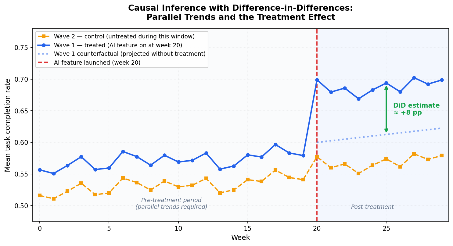
Figure 1: Causal inference with difference-in-differences. Blue solid: Wave 1 actual trajectory. Orange dashed: Wave 2 (control, untreated during this window). Blue dotted: the counterfactual, where Wave 1 would have gone based on Wave 2's post-period trend. The green arrow is the DiD estimate: the gap between the actual Wave 1 trajectory and the counterfactual in the post-treatment period. A, B, C, D correspond to the four cells in the table above.
Before week 20, wave 1 and wave 2 track each other closely. That's the parallel-trends requirement at work. At week 20, wave 1 pulls ahead of both wave 2 and its own counterfactual (the dotted line). That post-treatment divergence is the DiD estimate.
The DiD estimate handles two types of bias at once. Permanent differences between treated and control groups (wave 1 workspaces were always more engaged) cancel out because DiD focuses on changes in outcomes across time periods. Time trends that affect both groups (product improvements, market seasonality) cancel out because both groups experience them.
DiD asks one thing in return: parallel pre-treatment trends. The treated and control groups have to be moving in the same direction at the same rate before treatment starts. When that holds, you can extrapolate the shared trend forward and attribute any post-treatment divergence to the treatment. If the trends were already diverging before treatment, DiD is biased, and no amount of clever regression fixes it.
Parallel trends is the assumption you'll test in step 3.
Companion Notebook
All the code in this tutorial, including the synthetic dataset, the DiD regression, the parallel-trends plot, and the placebo pre-trend test, lives in a single executable Jupyter notebook in the GitHub repo for this series on product experimentation and causal inference for GenAI and LLM applications.
You can clone it, run generate_data.py once, and every output in this article reproduces exactly: github.com/RudrenduPaul/product-experimentation-causal-inference-genai-llm
Prerequisites
You'll need Python 3.11 or newer and comfort with pandas and basic regression. You can follow along without prior causal inference experience, as the article defines confounders and selection bias inline when they first appear. You'll encounter clustered standard errors and fixed effects in step 2. The article explains what they do and why they matter, but it doesn't derive them from scratch.
Install the packages for this tutorial:
pip install numpy pandas statsmodels linearmodels matplotlib
Clone the companion repo to get the synthetic dataset:
git clone https://github.com/RudrenduPaul/product-experimentation-causal-inference-genai-llm.git
cd product-experimentation-causal-inference-genai-llm
python data/generate_data.py --seed 42 --n-users 50000 --out data/synthetic_llm_logs.csv
Setting Up the Working Example
The dataset simulates a SaaS product with an AI summaries feature launched in two waves: wave 1 workspaces get it at week 20, wave 2 at week 30, with 50,000 users total, each with one row of telemetry.
The data generator bakes in a +5 percentage point causal effect on task completion for users in their workspace's post-treatment period. You know the truth upfront, so you can check whether your DiD estimator actually recovers it.
Load the data and inspect the structure:
import pandas as pd

df = pd.read_csv("data/synthetic_llm_logs.csv")
print(df.shape)
print(df[["wave", "signup_week", "workspace_id", "task_completed"]].head())
print("\nWave sizes:", df.wave.value_counts().to_dict())
print("Treatment weeks per wave:",
      df.groupby("wave").treatment_week.first().to_dict())
Expected output:
(50000, 16)
   wave  signup_week  workspace_id  task_completed
0     2           10            36               0
1     2           51            44               1
2     2            2            28               1
3     1           15            20               1
4     1           29             0               1
Wave sizes: {2: 25063, 1: 24937}
Treatment weeks per wave: {1: 20, 2: 30}
Here's what's happening: you load 50,000 rows, one per user. Wave 1 has about 24,937 users across 25 workspaces; wave 2 has about 25,063 users across 25 different workspaces. The treatment_week column records when each user's workspace got the AI summaries feature (week 20 for wave 1, week 30 for wave 2). The task_completed column is your outcome: did the AI successfully complete the user's task.
One important detail: signup_week in this dataset records which calendar week a user first joined the product, and we're using it as a time index to assign users to pre- or post-treatment cohorts.
A user who signed up in week 22 joined after the feature launched, so their experience is "post-treatment." A user who signed up in week 14 joined before the launch, so their experience is "pre-treatment."
This works here because each user has one row of telemetry tied to their initial product experience. In a panel dataset with multiple observations per user across time, you'd use an observation timestamp column tied to when each row was recorded.
To keep the analysis clean, restrict to users who signed up before the wave 2 launch (signup_week < 30). Wave 2 then works as a proper control group, since it hasn't been treated yet, while wave 1 has been treated for 10 weeks.
analysis = df[df.signup_week < 30].copy()
analysis["post"] = (analysis.signup_week >= 20).astype(int)
analysis["treated"] = (analysis.wave == 1).astype(int)

print(analysis.groupby(["treated", "post"])
              .agg(n=("user_id", "count"),
                   mean_completion=("task_completed", "mean"))
              .round(3))
Expected output:
                 n  mean_completion
treated post
0       0     9590            0.556
        1     4878            0.555
1       0     9633            0.592
        1     4738            0.643
Here's what's happening: you filter the data to the analysis window (weeks 0 to 29) and create two indicator variables. post is 1 for users in the post-week-20 period, 0 otherwise. treated is 1 for wave 1 users, 0 for wave 2. The groupby shows the four cells of the DiD 2x2 table: (treated=0, post=0), (treated=0, post=1), (treated=1, post=0), (treated=1, post=1). Those four means are everything you need for a first-pass DiD estimate.
Step 1: A Simple 2x2 DiD
Start with the cleanest version. Compute the four cell means by hand, then take the difference of differences:
cells = analysis.groupby(["treated", "post"]).task_completed.mean()

wave2_pre  = cells.loc[(0, 0)]   # control, pre
wave2_post = cells.loc[(0, 1)]   # control, post
wave1_pre  = cells.loc[(1, 0)]   # treated, pre
wave1_post = cells.loc[(1, 1)]   # treated, post

did_effect = (wave1_post - wave1_pre) - (wave2_post - wave2_pre)
print(f"Wave 1 change: {wave1_post - wave1_pre:+.4f}")
print(f"Wave 2 change: {wave2_post - wave2_pre:+.4f}")
print(f"DiD effect:    {did_effect:+.4f}")
Expected output:
Wave 1 change: +0.0515
Wave 2 change: -0.0013
DiD effect:    +0.0527  (ground truth = +0.05)
Here's what's happening: you pull the four cell means, compute wave 1's change in task completion from pre to post, compute wave 2's change over the same calendar window (wave 2 hasn't been treated yet), and take the difference. The DiD estimate is the piece of wave 1's change that can't be explained by whatever time trend also moved wave 2.
On this dataset the simple 2x2 estimate lands at +0.053, which is very close to the true +0.05. But you can't take this number to a product review. You have no standard errors, which means you can't say whether +0.053 is a real signal or within sampling noise. You have no covariate adjustment, so if wave 1 happened to have more heavy users in this cohort, some of that +0.053 could be engagement-tier composition. And you have no way to handle the workspace-level correlation in your data. Step 2 fixes all three.
Step 2: Regression DiD with Fixed Effects
The regression formulation of DiD produces the same point estimate as the 2x2 table when there are no covariates. But it also buys you three things:
Standard errors and p-values computed correctly
Covariate adjustment to reduce variance and sharpen your estimate
Cluster-robust errors that handle correlation within workspaces, which a staged rollout always has
The regression is: outcome ~ treated + post + treated:post + controls. The coefficient on the treated:post interaction is your DiD estimate.
import statsmodels.formula.api as smf

did_model = smf.ols(
    "task_completed ~ treated * post + C(engagement_tier)",
    data=analysis
).fit(
    cov_type="cluster",
    cov_kwds={"groups": analysis.workspace_id}
)

print(did_model.summary().tables[1])
Expected output:
================================================================================================
                                   coef    std err          z      P>|z|      [0.025      0.975]
------------------------------------------------------------------------------------------------
Intercept                        0.8301      0.007    126.538      0.000       0.817       0.843
C(engagement_tier)[T.light]     -0.4027      0.006    -63.168      0.000      -0.415      -0.390
C(engagement_tier)[T.medium]    -0.1766      0.007    -25.931      0.000      -0.190      -0.163
treated                          0.0367      0.005      6.885      0.000       0.026       0.047
post                            -0.0056      0.008     -0.684      0.494      -0.022       0.011
treated:post                     0.0541      0.011      4.981      0.000       0.033       0.075
================================================================================================
Here's what's happening: you fit an ordinary least squares regression of task completion on the treated indicator, the post indicator, their interaction, and a categorical control for engagement tier.
The treated:post coefficient is the DiD estimate. Users in the same workspace share common shocks, making their outcomes correlated. Grouping by workspace_id corrects for that.
On this dataset the treated:post coefficient comes out at +0.054 with a clustered p-value of <0.001. The ground truth is +0.050. At 0.4 percentage points from the true effect, with a standard error that accounts for workspace-level correlation, that's a number you can put in a product review.
A few practical notes on this regression:
Controls should be time-invariant (engagement tier, signup cohort). Time-varying controls that are themselves affected by treatment will bias the estimate.
Only the interaction has a causal interpretation. The intercept and level terms describe baseline differences between groups, nothing more.
Clustered errors are mandatory. Skip clustering and your standard errors are 3 to 10x too small, test statistics are artificially inflated, and results look far more significant than they are.
Step 3: Checking the Parallel-Trends Assumption
DiD is only valid if wave 1 and wave 2 were moving in the same direction at the same rate before treatment started. You check this by plotting (or tabulating) weekly means for the two waves across the pre-treatment window.
import matplotlib.pyplot as plt
import numpy as np

df_plot = df[df.signup_week < 30].copy()
weekly = (df_plot.groupby(["signup_week", "wave"])
             .task_completed.mean()
             .reset_index()
             .pivot(index="signup_week", columns="wave", values="task_completed"))

# 3-week rolling average to smooth week-to-week sampling noise
smoothed = weekly.rolling(3, center=True, min_periods=2).mean()

TREATMENT_WEEK = 20
pre_idx = smoothed.index[smoothed.index < TREATMENT_WEEK]
post_idx = smoothed.index[smoothed.index >= TREATMENT_WEEK]

# DiD counterfactual: wave 1 pre-period mean + wave 2's post-period change
wave1_pre_mean = smoothed.loc[pre_idx, 1].mean()
wave2_pre_mean = smoothed.loc[pre_idx, 2].mean()
counterfactual = wave1_pre_mean + (smoothed.loc[post_idx, 2].values - wave2_pre_mean)

fig, ax = plt.subplots(figsize=(10, 5.5))
ax.axvspan(-0.5, TREATMENT_WEEK, alpha=0.04, color="#94A3B8", zorder=0)
ax.axvspan(TREATMENT_WEEK, 29.5, alpha=0.06, color="#3B82F6", zorder=0)
ax.plot(smoothed.index, smoothed[2], "s--", color="#F59E0B", linewidth=2,
        markersize=4, label="Wave 2 — control (untreated during this window)", zorder=3)
ax.plot(smoothed.index, smoothed[1], "o-", color="#2563EB", linewidth=2.2,
        markersize=4, label="Wave 1 — treated (AI feature on at week 20)", zorder=4)
ax.plot(post_idx, counterfactual, ":", color="#2563EB", linewidth=2.2,
        label="Wave 1 counterfactual (projected without treatment)", zorder=4)
ax.axvline(TREATMENT_WEEK, color="#DC2626", linestyle="--", linewidth=1.8,
           label="AI feature launched (week 20)")

ax.text(9.5, 0.508, "Pre-treatment period\n(parallel trends required)",
        fontsize=9, ha="center", color="#64748B", style="italic")
ax.text(24, 0.508, "Post-treatment",
        fontsize=9, ha="center", color="#64748B", style="italic")
ax.set_xlabel("Week", fontsize=11)
ax.set_ylabel("Mean task completion rate", fontsize=11)
ax.set_title("Figure 2: Data-Driven Parallel-Trends Check\n(3-week rolling average, 50k users)",
             fontsize=12, fontweight="bold", pad=14)
ax.legend(loc="upper left", fontsize=9, framealpha=0.92)
ax.set_xlim(-0.5, 29.5)
ax.set_ylim(0.50, 0.72)
ax.grid(True, alpha=0.18, linestyle=":")
ax.tick_params(labelsize=10)
plt.tight_layout()
plt.savefig("parallel_trends.png", dpi=150, bbox_inches="tight")
print("Saved parallel_trends.png")
Expected output (Figure 2, data-driven verification):
Saved parallel_trends.png
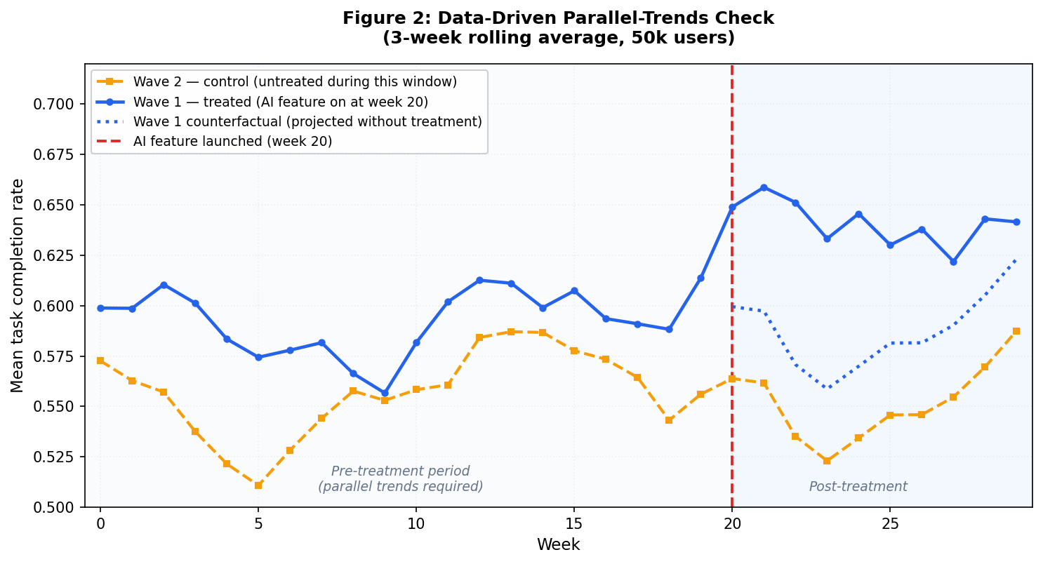
Figure 2 is the data-driven parallel-trends check from your actual dataset, plotted as a 3-week rolling average to smooth week-to-week sampling noise. Both waves track each other closely before week 20, and small wiggles in the pre-period affect both groups at the same time, which is exactly what parallel trends looks like. After week 20, wave 1 separates cleanly above the dotted counterfactual line. The gap between the solid blue line and the dotted line in the post-treatment window is the DiD estimate playing out in your actual data.
Here's what's happening: you group by signup week and wave, compute the mean task completion rate per cell, pivot so each wave is a column, and plot the two time series together.
A vertical dashed line marks week 20 when wave 1 got treatment. In the pre-treatment window (weeks 0 to 19) the two series should track each other closely. After week 20, wave 1 should pull ahead of wave 2 by roughly the treatment effect.
To put a number on it, run a placebo regression on the pre-treatment period only. Regress the outcome on a linear time trend interacted with the treated indicator. If the interaction coefficient is near zero and insignificant, the two groups were moving in parallel before treatment:
pre_only = analysis[analysis.post == 0].copy()
pre_only["weeks_since_start"] = pre_only.signup_week - 10  # center

placebo_model = smf.ols(
    "task_completed ~ treated * weeks_since_start + C(engagement_tier)",
    data=pre_only
).fit(
    cov_type="cluster",
    cov_kwds={"groups": pre_only.workspace_id}
)

print("Pre-trend slope difference:",
      placebo_model.params["treated:weeks_since_start"])
print("p-value:",
      placebo_model.pvalues["treated:weeks_since_start"])
Expected output:
Pre-trend slope difference: -0.00095...
p-value: 0.4435...
Here's what's happening: you restrict to pre-treatment observations, fit a regression that lets wave 1 and wave 2 follow different linear trends in the pre-period, and read off the interaction coefficient.
A coefficient close to zero with p > 0.05 means the two waves were moving in parallel before treatment. If that coefficient is large and statistically significant, the parallel-trends assumption is broken: your DiD estimate is absorbing whatever differential trend separated the groups before week 20.
If the placebo test fails, stop and rethink. Your options: restrict to a narrower pre-window where trends were parallel, find a better control group, or switch to synthetic control, which builds a weighted counterfactual from multiple untreated units.
On this synthetic dataset the placebo test passes: the pre-trend slope difference is -0.00095 with p = 0.44, so the parallel-trends assumption holds and the +0.054 estimate from step 2 is trustworthy.
When Difference-in-Differences Fails
DiD is a precise accounting method, and every precise method has specific failure modes worth knowing before you trust its output. Here are four common ones:
1. Non-parallel Pre-trends
When the treated and control groups were already diverging before treatment started, DiD mistakes that pre-existing drift for a treatment effect.
The placebo test in step 3 is your guard. Run it every time. If it fails, you have three options:
Restrict the analysis to a shorter pre-window where trends were parallel and re-run the placebo
Find a better control group whose pre-trend matches the treated group
Switch to synthetic control, which builds a weighted counterfactual from multiple untreated units and picks the weights to match the treated group's pre-treatment trajectory
2. Staggered Adoption
A staged rollout with three or more waves demands a different approach than a clean 2x2. Wave 1 gets treated at week 20, wave 2 at week 30, wave 3 at week 40. Once wave 2 is treated, it's no longer a valid control for wave 1 comparisons that span weeks 30 and beyond. Earlier treated units start acting as controls for later ones, which contaminates the estimate.
That's the Goodman-Bacon decomposition problem, and the standard two-way fixed effects estimator from step 2 will silently absorb it. The Callaway-Sant'Anna estimator (see their 2021 paper) fixes this by averaging only the clean 2x2 comparisons and discarding the contaminated ones. The differences package in Python implements it.
3. Time-varying Confounders that Hit Only the Treated Group
If your marketing team runs a targeted campaign in wave 1 workspaces during week 22, you've got a treatment-specific shock DiD can't net out.
Parallel trends certifies the pre-treatment period, but the post-treatment window remains your responsibility to audit.
Check every product or marketing event inside the analysis window. If you find one, the only options are to redesign the study, restrict the analysis to the window before the shock, or model the shock explicitly as a second treatment variable.
4. Anticipation Effects
If wave 1 customers knew in week 18 that the feature was coming in week 20, some will have started behaving differently before treatment technically started: signing up more, pre-configuring settings, contacting support. That contaminates the "pre" period. The tell is a bump or dip in wave 1 in the weeks immediately before week 20 on the event-study plot.
The fix is to push the pre-period cutoff back. Treat week 18 as the "treatment" start for purposes of the analysis, which removes the anticipation window from your pre-period baseline.
Each of these failure modes has a diagnostic and a specific remedy. Naming them in your analysis builds credibility with skeptical reviewers. DiD is a careful accounting identity – it produces reliable estimates exactly as long as its inputs are clean.
What to Do Next
The regression DiD above is the right tool for a two-wave rollout. If your rollout has three or more waves, switch to the Callaway-Sant'Anna estimator. If your rollout crosses a treatment threshold you set deliberately (confidence scores, query complexity), look into regression discontinuity. If you want to compare a single treated unit against a constructed counterfactual, synthetic control is the right choice.
The companion notebook for this tutorial is here. Clone the repo, generate the synthetic dataset with generate_data.py, and open did_demo.ipynb to reproduce every code block with pre-saved outputs.
If you ship AI features in waves, your rollout calendar is already a DiD study. The only question is whether you run the analysis.
Learn to code for free. freeCodeCamp's open source curriculum has helped more than 40,000 people get jobs as developers. Get started