


Perhaps the worst UI crime in MacOS 26 Tahoe was the inexplicable decision to add inscrutable, distracting icons next to every item in the menu bar. You will recall Jim Nielsen writing about it, rightly describing it as exactly the sort of thing that Mac users look down upon in platforms like Google Docs and Windows. You will also recall Nikita “Tonsky” Prokopov writing about it, illustrating that the bad idea wasn’t even implemented well, with different Apple apps using entirely different icons for the same menu items. You will also recall my linking to Nielsen (“I can tolerate being angry about UI changes Apple makes to the Mac. But I can’t tolerate being heartbroken.”) and to Prokopov (“The fact that Tahoe’s menu item icons are glaringly inconsistent and often utterly inscrutable is the fudge icing on a shit cake, but the real embarrassment is that the idea ever got past the proposal stage. No real UI or icon designers think this is a good idea. None.”)
Top third-party developers rightly rejected the design, adopting open source code from Brent Simmons to disable the default “icons in all standard menu items” behavior.
Wonderful news in MacOS 27 Golden Gate: the icons are gone. It’s like Tahoe’s menu item icons never happened. Prokopov noted it on Mastodon with before and after screenshots, and mentions that Apple has updated the Human Interface Guidelines accordingly:
Use menu item icons sparingly and with purpose. Icons allow people to find menu items more quickly, and help clarify what selecting an item does. Use an icon to highlight the most common actions and key features of your app, file system locations, connected devices, visual concepts like rotating or flipping an image, and user-generated content like folders and documents. Don’t display an icon if you can’t find one that clearly represents the menu item.
This updated advice in the HIG is perfect. Screenshot:
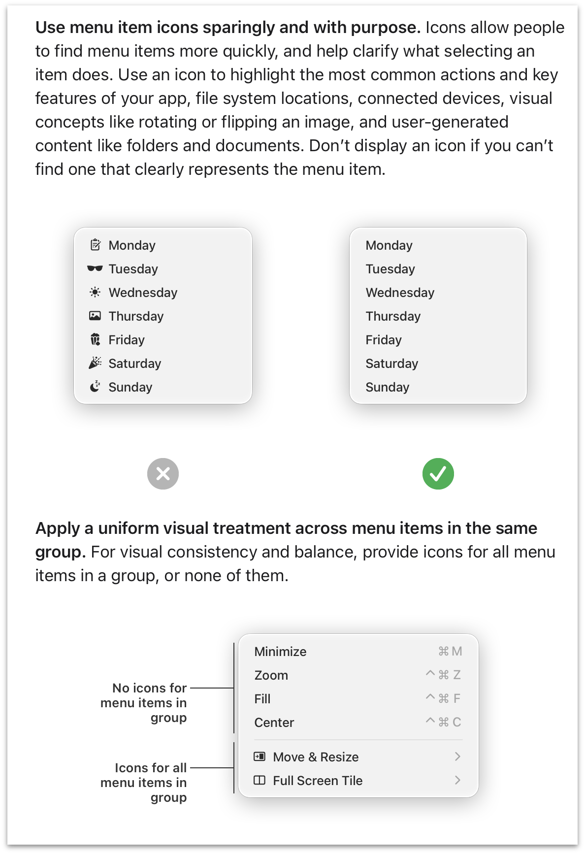
MacOS 26 Tahoe — across every Apple app on the system — is a living example of the updated HIG’s “what not to do” example illustrations (including the second section about groups within a menu). If you’re stuck using Tahoe until Golden Gate arrives, recall this tip to alleviate the problem to some extent.
This is my favorite news from all of WWDC this week. I mean that. In a small way I mean it because I so loathe this aspect of MacOS Tahoe. But in a large way I mean it because it’s proof that the rot has been rooted out of Apple’s software design team. I don’t know if all the untalented hacks are gone, but the untalented magazine-designer hacks with clout and influence all left with Alan Dye. I’ve chatted with a few people from Apple’s design team this week and they’re all loving the work they’re doing and the direction they’re taking Apple’s platforms. Backtracking on these idiotic menu item icons was a necessary first step.
此内容由惯性聚合(RSS阅读器)自动聚合整理,仅供阅读参考。 原文来自 — 版权归原作者所有。