For publications with a strong brand identity or those looking to fully optimize their Ghost site, a custom sign-up form is more than just a tool — it's an extension of the brand itself.
Using Of Record, a publication focusing on vinyl collecting and music listening, as our example, we'll delve into:
Here's a preview of the sign-up form we'll build in this tutorial:
0:00
/0:13

Ready to elevate your sign-up form into a memorable experience? Let's dive in!
For most publications, Ghost already offers a simple solution that works out of the box and without any custom code.
Embeddable signup forms
Start growing your audience from anywhere on the web, using the new embeddable signup forms. It’s now even easier attract new subscribers from any website, while keeping Ghost as the hub for your memberships. Branded Include your logo, publication name, and description in your signup form, and…
 Changelog

Head to Settings → Membership, select a layout, and color, apply your labels, then simply copy the embed code for use anywhere on the web. Here's a live example:
However, for advanced users, Ghost provides tools for creating a completely custom sign-up form that allows you to:
Let's see these tools at work by analyzing Of Record's sign-up form, shown below.
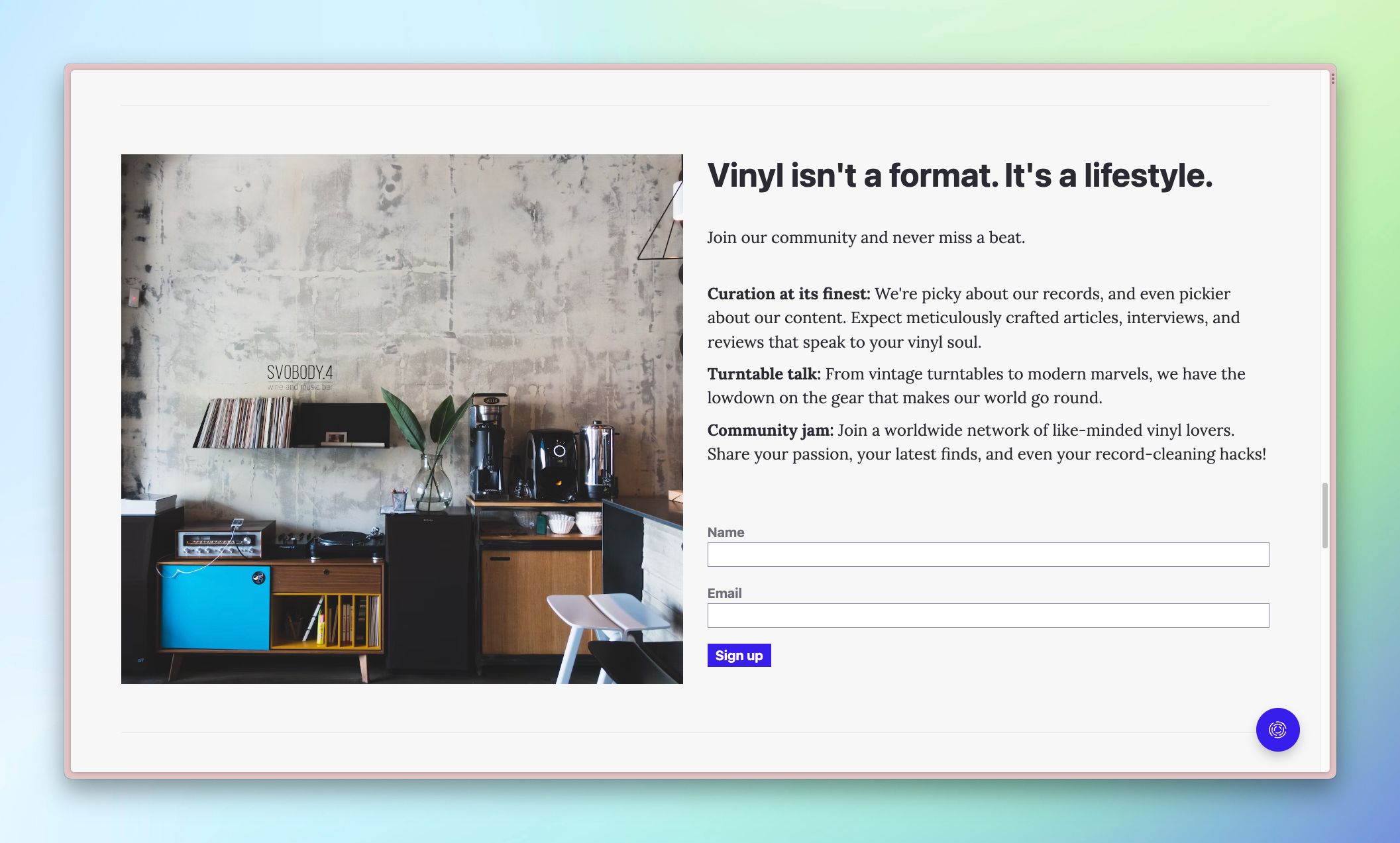
The beauty of building a custom sign-up form is that it's exactly the same as building one with standard HTML elements. Integrating it with Ghost is as simple as adding a few custom data attributes. Here's the code for Of Record's sign-up form:
<form data-members-form= >
    <input data-members-label type="hidden" value="Turntable buying guide" />
    <label>
        Name
        <input data-members-name />
    </label>
    <label>
        Email
        <input data-members-email type="email" required />
    </label>
    <button>
        Sign up
    </button>
    <p class="loading">⏲️ Please hold while we check our collection.</p>
    <p class="error">❗Something's gone wrong. Please try again.</p>
    <p class="success">🎸 Success! Check your inbox for our email.</p>
</form>
Putting this form anywhere in your theme or on your site via an HTML card will instantly create a custom sign-up form ✨
Let's talk about the necessary attributes that make it work.
To make Ghost aware of your custom form, add the data-members-form attribute to the form. Note that you can change the language of the email that a new member will receive by adding a value to the attribute:
data-members-form="signup": new members receive an email with "sign up" languagedata-members-form="subscribe" (default): new members receive an email with "subscribe" languageFunctionally, both of these options are identical. Opting for one or the other will depend entirely on your publication's identity. See additional options for the data-members-form attribute in the docs.
💡
Use the match helper with the @member object to only show the sign-up form to nonmembers. Learn more.
<label>
    Name
    <input data-members-name />
</label>
In Of Record's form, we wrap the input with a label element. This approach is optional, but it's a convenient method to associate the label and input, which makes the form more accessible.
The data-members-name attribute tells Ghost to collect the member's name. However, because required is omitted from the input, this field is optional. A member will be able to sign up without giving their name. To require a name, use the required attribute as seen in the next section.
<label>
    Email
    <input data-members-email type="email" required />
</label>
On this input, we include the type="email" and required attributes. These help with validation (the browser checks if the email is valid) and required ensures a value is present before submitting.
The magic comes in with the addition of the data-members-email attribute, which Ghost uses to capture the submitted email.
In addition to capturing a name and email, it's also possible to add a label to members who sign up with your custom form. These labels appear on the member's profile in Ghost Admin and are filterable via the Members menu. Also, when sending an email, you can use these labels as recipient groups. This works great if your sign-up form is coupled with particular content, and you want to send an update related to that content. With labels, you already have a list of everyone interested in that content!
Here's what the member profile looks like in Ghost Admin. Note the "Turntable buying guide" label.
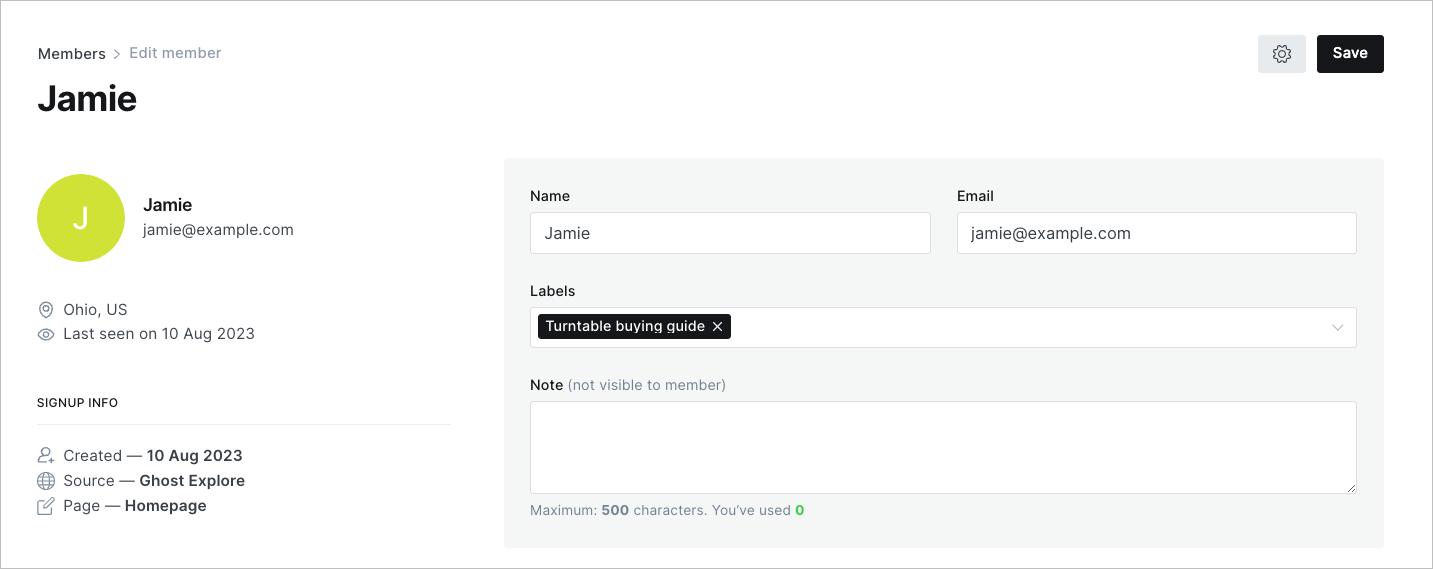
And, here's the code to add to set a label.
<input data-members-label type="hidden" value="Turntable buying guide" />It works by adding a hidden input type (meaning it won't appear to the user) along with the data-members-label attribute. Then, set the value to the label you want to add. That's it!
Now, whenever someone signs up with your custom form, this label will be applied automatically.
💡
Bright Themes has an advanced tutorial on letting users choose which labels are associated with their signup. Check out how it's done.
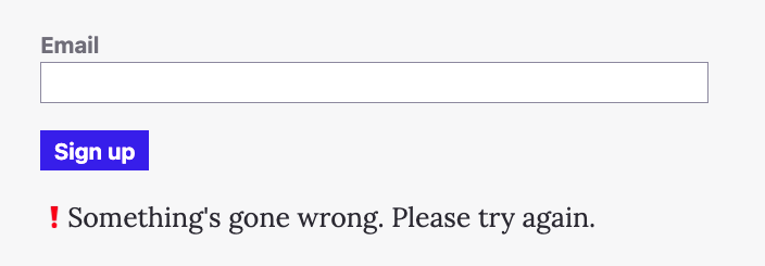
<p class="loading">⏲️ Please hold while we check our collection.</p>
<p class="error">❗Something's gone wrong. Please try again.</p>
<p class="success">🎸 Success! Check your inbox for our email.</p>
Not only does adding Ghost's custom data attributes ensure your form gets your members signed up, but it also adds relevant classes as the user signs up. These classes, added to the form element, reflect its state: loading, success, and error.
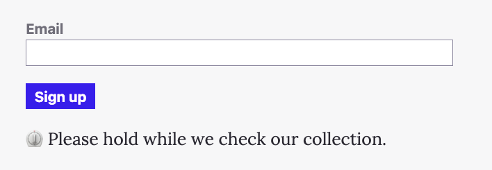
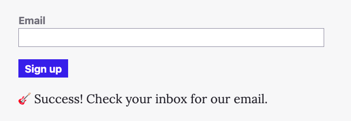
These classes enable you to convey the form's state to your user. How you want to do this is completely up to you, but we'll show you the basic logic to implement in CSS.
/* Form states */
:where(.loading, .success, .error)  {
    display: none;
}

.loading .loading, .success .success, .error .error {
    display: block;
}
We set the default style of the states (like <p class="success">) to display: none. Then, we override these states when Ghost adds the class to the form element. For example, here's what the form HTML looks like when the sign up is loading:
<form data-members-form class="loading">
  ...
</form>
The loading class on the form and the same class on the p element makes the selector .loading .loading match and updates the display property to show the state.
Because it's just CSS controlling whether elements are shown, you can simulate the different states by adding and removing the different classes from the form, rather than having to actually sign up over and over again.
Keeping the user apprised of where they are in the sign-up process is possible with just a few lines of CSS and opens up lots of creative possibilities when creating a custom form.
Now that you know how to make a custom sign-up form, you may be faced with the tricky task of what actually to put in it 🤔
With a custom sign-up form, you can take any approach you want:
These are but a few of the approaches you can take, which makes things difficult. How can you create an effective sign-up form? Don't worry! We've got you covered over on Ghost Resources.
We share evidence-based best practices to support creators, businesses, and publishers. For example, check out this formula for creating powerful copy or these strategies for building a sign-up form that converts.
Whether you're a publication with a strong brand identity like Of Record or someone looking to fully optimize your Ghost site, a custom sign-up form is a powerful tool to build your audience.
With knowledge of Ghost's custom data attributes and the styles to show and hide form states, you now have everything you need to create gorgeous, custom sign-up forms.
If you create one, don't hesitate to share it with the Ghost community. We like to hang out on the official Forum. It's also a great place to get ideas and learn more about building with Ghost.
Oh, and don't forget to sign up 💌

Make your inbox fire
Build a better internet with early access to features, tools, and tutorials.
No spam. Once a month. Unsubscribe any time.
此内容由惯性聚合(RSS阅读器)自动聚合整理,仅供阅读参考。 原文来自 — 版权归原作者所有。