
惯性聚合 高效追踪和阅读你感兴趣的博客、新闻、科技资讯
阅读原文 在惯性聚合中打开

推荐订阅源

WordPress大学
WordPress大学
Vercel News
Vercel News
博客园_首页
Y
Y Combinator Blog
美团技术团队
Cyber Security Advisories - MS-ISAC
阮一峰的网络日志
阮一峰的网络日志
aimingoo的专栏
aimingoo的专栏
H
Hackread – Cybersecurity News, Data Breaches, AI and More
MyScale Blog
MyScale Blog
GbyAI
GbyAI
人人都是产品经理
人人都是产品经理
T
Tailwind CSS Blog
MongoDB | Blog
MongoDB | Blog
D
DataBreaches.Net
博客园 - Franky
Engineering at Meta
Engineering at Meta
量子位
The GitHub Blog
The GitHub Blog
F
Fortinet All Blogs
freeCodeCamp Programming Tutorials: Python, JavaScript, Git & More
钛媒体:引领未来商业与生活新知
钛媒体:引领未来商业与生活新知
酷 壳 – CoolShell
酷 壳 – CoolShell
N
Netflix TechBlog - Medium

DEV Community

Authentication Security Deep Dive: From Brute Force to Salted Hashing (With Java Examples) Why AI Systems Don’t Fail — They Drift Spilling beans for how i learn for exam😁"Reinforcement Learning Cheat Sheet" I Replaced Chrome with Safari for AI Browser Automation. Here's What Broke (and What Finally Worked) How Python Borrows Other People's Work The $40 Architecture: Processing 1 Billion API Requests with 99.99% Uptime Vibe Coding: A Workflow Guide (From Zero to SaaS) Most webhook security guides protect the wrong side. The scary part is delivery. Headless CMS for TanStack Start: Build a Blog with Cosmic EU Age Verification App "Hacked in 2 Minutes" — What Actually Happened Comfy Cloud’s delete function does not actually remove files Running AI Models on GPU Cloud Servers: A Beginner Guide Event-driven media intelligence with AWS Step Functions and Bedrock I scored 500 AI prompts across 8 quality dimensions — here's what broke How to Call Google Gemini API from Next.js (Free Tier, No Backend Needed) The Portal Protocol: Reclaiming Human Connection in the Age of AI How to Fix Your Team's Scattered Knowledge Problem With a Self-Hosted Forum Intro to tc Cloud Functors: A Graph-First Mental Model for the Modern Cloud Designing Multi-Tenant Backends With Both Ownership and Team Access I Built a Neumorphic CSS Library with 77+ Components — Here's What I Learned PostgreSQL Performance Optimization: Why Connection Pooling Is Critical at Scale Cómo construí un SaaS multi-rubro para gestionar expensas en Argentina con FastAPI + Vue 3 🚀 I Built an Ethical Hacking Scanner Tool – Open Source Project I Replaced /usage and /context in Claude Code With a Single Statusline A Pythonic Way to Handle Emails (IMAP/SMTP) with Auto-Discovery and AI-Ready Design I Collected 8.9 Million Polymarket Price Points — Here's What I Found About How Markets Really Move EcoTrack AI — Carbon Footprint Tracker & Dashboard Everyone's Using AI. No One Agrees How. 5 self-hosted ebook managers worth trying in 2026 Building Your First AI Agent with LangChain: From Chatbot to Autonomous Assistant
Charting Query Results Without Leaving VS Code
Mike Burgh · 2026-04-22 · via DEV Community

Mike Burgh

You run a query. You get rows. Now you need a chart for a standup or a Slack thread. Usually that means exporting to a spreadsheet.

DBCode skips that step. Run a query, chart the results, all in VS Code.

The fast way

Run your query. Click the Chart icon in the results toolbar (or press Ctrl+G / Cmd+G). A chart appears using your last-used chart type. First time defaults to grouped column.

Click the dropdown arrow next to the Chart icon to pick a different type.
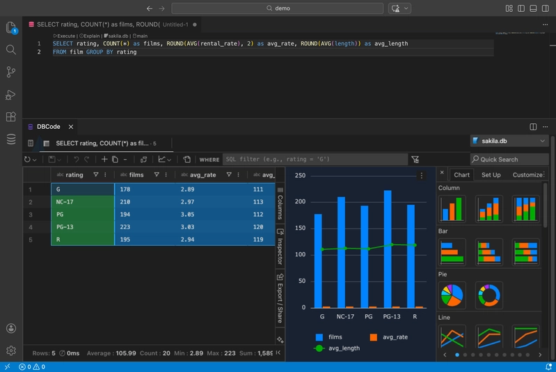
Chart editing interface

Chart types

Column, bar, line, area, pie, donut, scatter, bubble, radar, treemap, sunburst, heatmap, waterfall, funnel, histogram, box plot. Plus combination charts that mix column and line in one view.

Click the three-dot menu on any chart and select Edit to configure categories, series, aggregation, titles, legends, and axis labels across the Chart, Set Up, and Customize tabs.

Charting from a selection

Don't want to chart the whole result set? Highlight specific columns or rows in the results grid, right-click, and choose Chart Range with your preferred chart type.

Pivot mode

For multi-series data, toggle Pivot Mode in the Columns tab. Drag columns into Row Groups, Column Labels, and Values. Then right-click and choose Pivot Chart.
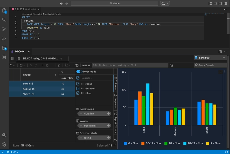
Pivot mode chart

This is useful when your data is in long format (one row per category per date) and you want each category as a separate series.

Filters update charts

Apply filters in the Filters tab of the results pane and charts update automatically. Text filters (contains, starts with), number filters (greater than, between), date filters (before, after). The chart reflects whatever the grid shows.

Download

Click the three-dot menu on a chart and select Download to save it as an image.

Visualization docs