


The first time I really tried to understand sizing in Flexbox, I got stuck. Not because I didn’t understand width and height.Not because I didn’t know flex-grow or flex-shrink. But because everything I thought I knew about sizing suddenly stopped applying.
In normal layout, things feel predictable:
- Block elements fill width
- Height depends on content
-
widthandheightbehave like firm instructions
Then Flexbox shows up… and starts bending those rules.
The Moment Things Started Breaking
I remember setting width on a flex item and expecting it to behave normally.It didn’t.Then I tried adjusting height. Still weird.
Then I added align-items, and suddenly things stretched in ways I didn’t expect.
At that point, it felt like:
“Flexbox doesn’t respect width and height.”
But that’s not true.
Flexbox does respect them — just not in the way we’re used to.
What up with Flexbox?
Flexbox doesn’t think in horizontal vs vertical
It thinks in main axis vs cross axis
And once I accepted that, things started making sense.
Step 1: The Container Is Not the Problem
Let’s start simple.
<div style="display: flex;"></div>
That div is still a block element.
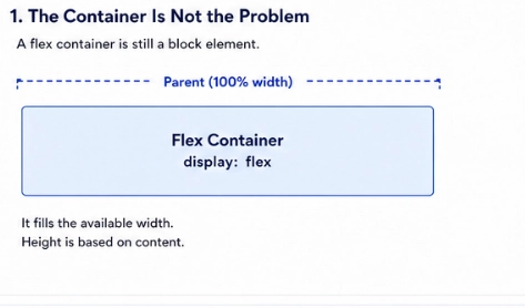
- It still fills its parent’s width
- Its height still depends on content
display: flexdoes not change how the container behaves outside
It only changes how its children are laid out
This was my first misconception.
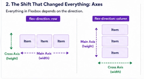
Step 2: Everything Depends on Direction
Flexbox introduces a new idea: axes.
| flex-direction | Main Axis | Cross Axis |
|---|---|---|
| row | horizontal | vertical |
| column | vertical | horizontal |
This one property controls everything.
And I mean everything.
Step 3: The Real Players in Sizing
Once axes are defined, sizing becomes a game between a few properties:
-
flex-basis: starting size (main axis) -
flex-grow: how items expand -
flex-shrink: how items shrink -
align-items: cross-axis behavior -
width/height: physical dimensions (sometimes ignored!)
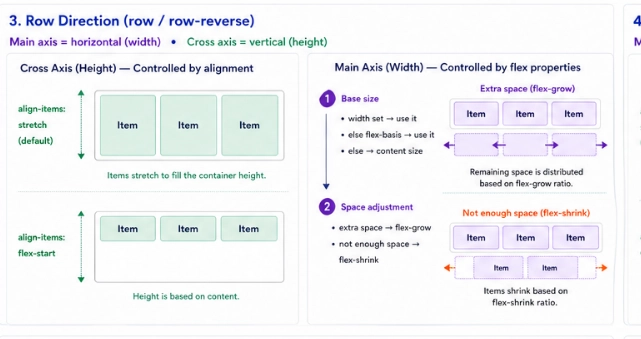
Let’s Talk About Row (Where Most People Start)
.container {
  display: flex;
  flex-direction: row;
}
- Main axis: horizontal
- Cross axis: vertical
What Happens to Width?
This is the main axis now.
So Flexbox asks:
- Do you have a
width?Yesuse it as a starting point - If not, do you have
flex-basis?Yes, use that - Otherwise: use content size
Then:
- Extra space?
flex-growdistributes it - Not enough space?
flex-shrinkreduces it
What Happens to Height? This is cross-axis now.
Flexbox handles it differently:
- If
heightis set, it uses it -
If not:
-
align-items: stretch(default), fills container height - Otherwise, content height
-
Then I Switched to Column… and Everything Broke Again
.container {
  display: flex;
  flex-direction: column;
}
Now:
- Main axis, vertical
- Cross axis, horizontal
Everything flips.
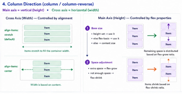
Column Direction (The Part That Confuses Everyone)
Height Becomes the Main Axis
Now Flexbox treats height the way it treated width before.
It asks:
- Do you have a
height? - Else, do you have
flex-basis? - Else use content size
Then:
- Extra vertical space,
flex-grow - Not enough,
flex-shrink
Width Becomes Cross Axis
Now width behaves like height did before:
- If
widthis set,use it -
If not:
-
align-items: stretch, fill container width - Else, content width
-
The Realization That Tied Everything Together
After going back and forth enough times, I realized:
Flexbox doesn’t randomly ignore properties
It just prioritizes based on the axis
The Rule That Finally Made It Click
Main axis, controlled by flex properties
Cross axis, controlled by alignment
And:
widthandheightonly matter when they align with the axis being calculated
One Last Correction I Wish I Knew Earlier
I used to think:
“
flex-basisis the minimum size”
That’s wrong.
It’s actually:
The starting size before growing or shrinking
That small misunderstanding caused a lot of confusion for me.
How I Debug Flexbox Now
Whenever something looks off, I ask:
- What is the main axis?
- What is the starting size (
flex-basis/ width / height)? - Is there extra space or overflow?
- What is controlling the cross axis (
align-items)?
And suddenly, it’s no longer magic.
Final Thought
Flexbox feels confusing because it asks you to stop thinking in fixed dimensions and start thinking in relationships:
- Between items
- Between axes
- Between available space and constraints
Once you make that mental switch, Flexbox stops fighting you…
and starts working with you.