










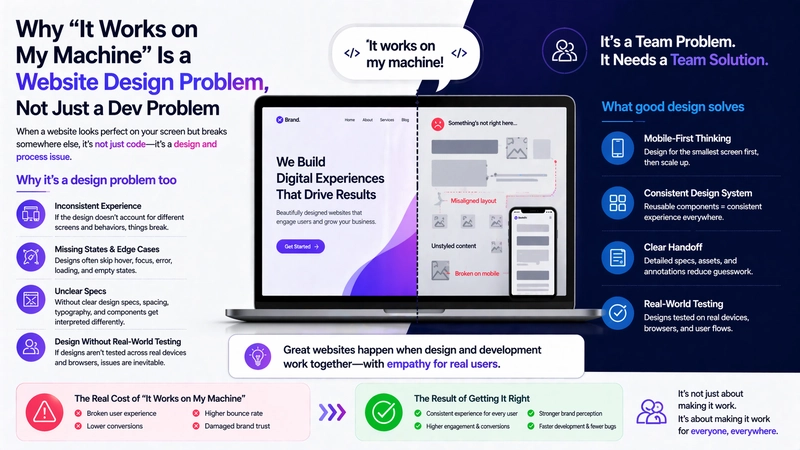
Every developer has said it. Every designer has heard it and rolled their eyes a little. But here's the thing: "it works on my machine" isn't just a testing failure. In 2026, it's often a design and architecture failure that was baked in way earlier than anyone wants to admit.
I've been thinking about this a lot lately after working through a few web projects where the gap between "looks great in Figma" and "actually works for real users on real devices" was... wider than it should have been.
The gap between design and lived experience
When you build websites professionally, you work on good hardware. You have a fast machine, a decent internet connection, probably a high-resolution monitor. Your browser is up to date. You've cleared your cache. The fonts load instantly because they're already cached from testing.
Your users are not in that environment. Some of them are on budget Android phones with 3G connections in areas with patchy coverage. Some of them are on ancient iPads their company hasn't replaced yet. Some of them have accessibility needs that mean your carefully designed hover states and animated reveals are actively making the experience worse for them.
This isn't just a "test on more devices" reminder. It's a design philosophy point. If your design decisions assume an ideal environment, they're not really design decisions - they're prototypes. Real design accounts for the actual range of people using it.
Performance is a design decision
Here's something that gets siloed incorrectly: performance is treated as a development concern, but a lot of performance problems start in design.
A 4K hero image because the designer wanted the visual impact. A custom font because the brand guidelines specified it. Twelve different animation effects on the homepage because they looked incredible in the prototype. All of these are design decisions. All of them have performance costs that the development team has to absorb downstream.
The most effective teams I've seen treat performance as a constraint from the very beginning of the design process, not something you bolt on at the end when Lighthouse is giving you red scores. "What's the performance budget for this page?" should be a design question, not a post-launch panic question.
Component-first design and why it matters for devs
This is where design and development decisions actually intersect in ways that matter for code quality. When design or website ux design is done without a component system when every page is essentially a new snowflake, the frontend code gets messy. You end up with twelve variations of a card component because the designer made each one slightly different, and now the developer has twelve separate things to maintain instead of one configurable component.
Component-first design (whether you're using Figma's component library, a Storybook instance, or just a shared design system document) maps to how good frontend code actually works. It forces consistency. It reduces the implementation surface. And it makes changes dramatically cheaper because you're changing one component, not hunting through every page.
The handoff problem nobody talks about enough
Somewhere between "the design is approved" and "the code is deployed," information gets lost. Interaction states that weren't fully specced. Edge cases the design didn't account for what happens to this card if the title is 80 characters instead of 30? What does the form validation look like? What happens on a 320px screen?
These gaps get filled by developers making judgment calls. Sometimes those calls are great. Sometimes they're not. And then the designer looks at the built thing and says "that's not what I designed," and the developer says, "you never told me what to do there," and both of them are right.
Better process: design reviews that specifically look for unspecced states, edge cases, and responsive breakpoints before anything gets built. Painful upfront. Much less painful than rebuilding later.
What this means practically
If you're on a dev team that works with designers, push earlier on performance and edge cases. If you're on a design team that hands off to devs, design for the messy reality of real content and real devices.
The websites that actually serve users well - not just the ones that look good in portfolio screenshots are built by people who understand that design and development aren't sequential phases. They're an ongoing conversation.
This is something the team at Mittal Technologies has built into their process for web projects - treating design decisions and development constraints as the same conversation rather than separate workstreams. It's not always the fastest process, but it produces good website ux design or websites that hold up when real people actually use them.
It's worth thinking about next time someone says, "it looks fine in the mockup."