惯性聚合 高效追踪和阅读你感兴趣的博客、新闻、科技资讯
阅读原文 在惯性聚合中打开

推荐订阅源

G
Google Developers Blog
阮一峰的网络日志
阮一峰的网络日志
博客园 - 聂微东
F
Fortinet All Blogs
H
Help Net Security
让小产品的独立变现更简单 - ezindie.com
D
DataBreaches.Net
MyScale Blog
MyScale Blog
B
Blog
I
InfoQ
钛媒体:引领未来商业与生活新知
钛媒体:引领未来商业与生活新知
GbyAI
GbyAI
Google DeepMind News
IT之家
IT之家
The GitHub Blog
The GitHub Blog
有赞技术团队
有赞技术团队
博客园_首页
L
LangChain Blog
V
V2EX
OSCHINA 社区最新新闻
OSCHINA 社区最新新闻
T
The Blog of Author Tim Ferriss
Cyber Security Advisories - MS-ISAC
Microsoft Azure Blog
博客园 - Franky

9to5Mac

Apple permanently closing three US stores, here’s when [Updated] Apple Arcade just added 4 new ad-free games with these titles now available At least for now, Liquid Glass in Pixelmator Pro remains a Creator Studio exclusive Apple @ Work: How to add an existing Mac to Apple Business Manager without wiping it Hands-on: SkyDex turns your daily weather check into a Pokémon adventure App Store fight continues as Apple and Epic clash over court-ordered stay OpenAI says to update Mac apps including ChatGPT and Codex as security precaution Apple TV in-person ‘experience’ coming later this month in LA New iPhone Fold leaks cover ‘Ultra’ name, launch timing, more Report: Apple tops global smartphone market for first time in Q1 as overall shipments drop Car Keys in Apple Wallet coming soon to major new vehicle brand Apple previews AI, accessibility, and AirPods Pro 3 research for CHI 2026 April 10, 2026 – Apple Store closures, more VSCO report explores how photographers perceive, adopt, and actually use AI XChat, X’s standalone messaging app, launching soon with these features Apple TV has three shows with finales this week, here’s what’s ending iOS 26.4 adds setting to let you change new Liquid Glass effect Hands-on: Satechi’s 3-in-1 Qi2 charger brings 25W of power with a clean Apple aesthetic [Video] iOS 27 adding new ‘Siri’ app to Home Screen: Here are the rumored features Deals: All 15-inch M5 MacBook Air models $150 off, Series 11 $99 off, Nomad leather iPhone 17 cases, more Amazon launches ‘Prime Video Ultra’ with new features, higher price How the Mac changed the way I clear mental clutter YouTube Premium is getting a US price hike of up to $4/month Tribit StormBox Micro 3: My favorite travel speaker just got better and cheaper FBI used iPhone notification data to retrieve deleted Signal messages Adobe’s low-processing camera app expands support to select iPads and the iPhone 17e New Apple TV movie starring Keanu Reeves now available to stream Apple collector showcases 50 years of Mac startup sounds [Video] WhatsApp is bringing Status updates to the top of the Chats tab iOS 26’s Messages app got a big upgrade for an essential feature
Apple again warns developers not to do what Apple did in ...
Ben Lovejoy · 2026-06-11 · via 9to5Mac
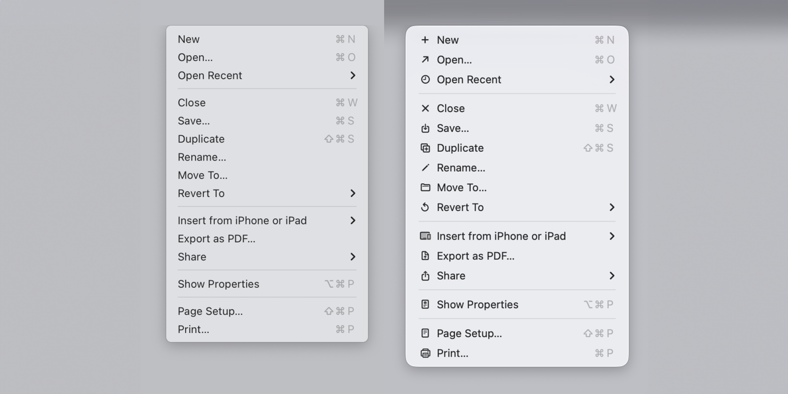
macOS Tahoe icons do exactly what Apple said designers should never do | Sequoia menu items left, Tahoe version right

The menu icons in macOS 26 Tahoe were roundly criticized for being both ugly and making Macs harder to use. A software engineer pointed out that Apple warned against this very mistake in guidelines published way back in 1992, and the company is now reiterating that decades-old advice as developers get to try macOS 27 Golden Gate

9to5Mac readers had mixed views on the app icons introduced as part of macOS 26 Tahoe, but there was a clear consensus that Apple’s introduction of icons for every menu option was a terrible idea.

Indeed, one software engineer pointed out that Apple’s Macintosh human interface guidelines advised against this very mistake way back in 1992. The company described the practice as ugly, unpleasant, distracting, illegible, messy, cluttered, confusing, and frustrating.

Apple has now corrected this mistake, and Nikita “Tonsky” Prokopov noted that the company’s very latest guidelines reiterate this advice.

Use menu item icons sparingly and with purpose. Icons allow people to find menu items more quickly, and help clarify what selecting an item does. Use an icon to highlight the most common actions and key features of your app, file system locations, connected devices, visual concepts like rotating or flipping an image, and user-generated content like folders and documents. Don’t display an icon if you can’t find one that clearly represents the menu item.

John Gruber sees it as a sign that today’s Apple UI designers are now on the right course.

It’s proof that the rot has been rooted out of Apple’s software design team. I don’t know if all the untalented hacks are gone, but the untalented magazine-designer hacks with clout and influence all left with Alan Dye. I’ve chatted with a few people from Apple’s design team this week and they’re all loving the work they’re doing and the direction they’re taking Apple’s platforms. Backtracking on these idiotic menu item icons was a necessary first step.


Add 9to5Mac as a preferred source on Google Add 9to5Mac as a preferred source on Google

FTC: We use income earning auto affiliate links. More.