


Customer-facing analytics are the stats you show your users, not your internal team. A users' usage dashboard, a "23 people are viewing this right now" counter on a product page, a public leaderboard, or how big your support queue is.
Under the hood, a lot of these are powered by the same kind of infrastructure: a fast, authenticated API layer that takes product data and ships it straight into the place users will see it. At PostHog, we call this Endpoints.
Endpoints are a way to expose your PostHog data as fast, versioned, authenticated APIs you can drop straight into your product without maintaining a custom API backend.
But, rather than telling you what customer-facing analytics is, we’re going to show you five companies who do it really well, and for each one, we've pulled out what's worth copying.
Vercel is the textbook case of a dashboard that customers log in to check. Every project deployed on Vercel ships with a Web Analytics panel that surfaces live visitor counts, top pages, referrers, UTM campaigns, and geographic breakdowns. All one click from the deploy button, with no separate tool to install.
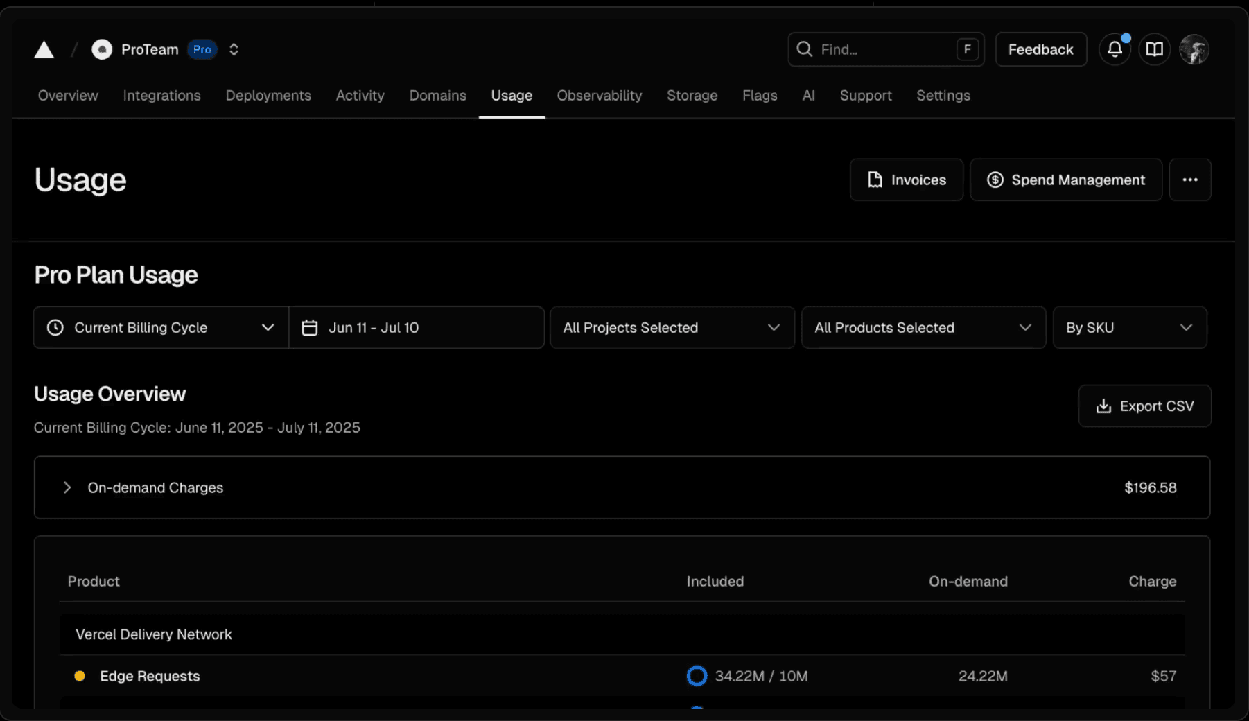
Treat customer-facing analytics with the same latency expectations as the rest of the product. Vercel made the design choice for their Web Analytics so that data shows up "seconds after enabling Analytics, not 30 minutes".
Customer-facing analytics live or die on whether users trust the numbers are fresh — the moment they stop trusting, the dashboard quietly becomes wallpaper.
Good news if you're a PostHog user: We just launched a real-time dashboard for Web Analytics.
Booking.com has made a science of turning live activity into social proof: "23 people are looking at this hotel right now." "Booked 4 times in the last 6 hours." "Only 2 rooms left at this price." These numbers are pulled from live booking and browsing data and dropped directly onto the property listing.

Put the analytics where the decision happens, not in a dashboard. Booking's live counters aren't a side feature, they're load-bearing conversion copy, and industry analysts have credited similar "shopping activation" widgets with lifting direct bookings by close to 50%. Audit your purchase flow for places a live number would move inventory, demand, recent activity, and put it inline. Real-time data that would matter to a buyer right now is wasted signal the moment you bury it two clicks deep in a reports tab.
Product Hunt's entire homepage is a customer-facing leaderboard. Every 24 hours it ranks a few hundred new launches by upvotes, comments, and reviews, and rolls the top five into permanent "Yesterday / Last Week / Last Month" slots. The ranking logic is transparent enough that makers plan launches around it; roughly 700–800 upvotes is the bar for a weekday #1.
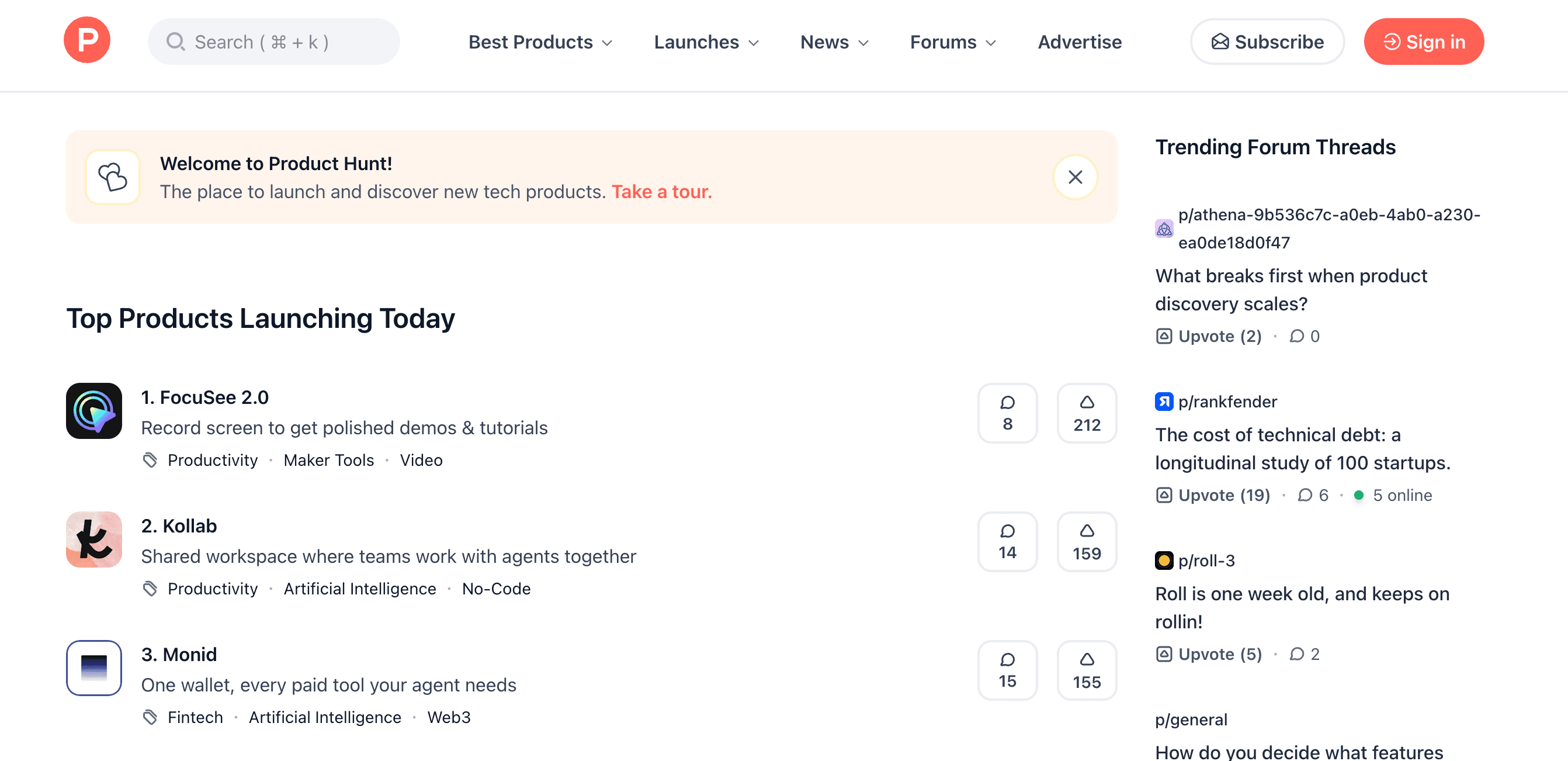
Make your analytics two-sided. If you're sitting on ranking data , you have a potential product. Leaderboards get dismissed as a gimmick, but Product Hunt turned a database of upvotes into the homepage and let it do two jobs at once: recommendation feed for readers, scoreboard for makers. The more people check it, the more valuable ranking on it becomes.
One of the ways we use Endpoints is HogHero, our internal Zendesk app.
When a customer opens a support ticket, HogHero shows our support rep the recent conversations that customer had with PostHog AI before they reached a human. The rep gets the context instantly and they start the conversation already halfway to the answer.
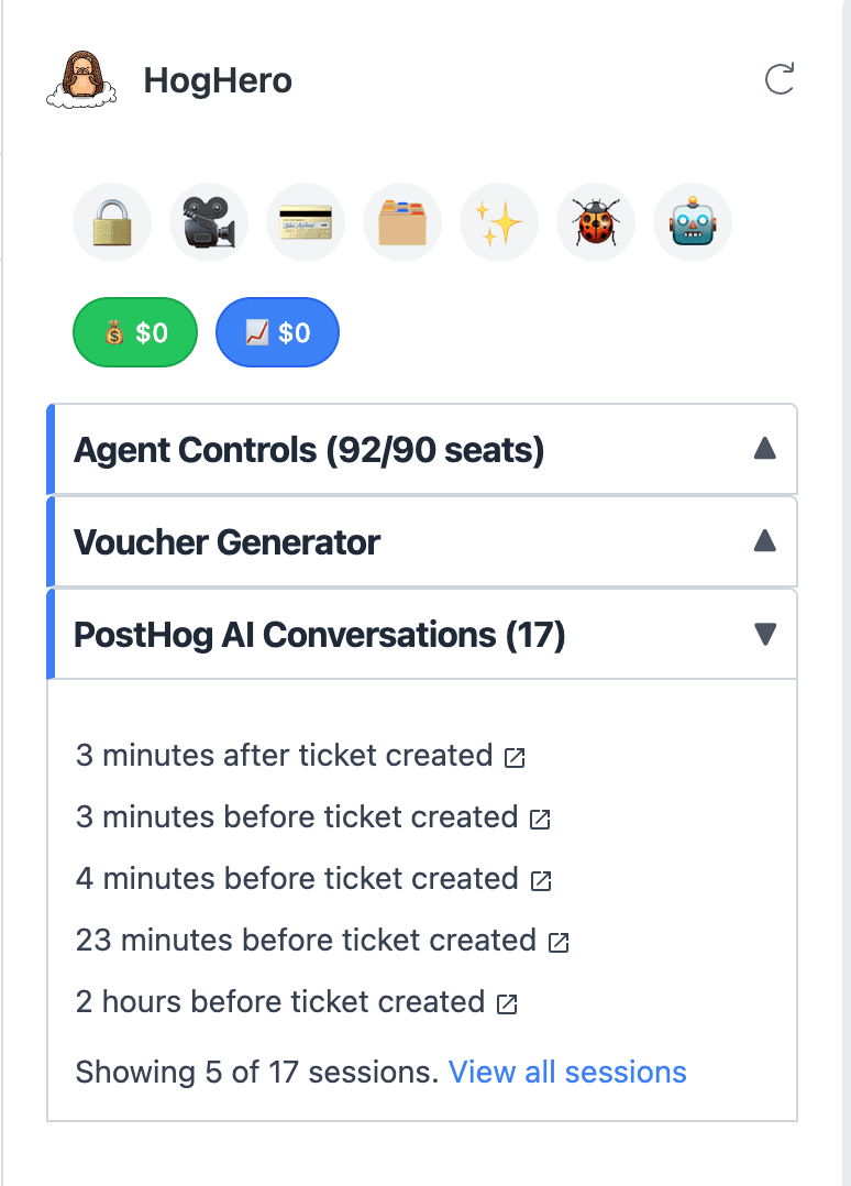
Customer-facing analytics doesn't have to mean end-customer-facing. The fastest way to make an internal tool feel magical is to put the right data inside the app people are already in, not build yet another place they have to log into. Our reps don't have to switch tabs to PostHog and rebuild the customer's context, the conversation history is just there, scoped to that customer, the moment the ticket opens.
The green-square contribution graph on every GitHub profile is one of the most-copied analytics patterns on the internet. It's a one-year heatmap of commits, PRs, issues, and reviews, rendered on your public profile. It's functionally a behavior-change mechanic: "don't break the streak" is a meme precisely because the graph makes the streak visible to you and everyone who looks at your profile.
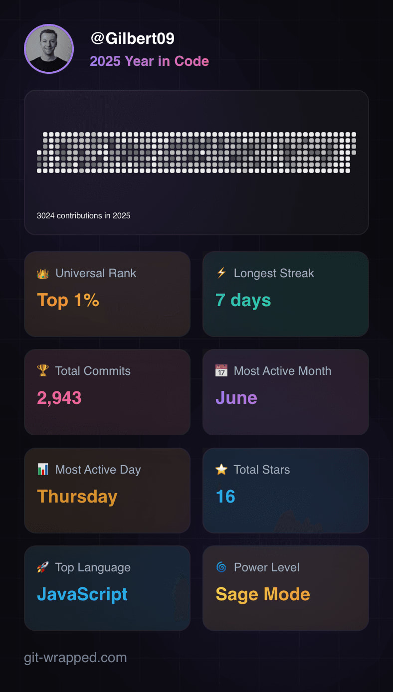
Once you expose customer-facing analytics, users will ask for more – and some will just build it themselves. The contribution graph started life as a visualization and ended up as identity, habit-loop, and an entire third-party ecosystem of GitHub Wrapped tools. These are built by people who want to share their streaks which creates a viral community moment that's great for GitHub’s brand.
Across all five, the same few principles keep showing up:
Inspired to build customer-facing analytics yourself? We’re biased but we think you should check out Endpoints. Here's how it works:
Take the data you already trust in PostHog, ship it to the place your users actually look, and let the tool do the heavy lifting for you. Give it a try, or you can check out our docs to learn more.
此内容由惯性聚合(RSS阅读器)自动聚合整理,仅供阅读参考。 原文来自 — 版权归原作者所有。