




Our PDF SDK supports Apple’s visionOS alongside iOS and Mac Catalyst. While adding this support, we encountered some challenges related to displaying UIKit popovers from ornaments built in SwiftUI. We have a UIKit view controller, PDFViewController, which displays PDF documents and is shown with different tools in the navigation bar. We also have existing code for iOS that shows modal views for some of these tools as popovers. To display the tools in ornaments on visionOS, we wanted to reuse this existing code.
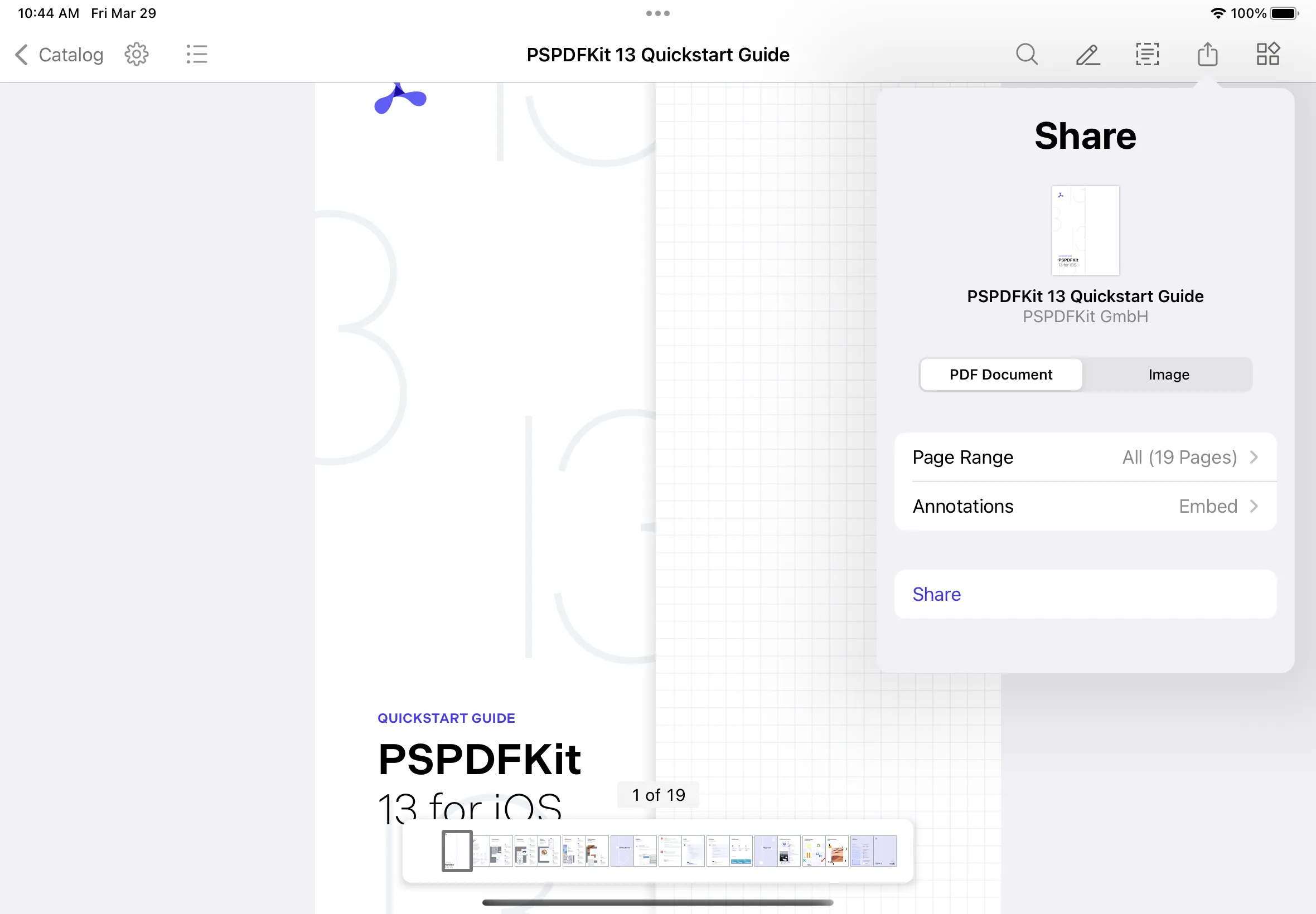
In this blog post, we’ll delve into the challenges we faced when implementing this. But first, we’ll provide a quick overview of ornaments on visionOS.
On visionOS, an ornament(opens in a new tab) floats alongside an app’s window, holding extra controls and information without obstructing the main content.
Ornaments can appear on any side of a window. Inside an ornament, you can place buttons, sliders, or any other controls your app requires. The system already uses ornaments for elements like toolbars and tab bars. However, you can also build your own custom ornaments for unique features in your app.
By default, visionOS displays toolbars and tab bars as ornaments. Here’s an example of how they’re displayed:
struct ViewWithDefaultToolbarAndTabView: View {
var body: some View {
TabView {
Text("Toolbar")
.tabItem {
Button("Share", systemImage: "square.and.arrow.up") { }
}
.toolbar {
ToolbarItem(placement: .bottomOrnament) {
Button("Text", systemImage: "doc.text") { }
}
ToolbarItem(placement: .bottomOrnament) {
Button("Draw", systemImage: "pencil.line") { }
}
ToolbarItem(placement: .bottomOrnament) {
Button("Eraser", systemImage: "eraser") { }
}
}
Text("Search")
.tabItem {
Button("Search", systemImage: "magnifyingglass") { }
}
}
}
}
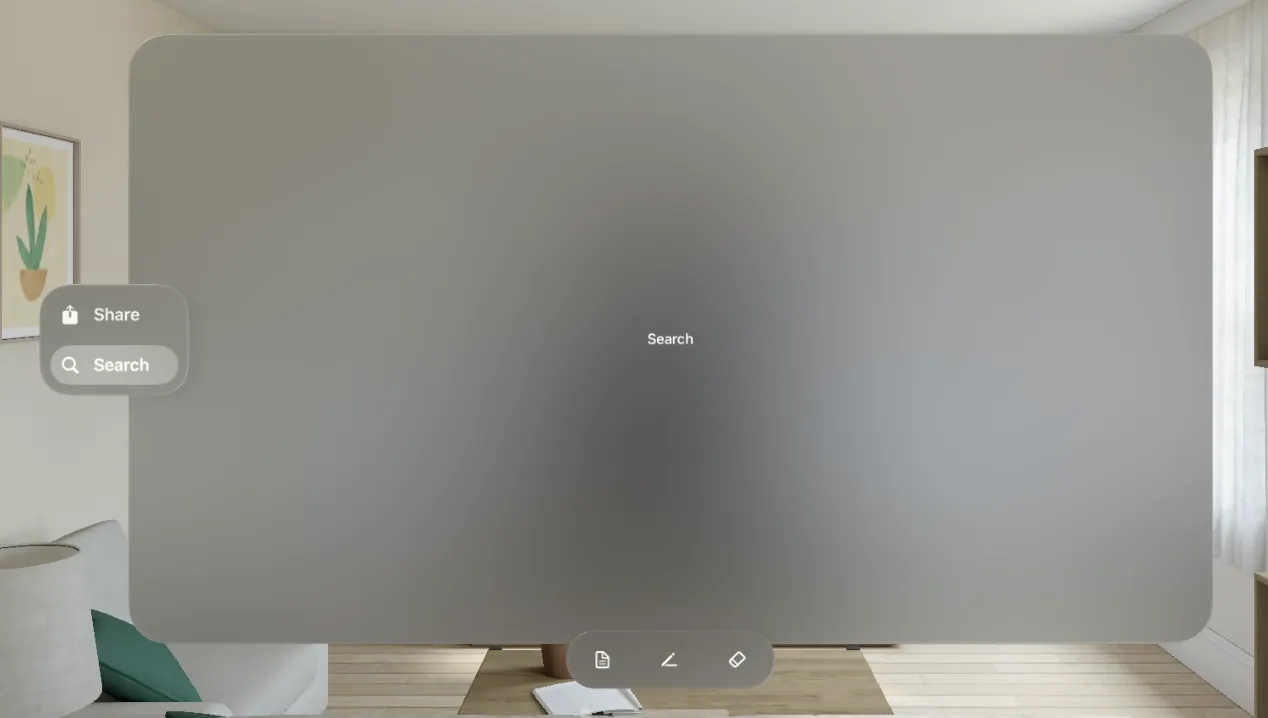
You can also display custom ornaments with an ornament view modifier on any SwiftUI view. Here’s an example:
struct ViewWithCustomOrnament: View {
@State private var showingPopover = false
@State var searchList: [String] = ["Item 1", "Item 2", "Item 3", "Item 4", "Item 5"]
var body: some View {
Text("PDFView")
.ornament(
visibility: .visible,
attachmentAnchor: .scene(.trailing),
contentAlignment: .top
) {
ToolbarOrnament()
}
.ornament(
visibility: .visible,
attachmentAnchor: .scene(.top),
contentAlignment: .trailing
) {
HStack {
Button("Share", systemImage: "square.and.arrow.up") {
// Show sharing UI.
}
SearchBarOrnamentItem()
}
.labelStyle(.iconOnly)
.padding(20)
.glassBackgroundEffect()
}
}
}
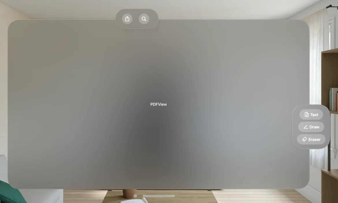
The example above uses the ornament view modifier, which accepts several parameters. The visibility parameter gives you the ability to dictate when an ornament is displayed.
The attachmentAnchor and contentAlignment parameters let you manage an ornament’s location. They provides the flexibility to specify the exact point in the scene where the ornament should be attached.
The final parameter for the ornament view modifier is the ViewBuilder closure. This allows you to specify an ornament’s content.
Additionally, the glassBackgroundEffect view modifier can be used to apply a visionOS-style background to content.
Ornaments can also be shown on any UIKit view controllers using the view controller’s ornaments property, which is an array of UIHostingOrnaments. A UIHostingOrnament is created with a SwiftUI view as a parameter. Here’s an example:
class PDFViewController: UIViewController {
func setUpOrnaments() {
self.ornaments = [
UIHostingOrnament(sceneAnchor: .trailing) { ToolbarOrnament() },
UIHostingOrnament(sceneAnchor: .top) { NavigationBarOrnament() }
]
}
}
This is how we added different toolbars as ornaments to our PDFViewController.
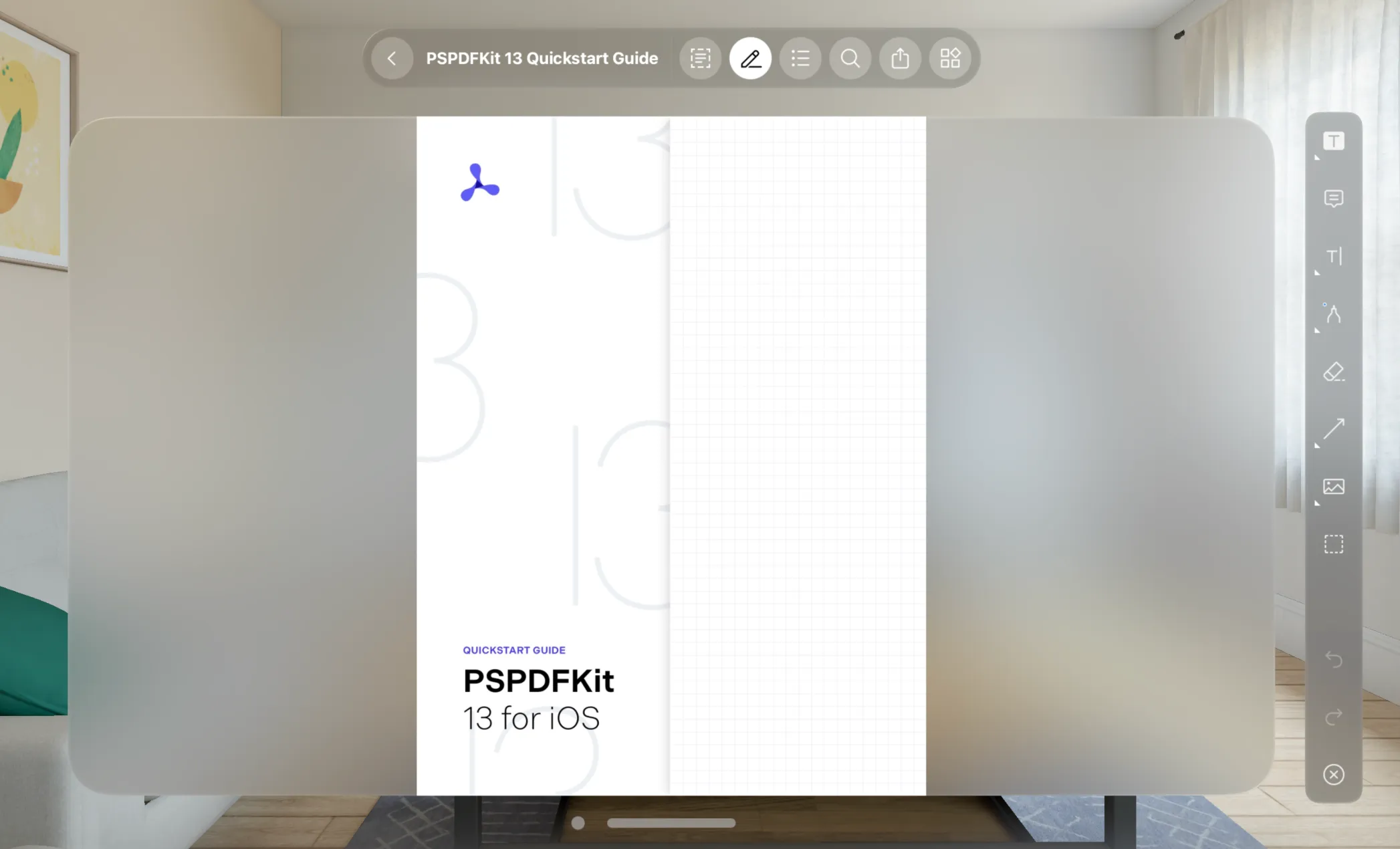
You can show a popover using SwiftUI when a button in the ornament user interface (UI) is tapped. Here’s how:
struct SearchBarOrnamentItem: View {
@State private var showingPopover = false
@State var searchList: [String] = ["Item 1", "Item 2", "Item 3", "Item 4", "Item 5"]
var body: some View {
Button("Search", systemImage: "magnifyingglass") {
showingPopover = true
}
Spacer(minLength: 10)
.popover(isPresented: self.$showingPopover,
attachmentAnchor: .point(.bottom),
arrowEdge: .bottom,
content: {
ForEach(searchList, id: \.self) { item in
Text(item)
.padding()
}
.padding()
.presentationCompactAdaptation(.none)
})
}
}
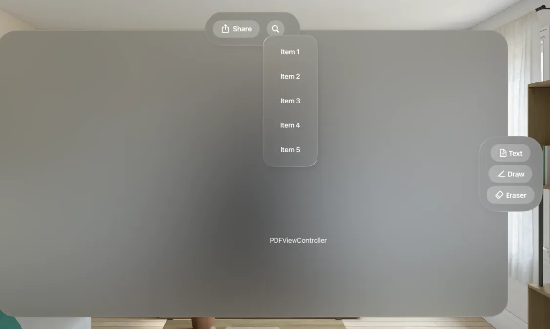
Now that we’ve covered the ornament UI, this section will cover the specific problem we encountered.
We wanted to reuse the popover UI shown when tapping different tool buttons in the ornament UI. The popover view controller needs a UIKit view as the source view to figure out the frame or position of the popover view. But we only have SwiftUI views in the ornament toolbar.
To solve this problem, we created a SwiftUI button wrapper, AnchorButton, which contains an internal UIKit view. AnchorButton uses a ZStack to display a SwiftUI view on top of a UIKit view. Now, since the SwiftUI view and UIKit-wrapped UI view are at the same position in the view hierarchy, we can use the UIKit view as the source view to display the existing UIKit popover. Refer to AnchorButton.swift(opens in a new tab) for more details and the source code of the wrapper in the example project(opens in a new tab).
With the fix above, we were able to reuse our prebuilt UIKit popover UIs, but we got the following error in the console:
Trying to convert coordinates between views that are in different UIWindows, which isn’t supported, Use convertPoint: fromCoordinateSpace: instead.
This occurred because ornaments are in different windows and coordinates need to be converted to destination coordinates. The code below shows how:
class PDFViewController: UIViewController {
func showPopover(sourceView: UIView) {
let popoverViewController = PopoverViewController()
popoverViewController.modalPresentationStyle = .popover
if let popoverController = popoverViewController.popoverPresentationController {
let pointInView = view.convert(sourceView.bounds, from: sourceView.coordinateSpace)
popoverController.sourceView = view
popoverController.sourceRect = pointInView
popoverController.permittedArrowDirections = .up
}
self.present(popoverViewController, animated: true)
}
}
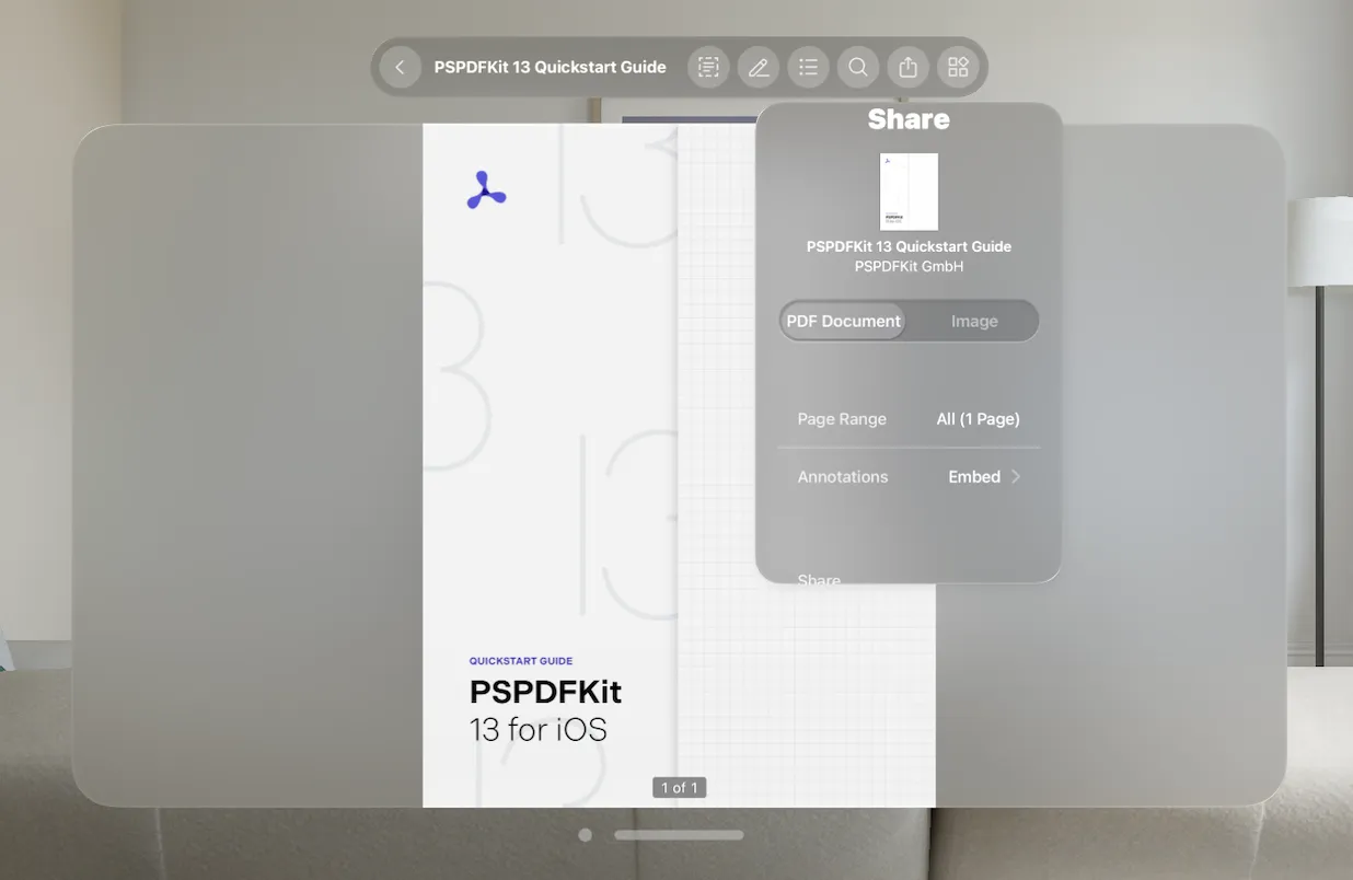
visionOS ornaments float alongside an app’s window, holding extra controls and information without obstructing the main content. In this post, we’ve seen how to show ornaments when the content is implemented using either SwiftUI views or UIKit view controllers. We also saw how to present popovers from ornaments, using either SwiftUI or UIKit to display the popover content.
The full source code for the examples used in this post is available on GitHub(opens in a new tab).
See our getting started guides for information on how to integrate PSPDFKit into your visionOS app. Feel free to reach out to us if you run into any problems or have questions. We’re happy to help!
此内容由惯性聚合(RSS阅读器)自动聚合整理,仅供阅读参考。 原文来自 — 版权归原作者所有。