









This post is part 4 in a six-part series about our design system, Baseline UI.
We recently published our design system, Baseline UI(opens in a new tab), which is a comprehensive set of reusable code blocks that enable users to efficiently build out their user interfaces (UI). In this article, we’ll delve into the concept of design tokens and explore their various applications and benefits within a design system.
In the context of a design system, tokens are standardized, reusable values that define design properties such as colors, typography, and spacing. They can be seen as the smallest pieces of a design system that capture design decisions — as building blocks for maintaining consistent visual language across all digital products. These tokens serve as the single source of truth for style attributes, ensuring consistency across both design files and codebases.
Using design tokens in a design system is fundamental for creating customized themes that can be adapted to various needs, such as aligning with brand identity or meeting specific requirements like AAA accessibility standards.
Tokens ensure that the same style values are applied uniformly across various components, products, and devices, maintaining a cohesive look and feel. This consistency is crucial for establishing and preserving a strong brand identity.
By using tokens, designers and developers can easily update and scale design elements. Changing a token’s value updates all instances where it’s used, simplifying global style updates. This scalability is particularly useful in large projects with multiple products and platforms.
Tokens eliminate the need for repetitive hardcoding of design values. This reduces errors and speeds up the development process, as design changes don’t require manual updates across multiple files. Tokens streamline the workflow, allowing teams to focus on more critical tasks.
With tokens, designers and developers can work more harmoniously. Tokens bridge the gap between design and code, providing a common language that ensures both teams are aligned. This alignment fosters better communication and collaboration, leading to more cohesive and well-executed designs.
There are two tiers that are used in the Baseline UI design system. Each token tier adds a specific capability to the design system.
Core tokens store the raw values that form the foundation of the design system. These tokens define all values that can be used, such as colors, typography, and spacing. They aren’t applied to the product directly, rather they serve as references.
For instance, core tokens in Baseline UI are named descriptively, such as --bui-color-blue-50 or --bui-spacing-12. The 50 in the color token suggests a mid-level blue on a scale from 10 to 100, while 12 in the spacing token denotes 12 pixels.
Semantic tokens reference core tokens and describe their intended use in a contextual manner. These tokens are used throughout the product, and they represent the design system team’s decisions on when and where to use specific tokens. Semantic tokens are organized into sets that can be combined to form a theme. For example, the semantic token --bui-color-interactive-primary references the core token --bui-color-blue-70.
In Baseline UI, we divided our design tokens into the following categories:
Token names are composed of different elements. Depending on the tier, various elements are combined to form a token name.
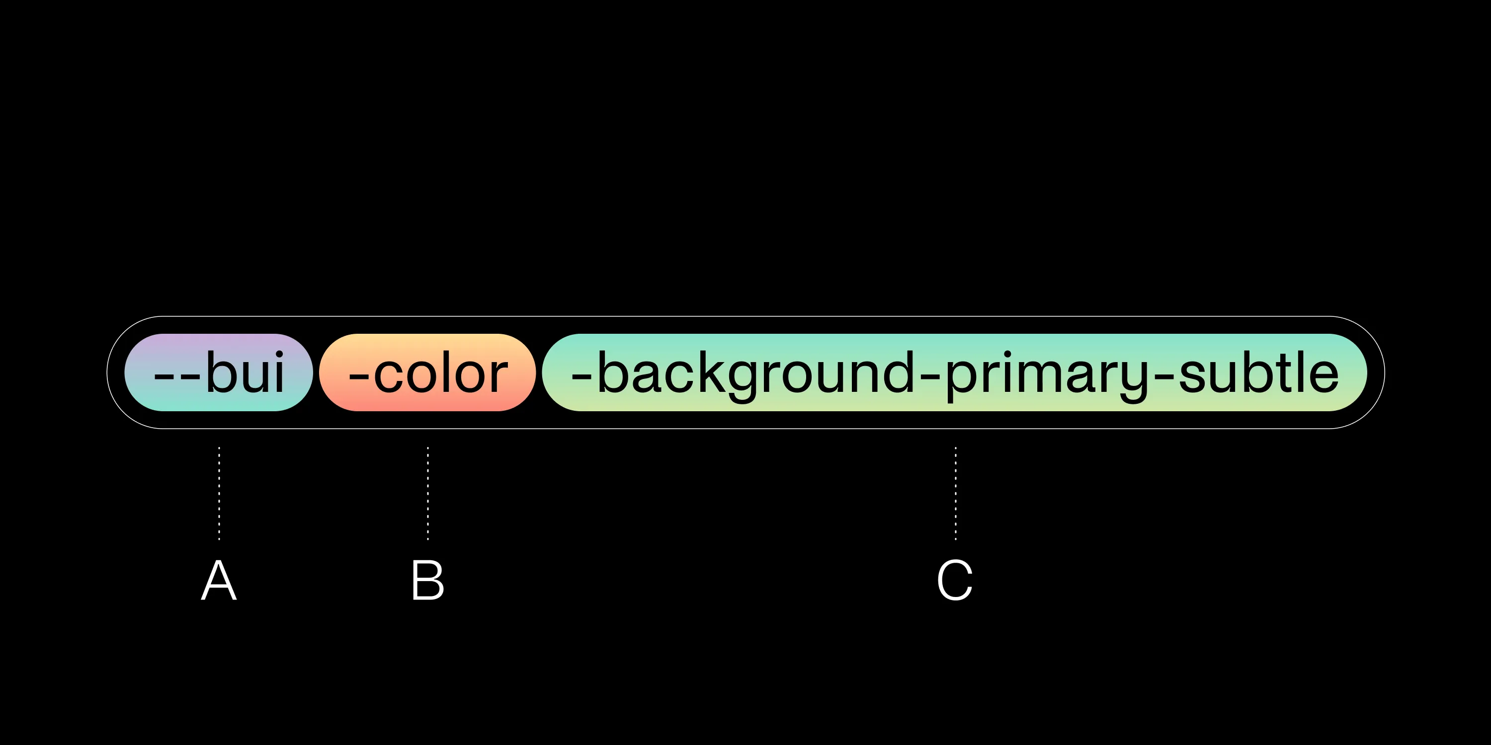
Namespacing involves adding the bui prefix to all tokens. This prefix is an abbreviated form of the Baseline UI design system name, ensuring a unique and consistent identifier across the entire design system. It helps avoid conflicts where design tokens might have the same names as tokens from other systems (e.g. when integrating with Bootstrap).
The second word in the token’s name is the category — following the exact token categories as described above. This categorization helps in easily identifying and organizing the tokens.
The token name ends with a descriptive name to communicate the token’s role. It specifies the design attribute and the token’s purpose, providing clear context for its use.
Design tokens are the backbone of any robust design system, providing a standardized, reusable framework for defining design properties. In Baseline UI(opens in a new tab), tokens ensure consistency, scalability, efficiency, and enhanced collaboration between designers and developers. By categorizing tokens into core and semantic tiers, and by further dividing them into specific categories like color, typography, and spacing, we enable a streamlined and cohesive design process.
Adopting a token-based approach not only simplifies global style updates but also ensures that the visual identity of your brand is preserved across various digital products. Whether you’re aligning with brand identity or meeting accessibility standards, design tokens make it easier to maintain a unified look and feel.
By using design tokens instead of hardcoded values, building, maintaining, and scaling products with a design system can be streamlined.
In part V, we examine how Baseline UI facilitates easy customization of user interfaces, allowing our customers to tailor solutions to fit their specific needs and preferences. We’ll explore the various customization options available in Baseline UI and how they contribute to improving user experiences. You can read part I, part II, and part III here.
此内容由惯性聚合(RSS阅读器)自动聚合整理,仅供阅读参考。 原文来自 — 版权归原作者所有。