





This post is part 6 in a six-part series about our design system, Baseline UI.
So far, we’ve discussed various design and accessibility aspects of Baseline UI, which were critical considerations during its development. However, our work doesn’t stop there. A major reason for creating Baseline UI was to develop a library of components that enable easy customization. We’ve talked about theming and styling in the previous articles, but in this article, we’ll delve into a more complex use case — customizing the user interface (UI) for a specific product.
The Baseline UI project is divided into multiple parts:
Both the Core and App parts contain React components that can be customized using props. The rest of this article talks about how we’ll enable customers to customize the recipes for complex use cases.
In most frameworks, components are customized via props. While this method works well at a granular component level, where customization needs are predictable, it falls short for more complex layouts. For instance, predicting the customization needs for a TextInput component is relatively straightforward. However, this predictability diminishes as the complexity of the layout increases. Consider the example below.
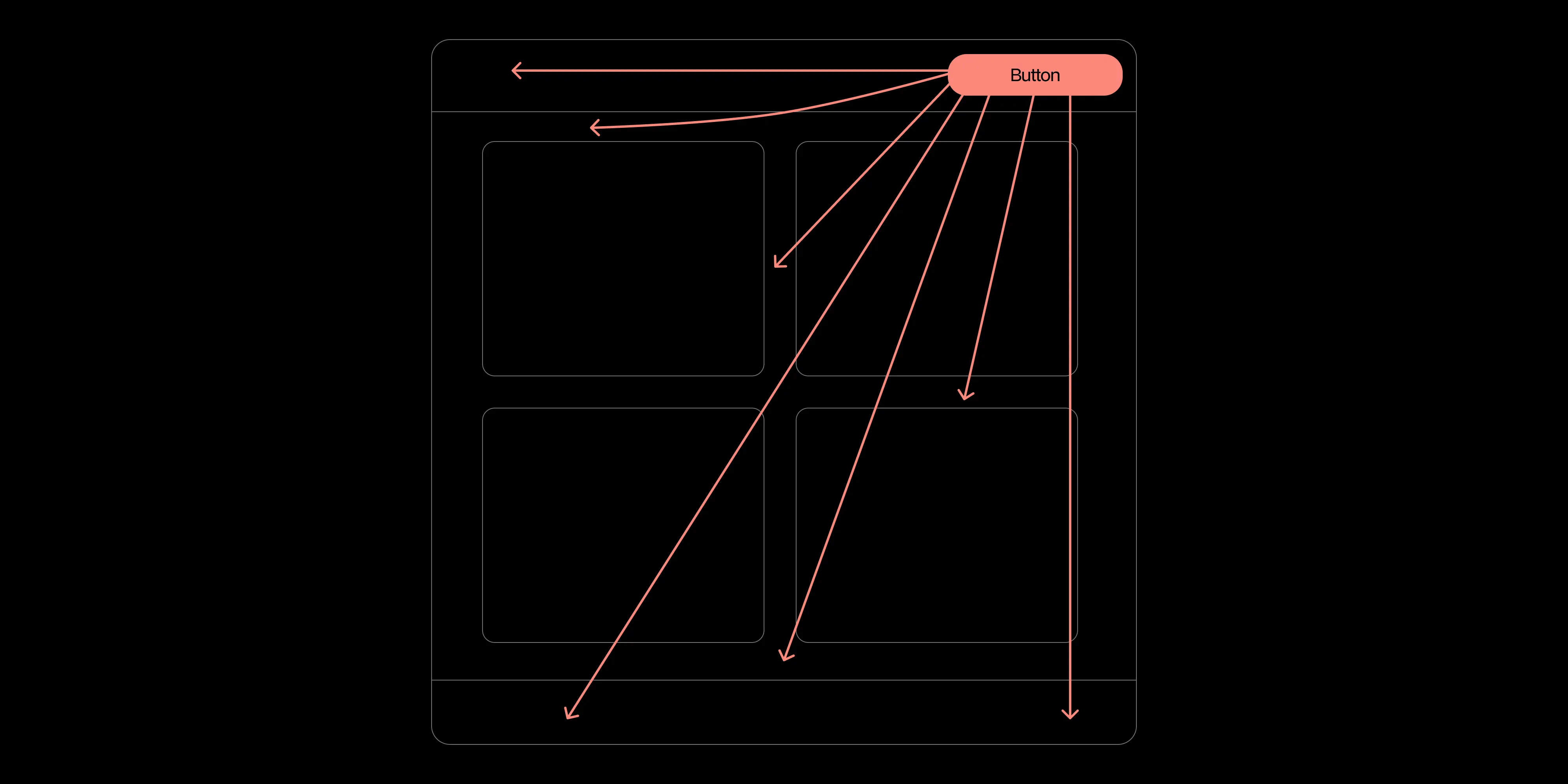
In the layout shown above, a user might want to move the button to anywhere in the layout, change the color of the button, or even replace the button with a different component. This is just one of the many possible use cases. Predicting these customization needs is challenging, and providing props for each of these use cases isn’t feasible. This is where the problem lies.
Our diverse customer base spans various industries, each with unique customization demands that are hard to foresee. The overall UI for one user can be vastly different from another’s, making it challenging to cater to all needs using traditional methods. Historically, this level of customization has been a prime demand from our customers. Therefore, when developing Baseline UI, we aimed to address this requirement effectively.
Traditional customization approaches wouldn’t suffice, so we devised an alternative method to enable users to achieve their desired UI without starting from scratch. We established the following constraints:
One initial solution was to open source the UI of our product. This would allow users to fork the repository and modify the UI as they see fit, enabling us to claim that our UI is fully customizable. However, this solution had several drawbacks:
Due to these drawbacks, we decided that irrespective of whether or not we eventually open source the UI, this can’t be the first step toward a solution. We don’t want to shift the burden of maintaining the UI to the users and claim that the UI is customizable. Rather, we want to provide a seamless experience for them.
Another solution we devised, and the one we ended up using, was to provide a way to expose the component tree to the users. We created a custom JSX runtime as part of the Baseline UI project that allows users to:
This solution offers several advantages:
Here’s a pseudocode example of the solution:
=
function increment(number) {
return number + 1;
}
createBlock(DefaultComponent, {},
({ ui, state }) => {
const stampsPresetButton = ui.getBlockById("stamp-presets-button")
stampsPresetButton
// Change the prop of a child component.
.setProp("variant", "primary")
.setProp("onPress", (...args) => {
// Access the default prop of the component.
stampsPresetButton.props.onPress(...args);
// Create a new state variable and use it.
state.set("pressed", !state.get("pressed");
})
return ui.createComponent();
}
).createComponent();
=
In this code, DefaultComponent is the default UI component exposing the component tree to the users. The ui is an instance of Block(opens in a new tab) that contains the component tree, and the state object contains the state of the UI. Users can modify the component tree to achieve their desired UI. The ui.createComponent() method creates the UI using the modified component tree.
This is just a glimpse of what the customization API can do. We’re currently working on integrating this solution into our Web SDK, and we’re excited to see how our users will create their own customized UIs with it.
In this article, we discussed the problem of designing a customization API that’s easy to maintain, yet flexible for complex layouts. We also highlighted the advantages of the component tree solution and how it’ll be integrated into our Web SDK. We’re eager to see how it’ll be received by our users and how they’ll use it. If you find this solution interesting and would like to know more about it, contact us. We’d be happy to discuss it further with you.
In future articles, we’ll delve deeper into the technical aspects of the customization API and provide more examples of how it can be utilized. Stay tuned!
To learn more about Baseline UI, you can read part I, part II, part III, part IV, and part V of our series.
此内容由惯性聚合(RSS阅读器)自动聚合整理,仅供阅读参考。 原文来自 — 版权归原作者所有。