



惯性聚合 高效追踪和阅读你感兴趣的博客、新闻、科技资讯
阅读原文 在惯性聚合中打开

推荐订阅源

Threat Intelligence Blog | Flashpoint
Microsoft Azure Blog
博客园 - 三生石上(FineUI控件)
WordPress大学
WordPress大学
人人都是产品经理
人人都是产品经理
钛媒体:引领未来商业与生活新知
钛媒体:引领未来商业与生活新知
博客园 - 聂微东
Jina AI
Jina AI
奇客Solidot–传递最新科技情报
奇客Solidot–传递最新科技情报
T
Tailwind CSS Blog
罗磊的独立博客
爱范儿
爱范儿
OSCHINA 社区最新新闻
OSCHINA 社区最新新闻
Apple Machine Learning Research
博客园 - Franky
阮一峰的网络日志
阮一峰的网络日志
雷峰网
雷峰网
博客园 - 叶小钗
美团技术团队
让小产品的独立变现更简单 - ezindie.com
月光博客
月光博客
freeCodeCamp Programming Tutorials: Python, JavaScript, Git & More
大猫的无限游戏
大猫的无限游戏
The Cloudflare Blog
Last Week in AI
Last Week in AI
S
SegmentFault 最新的问题
博客园 - 【当耐特】
小众软件
小众软件
Hugging Face - Blog
Hugging Face - Blog
量子位
宝玉的分享
宝玉的分享
V
Visual Studio Blog
博客园_首页
IT之家
IT之家
V
V2EX
腾讯CDC
aimingoo的专栏
aimingoo的专栏
博客园 - 司徒正美
Microsoft Security Blog
酷 壳 – CoolShell
酷 壳 – CoolShell
H
Hackread – Cybersecurity News, Data Breaches, AI and More
Blog — PlanetScale
Blog — PlanetScale
I
InfoQ
有赞技术团队
有赞技术团队
J
Java Code Geeks
Recorded Future
Recorded Future
Engineering at Meta
Engineering at Meta
Vercel News
Vercel News
CTFtime.org: upcoming CTF events
H
Help Net Security

Inside Nutrient

A guide to the invisible work behind documents Introducing Nutrient Documents for Salesforce: Native document generation and signing Document AI vs. traditional OCR: Choosing between OCR, AI, and hybrid pipelines PDF SDK compliance and security evaluation checklist for enterprise teams (2026) Invariant Corp replaces paper processes with Nutrient Workflow and scales without limits What is process mapping? A complete guide Nutrient vs. Conga Composer for Salesforce document generation (2026) Document routing: How to automate document distribution The CTO’s AI playbook: Why accountability architecture beats orchestration Compliance workflow automation: Why built-in compliance is table stakes Workflow diagrams: Examples, symbols, and how to build one that actually runs Digital forms: Replace paper forms with automated workflows Approval workflow software: How to automate approvals Why document-centric automation is different The CEO’s AI playbook: Why decision architecture beats model selection Nutrient SDK product updates for Q1 2026 PDF redaction verification: How to prove sensitive data is permanently removed What is a VPAT? The complete guide to accessibility conformance reports What is PDF/UA? The accessible PDF standard explained Salesforce eSignatures: Generate, sign, and track documents in one flow Online document viewer: Options, tradeoffs, and how to embed one Document viewer for web apps: React, Vue, Angular (2026) Best document viewers in 2026: A buyer’s guide How to edit a PDF in Python: Add text, images, and annotations Nutrient advances Workflow platform with agentic AI for enterprise-grade speed and consistency in document-heavy operations How to create a Salesforce quote template from opportunity data The business case for accessibility: Five ways it drives enterprise value Python PDF library comparison (2026): 7 libraries for developers Why your AI agent hallucinates PDF table data PDF.js limitations: When to upgrade to a commercial PDF SDK How Subject scaled 5× with Nutrient’s PDF SDK without rebuilding its document layer I replaced our sales training with an AI coach that runs in Slack — here’s what broke Redirecting to: https://securitybuzz.com/cybersecurity-news/why-enterprise-permissions-are-ais-most-dangerous-inheritance/ Nutrient .NET SDK vs. iText Core: Complete comparison for .NET developers DocuVieware: Support’s most frequently asked setup questions Introducing Nutrient Workflow How to convert PDF to Word in C# (.NET) When email and spreadsheets stop working: Work order approval workflows for field teams on the move Compliance with confidence: Why document-centric automation is the foundation of your mission Nutrient expands AI Assistant, automating multistep document workflows inside any application What is document generation? A developer’s guide to PDF generation Document Converter data flow and how real-time watermarks skip the queue PDF/UA compliance guide: Requirements, standards, and best practices Computers still can’t understand you How Athena Intelligence built AI agents for regulated enterprises with Nutrient’s document infrastructure How to convert HTML to PDF (2026): 4 methods from browser print to SDK How to build a document extraction pipeline with Nutrient Vision API OCR vs. intelligent document processing: Choosing the right document extraction engine Beyond OCR: How document intelligence eliminates manual processing in regulated industries Nutrient vs. IronPDF: Complete comparison for .NET developers Nutrient vs. Aspose.PDF: Complete comparison for .NET developers Redirecting to: https://fortune.com/2026/02/19/openclaw-who-is-peter-steinberger-openai-sam-altman-anthropic-moltbook/ Lufthansa Systems uses Nutrient to deliver reliable, scalable PDF rendering for pilots worldwide Nutrient vs. Syncfusion: Complete comparison for .NET developers React’s useTransition: The hook you’re probably using wrong First City Monument Bank streamlines banking processes with Nutrient Workflow Redirecting to: https://www.sdcexec.com/warehousing/automation/article/22957364/nutrient-workflow-automation-the-missing-link-in-supply-chain-efficiency The complete guide to digital signatures: PAdES, CAdES, and XAdES explained Nutrient Python SDK: Production-grade document processing for Python Introducing agentic document editing for web applications with AI Assistant Nutrient vs. QuestPDF: Complete comparison for .NET developers How we fixed the GdPicture license expiration (and what to do if you’re affected) Red team security testing with agentic AI The future of healthcare document automation Best healthcare workflow software compared Nutrient SDK product updates for Q4 2025 How Harvey scaled legal document workflows 50 percent MoM without rebuilding infrastructure HIPAA-compliant document management in hospitals How we optimized rendering performance while handling thousands of annotations in React — Part 2 Automated PII removal with Nutrient API Redirecting to: https://www.devopsdigest.com/2026-low-code-no-code-predictions Redirecting to: https://www.kmworld.com/Articles/Editorial/ViewPoints/Leaders-predict-AI-to-continue-permeating-all-aspects-of-KM-in-2026-172594.aspx What are deep agents and how do they solve complex problems? Whipping up document magic: Your easy-bake recipe for Vue and Nutrient Web SDK 🧁 What I’ve learned about product iteration planning while building SDKs Passwordless document signing: Three-layer security guide New zip folder functionality streamlines file management in Document Automation Server The keyboard shortcuts playbook: Taking control of keyboard events in Nutrient Web SDK From experienced engineer to AI beginner: My unexpected journey AI-assisted manual testing: Handling Safari’s PDF rendering and UI quirks How to keep a 20-year-old SDK up to date How we optimized rendering performance while handling thousands of annotations in React — Part 1 Nutrient announces new executive hires to accelerate next phase of growth High performance UI using web workers Automate document conversion at scale with Python and Nutrient DCS From curiosity to PLG (and AI): My journey to understanding product-led growth Prost to progress: One year as Nutrient Pigeon usage at Nutrient: Bridging native SDKs to Flutter Modernizing CI build servers: How to migrate from Chef to Ansible Unix man pages: AI-friendly documentation since 1971 Consistent hashing for even load distribution Best AI redaction APIs: Complete comparison guide for 2025 Why AI document redaction matters for modern security From coding to coordinating: How AI transformed my workflow What is intelligent document processing (IDP)? A complete guide Enterprise PDF SDKs: Best PSPDFKit (now Nutrient) alternatives Nutrient SDK product updates for Q3 2025 GdPicture support best practices Redacting sensitive data with Nutrient AI redaction API How AI is transforming the customer experience at Nutrient: From instant answers to intelligent support
Master the Baseline UI theme in detail
Petra Bukovinski, Maša Majce · 2024-07-11 · via Inside Nutrient

This post is part 5 in a six-part series about our design system, Baseline UI.

This post will explore the Baseline UI(opens in a new tab) (BUI) theme in greater detail and provide insights into how you can customize it to align with your brand. But first, what is a theme?

A theme is a cohesive collection of elements and styles applied across various components to ensure a consistent design language. This consistency allows components and styles to be reused across an app, enhancing both aesthetics and functionality. By understanding the foundational elements of the BUI theme, you can effectively leverage and adapt it to create a seamless user experience that reflects your brand’s unique identity.

BUI theme elements

We use design tokens for theming. Design tokens are the core elements of a design system — like color, typography, spacing, and icons — that can be consistently applied across different platforms and devices. Theming is a comprehensive concept that includes all token elements, as well as our icon set. Our default themes include BUI Light Theme and BUI Dark Theme, which, by default, automatically switch based on a user’s system settings.
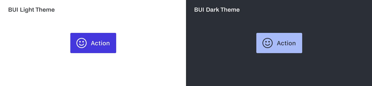
Default Themes Example of our primary action button component in the default styles of the light and dark themes on a Mac.

Colors

Colors play a crucial role in setting the tone and mood of your application. The BUI theme utilizes a thoughtfully curated color palette designed to be versatile and adaptive.

Main Palette

Main palette — The primary color scheme is neutral, predominantly featuring shades of gray. This neutral palette serves as a foundation, providing a clean and minimalistic look. A blue color scheme is used to highlight interactive elements, giving the UI a duotone appearance that can easily transition to a single-tone concept if needed.

Supporting Colors

Supporting colors — The theme also includes a supporting color scheme with reds, oranges, greens, and blues. These colors are typically used for indicating negative and positive actions within the UI. For example, red might signal an error or warning, while green could indicate success or confirmation.

Typography

Typography is essential for readability and conveying the right message. Our typographic styles are designed to be clear and accessible, ensuring a consistent reading experience across different devices.
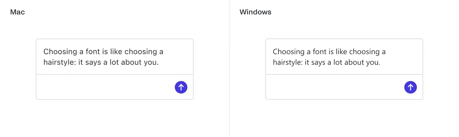
System Fonts

System fonts — Our typographic styles inherit the system fonts. For Mac users, this means displaying all typographic styles in SF Pro, while Windows users will see the Segoe UI font. This approach ensures text appears natural and native to the operating system, enhancing user familiarity and comfort.

Object roundedness

The shape and roundedness of UI elements can significantly impact the overall feel of your application. Rounded corners often create a more approachable and friendly interface.
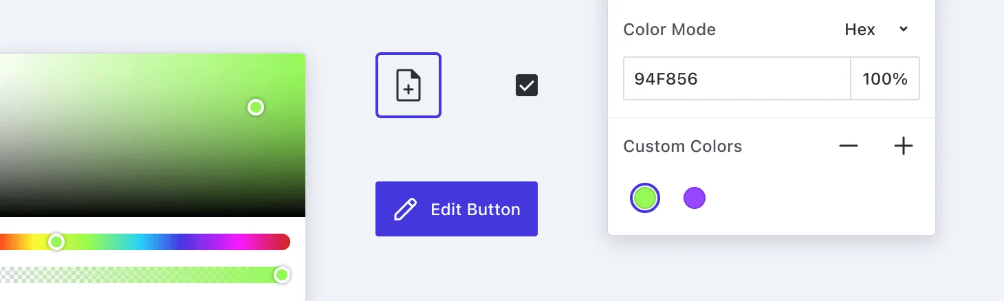
Rounded Elements

Rounded borders — Elements such as buttons, dialogs, popovers, form inputs, and dropdowns feature rounded borders. Roundedness can soften the appearance of the UI, making it feel more modern and accessible.

Range of roundedness — We offer a variety of roundedness options, from extra small to 2× large, as well as fully rounded corners. This flexibility allows you to adjust the visual style to match your brand’s personality, depending on whether you prefer sharp, angular edges or smooth, rounded corners.

Spacing

Effective use of spacing is crucial for creating a well-organized and visually appealing layout. Consistent spacing helps maintain a balanced and harmonious design.
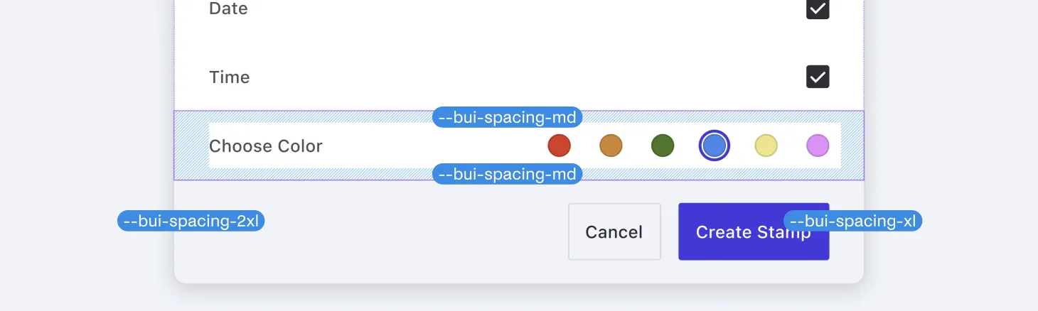
Spacing

Consistent spacing — We define a range of spacings, from extra small to 9x extra large. These are all multiples of 4px, with the sole exception being the 2px spacing. This approach ensures that elements are evenly distributed, contributing to a clean and structured layout.

Icons

Icons are a vital part of UI design, providing visual cues that help users navigate the interface efficiently.
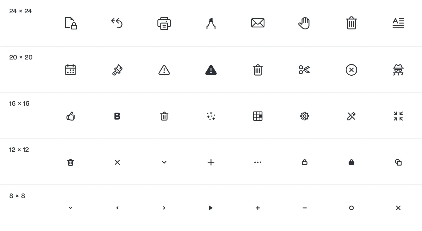
Icons

Neutral design — Our icon set features a neutral aesthetic, with rounded caps and a consistent line thickness of 1.5px across all sizes. Some icons also have filled versions, and in certain cases, the line thickness can be adjusted to 1px for intricate details, in combination with the standard 1.5px lines. This design approach ensures that our icons are versatile and seamlessly integrate with various design styles.

Icon sizes — We provide multiple icon size sets to suit different needs, including 24 × 24 px (Large), 20 × 20 px (Medium), 16 × 16 px (Small), 12 × 12 px (Extra Small), and 8 × 8 px (Extra Extra Small).

When choosing an icon size, it’s important to consider the level of detail required. Smaller icons, such as 8 × 8 pixels, are best suited for simple shapes like chevrons, which don’t require much detail. Conversely, intricate icons like a printer cannot be effectively rendered at such a small size due to the complexity and the need for recognizability. Therefore, it’s crucial to select icon sizes pragmatically based on their use case. These size variations allow you to use icons appropriately across different contexts, from large buttons to small indicators, ensuring clarity and visual harmony.

Elevation

Elevation effects, such as shadows, help differentiate elements and create a sense of depth in the user width.
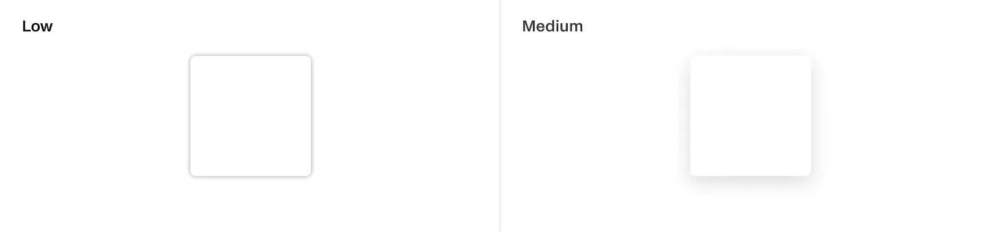
Elevation

Drop Shadows — Our dialogs, popovers, and dropdowns feature drop shadows to elevate them from the background, ensuring they stand out more prominently. This technique adds visual hierarchy, guiding users’ attention to the most important elements.

Opacity

Opacity levels control the transparency of elements, allowing for layered designs and visual effects.

Opacity

Opacity levels — We define four opacity levels, ranging from invisible to high. These levels can be used to create subtle visual effects, such as disabled states and overlay screens.

Theme customization

Customization is a key feature of our theme, enabling you to tailor it to meet your specific needs and branding requirements.
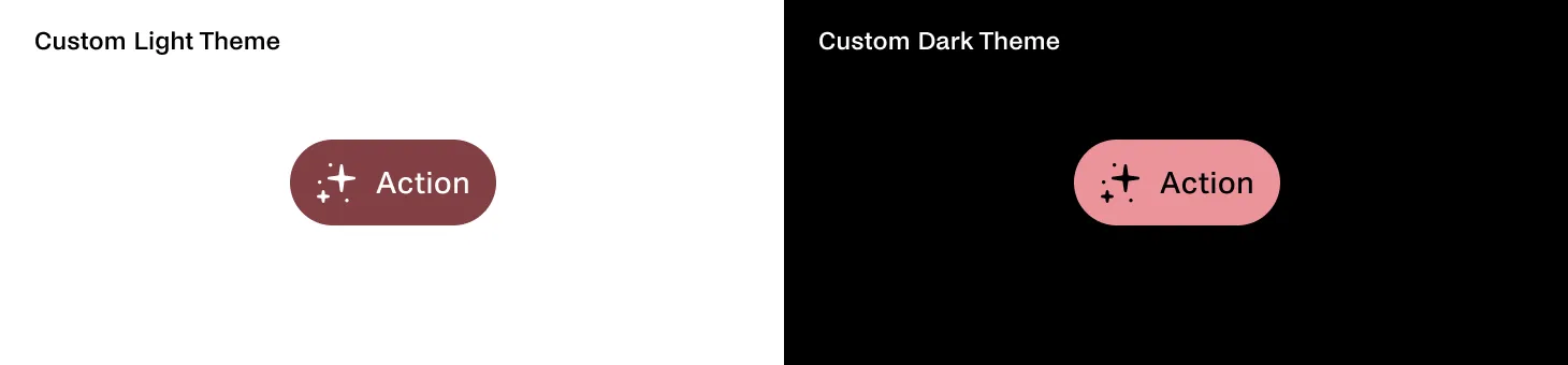
Custom Themes Example of our primary action button component in customized light and dark themes. It features fully rounded corners, custom interactive colors, and a custom font.

Changing design tokens

Modifying values — You can easily customize the theme by changing the values of the design tokens. For instance, you can adjust color schemes, typography settings, and spacing values to match your brand’s style guide. This flexibility ensures that your application can maintain a consistent look and feel that aligns with your brand identity.

Replacing icons

Custom icon sets — If you have a unique icon set that better represents your brand, you can replace our default icons with your own. This allows you to infuse your application with distinctive visual elements that resonate with your brand’s aesthetic.

By leveraging these customization options, you can create a UI that’s not only visually appealing but also reflective of your brand’s personality and values. Whether you’re aiming for a sleek, modern design or a more playful, vibrant interface, the Baseline UI theme provides the tools and flexibility you need to achieve your vision.

Conclusion

The Baseline UI(opens in a new tab) theme offers a robust and flexible framework for designing a consistent and visually appealing user interface. By understanding and utilizing its core elements — colors, typography, object roundedness, spacing, icons, elevation, and opacity — you can create an application that’s not only functional but also aesthetically aligned with your brand.

The theme’s customization capabilities empower you to tailor every aspect of the design to fit your unique requirements, ensuring your application stands out in a crowded marketplace.

In part VI, we’ll dive even deeper into how Baseline UI facilitates easy customization of user interfaces, allowing our customers to tailor solutions to fit their specific needs and preferences. We’ll explore the various customization options available in Baseline UI and how they contribute to improving user experiences. You can read part I, part II, part III, and part IV here.