











We recently undertook an exciting project to redesign the icon set in our Web SDK. In this article, we’ll share insights on preparing an icon set for optimal use in design software, specifically in Figma.
Moreover, we’ll offer tips on preparing for the handover process to smoothly integrate these icons into our design system, Baseline UI(opens in a new tab).
In recognizing that our customers frequently customize the SDK to align with their branding guidelines or create new icons for specific functionalities, this article aims to provide practical advice for achieving these goals efficiently and effectively.
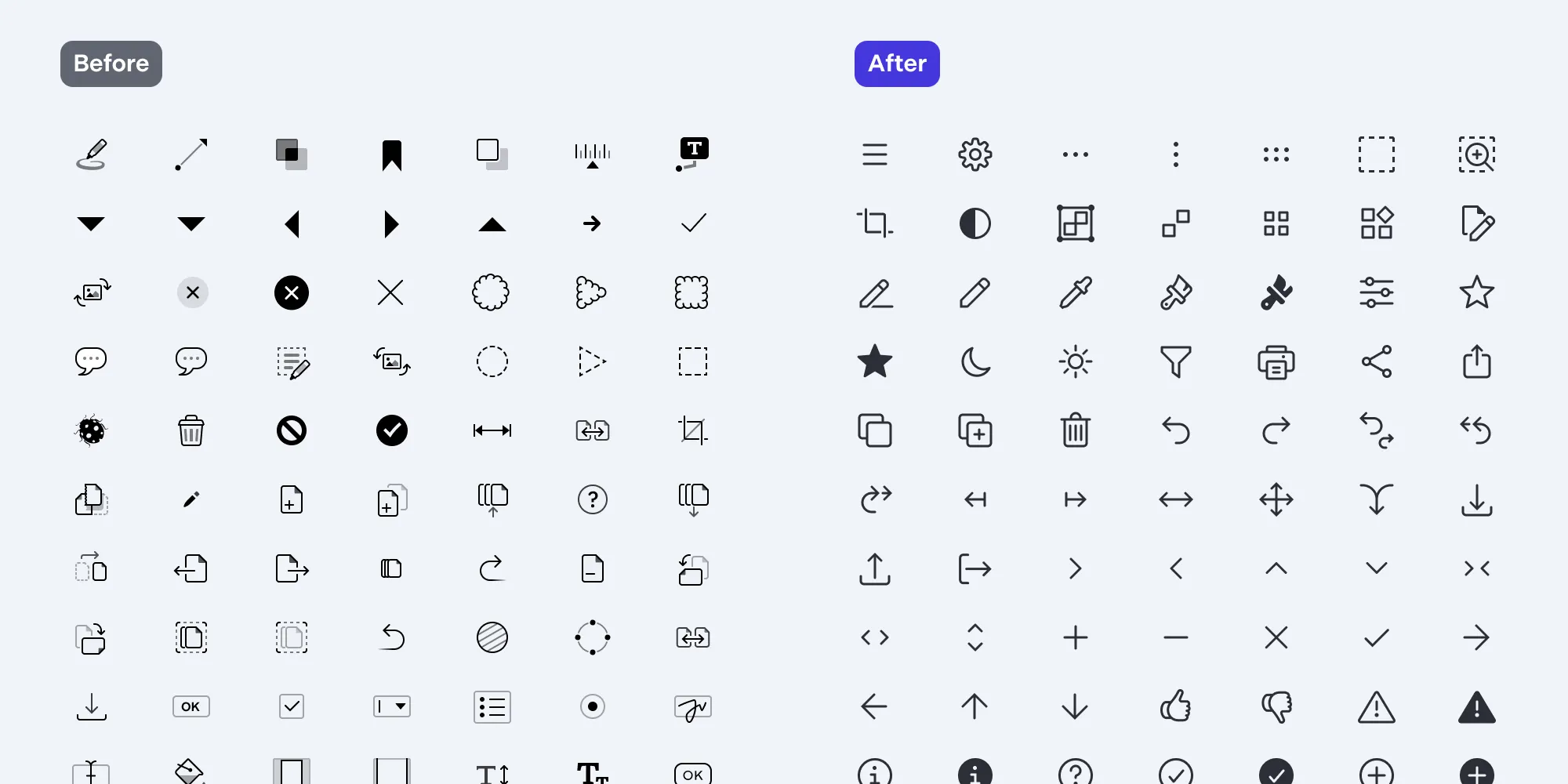
In late 2022, we introduced a new icon set to our mobile platforms. In extending this set to our Web SDK, we aimed to harmonize the style of icons across all our products, ensuring a more cohesive and consistent cross-platform experience.
Unlike the previous set, which utilized varying opacity levels, the new icons feature a uniform, full opacity. This deliberate shift simplifies color customization, enabling adjustments in a single step, while also ensuring compliance with accessibility standards.
Moreover, the integration of this new icon set into our Baseline UI(opens in a new tab) design system reflects our commitment to a cohesive design framework that evolves in tandem with our products. This ensures that our iconography remains aligned with the latest design standards and user expectations, contributing to a seamless and intuitive user interface (UI) across our platforms.
Designing icons can be approached in many ways, and we’d like to share the process we followed to create a cohesive set for our design system.
The single source of truth for our designs is the Baseline UI(opens in a new tab) design system, which matches the designs prepared in Figma exactly. To maintain consistency and save time, the first recommendation is to collect all icons in a single Figma page. This approach provides a clear overview of the available icons and ensures a unified design language.
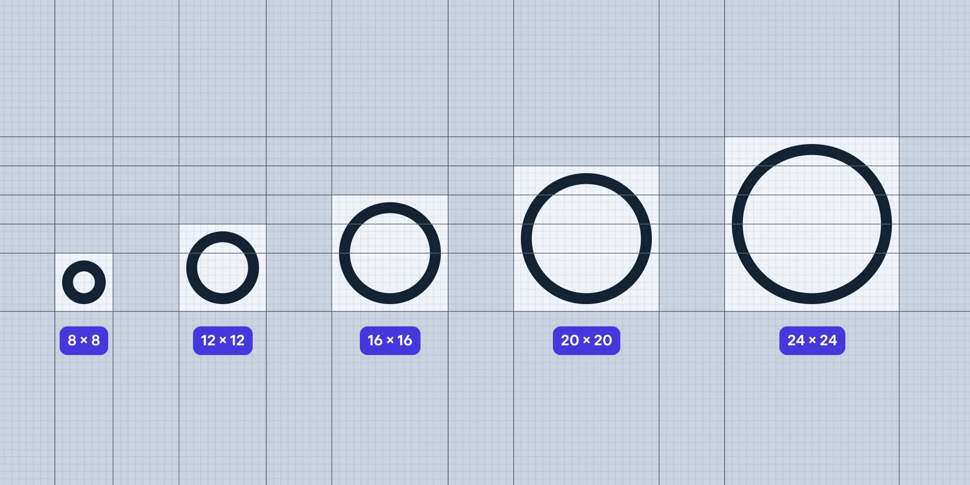
Our design system includes icons of various sizes: from Extra Extra Small (8 × 8 pixels) to Large (24 × 24 pixels). Before creating a new icon, verify the required size to ensure it fits seamlessly into the existing set.
We use a combination of outline and filled icons, with a stroke width of 1.5 pixels for the outline icons. Lines have rounded caps, and corners are rounded as well. This consistency in style helps maintain a uniform look across the set.
Start by creating a frame of the desired size.
Design the desired shape by following style guidelines. Test the icon at 100 percent zoom, try it in the UI, and make adjustments if needed.
Save this version as a work file without creating a component.
Tip: Our approach to immediately differentiating the working icon files from the final icon set is to use a different color — violet in our case.
Flattening is important for several reasons. First, it allows you to save the individual path of every icon instead of saving the entire SVG, which significantly reduces the file size and saves space. Second, animating an icon with a single path is much easier compared to dealing with multiple paths, leading to smoother and more efficient animations.
To ensure the icon will inherit the specified color styles when used in the design system components, it’s essential to always name the single icon layer in all icons the same thing. We simply name the layer “icon” in lowercase.
We aren’t scaling the icons in the UI, so we set all constraints to center.
Use the correct color token (e.g. color.icon.primary) to ensure the icon inherits styles correctly. Read more about design tokens in this article.
Create a component from the frame.
Name the component according to your conventions. We follow a few simple guidelines:
-filled suffix.Using these master icons when designing components makes it easy to swap out icons while preserving any style overrides.
For integration into Baseline UI, we export icons in .svg format. SVG is an XML-based vector graphic that supports transparent backgrounds and scales without quality loss. To ensure the fill color is programmatically defined, we set the fill of the single path inside the SVG to “currentColor” using the SVG Export plug-in in Figma. Select the master components, open the plug-in, and choose currentColor from the presets dropdown.
For a detailed guide on using Baseline UI icons in your project, see here(opens in a new tab).
Redesigning our icon set was a crucial step in enhancing the visual consistency and accessibility of our products as well as streamlining our processes internally. By including it in the Baseline UI(opens in a new tab) design system and simplifying the customization process, we aim to provide a better experience for both designers and developers. We hope these insights and tips will help you create and integrate your icon sets more efficiently, ensuring a seamless fit with your branding and functionality needs.
此内容由惯性聚合(RSS阅读器)自动聚合整理,仅供阅读参考。 原文来自 — 版权归原作者所有。