


We’re excited to share the story behind our brand’s transformation. This isn’t just a visual refresh — it’s a complete evolution of our identity and product offerings, designed to reflect our vision for the future.
When reimagining our brand, we faced a significant challenge: uniting multiple companies and products under one cohesive identity. To bring our vision to life, we partnered with the world-renowned design agency Pentagram(opens in a new tab).
With a detailed brief in hand, we embarked on a collaborative, iterative journey. The result? A brand that seamlessly blends creativity, feedback, and precision — one that we’re incredibly proud of.
At the heart of our new brand lies the atom — a circular form that symbolizes connection, growth, and innovation. This versatile element represents the harmony of multiple systems working together — much like an ecosystem — reflecting our ambition to continuously evolve and push boundaries.
The atom also serves as the foundation for our logo, where dynamic, circular dots converge to form an “N.” Warm neutrals paired with vibrant accent colors enhance our approachable and friendly identity, while the design embodies stability, scalability, and collaboration.
Our refreshed art direction focuses on two central themes: people and nature. When zoomed out, our brand is about people — their experiences, needs, and creativity.
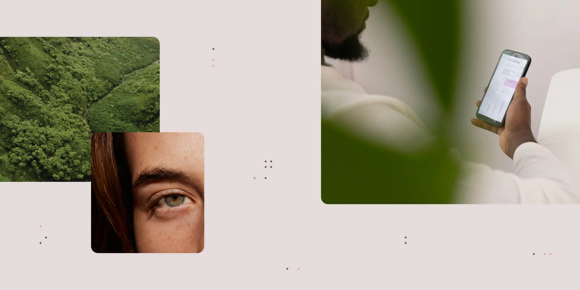
When zoomed in, it’s about the product — the precise details that power those experiences.
This duality ensures that our brand remains relatable, human, and engaging, while emphasizing the innovative spirit driving our work.
One of the primary goals of our rebrand was to create a website that could serve diverse audiences without causing confusion. Our SDKs cater to developers, our low-code offerings target IT specialists, and our workflow platform is designed for citizen developers.
The solution? A unified website(opens in a new tab) structured like five distinct sites under one roof. We developed a top navigation that includes all product lines, with content that adapts to the user’s selected offering.
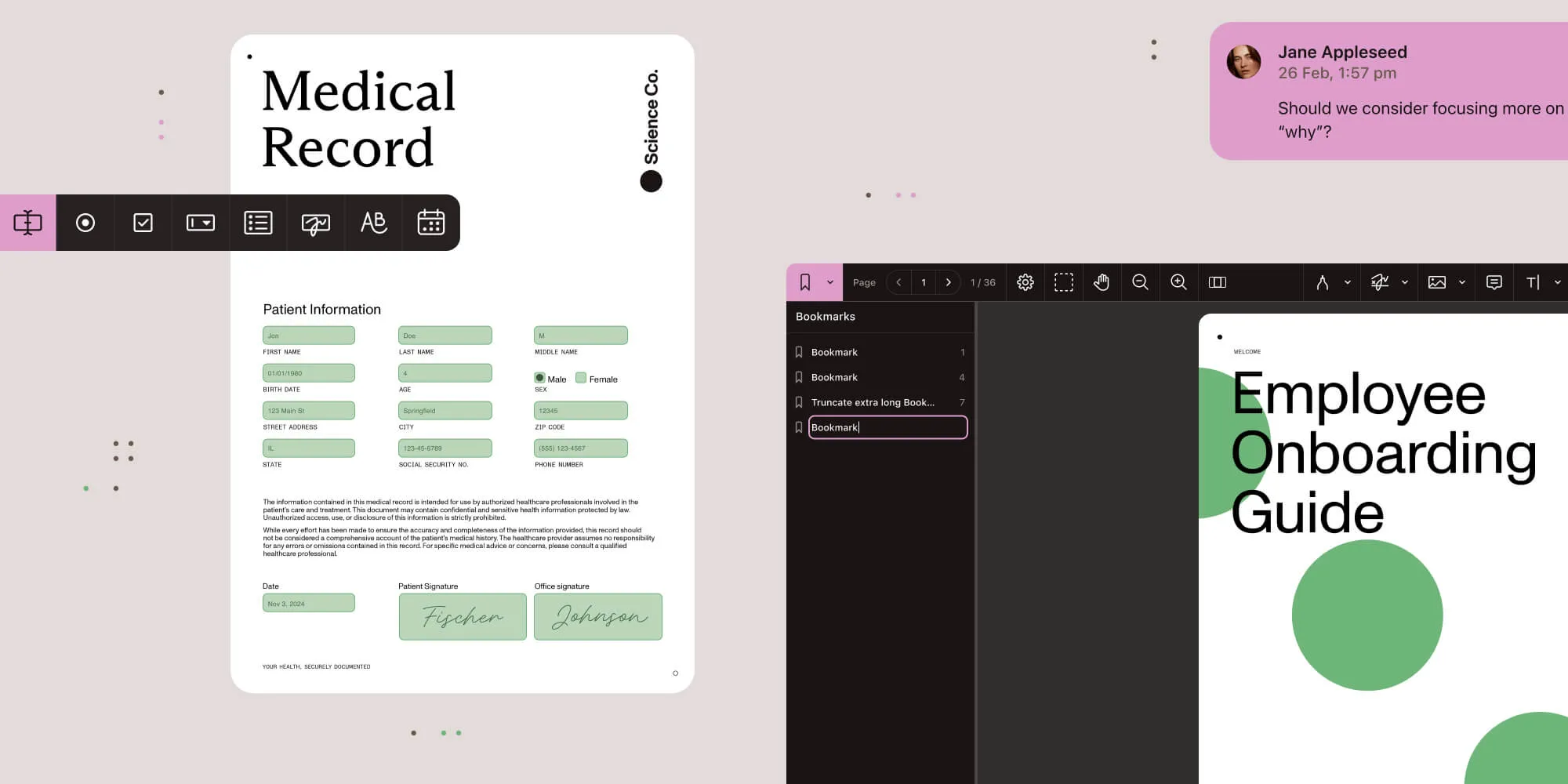
As users navigate the site, they’ll notice the atom’s influence throughout — from background animations to animated sample documents — forming strong interactions and interconnected ecosystems.
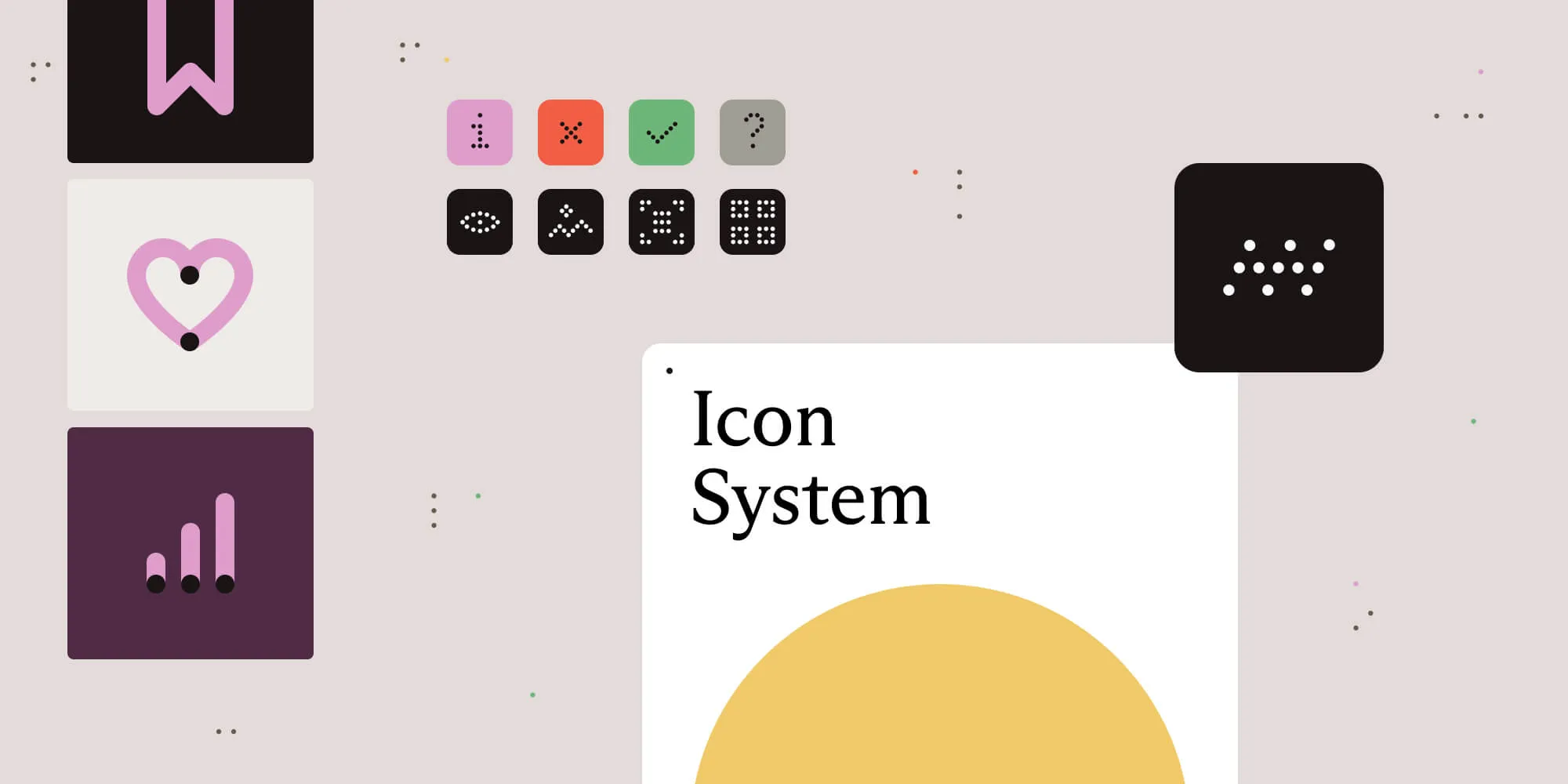
Even our icons, along with other design elements, are designed using atoms and feature rounded corners, echoing the circular form of the atom.
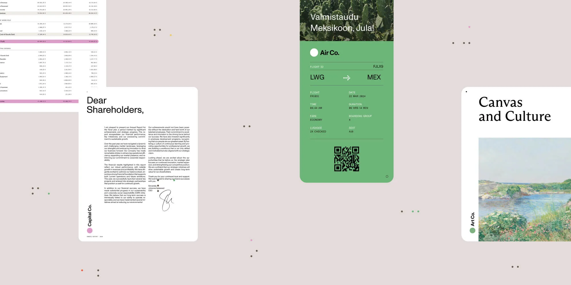
Our brand’s versatility shines through in every touchpoint — from newsletters to sample documents. These assets are built on a dotted atom grid, ensuring visual cohesion across all mediums.
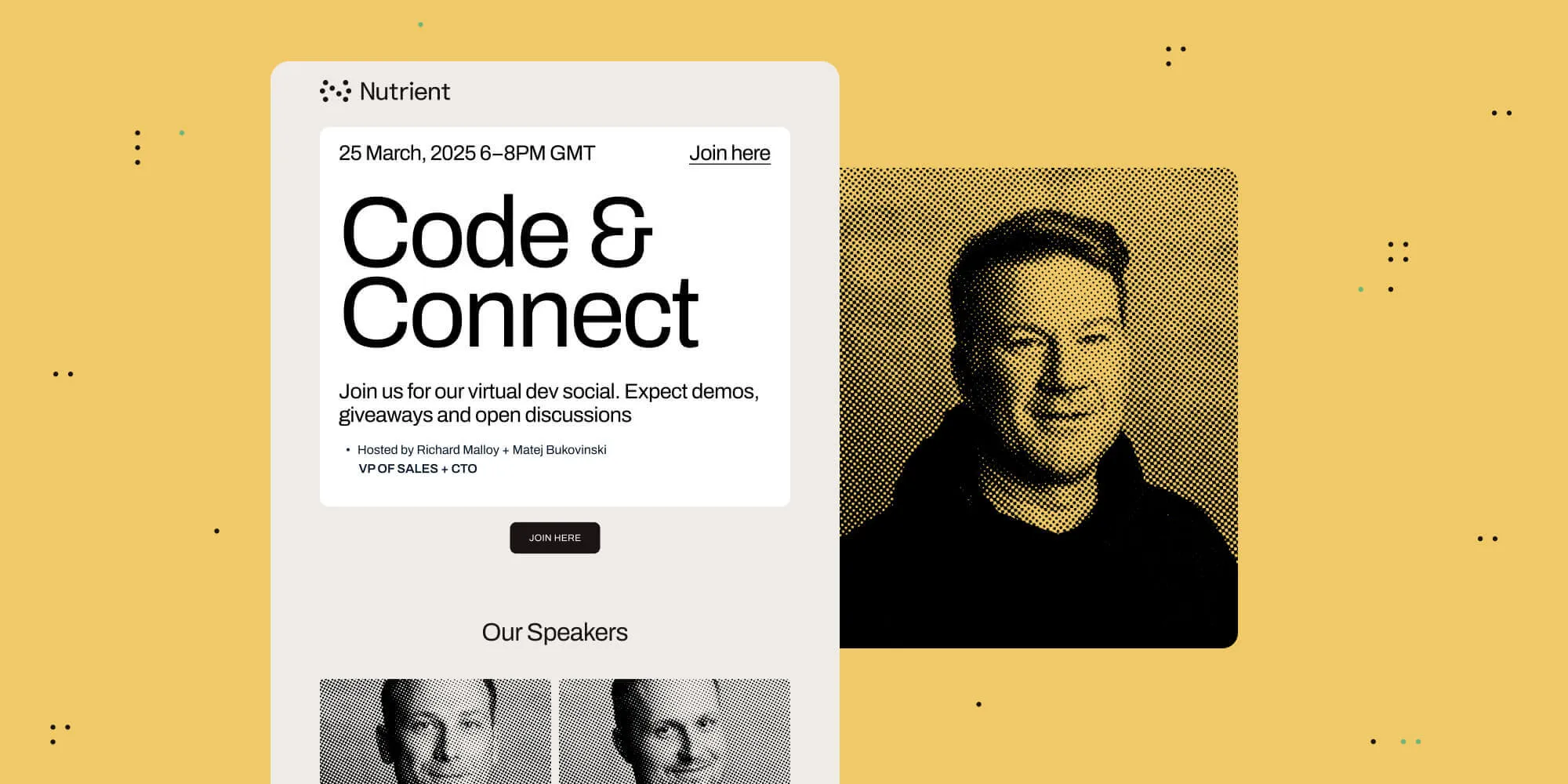
Soft shapes with rounded corners emphasize the human-centric nature of our design, reinforcing a consistent, recognizable brand identity.
This transformation marks the beginning of an ongoing journey. Our commitment to continuous evolution drives us to push boundaries, explore new possibilities, and share more updates as we shape the future together.
此内容由惯性聚合(RSS阅读器)自动聚合整理,仅供阅读参考。 原文来自 — 版权归原作者所有。