






Posted by on May 23, 2014
I help researchers make maps of their research. An archaeologist recently wanted to visualise the distribution of some iron-age artefacts around the Levant, based on a spreadsheet of thousands of rows. Each row represents one kind of artefact at a given site, such as “3 incised bangles, subtype I.b.iv, at Gath.” What are these maps called? I’ll go with “multivariate binary symbol map”.
It sounded like a job for CartoDB, but as the requirements unfolded, she wanted pretty specific cartography, plus a custom base map of rivers, historical boundaries etc. So we used TileMill instead, although we didn’t end up getting all that done.
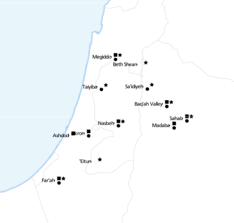
This is where we got to. Each symbol next to a place name represents the presence of a specific type of artefact. ‘Eitun has pins of Type 1 with “incised decorations”, Far’ah has pins of Type 1 with “incised decorations”, “plain decorations” and “ribbed/grooved decorations”.
The most complex of these maps has 6 different attributes:
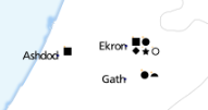
With a clearer understanding of exactly what we were trying to achieve, I probably would have done something simpler to calculate each of these attributes, such as using Excel. Instead, I loaded the data into PostGIS and wrote some queries. TileMill supports CSV files directly, but unlike CartoDB, doesn’t load the data into a database, so you can’t run SQL queries.
This post from “The World is a Village” explains how to load CSV into PostGIS, but in summary:
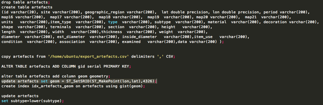
The most interesting line is:
update artefacts set geom = ST_SetSRID(ST_MakePoint(lon,lat),4326);
That’s what converts the raw lon and lat columns into a geometry column so that TileMill can plot it.
To determine “are there any artefacts of type X in location Y”, an easy way is to write a view. Each column is a different subquery, for a different X.
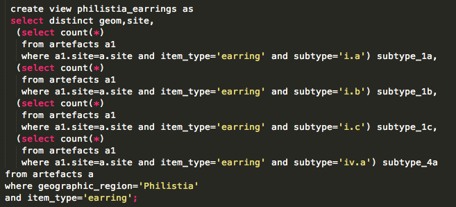
That gives data like this:

So, in TileMill we can now use a filter like [subtype_1a>0] to decide whether to place a symbol.
Because there were so many maps to produce (5 of this type, plus another 11), I created them all in one project, each as a single layer.
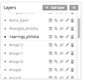
The #map1 to #map12 layers refer to a different set of data. Each layer pulls in the same spreadsheet, and styles it identically, with the only difference being a single filter.
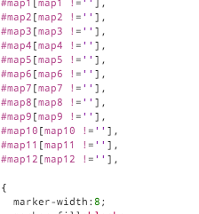
That turned out to work really well.
But back to the main problem of showing symbols for attributes. It’s easy to show a single symbol if an attribute is present (like a coffee icon if a site is a cafe). But how do you show 4 symbols simultaneously, without them overlapping?
I thought of two approaches.
It’s theoretically possible to construct a text string, with an appropriate font. The string could look like “A Q Z”, where A gets rendered as a square, Q as a circle and Z as a star. Unfortunately I couldn’t make it work. I just couldn’t find an open truetype font that would behave like this. I tried loading various WingDings fonts, but always got little boxes instead of symbols.
There are projects like Map Icons or Font Awesome which sort of do this, but using web technologies that aren’t compatible with TileMill. The only proof of concept I achieved was using punctuation.
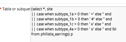
Using fonts makes it very easy to space icons appropriately:
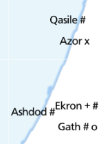
Using punctuation in this way just doesn’t look good.
So the second approach is using traditional markers, and finding a way to position them appropriately. In CartoCSS, there’s no “marker-dx” to offset a marker, but there is “marker-transform“. So you can use SVG transforms, such as translate().
marker-transform:translate(10,-5);
That positions your marker 10 pixels right, and 5 pixels up.
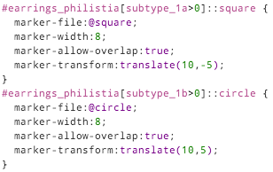
Each different symbol has to be given its own layer (::square, ::circle…), and a different translation offset: (10, -5), (10, 5), (20, -5) etc.
This guarantees that they don’t collide, and mostly looks good:
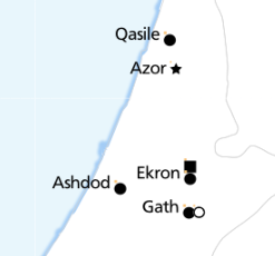
although it inevitably leads to odd positioning:

With enough time, you could some write some fancy SQL that would stack symbols from the left, avoiding any gaps.
The only other styling of note is that the text labels should appear right-justified, to the left of the exact position. The CartoCSS designation for this is text-horizontal-alignment: left.
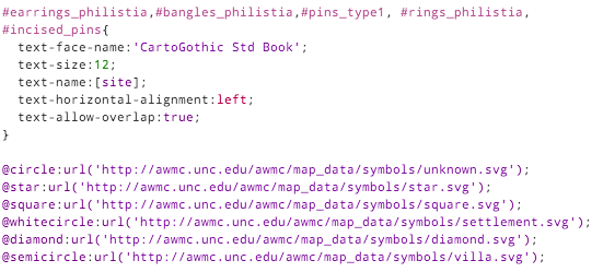
You can see the full TileMill project on Github.
此内容由惯性聚合(RSS阅读器)自动聚合整理,仅供阅读参考。 原文来自 — 版权归原作者所有。