


The Ghost editor is really great, providing many options for different types of content that could go into posts. However sometimes you want to highlight content in a different way, that is where alert boxes come in.
You can put emphasis on specific parts of your content, and make it clear it's an important piece of information. In this guide we will handle the following types of alerts:
- default
- information
- warning
- error
- success
The layout - HTML
You will have to use the HTML card as we need a specific markup for this to work. Here is the code that will be used:
<div class="alert">This is an alert with default appearance.</div>

<div class="alert info">This is an alert. Appears as info type.</div>

<div class="alert warning">This is an alert. Appears as warning type.</div>

<div class="alert danger">This is an alert. Appears as danger type.</div>

<div class="alert success">This is an alert. Appears as success type.</div>
The style - CSS
Let's start styling our alert boxes, first, we will address the main class then add some specifics for the type. You can add this in Code Injection in the Ghost Admin.
<style>
  .alert {
    --color-info: #259eef;
    --color-warning: #e3bc1f;
    --color-danger: #fc365e;
    --color-success: #48c774;
    --color-alert: #666;

    --content-info: "i";
    --content-warning: "!";
    --content-danger: "!";
    --content-success: "✓";
    --content-alert: "i";

    border: 2px solid var(--color-alert);
    border-radius: 5px;
    color: var(--color-alert);
    margin-bottom: 2em;
    margin-top: 1em;
    padding: 1em;
    position: relative;
    width: 100%;
    font-weight: 500;
    font-size: 16px;
  }

  .alert:before {
    align-items: center;
    background-color: var(--color-alert);
    border-radius: 50%;
    color: #fff;
    content: var(--content-alert);
    display: flex;
    font-family: monospace;
    font-weight: 700;
    height: 24px;
    justify-content: center;
    left: -12px;
    line-height: 1;
    position: absolute;
    top: -12px;
    width: 24px;
  }

  .alert:after {
    background-color: var(--color-alert);
    content: "";
    height: 100%;
    left: 0;
    opacity: .1;
    position: absolute;
    right: 0;
    top: 0;
    width: 100%;
    z-index: -1;
  }

  .alert.info {
    --color-alert: var(--color-info);
    --content-alert: var(--content-info);
  }

  .alert.warning {
    --color-alert: var(--color-warning);
    --content-alert: var(--content-warning);
  }

  .alert.danger {
    --color-alert: var(--color-danger);
    --content-alert: var(--content-danger);
  }

  .alert.success {
    --color-alert: var(--color-success);
    --content-alert: var(--content-success);
  }
</style>
To add some context for the styling:
- in the
.alertclass, we add the general styling, like color, padding, margin - in the
:beforepseudo-class, we define the symbol/sign for the different alert types as well as the styling for it - in the
:afterpseudo-class, we define the background color, which depends on the type and opacity is set - then finally we have the alert types, where you can change the color and the sign for each type
The result
Here is the final look of the boxes:
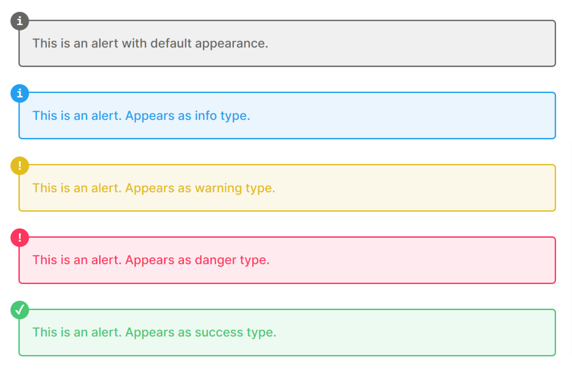
You can define your own alert type and you can change the color for each type. You can even create a snippet out of it, so you don't have to remember the markup.