



Published: May 19, 2022
Last updated: August 25, 2023
If you ask me (and I know you didn’t, but be a good sport), HTML’s biggest missing piece is a native toggle switch: a button that has two possible states—on/off, enabled/disabled, etc.—and which when pressed, switches from one state to the other.
HTML has buttons, of course—and for that matter, native binary elements, like checkboxes and details/summary—but it doesn’t really have a native toggle button.
This is an issue, because toggles are all over the web. And for good reason: they’re incredibly useful. But depending on the implementation, the buttons we’re making might not all be equally usable for everyone.
In this post, we’ll will first look at some possible options, before going into detail on an optimally accessible solution, and implementing that approach in both vanilla JS and a few popular front-end frameworks.
An ok but not optimal approach: checkboxes
I’ll assume for the purposes of this post you already know we shouldn’t just add a click handler to a <div> and call it a button. But if not: know that it’s always important to use the correct semantic HTML for our purposes. div elements have no built-in accessibility, such as keyboard handling or a semantic role. So instead of a <div>, we want to find an element that already suits our purposes a bit better.
Knowing that, the first thing many developers reach for when in need of a toggle button is a checkbox, i.e., <input type="checkbox" />. Implementations like this are common:
<!-- Technically accessible, but not ideal -->
<label for="my-checkbox">
	<input type="checkbox" id="my-checkbox" />
	Toggle some setting
</label>
But while checkboxes are generally serviceable enough (and certainly not the worst option), we can do better.
Why, you might ask?
Well, first: checkboxes are typically form components, not standalone elements. So if you’re not using them inside a <form> element, they could be confusing to encounter—especially if not properly attached to a <label> with a for attribute and descriptive text. And in any case, they have a strong association with forms, which means the user might expect them to change the data they’re sending to us, rather than to change the UI.
Next: the two states of a checkbox are always “checked” and “unchecked,” (though it is technically possible to have an “indeterminate” state as well). While that may be fine enough, it’s not quite as semantic as we would like; buttons are typically considered “on,” “selected,” or “enabled,” rather than “checked.”
A third reason: checkbox styling is very limited, and so we’d likely be reaching for some CSS hacks to make our checkbox seem like a button. That’s definitely doable, but it’s another hurdle in our way.
But fourth and most importantly: checkboxes aren’t actually buttons. Yes, they’re interactive and semantic by default, but a user can’t trigger them with the enter key, as they could with a <button> element. That can result in some unexpected, non-standard, and clunky behavior.
Again, don’t get me wrong: you could do much worse than a native HTML checkbox for a toggle switch. At least a checkbox toggle is still generally perceivable and operable. But it’s not quite the best option.
Another, similar option would be a pair of radio inputs. While arguably better in some ways, and while perfectly viable, this option still falls prey to many of the issues above, and so it isn’t really the best solution.
Accessible toggle button requirements
By definition, a toggle button has two states, and switches between the two when pressed (often causing some side effect on the page, like something being shown or hidden, but not always).
Most commonly, toggle switches on the web are represented as pill-shaped ovals, with circles inside that shift to the left when off and the right when on. Color is often added—and sometimes text—to convey the state of the switch.
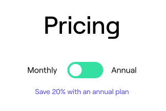
Pricing pages are common homes for a “pill switch” toggle like this:
Or, perhaps, in your device’s settings menu..
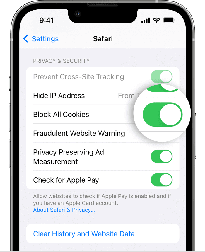
While the pill shape with the nub inside isn’t any standard HTML element, it’s still pretty universally recognized. We have lots of words for this—like “convention” and “affordance”—but what it means is: users typically won’t be confused when they encounter a switch like this, because they’ve probably seen many like it before, and already intuitively know how it works.
However, that may only be true if we’ve coded it properly.
Again, it might be easy to code up a pair of nested <div> elements to look and behave like a toggle switch for mouse users. But making sure it’s properly accessible for all users includes a bit more of a checklist.
Specifically, here’s what we want for any ideal toggle button:
- It should be an actual button element;
- It should be clearly marked as a toggle button (i.e., one with two possible states), both visually and non-visually;
- It should indicate its current state, both visually and non-visually
Let’s explore each of those in slightly more detail.
Toggle buttons should be buttons
The toggle should ideally be a <button> element; that’s the right tag for the job. In addition to semantics, this also ensures the element is keyboard navigable, announced to assistive technology users as a button, and can be activated with touch, click, or the proper keyboard keys.
Toggle buttons should clearly have two states, visually and semantically
No matter who I am or how I’m interfacing with the component, it should be clear this button has two possible states; on/off, enabled/disabled, etc.
That means the button needs both a visual indicator that it’s a toggle button, as well as an accessible indicator. While good text helps with both, the latter will also be managed with the aria-pressed attribute. You can optionally go for color, styling, or an icon for the visual.
Toggle buttons should show their current state, visually and semantically
It should be clear what state the button is currently in, no matter whether the user is simply looking at it or interfacing with the button using a screen reader or other assistive technology. Again, this is where aria-pressed will be key.
Understanding aria-pressed
I won’t go into what ARIA is here, but you can read more about ARIA on MDN if you’re curious to dive deeper.
Meanwhile: the aria-pressed attribute communicates the current state of a toggle button to assistive technologies. In the case of VoiceOver, it also specifically designates a button as a toggle button, instead of just a plain ol’ button.
Take the following:
<button>Press me</button>Given that markup, VoiceOver will announce “‘Press me,’ button.” There’s no indication of what kind of button it is. (This is one of many reasons why “press me” is an inadvisable choice for the text of our button, but it makes a serviceable example.)
Now, if we add aria-pressed:
<button aria-pressed="false">Press me</button>VoiceOver instead announces “‘Press me,’ toggle button.” The type of button is distinctly changed.
And if we flip the attribute value to true:
<button aria-pressed="true">Press me</button>We get “Selected, ‘Press me,’ toggle button,” clearly letting assistive technology users know the button is currently in its “on” or “enabled” state.
If you’re on a Mac, one of the best things you can do to help the accessibility of what you’re building is to turn on VoiceOver and try it out yourself. (And if you’re not on a Mac, using any screen reader software—or for that matter, any assistive technology—will help.)
Ordinarily, you have to delve several levels into MacOS settings to find the VoiceOver checkbox. However, there’s a “Show Accessibility status in menu bar” option you can check to keep all Accessibility toggles close at hand at all times, at the top of your screen.
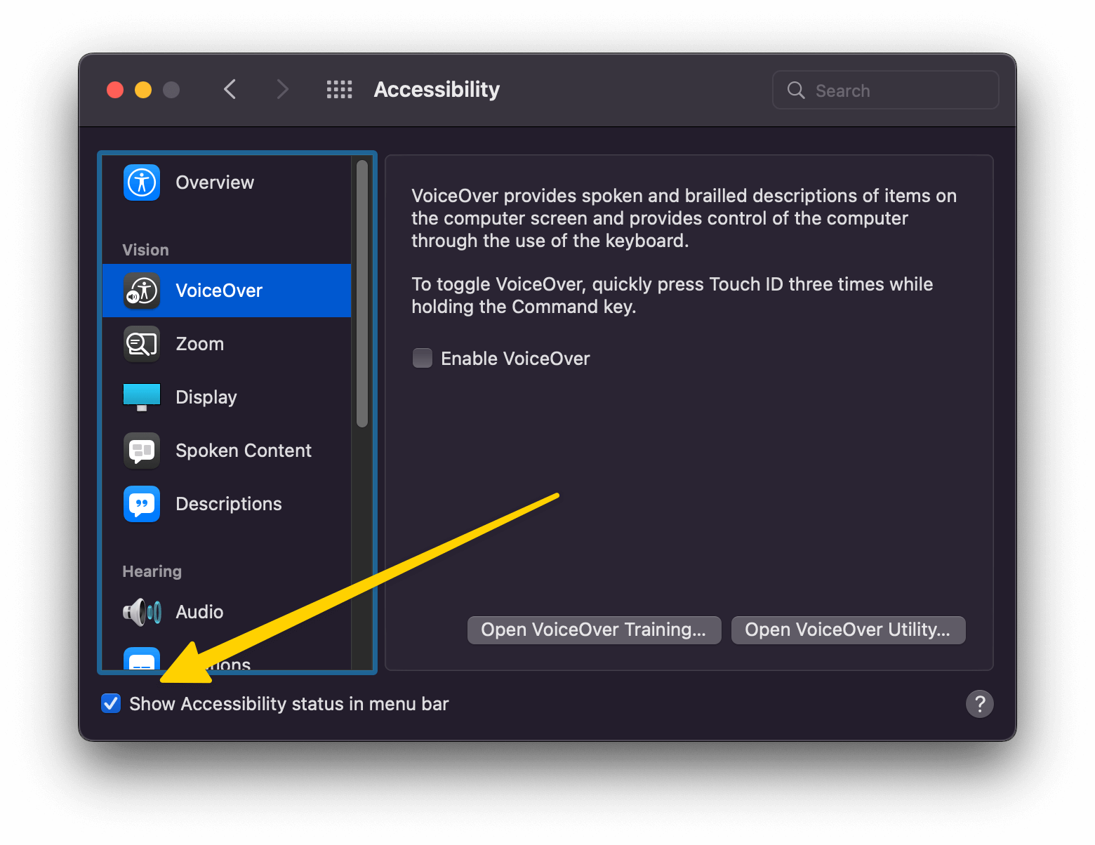
This allows you to toggle VoiceOver on and off any time from the menu bar, which I find exceptionally handy:
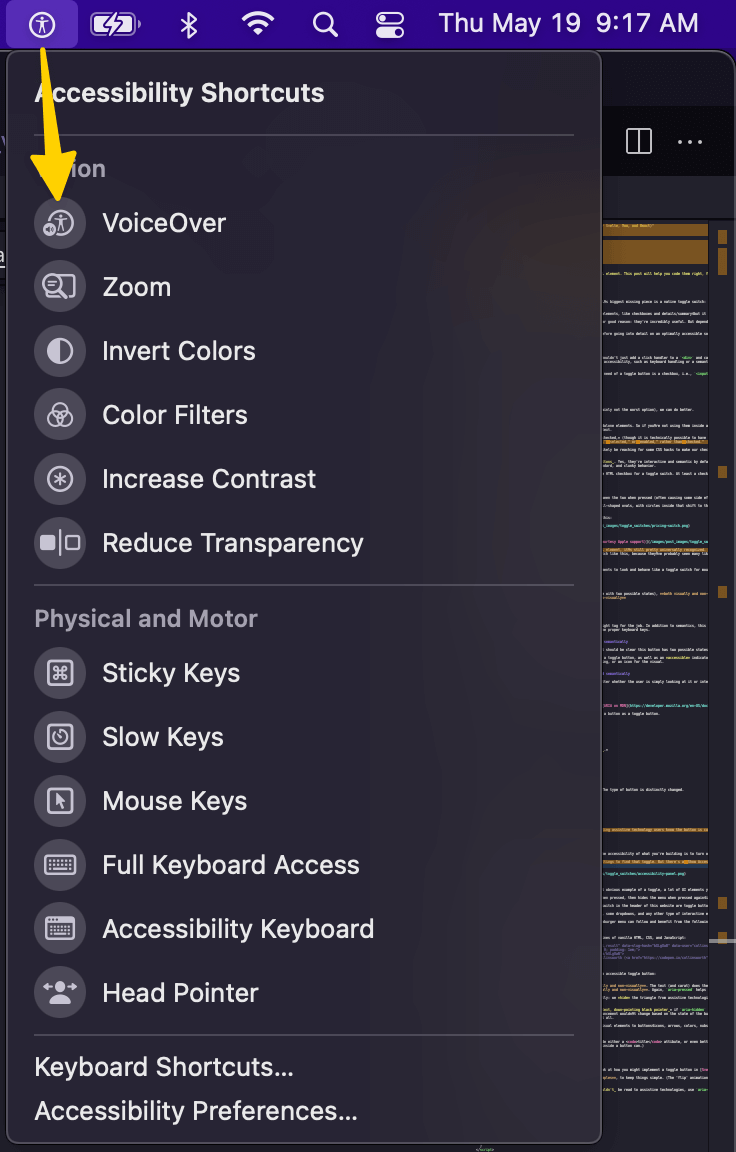
This setting has moved location in MacOS Ventura. It can now be found in System Settings > Control Center.
A toggle button in vanilla JavaScript
Here’s a very minimal way to code up a toggle button in a few lines of vanilla HTML, CSS, and JavaScript:
See the Pen Minimal accessible toggle button in vanilla JS by Josh Collinsworth (@collinsworth) on CodePen.
Take a look at how the code above achieves all three goals of an accessible toggle button:
- It should be an actual
<button>element. Check. - It should be clearly marked as a toggle button, both visually and non-visually. The text (and carat) does the job for us here visually, while
aria-pressedpicks up the slack non-visually. - The toggle button should show its current state, both visually and non-visually. Again,
aria-pressedhelps non-visually.
Visually, the triangle flips depending on state, but importantly: we hide the triangle from assistive technologies by using aria-hidden. This avoids screen readers, etc. trying to announce the triangle.
To elaborate on that third point: VoiceOver announces “toggle text, down-pointing black pointer” if aria-hidden is not applied to the triangle character. That’s bad for two reasons: first, it’s obviously a little nonsensical; but more importantly, that announcement wouldn’t change based on the state of the button, since we’re just using a CSS transform to flip the icon upside-down. So even though the arrow visually flips, the readout doesn’t change at all.
As a general rule of thumb: wherever you find yourself adding visual elements to buttons—icons, arrows, colors, nubs that slide back and forth, or whatever else—those should probably be hidden from assistive technologies with aria-hidden.
If your button only contains an icon or other non-text visuals, be sure to include either an aria-label attibute on the button, or some visually hidden but still screen reader-friendly text inside of it.
(The title attribute is sometimes recommended here (including in a previous version of this post), but according to accessibility engineer Melanie Sumner, aria-label is a bit better implemented, and therefore generally preferred.)
As a final note: I use showing and hiding text only as a convenient example to show that the button is doing something. If revealing text is the actual purpose of your toggle button in production, there may be accessibility concerns I’m not covering here (for example: alerting the user that the page content has changed, and/or properly directing focus to the text).
Toggle button styling
As you may notice: I make use of the [aria-pressed=true] and [aria-pressed=false] selectors in the CSS above. This trick comes courtesy of Heydon Pickering, and provides us with a very handy, pure CSS way of alternating the appearance of the button based on its current state.
[aria-pressed='true'] .icon {
	transform: rotate(180deg);
}
Toggle buttons in major frameworks
We saw the vanilla JS version of the button above; now let’s look at how you might implement a toggle button in Svelte, Vue, and React.
Please note: I’ll eliminate the CSS in these examples, just to keep things simple.
Just remember that if you use any text or iconography that shouldn’t be read to assistive technologies, use aria-hidden on it to avoid verbosity and confusion.
Svelte
Like most things Svelte, this one is pretty straightforward. You could go with an inline event handler instead of the toggleIsPressed function, but I find this way a little more readable.
<!-- ToggleButton.svelte -->
<script>
	let isPressed = false;

	const toggleIsPressed = () => {
		isPressed = !isPressed;
	};
</script>

<button aria-pressed={isPressed} on:click={toggleIsPressed}>
	Toggle text
	<span aria-hidden="true" class="icon">▼</span>
</button>

{#if isPressed}
	<p>The button is pressed!</p>
{/if}
Vue 2 (options API)
There’s an important thing to notice about the Vue examples: you need to use the String() function when dynamically setting the value of aria-pressed.
That’s because when a value bound with v-bind (or :) is falsy, Vue removes the attribute entirely; instead of aria-pressed="false", we would get no attribute or value at all. So we want a string of "false", rather than the boolean false, to keep the attribute in place.
<!-- ToggleButton.vue -->
<template>
<div>
<button
:aria-pressed="String(isPressed)"
@click="toggleIsPressed"
>
Toggle text
<span aria-hidden="true" class="icon">▼</span>
</button>
<p v-if="isPressed">The button is pressed!</p>
</div>
</template>
<script>
export default {
data() {
return {
isPressed: false
}
},
methods: {
toggleIsPressed() {
this.isPressed = !this.isPressed
}
}
};
</script>Vue 3 (composition API)
Again, we need to wrap isPressed in a String() function to make sure that aria-pressed doesn’t disappear entirely when the value is false.
<!-- ToggleButton.vue -->
<template>
<button
:aria-pressed="String(isPressed)"
@click="toggleIsPressed"
>
Toggle text
<span aria-hidden="true" class="icon">▼</span>
</button>
<p v-if="isPressed">The button is pressed!</p>
</template>
<script setup>
import { ref } from 'vue'
const isPressed = ref(false)
const toggleIsPressed = () => {
isPressed.value = !isPressed.value
}
</script>React
As in the Svelte example, here I use a toggleIsPressed function, but you could just as easily put an inline click handler. I like more shorter lines rather than fewer long lines, personally, but your idea of readability may vary.
// ToggleButton.jsx
import { useState } from 'react';

const ToggleButton = () => {
	let [isPressed, setIsPressed] = useState(false);

	const toggleIsPressed = () => {
		setIsPressed(!isPressed);
	};

	return (
		<>
			<button aria-pressed={isPressed} onClick={toggleIsPressed}>
				Toggle text
				<span aria-hidden="true" className="icon">
					▼
				</span>
			</button>

			{isPressed && <p>The button is pressed!</p>}
		</>
	);
};
As a final note on all of the above components, I just want to call out once more that the purpose of this guide is to show you how to code an accessible toggle button. None of these really shows the ideal way to hide and reveal text; that’s just a handy interactive example to demonstrate the button working.
Toggle buttons aren’t just pill-shaped switches
While the pill-shaped switch is perhaps the most obvious example of a toggle, a lot of UI elements you might not think of as toggle buttons actually qualify, too.
For example: a hamburger menu button—which reveals a nav menu when pressed, then hides the menu when pressed again—is, definitively, a toggle button.
For that matter, the light/dark mode switch and reduced motion switch in the header of this website are toggle buttons.
Other toggle button examples might include accordions, tooltips, dropdowns, or any other type of interactive element that alternates the UI between two states on a press.
With that in mind, every interactive toggle in our application or website can benefit from the prior examples and principles.
Wrapup
I hope this post has been helpful, and that you feel more empowered to code toggle buttons properly. If you’d like to know more, I highly recommend Inclusive Components by Heydon Pickering. I’m no accessibility expert, but he is, and a great deal of the things I do know I learned from Heydon and this book.
Credit where it’s due: Heydon has a chapter on toggle buttons that served as direct inspiration for this post—although he goes into a great deal more depth on several topics, so it’s definitely worth also reading.
Thanks for reading, and remember: accessibility isn’t a toggle; it’s not a perfectly “on” or entirely “off” binary. Accessibility is something we can and should improve bit by bit, day by day, however we can.