


Published: February 22, 2023
Last updated: February 28, 2023
Part of my son’s evening routine is picking up the various toys he’s gotten out and played with that day (or gotten out, at least), and putting those items all back into the toy basket.
Usually, my four-year-old casually places the toys into the basket at a steady pace, so we can get on with the more fun parts of bedtime, like reading books.
Other times, when he feels like stalling, the toys casually float along as slowly as possible; others, they arc playfully in the air, as an ad hoc game forms around the process.
Sometimes, it’s a race, and the toys fly rapidly into the basket. Sometimes they zing by in frustration. And, of course, sometimes there are slow, melancholy theatrics to go along with a day of fun coming to an end. (I get it; I hate when play time is over, too.)
In all the above cases, the toys do exactly the same thing; they travel along a more-or-less predefined route to a set destination. But even though it’s the same action every time, the way the toys travel is meaningful.
There’s a story in the way things move, both in the real world and in user interfaces.
Artfully crafted, smooth transitions and animations are one of the most important details that help set excellent user interfaces apart from the rest. Well-designed movement makes a UI both more engaging and more intuitive.
Bad transitions and animations, however, can make the same UI feel mediocre, cheap, confusing, or even broken. Poorly implemented movement could even be worse than no movement at all.
At the center of any movement on the web is what’s called an easing curve. This curve is the “rhythm” of the movement, and understanding it well—with the aim of improving our own animations and UIs—is the goal of this post.
What’s the difference between a transition and an animation?
Before we get started, I should clarify: I’ll use the words “transition” and “animation” mostly interchangeably in this post, even though the two concepts are distinct in CSS.
I’ll also assume you have a decent understanding of the CSS principles behind the two already, but as a refresher/clarifier:
Transition:
- Uses the
transitionproperty - Transitions between exactly two states
- Usually the result of a state change, like hovering, or clicking a button
- Plays once; stays in end state as long as the trigger condition is true, then reverts
An example of a CSS transition might be a button that changes color when it has hover or focus:
.btn {
	background: lightblue;
	transition: background 0.2s ease;
}

.btn:is(:hover, :focus) {
	background: yellow;
}
Animation:
- Uses
@keyframesanimations, and applies them with theanimationproperty (or properties) - Animates between any number of states
- May start because of a trigger event, but is usually either always on, or plays immediately once the element enters the DOM
- Can repeat any number of times. May stay in end state, or revert to beginning state. May also alternate directions. Elements could also have multiple animations applied at once.
A basic CSS animation example might be a loading spinner that rotates indefinitely:
.spinner {
	animation: spin 1s linear infinite;
}

@keyframes spin {
	to {
		transform: rotate(1turn);
	}
}
So yes, as far as CSS is concerned, those are technically two different things. However, I’ll mostly use the words interchangeably in this post, because good fundamentals (and cubic-bezier curves) apply in both cases. Which one you use will mostly just depend on the situation.
If you do apply any type of easing on a CSS animation, just note it will apply to each step in the animation individually.
For example: if an animation has five steps and uses ease-out, each step will ease out, for five total easings, rather than the entire animation having one overall easing applied.
What’s an easing curve, and how does it work?
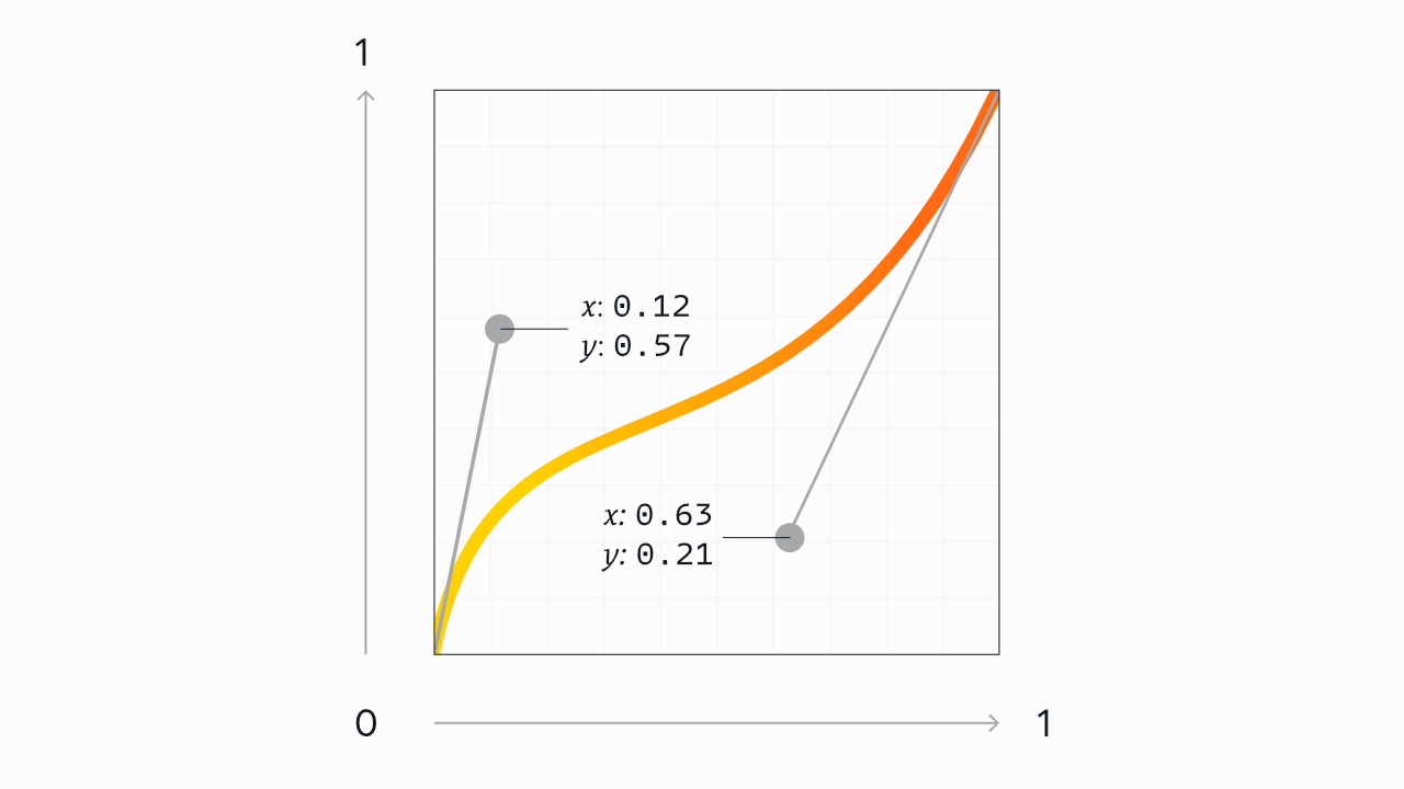
The easing of any web-based movement is what’s called a cubic bézier curve. That might sound fancy or intimidating (diacritics!), but all it means is: a line, usually curved, defined by four numeric values.
As our example, let’s look at this curve from the top of the article once again:
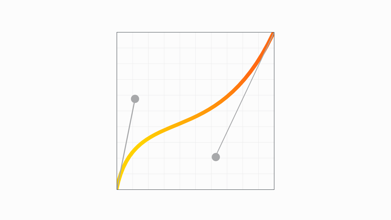
That might look like something from an algebra textbook (or maybe a vector software demo), but we need not do any math, and it’s not nearly as complex as it might seem.
The curve is shaped by the two circular handles originating from the ends of the line—just like the pen tool in design software. (In fact, you could create this exact curve with these same handle positions in your vector editing software of choice.)
The horizontal x axis represents the duration of the transition. You could think of the x axis as the timeline of the transition, kind of like the playback bar on an audio or video file: the transition starts at the far left, and moves to the right at a consistent pace.
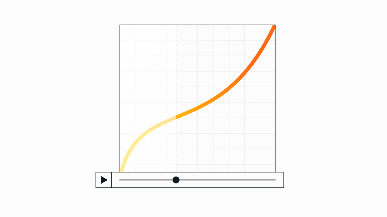
If your transition lasts one second, for example, the left side is the very beginning of the animation, and the far right is the end state, one second in.
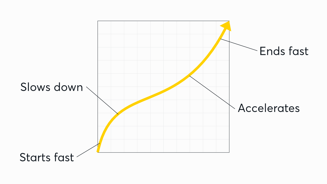
The vertical y axis is the speed of the change. The more vertical the line is at that point during playback, the more the change accelerates at that point in the transition. (So in this example, the transition will start fast, ease to a slower pace in the middle, and then gradually pick up speed to end fasr.)
For the purposes of defining curves, the x and y axes are both measured from 0 to 1. The bottom-left corner is
0, 0; the top-right is1, 1.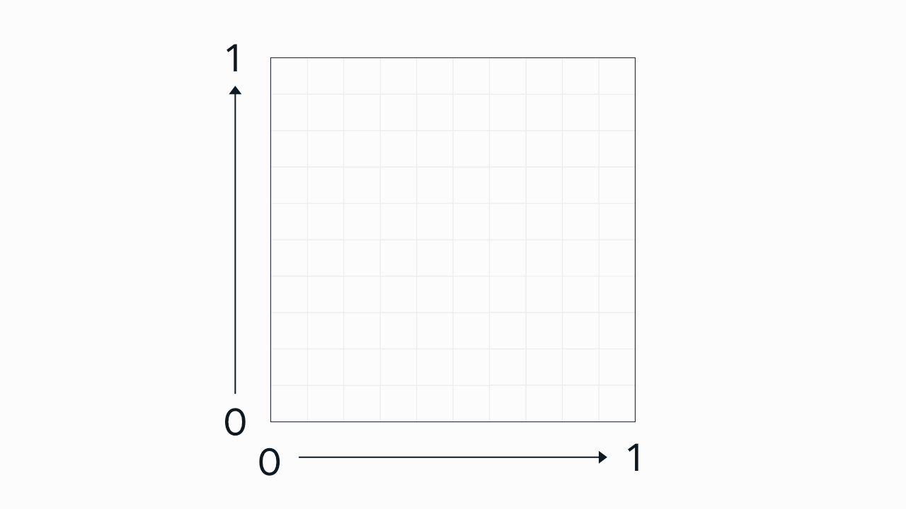
This is why CSS easing functions are written as four numeric values. You could quite literally think of cubic-bezier as a function that accepts exactly four arguments: the x and y coordinates of the start handle, and the x and y of the end handle, in that order.
The curve above would be represented in CSS as:
cubic-bezier(0.12, 0.57, 0.63, 0.21);Or, if you prefer leaving off the leading zeroes, that’s valid, too:
cubic-bezier(.12, .57, .63, .21);Here’s that full illustration one more time:
Values are allowed to go out of bounds vertically on the y axis, but not on the x axis (since animation can go backwards, but time can’t). This allows you to create an “overshoot” effect, where the transition goes beyond the start or end state and then comes back.
And here’s that curve in action, in a real animation. The circles follow the easing curve (both visually and in the code) from bottom left to top right, via CSS transform:
See the Pen Untitled by Josh Collinsworth (@collinsworth) on CodePen.
Naturally, an element’s position is just one of many possible attributes you could animate, but it works well to demonstrate the point. (Oh, and by the way: this exact curve isn’t anything special. In fact, it may not be useful at all in actual UI work. I just picked it because it looked nice and made for a good demo.)
If you’d like to play around with other types of easing curves, I made an interactive easing playground here (also shown below). Feel free to try it out, and then hop back in here when you’re ready.
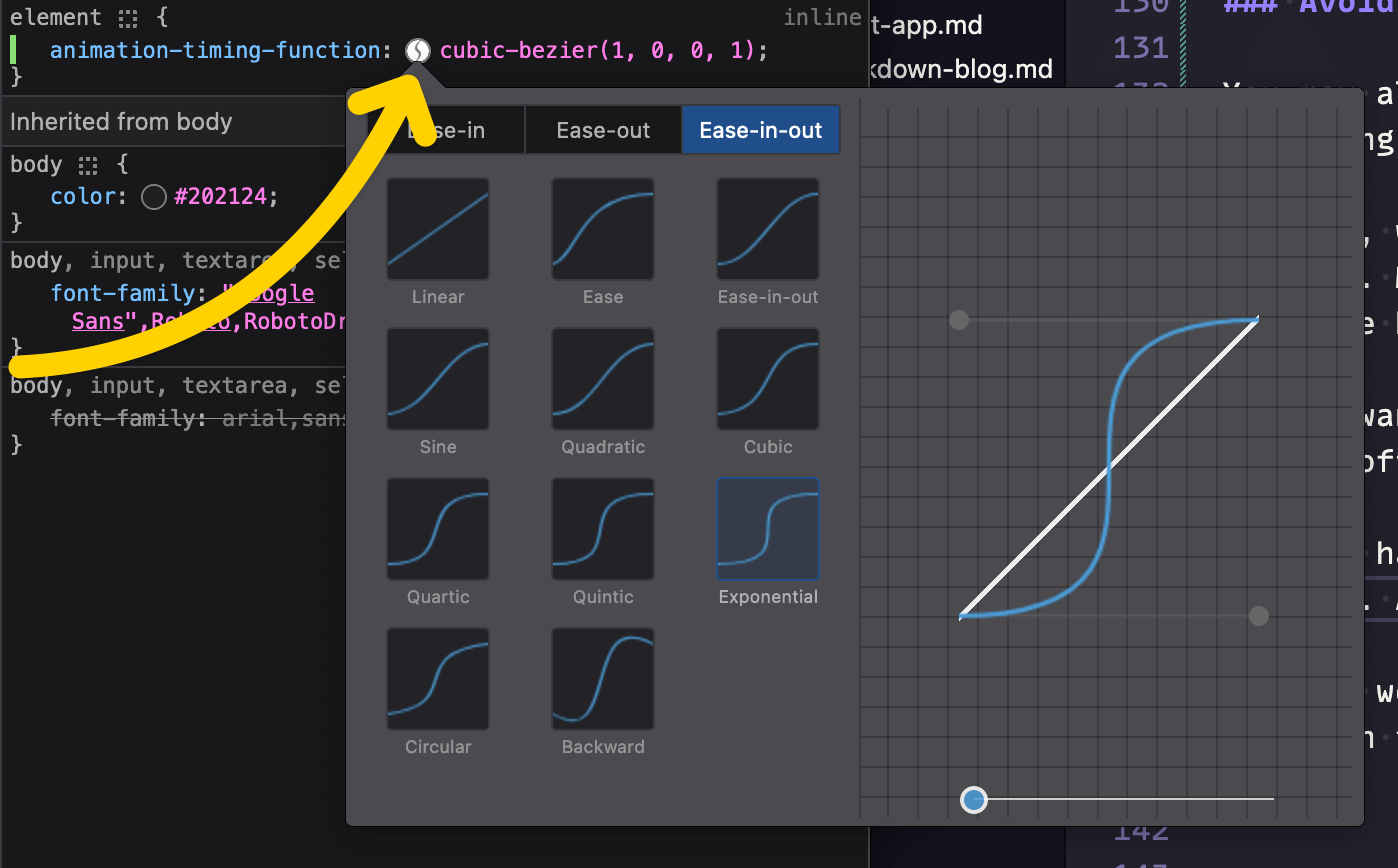
Also worth knowing: you can open your browser’s dev tools any time, and adjust your easing curves live.
The screenshot below is from Firefox, but every major browser has the same tooling available; in dev tools, select an element with a cubic-bezier curve applied to it, and click the curvy line icon to open the easings panel.
I’d also like to give a shout-out here to easings.co, which lets you test out various easing curves with a number of common UI elements, to see how they work visually in a realistic scenario. It’s well worth a look if you’re trying to settle on the right feel for your own UI.
Where do easings get their names?
If you’ve taken the time to look at easing types above, you may have noticed that there are three versions of each kind of curve: “in,” “out,” and “in-out” (i.e., both).
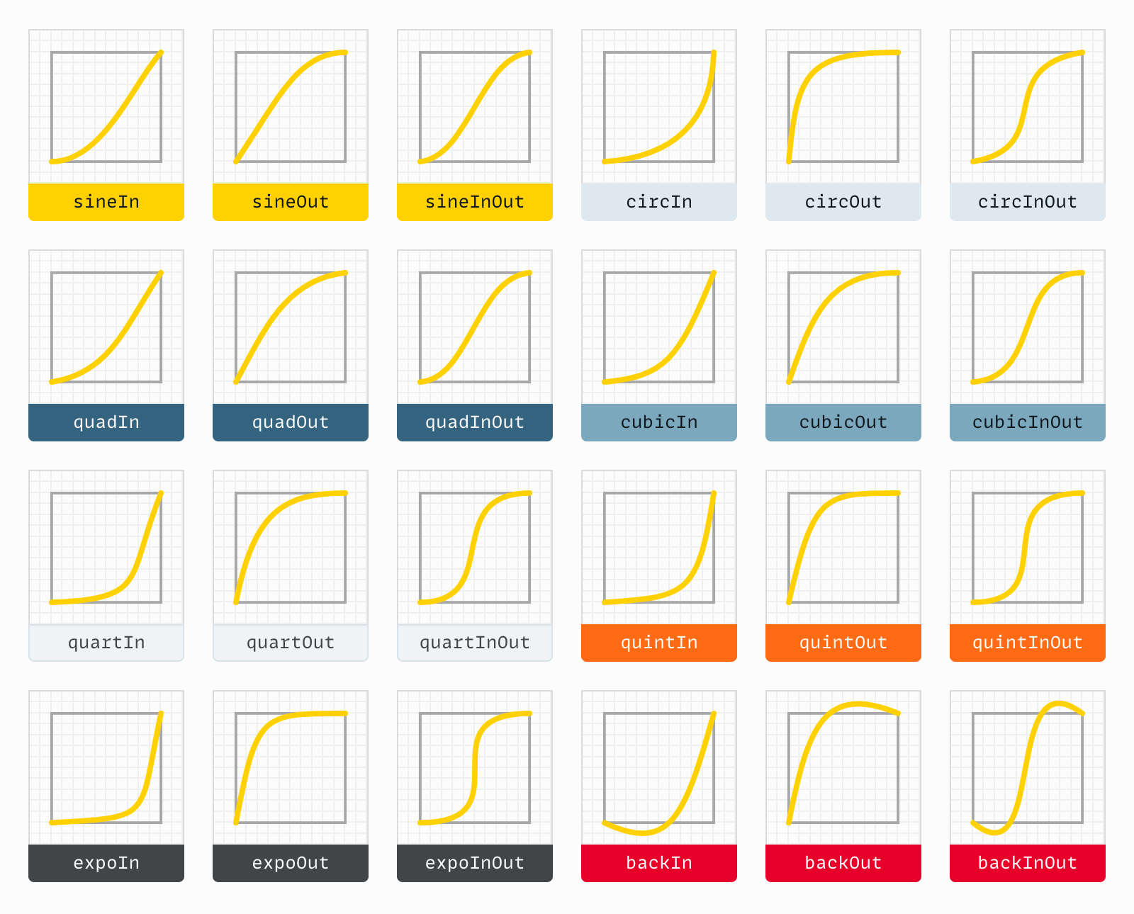
The name of most of these kinds of curves (cubic, quintic, etc.) represents the mathematical power used in generating the curve. The higher the number, the sharper the curve, as the rate of acceleration multiplies.
- Quadratic: power of 2 (squared)
- Cubic: power of 3 (cubed)
- Quartic: power of 4
- Quintic: power of 5
- Exponential: power of 10
Sine is its own mathematic thing (that I have neither the offhand knowledge nor the desire to get into); circular is based on square roots; and the “back” options just overshoot and then come back.
You may also see other named presets, like “bounce” or “elastic” (Svelte ships with those, as do many easing and animation libraries), but often they require JavaScript—or at least, a fairly complex @keyframes animation—as a pure CSS bézier curve with just two handles isn’t capable of that number of steps.
None of that is really important to know before using the curves in question, but it may help make some sense of the names when you’re browsing. It can also give you an idea of how to create similar curves from scratch, should the need arise.
Why does easing matter?
While the workings of bézier curves make for interesting trivia, you might reasonably ask: why does this matter? Why is it important to use one easing curve over another—or for that matter, any curve at all?
True, animation is cool. (When done well, anyway.) But beyond that, well-implemented animation can also be intuitive.
In the real world, there’s little such thing as instant. Nothing just appears or disappears. Things move into or out of place, and our brains perceive the changed state of things by observing that movement.
Similarly, when things move, how they move is key in understanding the movement, like I mentioned about in the intro. Think of a simple motion, like waving your hand. Vary the speed of the wave, and notice how the “feel” and perceived meaning of the gesture varies. A slow wave seems hesitant; a fast wave seems enthusiastic. One that starts fast then slows down (or vice versa) seems to indicate your feelings might be changing in real time. ”Oh, hey! I know you! …Oh wait…no I don’t.” (Not that I’ve ever done anything like that.)
Again: movement tells a story. The transition itself is the verb; the easing curve is the adverb.
Wrap-up and next steps
Thanks for reading! I hope you’ve come away with a better understanding of CSS cubic-bezier easing curves, including how they work, and why they’re valuable.
If you’re looking for practical next steps on where to go from here, I suggest reading Ten tips for better CSS transitions and animations next. It’s a follow-up post where I dig deeper into the “how” of crafting optimal, fine-tuned animation on the web.
Otherwise, thanks for reading, and feel free to send any feedback below!