


Published: March 16, 2019
Last updated: May 13, 2020
Recently, I’ve been using (and loving) the new Gutenberg editor in WordPress 5.0+. It’s a huge step forward in both what developers can offer, and what users can expect out of their content creation experience.
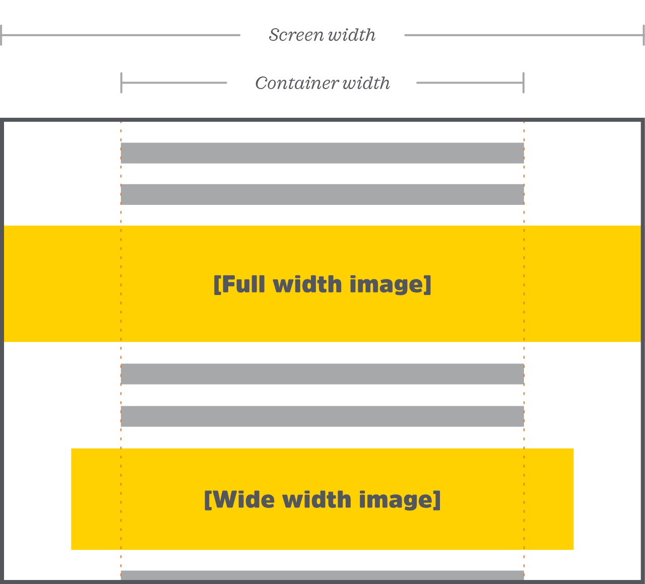
One of the new features of Gutenberg that I particularly enjoy is the ability to set an image as either “wide width” or “full width,” to allow it to break out of its container element in order to span a greater width of the screen.
Here’s a visual example of what I mean:
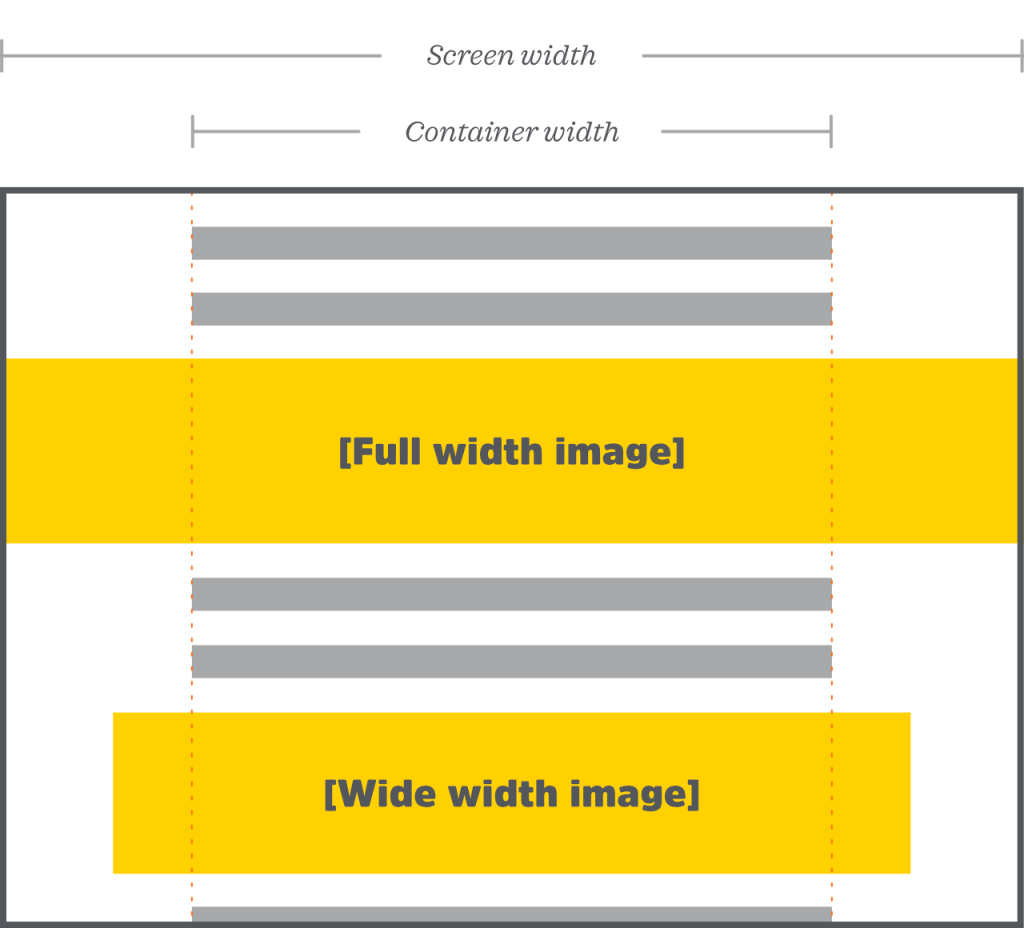
Ordinarily, an image would be constrained to the content width (visualized by the dotted lines in the image above). Being able to allow images to break out of those confines is a powerful layout tool, though, as it allows content authors to add a great deal of visual interest and hierarchy to any page, post, or content supported by the new Gutenberg editor!
Adding Theme Support
Adding support for wide- and full-width images is up to the theme developer. Fortunately, from the backend, it’s dead simple; just add this line to the theme’s functions.php file (please be sure to use a child theme as appropriate):
//functions.php

add_theme_support( 'align-wide' );
That tidy little snippet will make two new options available for image blocks in the Gutenberg editor, in addition to the usual options: “wide width” and “full width,” highlighted in the image below:

When the user chooses either of these options, the <figure> element that appears on the front-end of the site (oh yeah—by default, Gutenberg puts images inside <figure> elements, so that captions can be added easily. Anyway, that element, i.e., the image’s container) will have either an alignwide or alignfull class applied to it (depending, of course, on which was selected by the content author).
That’s it for the PHP/back-end setup. Other than the snippet above, everything we’ve covered so far is fully automatic and just handled by WordPress for us.
However, we still need to actually implement these layout techniques on the front-end of the site, using our theme’s CSS. Otherwise, nothing will happen visually when a content author chooses the full-width or wide-with image option.
Front-End CSS for Full-Width Images
I wanted to write this post mainly to share one technique that I came across online, which I feel is particularly clever in this situation (and which is not at all exclusive to Gutenberg or WordPress):
/* style.css */

.alignfull {
	width: 100vw;
	margin-left: calc(50% - 50vw);
}
Even though that bit of CSS above is very brief (only two properties!), I still want to be sure we cover what it’s doing, because it’s a pretty elegant solution for our needs.
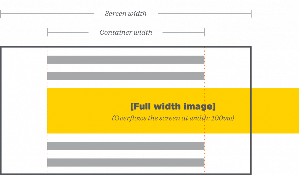
The width property is pretty straightforward: a value of 100vw ensures that the image is always exactly as wide as the viewport, no matter what size that might be. (Remember, width: 100% might not work here, because percentages are based on the width of the parent element, not the screen, and our image’s parent element may or may not be as wide as the viewport.)
However, making the image 100vw wide on its own doesn’t do us much good on its own, because it would overflow the screen, as shown in this image:
That brings us to the margin property, which is the clever part. This is where the real CSS magic happens:
margin-left: calc(50% - 50vw);In case you’re new to the calc function, in essence, it lets you do math to set CSS values. It’s most commonly used in responsive design to, say, let your image take up a quarter of the available space, minus an 8px margin (which would be width: calc(25% - 8px);).
But calc has many other uses, and can crunch numbers on any dynamic or static values, even between two different units of measurement (as in the previous example, to subtract pixels from a percentage).
Back to our fullwidth image: in order to make the image the full width of the screen and position it properly, we want to set a negative margin. And as you’ve probably guessed, we’ll need calc to help us, because the distance between the side of our container and the left edge of the screen is responsive, and always changing.
So how do we determine how far the image needs to shift to the left? Answer: we don’t. 😎
Instead, we’re going to send our image halfway to the right. That’s the 50% portion of our calc formula:
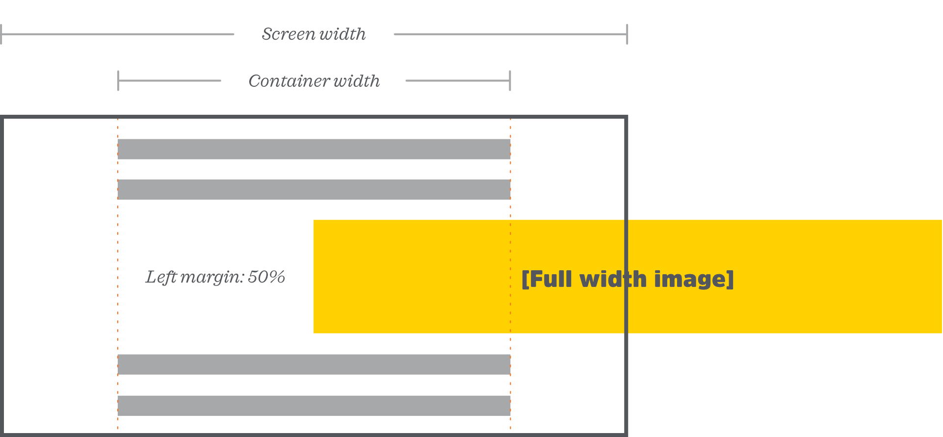
Now we can begin to see the full picture (no pun intended)!
Since percentage values are calculated based on the parent element’s width, a margin of 50% sends the image exactly halfway across the parent element. And since our parent element is already centered on the screen, that means our image is now exactly halfway across the viewport, no matter how wide the viewport is!
Now that our image’s left side is directly in the center of the screen, the rest is just subtracting 50vw from the left margin—which is the other half of our calculation. Thus, calc(50% - 50vw) gives us exactly the full-width image we’re looking for!
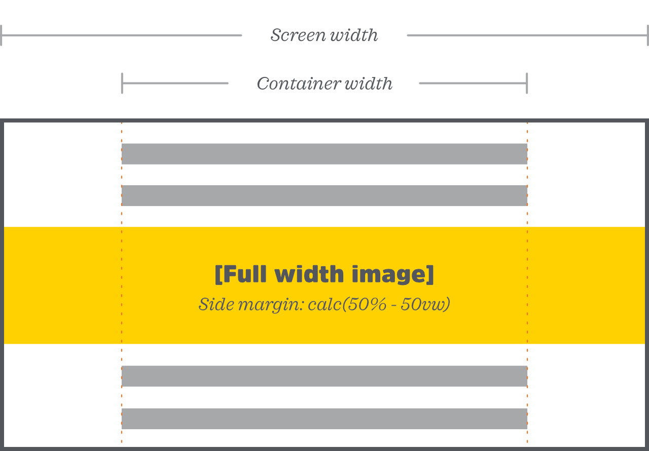
Once more, here’s the CSS from above:
.alignfull {
	width: 100vw;
	margin-left: calc(50% - 50vw);
}
There’s one small issue here, which is: we don’t take into account the possibility that our .alignfull element might already have a right margin. If it does, it will actually be taking up more than the full width of the screen, and that’s no good.
Plus, we probably want space above and below our fullwidth image, just to make it stand out a little more. So really, instead of setting just a margin-left property, we’d most likely be better off setting all four sides at once:
margin: 2rem calc(50% - 50vw);This way, we’ve made sure all four sides of our image are accounted for while also giving the image a little breathing room.
And if you’re wondering (or just wanting to get super technical): yes, this does mean that both sides of the image get brought in by 50%, then are each pulled back out 50vw. If you didn’t have the - 50vw part of the CSS above, the image would effectively be 0% wide (since it would have a margin of 50% on both sides). Interesting! 🤓
Lastly, as you probably realized: this post assumes the content container is already centered on the screen. If your content is not already centered in the viewport, this specific CSS won’t work for you, and you’ll need to do something a little more creative to get your images full-width.
Front-End CSS for Wide-Width Images
Wide-width images work similarly to the above, but naturally, we don’t want to make them the full width of the screen; otherwise, there would be no difference between wide-width and full-width (and that, of course, would just be silly).
How wide the image should be, exactly, as well as how to achieve the effect, is ultimately up to the theme author. However, I find something like this bit of CSS works quite well:
.alignwide {
	width: calc(100% + 20vw);
	position: relative;
	left: -10vw;
}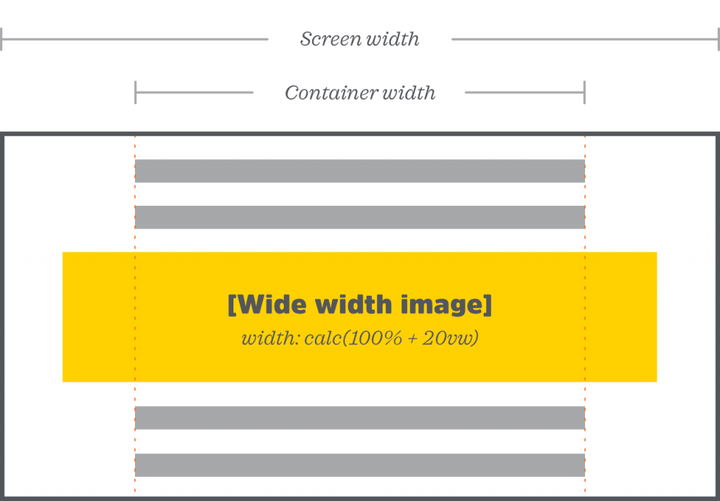
Our wide width image spans the 100% of its parent container, plus an extra 20 viewport width units.
You might notice that in this case, I chose not to use negative margin, and instead, opted for a negative value on the left property (paired with relative positioning). Why’s that, and what’s the difference?
For the “why,” it’s mainly because: I wanted to illustrate that there’s more than one technique available here.
As for the difference…well, to be honest, which works better will probably depend on your use case, and the environment you’re working in. None of this CSS exists in a vacuum (hopefully).
If your images already have a side margin, then overriding that with a negative margin will probably work better (or, alternatively, you could just be aware that you may need to remove the side margin if you’re utilizing relative positioning).
There are undoubtedly posts written on the advantages and disadvantages of both techniques, and I don’t feel the need to retread that ground here. Some developers avoid negative margins like the plague; I think they’re fine in a situation like this, and as long as you’re not just using them to avoid changing a different part of the CSS, or as a hacky way to get around something that should just be fixed on its own.
Another note here: unless you’re ok with your wide-width images bleeding off the page at smaller screen sizes, you’ll need to either use a media query, and/or replace the 10vw with a value that doesn’t exceed the side padding/margin around your main content container.
(For example: if your main content container element, whatever that may be, has a padding or margin of 32px on each side, you’d want to make sure your .alignwide class had a width of no greater than calc(100% + 64px)).
I eventually landed on something like this for my personal use on wide-width images; they’re fullscreen up to a certain screen size (since they may as well be on mobile), then differentiate themselves starting at a certain @media breakpoint (likely the same one, or just above, where your content container element stops expanding and centers itself at a static width instead):
/* style.css */

.alignwide {
	width: 100vw;
	margin: 2rem calc(50% - 50vw);
}

@media (min-width: 960px) {
	.alignwide {
		width: calc(100% + 20vw);
		margin: 2rem -10vw;
	}
}
That’s it! I hope this was helpful in getting your theme’s images set up for Gutenberg support. Enjoy your new content editing experience!