


Published: March 24, 2022
Last updated: July 14, 2022
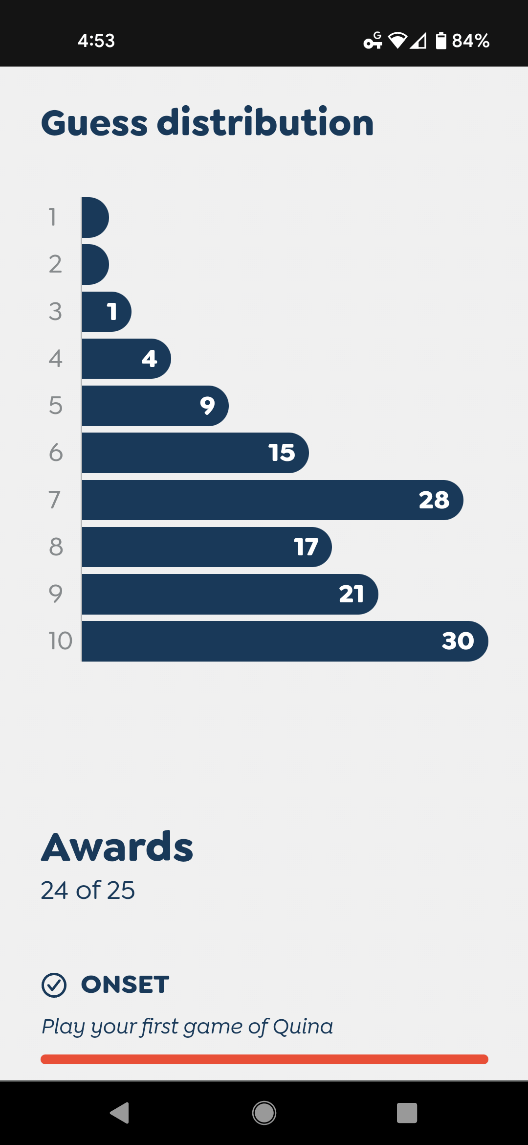
Inspired by Wordle, I recently added a bar chart element to Quina, to show players how many guesses they tend to need to finish their game. Here’s a screenshot from my phone:
At first, when I set out to build that chart, I was concerned at the daunting complexity. How do I make sure the bars are the right scale, both in relation to each other and to the chart itself? Reaching for an external library looked like the easy option.
Then I realized: this is actually a perfect use-case for CSS grid!
Setting up the grid
The trick is actually a fairly simple one, as far as putting charts into websites go. At a high level, all we need to do is:
- Create a grid container, which will serve as our chart, with any number of grid items (child elements) as the bars in the chart;
- Set
grid-auto-columns: 1fron the container; - Set
grid-column: span xon each one (wherexis its value); and - Color in each bar.
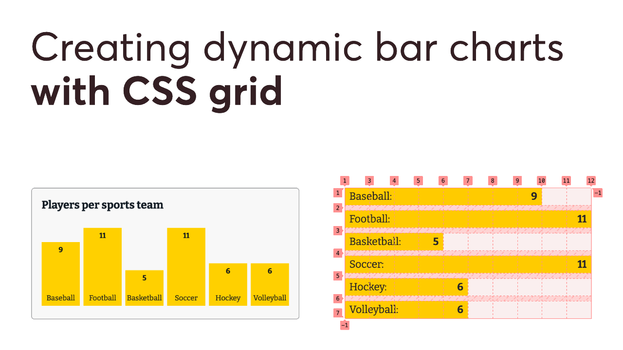
The nifty thing about this approach is: the chart will automatically be as wide as the widest bar; no math or percentages needed!
Let’s start with a simple, albeit contrived example: a bar chart that shows how many players are on the field at a time in a sport. (Not an especially useful chart, admittedly, but it’s easily understandable data to work with.)
See the Pen Simple CSS Grid Bar Chart by Josh Collinsworth (@collinsworth) on CodePen.
If you poke around at the code a bit, you’ll see I used an unordered list (<ul>) as the chart/grid container, and made each list item (<li>) a bar in the chart. This helps to ensure an accessible experience, as the contents of each bar will be read by assistive technologies like screen readers as an individual list item (something like, “‘Baseball: 9,’ one of six”).
It may seem like a <dl> element would be a good fit here, but I consulted an accessibility expert and was told screen reader support for definition lists is not great. They recommended I use an unordered list instead in this case.
Each individual bar has a colored background to make it visible, and places the value (number) inside a <span>. That’s just so we can use display: flex and justify-content: space-between to space out the two.
Each individual bar also has grid-column: span x set on it as well, where x is the bar’s value, making each bar a column width equal to its value.
Working with dynamic data
In a real-world use case, you probably wouldn’t be hard-coding your data into the HTML. Most likely, you’d be working with data from an external source.
Reusing our example from above, that data might look something like this:
// Our array of data, as an example
[
  {
    name: 'Baseball'
    value: 9,
  }, {
    name: 'Football'
    value: 11,
  },{
    name: 'Basketball'
    value: 5,
  },
  // ...etc.
]
Using a modern framework like Svelte, we can create a component to accept that data array as a prop, process it dynamically, and display it as a chart. (If you prever Vue instead, we’ll look at a different approach a little later on.)
In Svelte, that might look something like this:
<script>
	// This component will expect the data as a prop
	export let dataPoints;
</script>

<ul class="chart">
	{#each dataPoints as point}
		<li style="grid-column: span {point.value}">
			{point.name}
			<span>{point.value}</span>
		</li>
	{/each}
</ul>
NOTE: the code above is not optimized yet! I want to explore some options, and the quirks of CSS grid just a little before we get to the final version. I’ve also omitted the styling for now.
Ok, first, this component will expect a dataPoints prop. That’s our array of (what else?) data points, as in the JavaScript example above. Each item in the array will become a bar in the chart. (We could add some defaults or type checking here to be safe, if we wanted. That would probably be a good idea in production.)
Next, we iterate over each point, using an <li> for each one, which spans as many columns as its value. (For example: if point.value is 8, then the list item will have grid-column: span 8 applied as a style, to be exactly eight columns wide on the chart.)
Again, that’s the heart of this particular CSS trick; making each bar span X columns, which ensures the chart is always exactly as wide as the widest item(s), saving us from doing any math to figure out how chart items should be sized!
This approach assumes you want the widest bar to be the width of the chart, which you might not, depending on use case. If your bar chart shows percentages, for example, it might be more intuitive to make the chart exactly 100 columns wide, so the bars are corresponding width.
In our loop, we also populate the bar’s actual visible text content with the point.name and point.value props. Again, the value is contained in a <span> element, so we can push the name and value apart from one another—though depending on your implementation and design, this might be unneeded.
I mentioned, however, that there were still some issues to solve here. Let’s get to that now.
Setting bar rows
One big problem you may run into with this approach is: grid items do not start on new rows automatically!
CSS grid tries to fit each new item onto the current row if there’s space before moving to the next row. That means you could end up with two or more of your bars butting up against each other side-by-side on the same row. You can see it happen in this case if you manually set the grid wide enough, or if the bars vary enough in size:
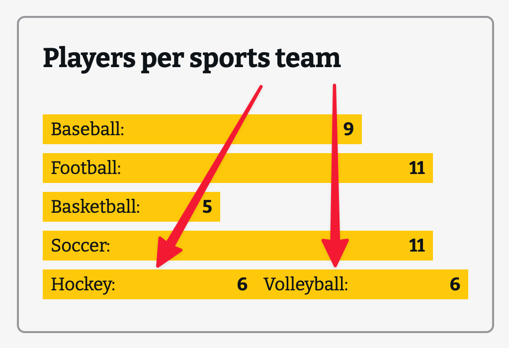
That’s no good. [Morbo voice]: Charts do not work that way!
Fortunately, there’s an easy solution.
- First, set
grid-column-start: 1on each grid item in your CSS; - Then, simply use
grid-column-endinstead ofgrid-columnon each bar’s inline styles. (Eithergrid-column-end: span x;, orgrid-column-end: x + 1;would work, wherexis the data point’s value.)
The problem shown above happens because the only explicit direction we gave to the grid container was to make the bars span a certain number of columns—and by default, CSS grid will try to fit multiple items onto the same row where it can. But when we set both -start and -end on a grid item, the grid will place it as directed, without overlaps.
Our final Svelte version, then, might look like this:
<script>
	export let dataPoints;
</script>

<ul class="chart">
	{#each dataPoints as point}
		<li style="grid-column-end: span {point.value}">
			{point.name}
			<span>{point.value}</span>
		</li>
	{/each}
</ul>

<style>
	.chart li {
		grid-column-start: 1;
	}
</style>
CSS
There are a few important styles needed to make this work. First off, make sure your grid container has the following:
.chart {
	display: grid;
	grid-template-columns: auto; /* The default, but best to be explicit */
	gap: 0.5rem 0;
	grid-auto-columns: 1fr;
}
All of these properties are important. Without explicitly setting grid-auto-columns to 1fr, each column may not be sized the same, which would skew the appearance of our chart—and since the whole point of a chart is to show the exact relationship between items, we definitely want equal columns.
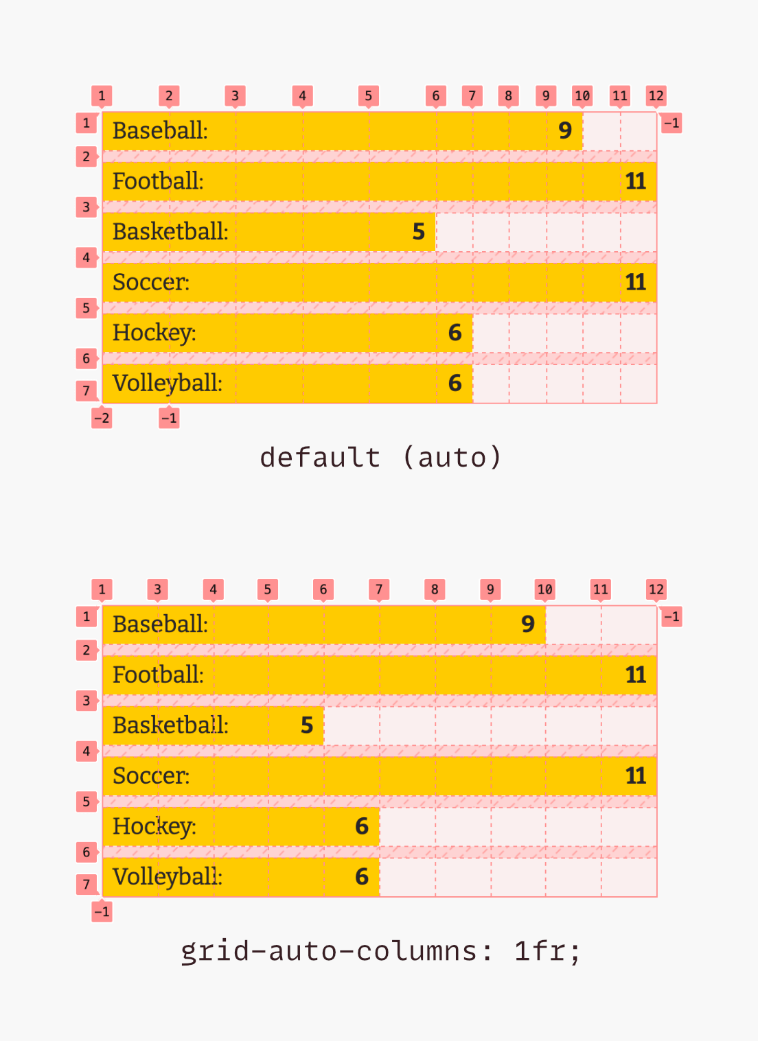
I also want to call attention to the gap property. A value of 0.5rem 0 means we have some space between rows, but crucially, not between columns. You definitely want to be sure you don’t have any column gap; otherwise, the gap will be added to the width of the bars, and they could easily end up overflowing the chart. My first Quina implementation made this mistake; shout-out to Andrew Walpole (quite possibly the world’s most proficient Quina player) for finding that bug. Andrew also took this idea and ran with it in a bar chart CodePen of his own.
Next, on the bars themselves, you’ll want something like this:
.chart > li {
	display: flex;
	justify-content: space-between;
	padding: 0.25rem 0.5rem;
	background: #ffd100; /* Or your color */
	grid-column-start: 1;
}
Aside from that, the rest is pretty straightforward, and you can add or adjust depending on your design. You’ll probably want to set list-style-type to none, just to get rid of the bullets that come with a list element by default. You might want to adjust the browser’s default padding on unordered lists, as well.
One final warning: CSS wants to make elements wide enough to hold their text contents by default. So when dealing with very small bars, be sure they don’t get wider than they should in the chart, just because the name of the bar is wide.
Other options
Here I’ve shown a horizontal bar chart, but it wouldn’t take much to change the bar chart to a vertical one instead. The placement of items is just a little more tricky; here’s a fork of my pen above:
See the Pen Simple CSS Grid Bar Chart - Vertical by Josh Collinsworth (@collinsworth) on CodePen.
The above pen uses Vue instead of Svelte, if you’d like to take a peek at another framework implementation.
The main things to keep in mind if you want the bars to go vertical are:
- The sizing of the bars will need to be switched from
grid-columntogrid-row. - When placing the bars, you’ll need to know the largest value of all the data points, in order to offset each one appropriately (because CSS grid places the item’s top at the named column then spans downward, and there’s no way to reverse that flow like you can with flexbox). In the pen above, this is accomplished with a
computedproperty. (Alternatively, you could just choose a value you know to be higher than any bar would be and compute with that.)- The placement formula to make all the bars align on the bottom is: [tallest bar’s value] - [bar’s value] + 1. The extra 1 is needed because the outer edge of the chart is technically row 1.
- You’ll still need to explicitly place each bar, but by column instead of row.
- You might want to set a
min-heighton the chart, since CSS grid will only make each row as minimally tall as it needs to be in order to distribute them evenly. - Which reminds me: you’ll probably want to have both
grid-auto-columnsandgrid-auto-rowsset to1fr, to make sure each bar is the same width, and that the height of each bar is properly relative. - You can either set
height: 100%on each bar to make it span all its rows, or setalign-items: stretchon the grid container. Either will work. - You’ll probably want to swap any spacing properties, like
gapandpadding, so what was the x axis is now the y axis and vice versa. - Finally, you’ll need to adjust the flexbox properties on the bars themselves, so that the bar label and value are pushed apart vertically rather than horizontally. (Setting
flex-direction: column-reverseworked well in my case.)
The good news is: as long as you only edit the CSS and don’t touch the HTML, the chart will still be accessible!
All of this is only one possible implementation of a CSS grid bar chart. There are many other ways to do it. In fact, you could take these same principles and build other kinds of charts, as well.
You could also change the style. One possible example: experiment with using grid placement to create partially overlapping items. Animating the bars so they rise one after another might be another potential enhancement.
In any case: I hope I’ve shown you that you don’t need to reach for some chart library for simple use cases, and that you have fun trying this out!