




Published: January 2, 2018
Last updated: May 18, 2020
This site is no longer on WordPress, so the theme described here can’t actually be seen anywhere, and the features described mostly aren’t on this website any longer.
It’s been a goal of mine for a very long time to completely redesign my WordPress theme from scratch. Finally, that goal is a reality!
The first time I built my own site, back in (I’d guess) 2013, I used Adobe Muse, which was a good fit for my lack of skill at the time, but a tool that lost relevance as I learned to code.
In 2014, I launched a portfolio site that I coded (mostly) from scratch. Looking back at it now makes me cringe a bit; knowing how to make something work and how to build it correctly are two very different things.
I built a WordPress site on the Divi theme roughly three years ago. At first, it was built entirely on Divi’s visual page builder, and that was handy for creating new layouts quickly. But the more I learned about WordPress (and child themes in particular), the less necessary it was to have the parent theme around. It was extra bloat for mostly features I didn’t use at all. So for a very long time, starting over with my own theme, built from scratch and completely personalized just for this site, has been a goal—and now I finally get to check it off.
About the theme
Rather than beginning with a parent theme or a starter theme like Underscores, I wanted this theme to be built completely from scratch. No borrowed or pre-written code at all; 100% original.
For building, I began with Local by Flywheel. Yes, I work for Flywheel, but I honestly don’t believe there’s a better tool for running WordPress sites locally—particularly given that my live site is hosted on Flywheel already, which means that pulling a copy of my live site to my local machine for development (and then pushing it back live when ready) was all as easy as a click of a button, thanks to the Push to Flywheel feature.
I also implemented CodeKit, for minification, auto browser refreshing, and Sass compilation. Bonus: CodeKit works with Local seamlessly.
Speaking of Sass: it’s invaluable. During theme development, I set up variables for breakpoint widths, colors, some font families, and created a mixin for flexbox settings.
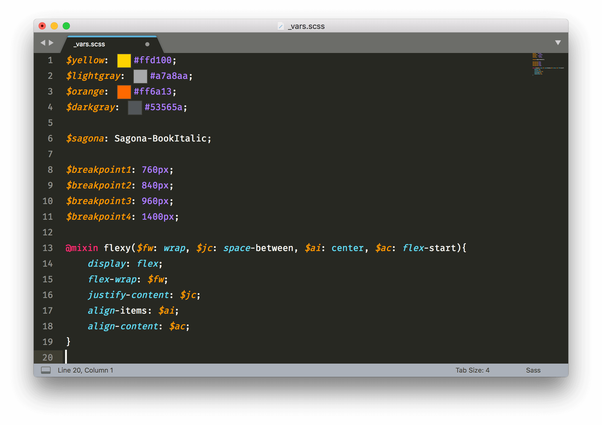
(That’s the ColorHelper Sublime extension creating the color boxes, by the way.)
I also got to take the opportunity to finally learn and implement Timber. I’d been hearing too many good things for too long to ignore it any more.
I love the way Timber makes template files so much cleaner, abstracting output code to bare minimums and eliminating the need to deal with the loop directly. Like any framework, though, there’s a little bit of a learning curve, particularly for some of WordPress’s more complex functionality, like comments and pagination. It’s very well documented, though. I would recommend it, and look forward to using it again. I’ll have to add it to my essential tools for WordPress development.
The theme runs mostly off a single index.php file which dynamically pulls in the appropriate Timber .twig files based on context. In fact, aside from the index file, the theme’s only PHP template files are the footer and header, the functions file, and a sidebar file.
Advanced Custom Fields + CSS Grid
I also took this opportunity to use CSS grid on a project for the first time—specifically, on the design page. It turns out, CSS grid mixes really well with Advanced Custom Fields, particularly the Pro Repeater field. I set up fields for images, height and width, to control the size of images in the grid:
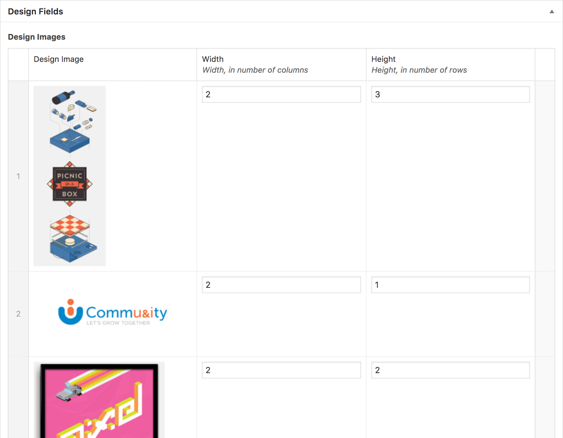
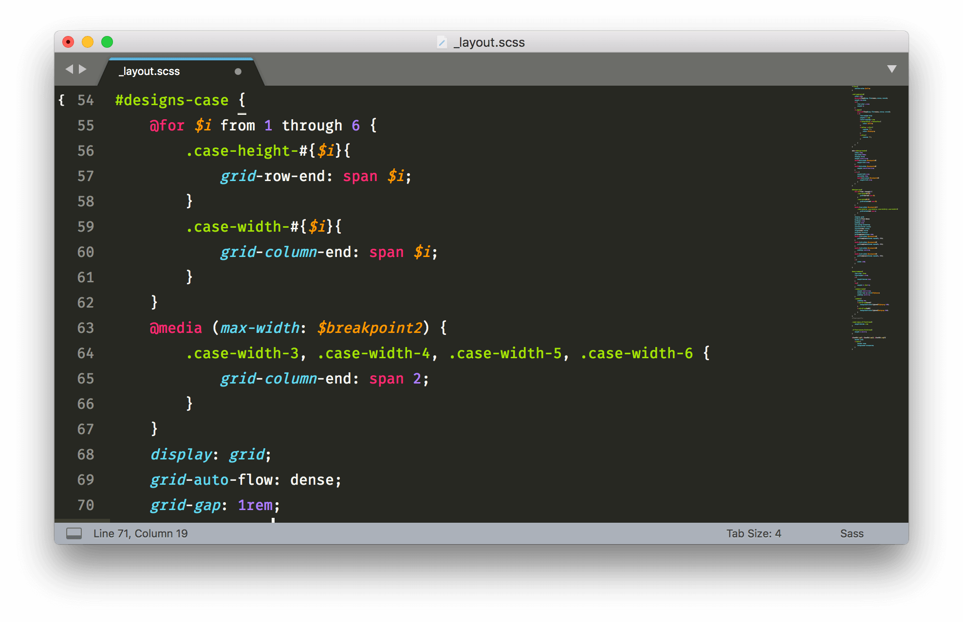
The width and height have max values, and a Sass loop (and a media query) sets CSS for those values with classes:
I’ve been using the same logo for myself since I was in school. On a whim, I decided to create a new one that more closely matches where I am now; more focused on development and applying design principles to the web.

As in the header, the logo’s “icon” form simply removes the lettering, leaving only two sets of brackets, implying code (particularly delving into objects or arrays), with the middle two characters highlighted and in the vague shape of a “J” and a “C” (my initials, of course). I like to think it also hints at my own duality of designer/developer.
The fonts
I’ve owned AmsiPro for years, and I’ve been waiting to use it on a project since I first saw it. I finally decided its personality was right for this project. It’s bold and friendly (particularly the ultra weight used for this site’s headers), but completely utilitarian and readable at lighter weights, as body copy.
I wanted to keep the font load fairly light, so only occasional splashes of Sagona Book Italic are used in places to highlight text. I’ve liked Sagona for a long time. I appreciate the hints of happiness in this Clarendon-esque serif, and I feel that makes it pair well with Amsi Pro.
Thanks for reading! It’s a personal goal to blog more this year and share some of the things I’ve learned over the past few, so this should just be the first of many new posts in the new year. Happy 2018!