







On my first trip to Japan, I brought along a JR Rail Pass to take advantage of the subsidized rail transport for tourists. After riding the JR Yamanote Line and the Tōkaidō Shinkansen, I assumed JR must be a single national train system.
But I soon learned it’s far from that. The Yamanote Line is run by the East Japan Railway Company — JR East — and the Tōkaidō Shinkansen by JR Central. And each of these JR companies is part of a group of associated but entirely separate companies — four now publicly traded, three overseen by a government agency — that each bear the JR mark.
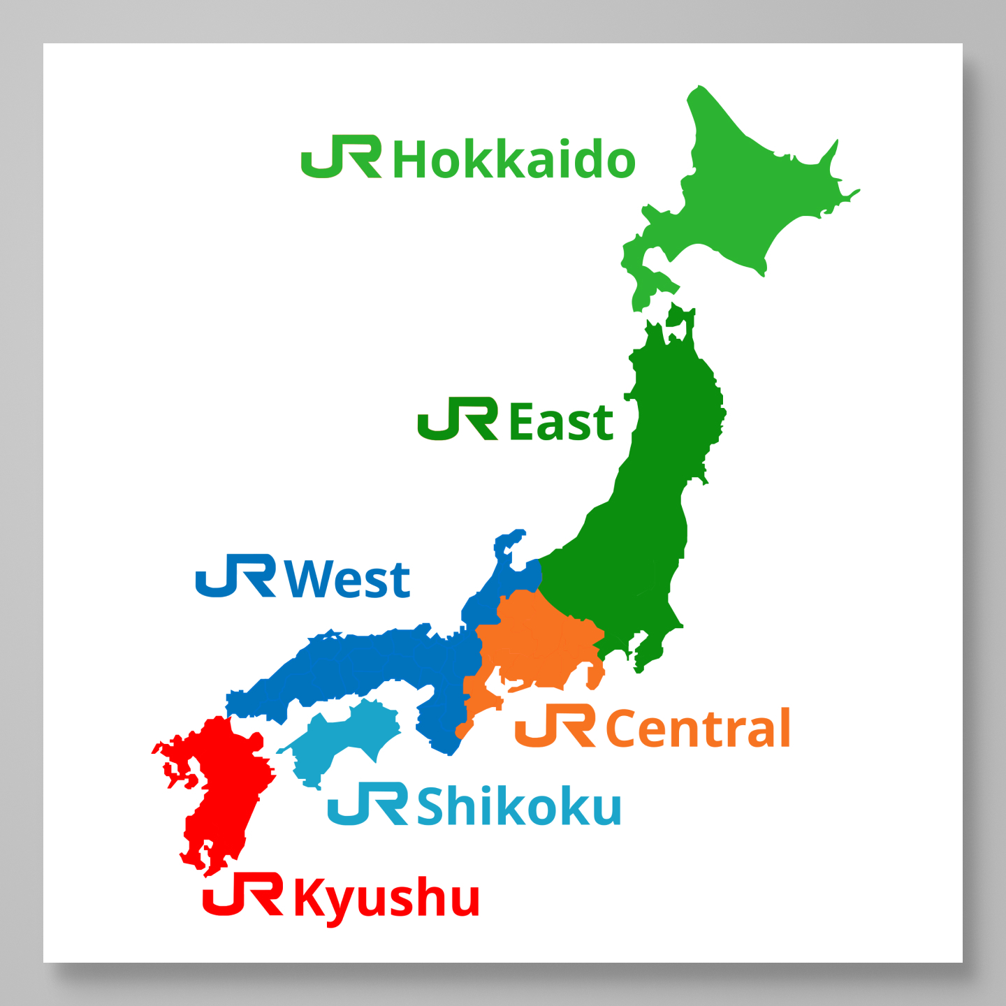
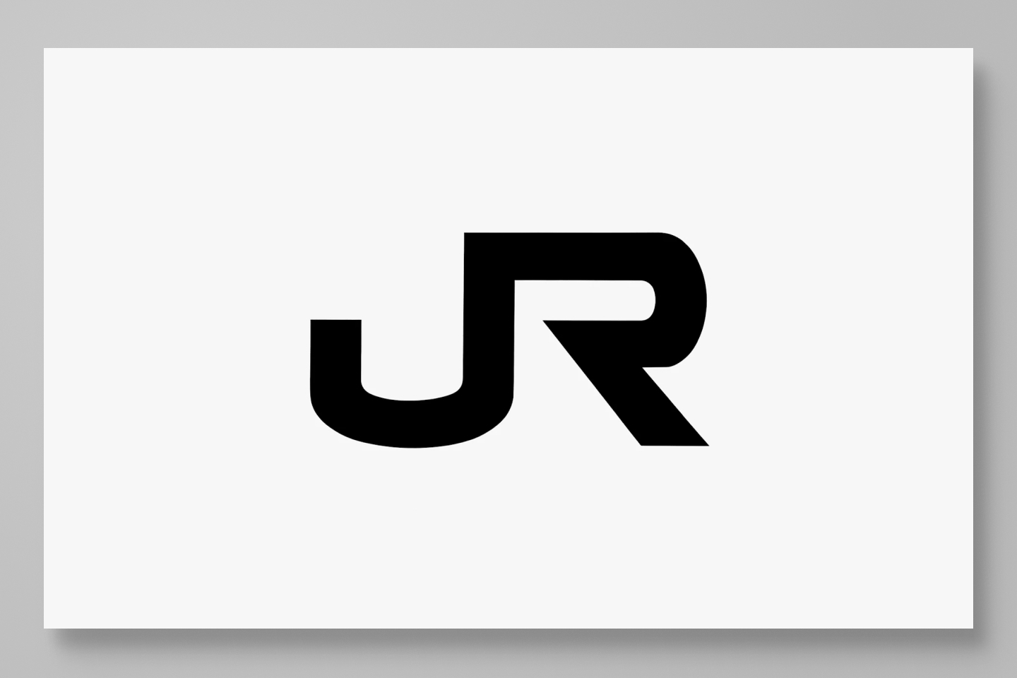
So tens of thousands of vehicles across Japan carry this JR mark and often interoperate on each other’s routes, yet they’re run by independent systems. And the mark has remained unchanged for nearly 40 years, giving off the air of a stable institution.
And the truth is that it didn’t need to happen this way.
Rail transport in Japan was originally run by Japanese National Railways (JNR). Like many state-owned corporations, it was starting to struggle in the 80s with mounting debt. JNR was losing its advantage over other transport, in both passenger and freight. In the ’80s, the Japanese government began pushing to privatize its state-run monopolies — to reduce the national deficit and improve efficiency across these sectors.
In 1985, Nippon Telegraph and Telephone (NTT) was privatized. Two years later, a similar decision was made for the railways. The main rationale for splitting up the system was that each region could be managed more efficiently by attending to its own conditions.
And so six passenger companies and one freight company were created as the JR Group. Normally, each new company would have chosen its own logo and corporate identity. But existing JNR employees felt that “even if we’re splitting up, there ought to be at least one thing that stays the same”.
And so the new corporate identity was commissioned as a single system that would apply across all the companies. In just 124 days — beginning with the passing of railway reform bills — the new JR companies launched across Japan, with new branding applied to every vehicle.
 Yamanote line in 1987. Image
courtesy of NDC
Yamanote line in 1987. Image
courtesy of NDC
The brief was minimal. The designers were given full control, told only that the group had to be called either “Japan Railways” or “Nippon Railways”. It was up to them to find a solution that worked aesthetically and within the constraints.
The letter J now precedes the names of many of Japan’s institutions — JT (Japan Tobacco), JA (Japan Agriculture), JP (Japan Post) — and it feels like a national convention that’s always been there. But it nearly never happened.
You see, the name JR Group was downstream of the design. There were two options — JR and NR — and the design was deemed the deciding factor. As I mentioned, NTT had launched in 1985, so there wasn’t yet a convention set in stone. Both Nippon and Japan were valid options. We know JR was chosen — but we can imagine that, had NR been chosen instead, those same institutions (J.League, JT, JA, JP) might have had an N in front of them.
In fact, many credit JR with pioneering the J at the front of these names. The firm that did the design work was the Nippon Design Center (NDC) — funny enough, with an N at the front. The studio was a collective of elite postwar creatives who had previously made the 1964 Tokyo Olympics posters, the Toyota logo, and the Asahi Breweries logo.
Chief director Yūsuke Kaji led the project, with Yōji Yamamoto serving as art director and handling much of the design. Yamamoto — not to be confused with the fashion designer Yohji Yamamoto, — was born in 1943 in Hiroshima and studied at Musashino Art University. He joined NDC just four years after the Olympics and spent more than a decade on Toyota advertising. He was put on the JR project and continued doing design work for entities of the JR Group as late as 2020.
The process, packed into those 124 days, was extensive and fast. It started with over 100 proposals spanning approaches: “JR” or “NR,” or even “R” alone. They considered the rails of the six passenger companies rendered graphically as a unifying motif, the rails depicted as a bird taking flight, or even numbering the companies. By mid-January, the list had narrowed to two or three finalists, and from there the JR mark was chosen.
 Some of Yōji’s sketches. Image
courtesy of NDC
Some of Yōji’s sketches. Image
courtesy of NDC
The design was locked only 2.5 months before launch — and in that window, Yamamoto and his team were responsible for the seven companies’ logotypes, colors, applications, standards manuals, press kits, and even the ticket designs.
When you look at the JR companies’ logos together, you’ll notice each one has its own color. It looks like a deliberate national color system.
 Image courtesy of NDC
But this palette arose from the constraints of a printing machine. The team at NDC decided it would be most practical to choose from a set of 15 colors that came with a color heat-transfer process: materials were printed in black toner, then a colored sheet was laid on top. Applying heat would adhere the color only where toner existed, letting a black-and-white printer produce color. It was a process designers used to make color comps and mockups before affordable color printing reached the market.
So the designers handed the presidents-to-be of each company the set of 15 colors and asked them to pick a main and a sub color. Each company chose its colors and then justified them by tying them to its region.
JR Hokkaido chose light green, to mimic buds sprouting all at once from pure-white snow. JR East chose a darker green, mirroring the green landscape of that region. JR Central chose orange, evoking the dawn over the Tōkai sea. JR West chose blue, owing to its Japanese culture and its seas and lakes. JR Shikoku picked light blue as a nod to the clear sky. JR Kyushu chose red, which they describe as the bright southern land of the sun. And JR Freight chose a container blue, symbolizing freshness and trust — JNR’s containers had been repainted from green to blue. The group kept an achromatic black-and-white scheme to represent the collective.
I picture the Latin letters JR when I think of Japan’s railways. But each of these companies also has a formal Japanese name, and every one ends in the kanji for “railway.” As the designers worked, they realized that standard character reads as “lose money”. And for seven companies born out of debt, that was a problem.
So while Yamamoto was drawing the company-name logotypes in their Latin forms, he was also designing the full kanji names of all these companies — and all of this was pre-PC-era craft. He was hand-drawing, photo-engraving, and tracing every logo on tracing paper .
Working on the kanji names, that “railway” character became the problem: its “gold” radical sat beside a component meaning “to lose”.
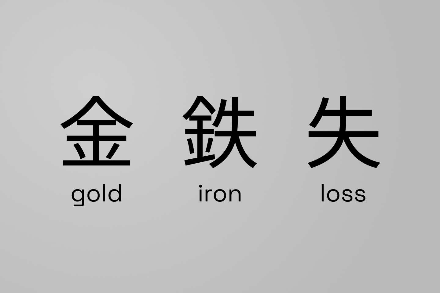
So they considered swapping the “lose” component for a near-identical one — the character for “arrow” — yielding a character that originally meant “arrowhead.” Visually it looks almost the same, but the meaning changes. To make sure it was a real character, they had to visit the National Diet Library and consult the historians and specialists there.
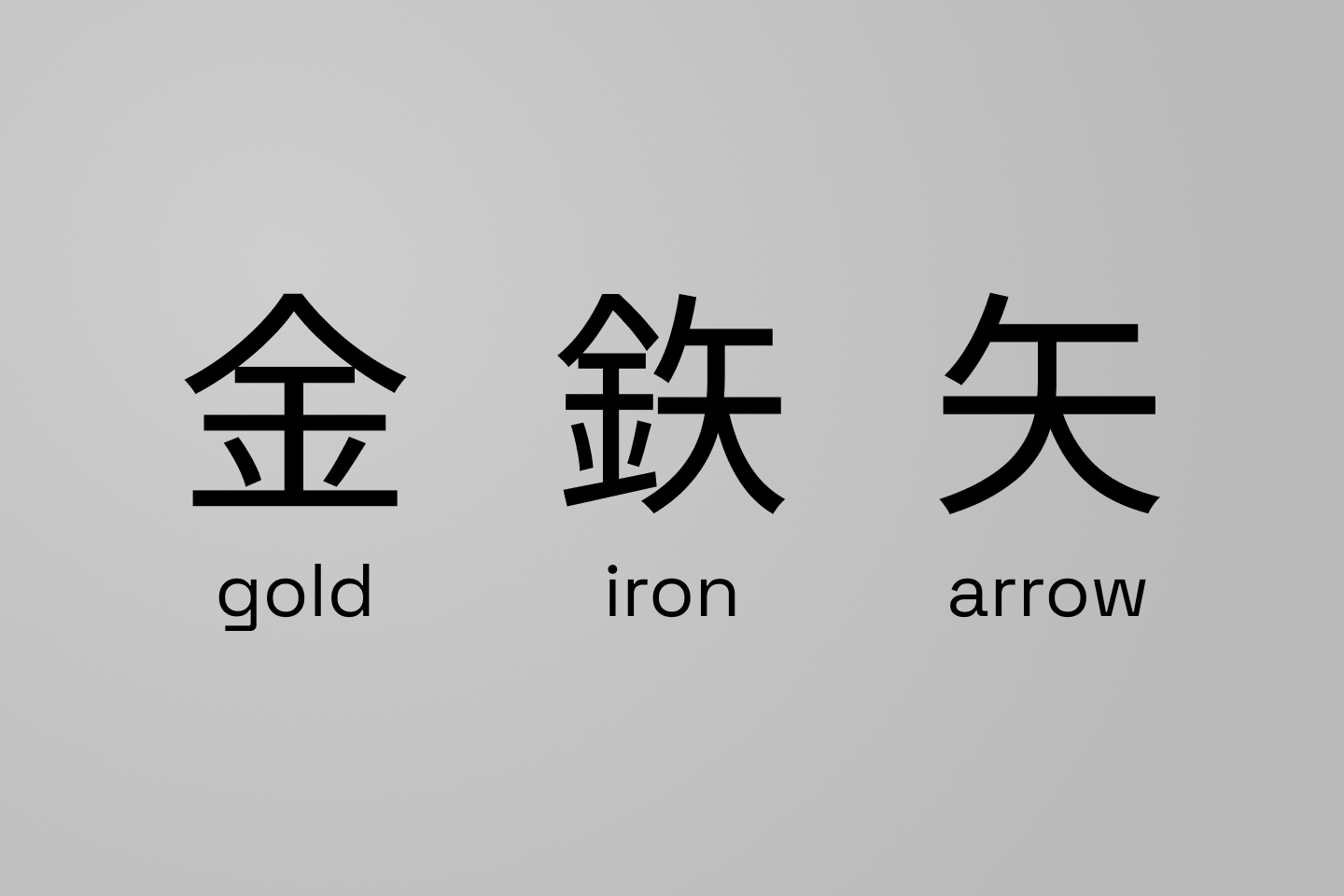
It’s here, in this character, that we see Yamamoto’s perfectionism. He did almost everything himself, because he wasn’t good at delegating to junior designers. Nearing 60, he was still pulling all-nighters — sending his junior employees home while he stayed back and hand-drew the letterforms through the night. The typography for the whole system was approved at 5 p.m. the evening before the final-print deadline for the press kit. And yet he had a nagging feeling it wasn’t perfect — knowing that whatever he shipped could survive for decades. So he stayed up all night, redid every company’s wordmark, and still made the 10 a.m. printer deadline.
At first, the plan for rolling out the new identity was modest. They wanted to mark a few trains and change some signs here and there. But that’s not how it went down.
That original plan called for prioritizing the highest-profile services — some limited-express trains, the Yamanote Line in Tokyo. But ambition started to creep in, and NDC proposed deploying the mark to ten thousand vehicles on day one. The difficulty was that all the trains were in operation, and the mark couldn’t be applied while they were moving — which left teams just four to five hours between the last train on March 31 and the first train under JR on April 1.
So national railway employees came together, in the spirit of one last service as a public agency. Under the motto “Our last service — let’s do it,” they went vehicle by vehicle, adding the JR mark to every one by hand. This was only possible because of the detailed manual NDC provided, full of diagrams hand-drawn by Yamamoto to indicate the mark’s applications.
 Workers applying the JR branding.
Image courtesy of NDC
Workers applying the JR branding.
Image courtesy of NDC
The funny thing is that Yamamoto knew almost nothing about trains. This part of the project was saved because one staff member’s son was a rail fan, and ended up helping with where to place the JR mark on different vehicle types.
 Guidelines. Image courtesy of
NDC
Guidelines. Image courtesy of
NDC
The effect was a wave of recognition across the country — the kind of change a more limited rollout could never have achieved.
 Shinkansen with JR logo. Image
courtesy of NDC
Shinkansen with JR logo. Image
courtesy of NDC
This brings us to the question of why the JR mark hasn’t changed in four decades. It’s common for organizations of this size to go through redesigns as economic conditions and leadership change — and yet it remains untouched.
Part of it is the strength of the mark itself. It reads well on either the left or right side of a vehicle. For example, an arrow-shaped logo would look odd on side of the train since it would point backwards. Its stroke weight is heavy enough to stay legible as trains move; and its shape conveys a feeling of speed even when standing still. The welding of the J and R carries the idea of rails connecting across the whole country as one continuous system.
All of this flowed from Yamamoto’s design philosophy — his conviction in making things built to last. He often spoke of his three guiding principles: fact, reality, and honesty — conveying the truth, conveying what’s real, and never lying — and he returned to them throughout his work. For the JR mark, he wanted something true to life, neither too small nor too grand (a trap corporations often fall into), and something that represented what JR was doing today, not a futuristic gesture toward a future that might never arrive.
He also felt that too many corporate brands looked great on a desk but didn’t translate — lacking boldness and scale once applied. He was influenced by Motoo Nakanishi, one of the figures credited with adapting Western corporate-identity theory to Japan. Nakanishi was opposed to treating corporate identity as just a logo and a logotype; instead, he created a framework splitting it into three layers. MI, or Mind Identity, is the philosophy, values, and vision behind a company. BI, or Behavior Identity, is how the company and its people act in the world — the kind of service they provide. And VI, or Visual Identity, is the visual expression of how the mind and behavior identities are manifested.
And so Yamamoto, even as he did the surface-level work of the logos, was making sure the mind and behavior identities underlying the corporate identity were strong.
Given all that, the legacy he left with the JR mark is unsurprising. And looking at other companies privatized around that time, it’s clear it could have gone another way. Take Japan Airlines, which has repeatedly changed its mark — finally reverting to a version of its original crane in 2011.
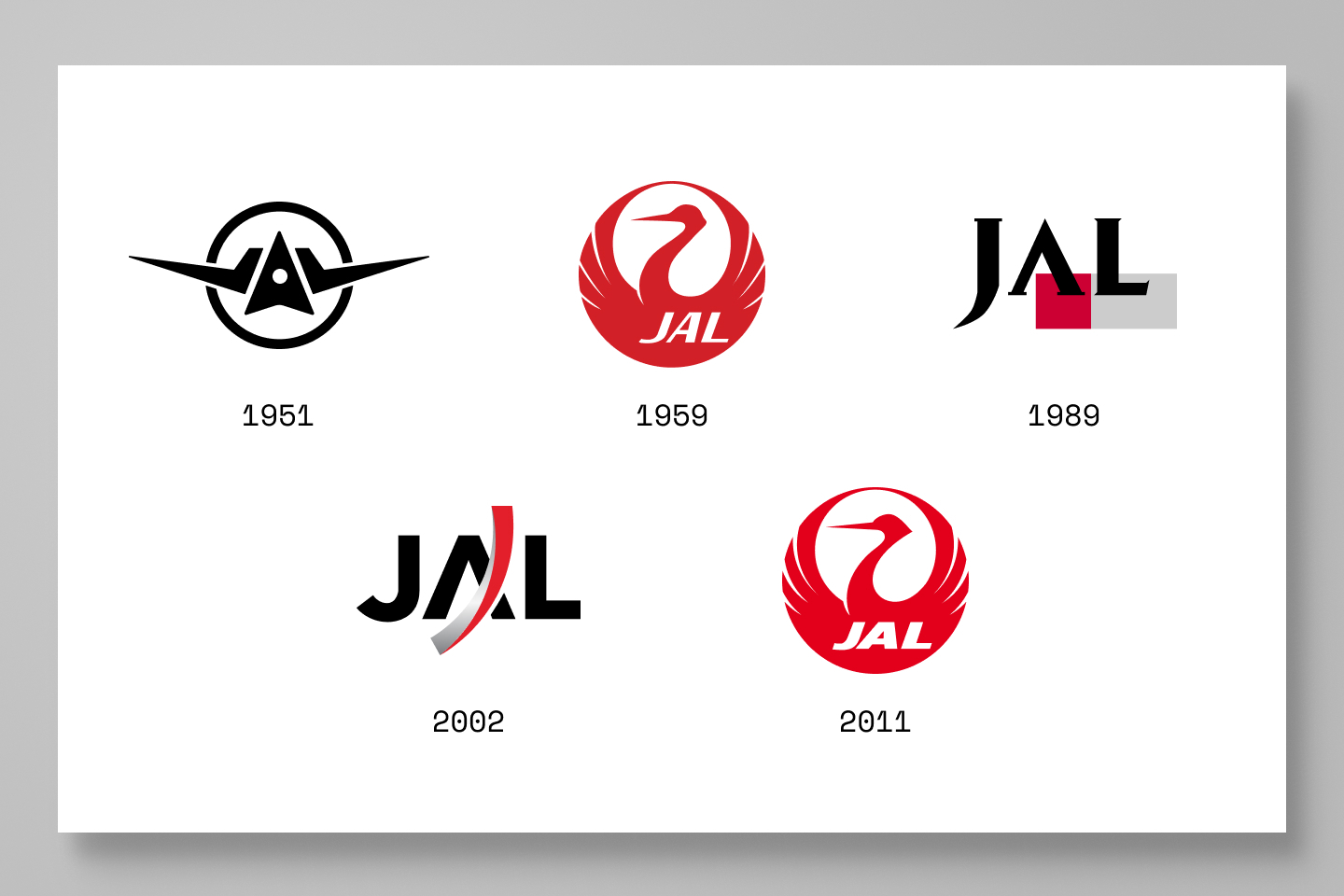
That contrast runs deeper than taste. Companies like JAL reach for a new logo when management has soured and they want to signal a fresh start. By that logic, the logo surviving three decades untouched is evidence the company has been steadily run. It never needed to signal a new start or a change of course.
Thanks to Q for reading drafts of this.
此内容由惯性聚合(RSS阅读器)自动聚合整理,仅供阅读参考。 原文来自 — 版权归原作者所有。