





A typeface built for you, the developers and creatives, Monolisa improves code legibility and provides a clear sans serif for all design tasks.

As a consultant, an instructor, and a presenter, having a clean and engaging mono font is paramount, and MonoLisa delivers information perfectly to everyone without forgetting to sneak in some personality in a gentle smile.

MonoLisa is now my go to font for all places. It has become my expectation in my terminal and code to the point that seeing other fonts confuses me. From the well designed and unique characters make it simple to parse and read throughout the day.

This font is so sharp that the readability of my code increased a lot! Definitely a font I will use for a long time.

I've been using MonoLisa as my editor font for the past few months. After a small adjustment period, I really grew to love it. Going back to any of my old font choices feels like a downgrade in comparison.

I've been using this font for months, and while the slightly wider nature of this font took a little getting used to at first, it eventually grew on me and I saw how well this font works with my daily workflow. A great, quality font and I highly recommend it!

As someone with an eye condition this font makes my life way easier. And not just in coding but even in design since it doesn't only carry regular but the whole set of weights so you can even use it in design, logos or anything a monospace font makes sense.

I switched to MonoLisa after trying out several different fonts in my terminal and in my IDE. As a coding instructor and speaker (and just someone who codes a lot in her free time), readability is always the most important thing to me in a font.

I'm not much of a font guy, but after using this font for just a few days it's grown on my and I really like it. (And people wasted no time in constantly asking me what font I use). Two thumbs up 👍👍

Love the aesthetics of the font and how it improves code readability. That's why we've also decided to use it as the default font at snappify.io

I had been struggling with some vision issues before and MonoLisa really helped me a lot by taking a lot of strain off my eyes.

MonoLisa is the perfect coding font IMO. Spacious, stylish, and super readable. I never pictured myself having such strong feelings about a font, yet here we are.
Both MonoLisa Code and MonoLisa Text share the same design principles and characteristics that make MonoLisa exceptional: distinctive letterforms, carefully balanced spacing, and extensive language support. Whether you’re writing code or designing interfaces, MonoLisa brings clarity and style to your work.
AI assistants produce both code and prose. MonoLisa Text renders long-form explanations with optimal readability, while MonoLisa Code keeps your code crystal clear. The perfect pairing for the AI era.
Distinction is critical for a good coding font since it reduces ambiguity and helps avoid mistakes that can lead to software bugs. MonoLisa’s glyphs fit perfectly together, but at the same time are distinct enough so your eyes will effortlessly tell them apart.
If italics are not enough, there is a script variant for a hand-written appearance.
If simple italics are not enough, there is a script version available.
The quick brown fox jumps over the lazy dog and runs away.
MonoLisa ships as a variable font with two axes. Weight gives you every cut from Thin to Black in a single file — no megabytes per style. Grade fine-tunes typographic color by adjusting stroke thickness without changing glyph widths, so a darker surface or your own preference can sit on its own setting while the layout stays put.
Weight
400
Grade
0
Set font-variation-settings: "GRAD" -50 to compensate on a darker surface.
Both axes — weight and grade — apply across MonoLisa Text and MonoLisa
Code, so prose and inline tokens shift together.
Set font-variation-settings: "GRAD" -50 to compensate on a darker surface.
Both axes — weight and grade — apply across MonoLisa Text and MonoLisa
Code, so prose and inline tokens shift together.
Both MonoLisa Code and MonoLisa Text support over 200 languages and different alphabets including Latin, Armenian, Cyrillic, Greek, Hebrew, and more. The same level of care and attention to detail extends across all scripts in the whole family.
FrançaisհայկУкраїнськаΕλληνικάטיפוגרפיה
MonoLisa includes many OpenType features to enable an unprecedented level of customization.
OpenType features have great support in professional graphic software. Unfortunately, they are still not available in most text editors. To make MonoLisa work in all environments, we allow you to pick the features you want to use in just a few clicks before you download the font, making it a unique font tailored to you. Check out the tester to see all the features in action.
1:11:1
¡M!¡M!
{|{|
3636
gg
gg
ff
@@
**
\\\\
0xF0xF
####
</></>
<|><|>
<-><->
<=><=>
====
.=.=
<~><~>
&>&>
As a consultant, an instructor, and a presenter, having a clean and engaging mono font is paramount, and MonoLisa delivers information perfectly to everyone without forgetting to sneak in some personality in a gentle smile.
MonoLisa is now my go to font for all places. It has become my expectation in my terminal and code to the point that seeing other fonts confuses me. From the well designed and unique characters make it simple to parse and read throughout the day.
This font is so sharp that the readability of my code increased a lot! Definitely a font I will use for a long time.
I've been using MonoLisa as my editor font for the past few months. After a small adjustment period, I really grew to love it. Going back to any of my old font choices feels like a downgrade in comparison.
I've been using this font for months, and while the slightly wider nature of this font took a little getting used to at first, it eventually grew on me and I saw how well this font works with my daily workflow. A great, quality font and I highly recommend it!
As someone with an eye condition this font makes my life way easier. And not just in coding but even in design since it doesn't only carry regular but the whole set of weights so you can even use it in design, logos or anything a monospace font makes sense.
I switched to MonoLisa after trying out several different fonts in my terminal and in my IDE. As a coding instructor and speaker (and just someone who codes a lot in her free time), readability is always the most important thing to me in a font.
I'm not much of a font guy, but after using this font for just a few days it's grown on my and I really like it. (And people wasted no time in constantly asking me what font I use). Two thumbs up 👍👍
Love the aesthetics of the font and how it improves code readability. That's why we've also decided to use it as the default font at snappify.io
I had been struggling with some vision issues before and MonoLisa really helped me a lot by taking a lot of strain off my eyes.
MonoLisa is the perfect coding font IMO. Spacious, stylish, and super readable. I never pictured myself having such strong feelings about a font, yet here we are.
MonoLisa Code is a typeface optimized for code editors. Every character has the same width, which is perfect for alignment and readability when writing code. The increased character width and specially designed ligatures make it exceptional for programming.
For the code family, increased character width helped us design a typeface with more natural, open forms. The shapes are more relaxed, creating less eye strain over long periods of time. MonoLisa Text inherits these relaxed, open forms while using proportional spacing.
Wide
MonoLisa uses open forms, and terminals (starting and ending points) that are pointing towards the neighboring letters to let the eye follow the line of text fluently.
Monospaced fonts tend to have unevenly distributed dark and light space when compared to regular typefaces. MonoLisa carefully compensates for the issue by using unique letter shapes to maintain the balance.
WMA
MonoLisa comes with over 120 specially designed coding ligatures. A ligature is a special symbol that combines two or more characters together so it looks like one token. Ligatures help reduce visual noise and balance white space by aligning special symbols appropriately. These are optimized for code and are available in the code family.
++a>=b%%0!=c~~>d
<!--Comment-->
<>###Title...</>
??e:=f=>{|1,2,3|}
We know coding ligatures are a divisive topic. Some developers love them, others can’t stand them. We’ve listened to the community and designed MonoLisa’s ligature system around one principle: you should be in control.
By default, MonoLisa only enables whitespace ligatures — subtle adjustments that improve readability without changing the meaning of your code. All other coding ligatures are opt-in, organized into feature groups you can enable individually. No surprises, no hidden substitutions.
Pick the features that match the way you work, copy the settings line into your editor config, and you’re set. And if your editor doesn’t support OpenType features natively, our customizer lets you bake your preferred options right into the font files before you download — a font tailored to you in just a few clicks.
Choose the features you want to enable, and copy the following line into your settings.json:
"editor.fontLigatures": "'calt', 'liga', 'cv01', 'cv02', 'cv03', 'cv04', 'cv05', 'cv08', 'cv09', 'cv11', 'cv12'",
calt2
Contextual alternatives
liga73
Whitespace ligatures
------
''''''
""""""
......
..<..<
..=..=
{|{|
[|[|
.?.?
::::
::::::
::=::=
:=:=
:>:>
:<:<
;;;;
!!!!
!!.!!.
!!!!!!
?.?.
?:?:
????
?=?=
****
******
*>*>
*/*/
----
-=-=
*=*=
+=+=
%=%=
#:#:
#!#!
#?#?
#=#=
/*/*
//////
////
/**/**
$($(
>&>&
>=>=
<&<&
<=<=
&&&&
|}|}
|]|]
$>$>
....
.=.=
++++
++++++
+>+>
=:==:=
=!==!=
>:>:
>>>>
>(>(
>>>>>>
<(<(
<:<:
<*<*
<*><*>
<$<$
<$><$>
<+<+
<+><+>
<><>
<<<<
<<<<<<
^=^=
%%%%
cv023
Less, slash, greater
|||>|||>
<|||<|||
<||<||
||>||>
<|<|
|>|>
<|><|>
cv049
Less, hyphen, greater
->>->>
-<<-<<
>->>->
>>->>-
<-><->
<-<<-<
<<-<<-
-<-<
>->-
cv0514
Less, equal, greater
<==><==>
==>==>
=>>=>>
=<<=<<
>=>>=>
>>=>>=
<=<=
<==<==
<=><=>
>=>>=>
<=<<=<
<<=<<=
=>=>
>=>=
<!---<!---
<!--<!--
--->--->
-->-->
<--<--
->->
<-<-
|->|->
!==!==
/==/==
======
====
/=/=
||=||=
|=|=
&=&=
=/==/=
!=!=
~=~=
<~><~>
<~~<~~
~~>~~>
-~-~
~-~-
~>~>
<~<~
~~~~
~@~@
cv126
Ampersand combinations
&^=&^=
&^&^
>&->&-
<&-<&-
&>>&>>
&>&>
MonoLisa is designed with developers in mind. It’s one of the few fonts that come packed with symbols to use in CLIs including PowerLine. To see all the symbols, check out the specimen.
System Monospace
Shell prompt
user@host
~/projects/app
main
Box drawing table
┌────────────┬────────┬───────┐
│ File │ Status │ Lines │
├────────────┼────────┼───────┤
│ index.ts │ ✓ │ 142 │
│ utils.ts │ ● │ 38 │
│ config.ts │ ◐ │ 15 │
└────────────┴────────┴───────┘
Progress indicators
Build 62%
Tests 100%
Lint 25%
NORMAL
main
index.ts
utf-8 42:15
MonoLisa Code
Shell prompt
user@host
~/projects/app
main
Box drawing table
┌────────────┬────────┬───────┐
│ File │ Status │ Lines │
├────────────┼────────┼───────┤
│ index.ts │ ✓ │ 142 │
│ utils.ts │ ● │ 38 │
│ config.ts │ ◐ │ 15 │
└────────────┴────────┴───────┘
Progress indicators
Build 62%
Tests 100%
Lint 25%
NORMAL
main
index.ts
utf-8 42:15
Choose an example
JavaScriptCSSJavaPHPPythonReasonMarkdown
As a consultant, an instructor, and a presenter, having a clean and engaging mono font is paramount, and MonoLisa delivers information perfectly to everyone without forgetting to sneak in some personality in a gentle smile.
MonoLisa is now my go to font for all places. It has become my expectation in my terminal and code to the point that seeing other fonts confuses me. From the well designed and unique characters make it simple to parse and read throughout the day.
This font is so sharp that the readability of my code increased a lot! Definitely a font I will use for a long time.
I've been using MonoLisa as my editor font for the past few months. After a small adjustment period, I really grew to love it. Going back to any of my old font choices feels like a downgrade in comparison.
I've been using this font for months, and while the slightly wider nature of this font took a little getting used to at first, it eventually grew on me and I saw how well this font works with my daily workflow. A great, quality font and I highly recommend it!
As someone with an eye condition this font makes my life way easier. And not just in coding but even in design since it doesn't only carry regular but the whole set of weights so you can even use it in design, logos or anything a monospace font makes sense.
I switched to MonoLisa after trying out several different fonts in my terminal and in my IDE. As a coding instructor and speaker (and just someone who codes a lot in her free time), readability is always the most important thing to me in a font.
I'm not much of a font guy, but after using this font for just a few days it's grown on my and I really like it. (And people wasted no time in constantly asking me what font I use). Two thumbs up 👍👍
Love the aesthetics of the font and how it improves code readability. That's why we've also decided to use it as the default font at snappify.io
I had been struggling with some vision issues before and MonoLisa really helped me a lot by taking a lot of strain off my eyes.
MonoLisa is the perfect coding font IMO. Spacious, stylish, and super readable. I never pictured myself having such strong feelings about a font, yet here we are.
We went back to the drawing board and created MonoLisa Text, a proportional version of the original MonoLisa font family. Proportional letters are easier to read in plain text, so MonoLisa Text will be a perfect companion for pairing with code.
MonoLisa Text was conceived to offer designers and creatives a universal typographic workhorse. Thanks to its extensive script support (Latin, Cyrillic, Greek, Hebrew, Armenian, even Braille) and a vast range of helpful symbols, currency signs, arrows, and OpenType features, this typeface will help you tackle any design task coming your way, be it print, web, apps, logos, or signage. As with Code we put a lot of effort into making it as legible as possible. Thanks to its large x-height and crisp style, MonoLisa Text is great for smaller sizes, too, be it in print or on screens.”
Modern editors show code alongside documentation, type hints, and AI chat. MonoLisa Text renders inline docs and assistant responses with optimal readability, while MonoLisa Code keeps your code crystal clear. The perfect pairing for the AI era.
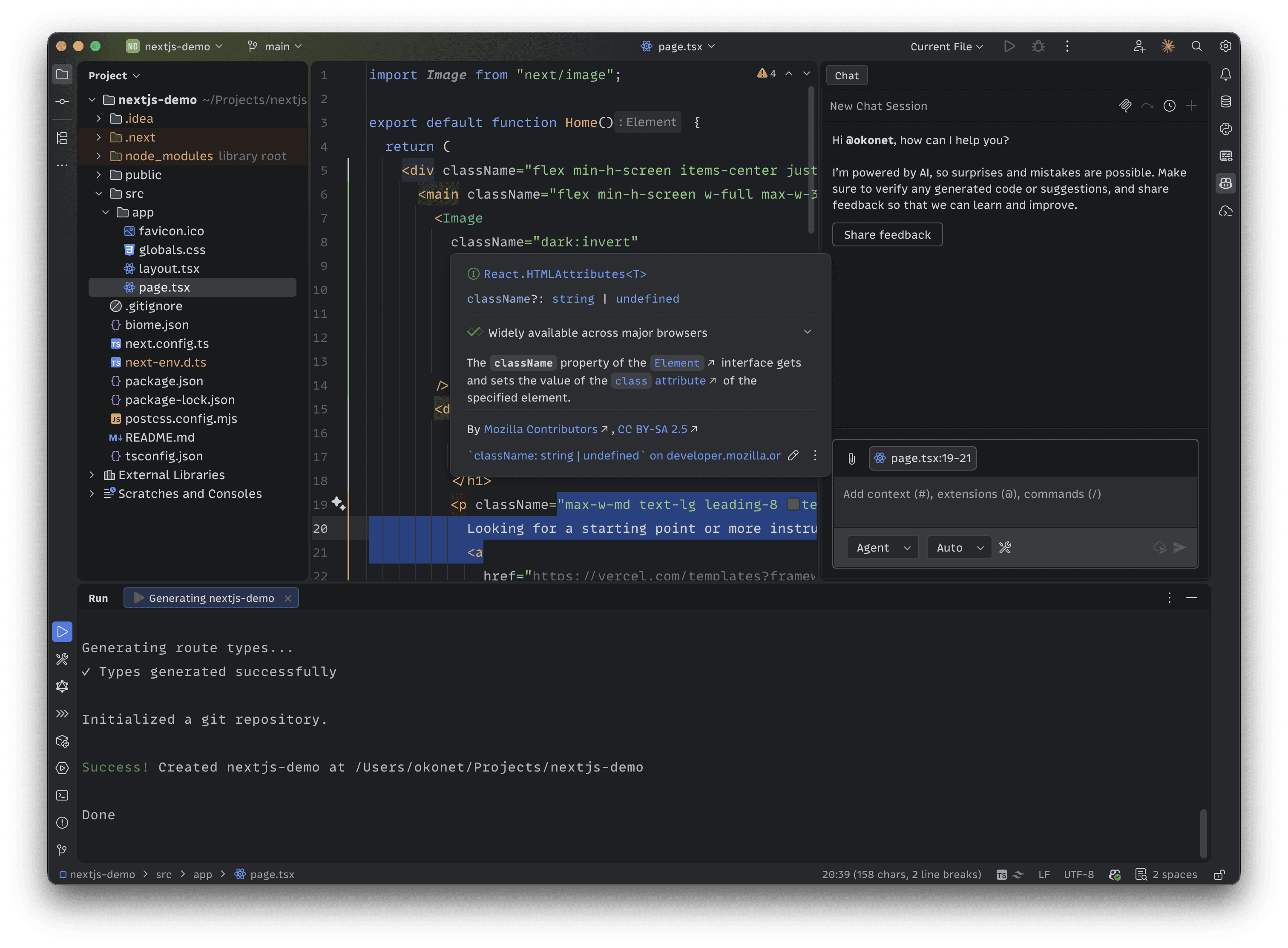
MonoLisa Text is great for user interfaces. Equal vertical metrics mean text snaps to the geometric center of any button, badge, or label automatically — no magic numbers, no adjustments needed.


As a consultant, an instructor, and a presenter, having a clean and engaging mono font is paramount, and MonoLisa delivers information perfectly to everyone without forgetting to sneak in some personality in a gentle smile.
MonoLisa is now my go to font for all places. It has become my expectation in my terminal and code to the point that seeing other fonts confuses me. From the well designed and unique characters make it simple to parse and read throughout the day.
This font is so sharp that the readability of my code increased a lot! Definitely a font I will use for a long time.
I've been using MonoLisa as my editor font for the past few months. After a small adjustment period, I really grew to love it. Going back to any of my old font choices feels like a downgrade in comparison.
I've been using this font for months, and while the slightly wider nature of this font took a little getting used to at first, it eventually grew on me and I saw how well this font works with my daily workflow. A great, quality font and I highly recommend it!
As someone with an eye condition this font makes my life way easier. And not just in coding but even in design since it doesn't only carry regular but the whole set of weights so you can even use it in design, logos or anything a monospace font makes sense.
I switched to MonoLisa after trying out several different fonts in my terminal and in my IDE. As a coding instructor and speaker (and just someone who codes a lot in her free time), readability is always the most important thing to me in a font.
I'm not much of a font guy, but after using this font for just a few days it's grown on my and I really like it. (And people wasted no time in constantly asking me what font I use). Two thumbs up 👍👍
Love the aesthetics of the font and how it improves code readability. That's why we've also decided to use it as the default font at snappify.io
I had been struggling with some vision issues before and MonoLisa really helped me a lot by taking a lot of strain off my eyes.
MonoLisa is the perfect coding font IMO. Spacious, stylish, and super readable. I never pictured myself having such strong feelings about a font, yet here we are.
By purchasing and downloading the font you’re agreeing to the EULA and our Refund Policy.
As a consultant, an instructor, and a presenter, having a clean and engaging mono font is paramount, and MonoLisa delivers information perfectly to everyone without forgetting to sneak in some personality in a gentle smile.
MonoLisa is now my go to font for all places. It has become my expectation in my terminal and code to the point that seeing other fonts confuses me. From the well designed and unique characters make it simple to parse and read throughout the day.
This font is so sharp that the readability of my code increased a lot! Definitely a font I will use for a long time.
I've been using MonoLisa as my editor font for the past few months. After a small adjustment period, I really grew to love it. Going back to any of my old font choices feels like a downgrade in comparison.
I've been using this font for months, and while the slightly wider nature of this font took a little getting used to at first, it eventually grew on me and I saw how well this font works with my daily workflow. A great, quality font and I highly recommend it!
As someone with an eye condition this font makes my life way easier. And not just in coding but even in design since it doesn't only carry regular but the whole set of weights so you can even use it in design, logos or anything a monospace font makes sense.
I switched to MonoLisa after trying out several different fonts in my terminal and in my IDE. As a coding instructor and speaker (and just someone who codes a lot in her free time), readability is always the most important thing to me in a font.
I'm not much of a font guy, but after using this font for just a few days it's grown on my and I really like it. (And people wasted no time in constantly asking me what font I use). Two thumbs up 👍👍
Love the aesthetics of the font and how it improves code readability. That's why we've also decided to use it as the default font at snappify.io
I had been struggling with some vision issues before and MonoLisa really helped me a lot by taking a lot of strain off my eyes.
MonoLisa is the perfect coding font IMO. Spacious, stylish, and super readable. I never pictured myself having such strong feelings about a font, yet here we are.
此内容由惯性聚合(RSS阅读器)自动聚合整理,仅供阅读参考。 原文来自 — 版权归原作者所有。