









Plotnine is a data visualization package for Python based on the grammar of graphics, a coherent system for describing and building graphs. The syntax is similar to ggplot2, a widely successful R package.
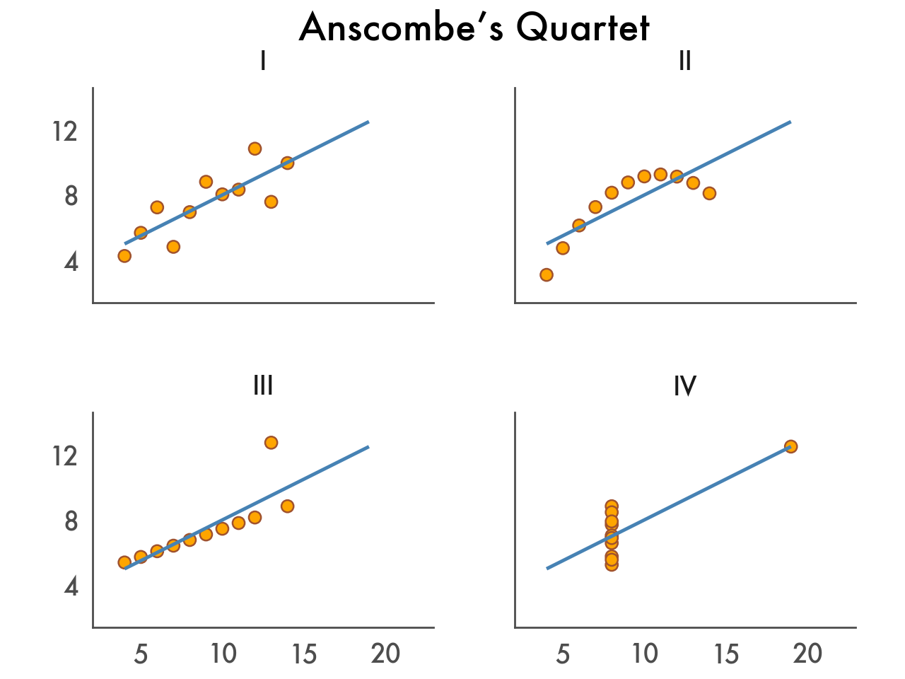
Let’s explore Plotnine’s features and walk through a typical workflow by visualizing Anscombe’s Quartet—four small datasets with different distributions but nearly identical descriptive statistics. They’re perhaps the best argument for visualizing data. You can see the final result belowon the right.
With Plotnine you can create ad-hoc plots with just a single line of code.
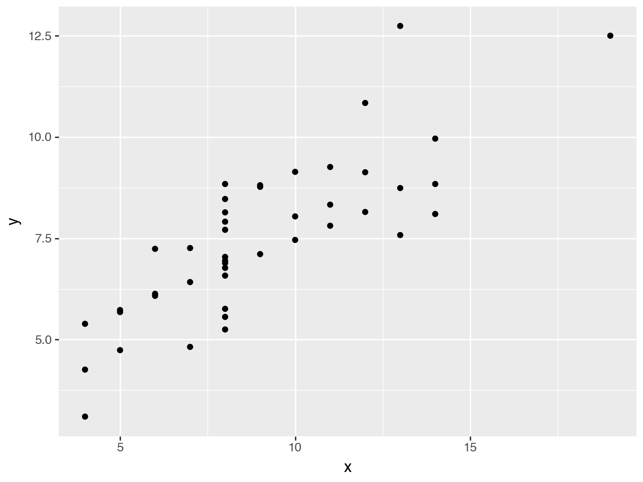
from plotnine import *
from plotnine.data import anscombe_quartet

ggplot(anscombe_quartet, aes(x="x", y="y")) + geom_point()
Our data contains two continuous variables, so let’s start with a basic scatter plot.
It doesn’t make much sense just yet; we need a way to distinguish between the four datasets.
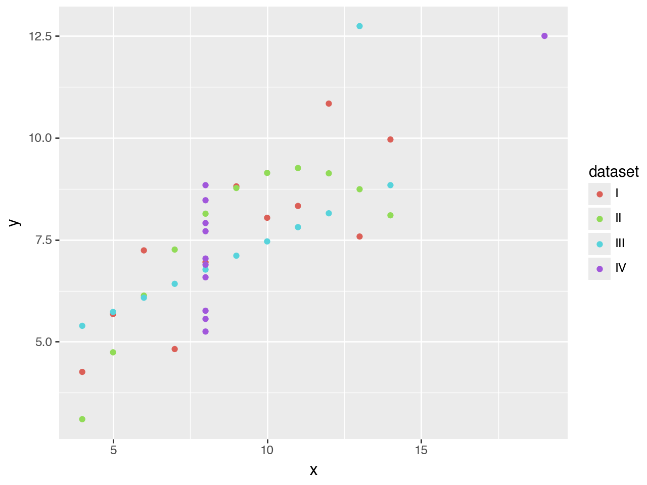
Legends, labels, breaks, color palettes. Many elements are added automatically based on the data.
By coloring each point according to the dataset it belongs to, the plot automatically gets a legend. The colors are chosen automatically as well. But don’t worry, as we’ll see later, everything can be adjusted.
It’s still rather messy, so let’s try a different approach.
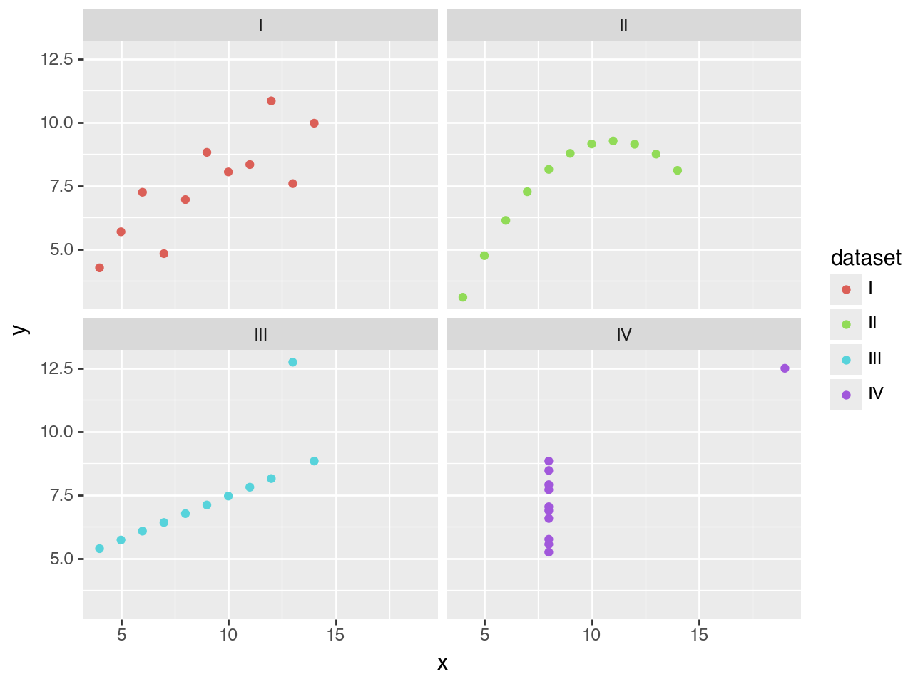
Any data visualization can be repeated across multiple panels without writing a for loop.
That’s better. The panels make the use of color redundant, so that’s something we need to fix.
The data and the mapping of columns are inherited, but can be changed per layer.
These scatter plots with trend lines clearly supports Anscombe’s point: that datasets with different distributions can have the same descriptive statistics.
When you’re doing exploratory data analysis, this plot might be good enough. But when you want to publish this, you may want to customize it further.
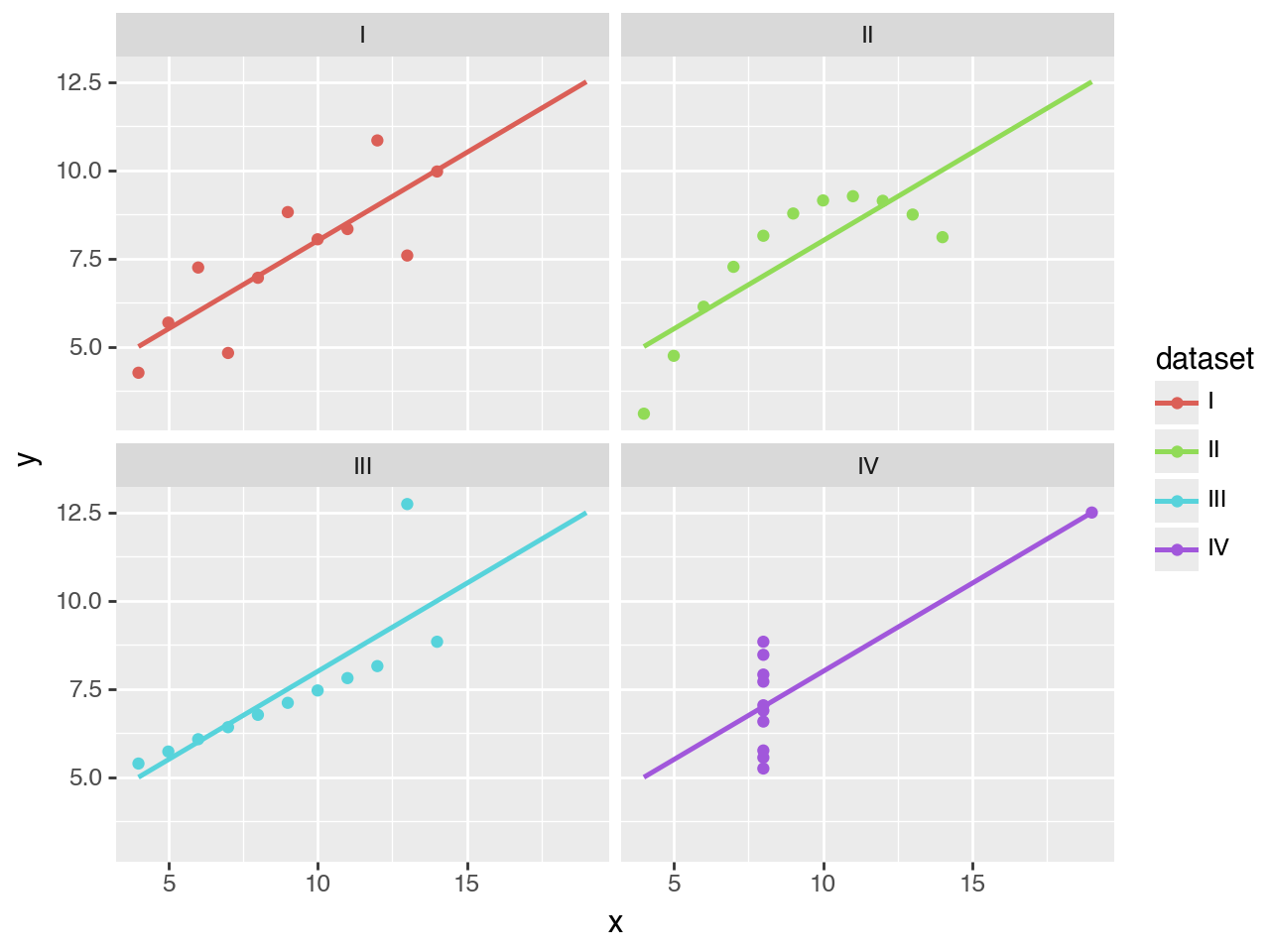
Anything that you see, can be adjusted.
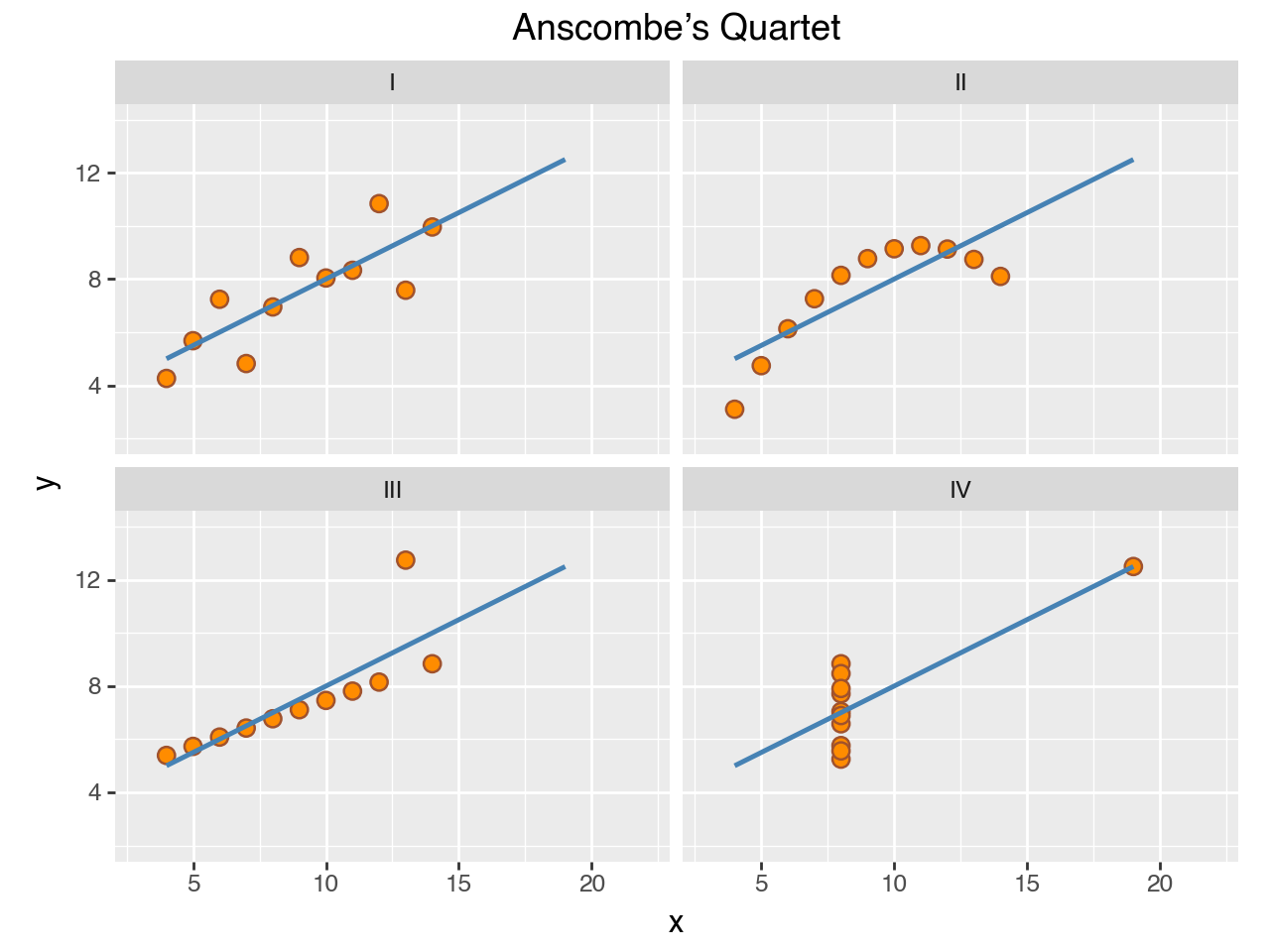
(
    ggplot(anscombe_quartet, aes("x", "y"))
    + geom_point(color="sienna", fill="darkorange", size=3)
    + geom_smooth(method="lm", se=False, fullrange=True,
                  color="steelblue", size=1)
    + facet_wrap("dataset")
    + scale_y_continuous(breaks=(4, 8, 12))
    + coord_fixed(xlim=(3, 22), ylim=(2, 14))
    + labs(title="Anscombe’s Quartet")
)
Here we change the sizes and colors, improve the breaks, and add a title.
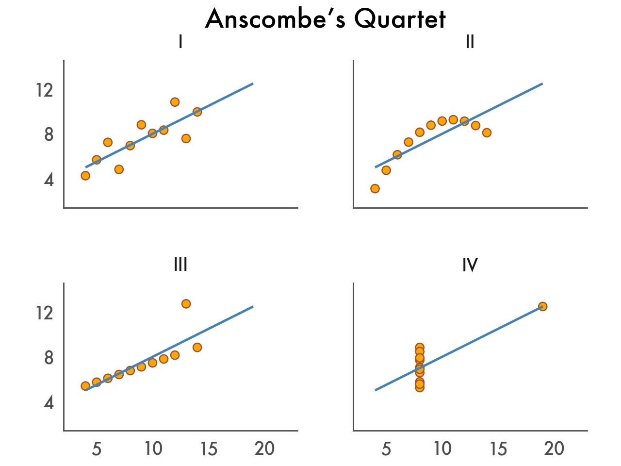
Finally, customize the theme to match your personal style or your organization’s brand.
(
    ggplot(anscombe_quartet, aes("x", "y"))
    + geom_point(color="sienna", fill="orange", size=3)
    + geom_smooth(method="lm", se=False, fullrange=True,
                  color="steelblue", size=1)
    + facet_wrap("dataset")
    + labs(title="Anscombe’s Quartet")
    + scale_y_continuous(breaks=(4, 8, 12))
    + coord_fixed(xlim=(3, 22), ylim=(2, 14))
    + theme_tufte(base_family="Futura", base_size=16)
    + theme(
        axis_line=element_line(color="#4d4d4d"),
        axis_ticks_major=element_line(color="#00000000"),
        axis_title=element_blank(),
        panel_spacing=0.09,
    )
)
There you have it, we started with a single line of code, and incrementally improved and customized our data visualization.
Curious how you can start creating these kinds of visualizations with your own data? In the next section we cover how to install Plotnine.
此内容由惯性聚合(RSS阅读器)自动聚合整理,仅供阅读参考。 原文来自 — 版权归原作者所有。