




Yassine Benazzou
Datadog makes it easy to correlate, compare, and visualize metrics from your infrastructure and applications. Some metrics, however, are inherently so noisy that the graphs become unreadable (the dreaded spaghettification problem), and you lose the ability to extract essential information about trends and large-scale deviations. For cases like these, we provide several smoothing functions that help you identify trends in your metrics. But choosing a smoother that works well for all zoom levels and points in time can be difficult to impossible. That’s why we created an Auto Smoother that automatically removes the noise of a timeseries while preserving its shape.
Let’s explore a few examples that show how Auto Smoother can help you derive more insights from your graphs.

Both of the graphs above show the same metric—the CPU idle on one of our production clusters—before (left) and after (right) applying Auto Smoother. This metric frequently oscillates between very high and very low values, making it hard to see trends in CPU usage until we apply the Auto Smoother. In both graphs, we can see that a couple of nodes became idle around 11:20 a.m. But only the smoothed graph makes it clear that, after this occurred, the remaining nodes almost halved their idle time as a result.
Auto Smoother also helps us identify trends in metrics that exhibit seasonality. Both of the graphs below show the average system load for each node in an application. This metric exhibits cyclical behavior, with peaks occurring about every 20 minutes.

In the graph on the left, we can see that two hosts regularly exhibit peaks that rise above the spaghetti, but it’s difficult to assess exactly how much more load those hosts have compared to others. It’s also hard to determine if there are any irregularities in this cyclical behavior. Using Auto Smoother makes it immediately obvious that two of the boxes have about twice as much load as their peers. Auto Smoother also helps spot irregularities in the load. For example, we can see that the second-most loaded host (in yellow) exhibited a noticeable decrease of load around 12:00.
Our Auto Smoother is inspired by the ASAP (Automatic Smoothing for Attention Prioritization) algorithm developed by Stanford’s Future Data Systems Research Group. Like ASAP, our algorithm uses a moving average to smooth the timeseries, automatically choosing the optimal size for the moving average window based on two properties of the smoothed timeseries: the roughness and the kurtosis (defined below). The window size refers to the number of datapoints that will be used to calculate the moving average—in other words, a larger window size will lead to more smoothing.
The roughness is a measure of the noisiness of a timeseries. It is defined as the standard deviation of the first difference series. The kurtosis is the fourth standardized moment of a random variable. It measures the “tailedness” or “outlyingness” of the probability distribution of the timeseries: a metric with larger tails in its probability distribution will have a higher kurtosis. Auto Smoother uses this measure to ensure that the smoothed series preserves the large-scale trend of the original noisy timeseries. In other words, it prevents the algorithm from oversmoothing.
Combined, these two measures define an objective function that our Auto Smoother algorithm uses to calculate the optimal window size for the moving average. The window size is chosen so that the moving average will reduce the noise, or roughness measure, while ensuring that the kurtosis of the smoothed data remains high enough for the user to spot important deviations and trends in the timeseries.
To specifically account for the level of fluctuations present in timeseries collected from high-scale infrastructure and applications, our Auto Smoother algorithm weighs roughness and kurtosis differently than ASAP does. Our algorithm also uses a different optimization technique, which allows us to continuously smooth metrics and yield faster results for the data displayed on our real-time dashboards.
Compared to other traditional smoothing functions, Datadog’s Auto Smoother has several advantages:
It automatically chooses the optimal window size to smooth your timeseries, which means that you don’t need to try several parameters before finding the one that best fits your timeseries. For example, the following timeseries exhibit some seasonality. Auto Smoother detects that periodic behavior and uses it to calculate the ideal window size parameter for smoothing:

Auto Smoother continuously adapts the smoothing window based on the noisiness of new datapoints as they are collected in real time. (If newly collected points make the timeseries too noisy, Auto Smoother will change the smoothing window accordingly.)
When you change the time range of a dashboard, Auto Smoother automatically adapts and chooses a new best window size. At different levels of zoom, the optimal window size can vary greatly (e.g., a zoomed-in plot often needs much more smoothing than a zoomed-out graph of the same timeseries).
When you apply Auto Smoother to several timeseries using a group by query (e.g., avg by), the same window size is applied on all the timeseries, providing consistent smoothing for easy comparison and visual inspection across hosts or other infrastructure components:

Our Auto Smoother can also be combined with other algorithms, like outlier detection, to help highlight important abnormalities in your metrics.

In this example, we have applied an outlier detection algorithm to the same CPU idle metric discussed in the first example above. Noise obscures outliers in the graph on the left, whereas in the graph on the right, Auto Smoother makes it obvious that two hosts (highlighted in blue and purple) are behaving significantly differently than their peers, as identified by the outlier detection algorithm.
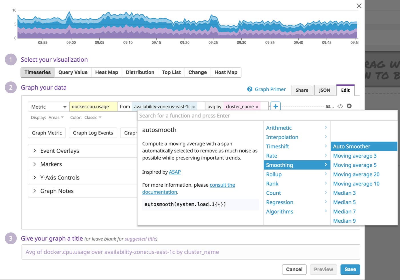
To use Auto Smoother, simply click the + button next to an expression in the timeseries graph query editor to access the function menu. Then navigate to the “Smoothing” section, where you’ll find the Auto Smoother function (autosmooth()):
Auto Smoother is now available in Datadog, so you can immediately start using it to reduce the noise in your timeseries visualizations. If you’re new to Datadog and you’d like to use this algorithm to extract valuable signals from noisy timeseries data, you can get started with a 14-day free trial.
此内容由惯性聚合(RSS阅读器)自动聚合整理,仅供阅读参考。 原文来自 — 版权归原作者所有。