





K Young
If you’ve ever needed to understand what is happening right now on all your hosts, today’s a great day. We’ve just added Host Maps to Datadog, and we think you’re going to like them.
Host Maps let you see all of your hosts together on one screen, grouped however you want, filtered however you want, with metrics made instantly comprehensible via color and shape. This is a new and simple way to spot outliers, detect usage patterns, avoid resource problems, and make decisions about how to best manage your infrastructure. Host Maps work at any scale, whether you have 10, 100 or 10,000 hosts.
When you use Host Maps, we wanted the experience to be like waving a magic wand, and having every host leap to attention, telling you the high-level story instantly, ready to report further details on demand. The video above shows Host Maps in action.
We built Host Maps for ultimate flexibility; with just a few clicks, you can ask innumerable infrastructure-level questions and get instant, visual answers. Below are some common uses, but we would also love to hear on twitter about the ways you use Host Maps at your company (@datadoghq).
If you are an AWS user, you probably use a variety of instance types. Some instances are optimized for memory, some for compute, some are small, some are big. If you want to reduce your AWS spend, a great place to start is by figuring out what the expensive instances are used for. With Host Maps this is easy. First group by “instance-type” and then group by role or name. Take a look at your expensive instance types, such as c3.8xlarge. Are there any host roles whose CPU is underutilized? If so, you can zoom in to individual hosts and see whether all that computational horsepower has been needed in the last several months, or whether this group of hosts is a candidate for migrating to a cheaper instance type.
Below is a subset of Datadog’s infrastructure. As you can see, c3.2xlarge instances are pretty heavily loaded.
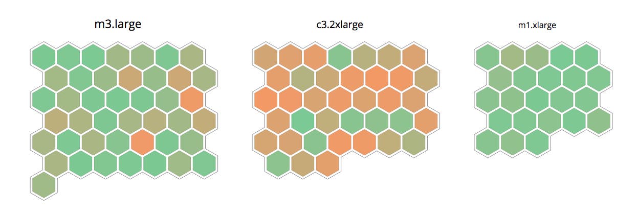
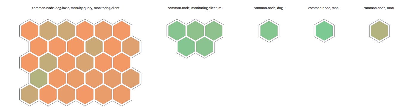
As seen below, by clicking on the c3.2xlarge group and then sub-grouping by role, we found that only some of the roles are loaded, while others are nearly idling. If we downgraded those 7 green nodes to a c3.xlarge, we would save almost \$13K per year. That’s worth investigating! ( \$0.21 saved per hour per host x 24 hr/day * 365 days/year * 7 hosts = \$12,877.20 / year )
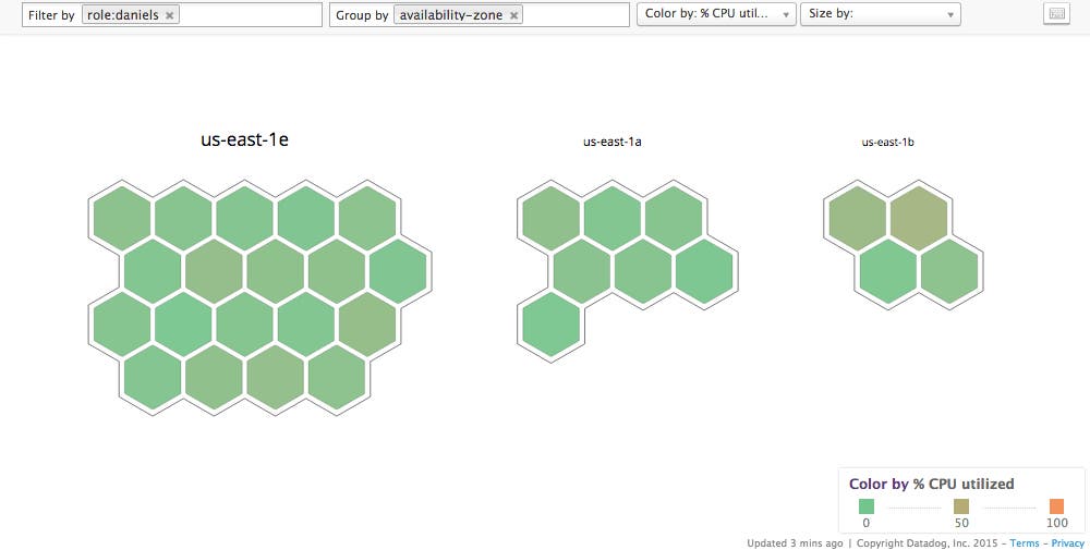
Host maps make it easy to see distributions of machines in each of your availability zones (AZ). Filter for the hosts you are interested in, group by AZ, and you can immediately see whether resources need rebalancing. As seen below, at Datadog we have an uneven distribution of hosts with role:daniels across availability zones. (Daniels is the name of one of our internal applications.)
Imagine you are having a problem in production. Maybe the CPUs on some of your hosts are pegged, which is causing long response times. Host Maps can help you quickly see whether there is anything different about the loaded and not-loaded hosts. You can rapidly group by any dimension you would like to investigate, and visually determine whether the problem servers belong to a certain group. For example, you can group by availability zone, region, instance type, image, or any tag that you use at your company. You will either find a problem very quickly, or rule out these explanations before spending time on deeper investigations.
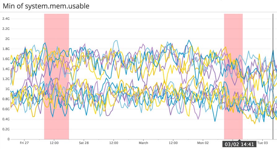
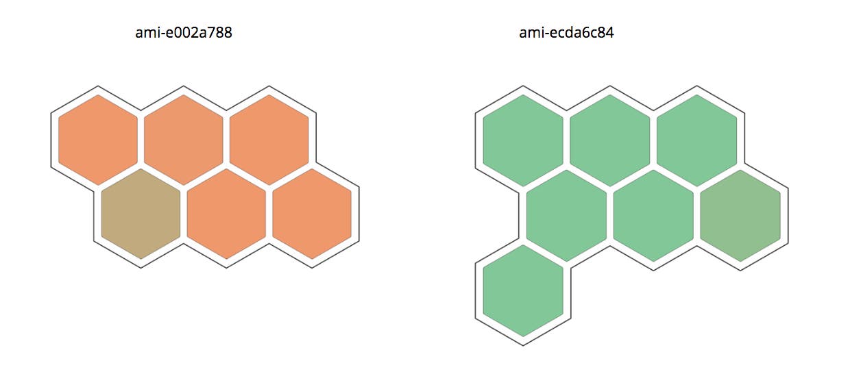
Below is a screenshot from a recent issue we had a Datadog. As you can see, some hosts had much less usable memory than others, despite being part of the same cluster. Why? We grouped by machine image in Host Maps, and the problem was immediately clear: there were in fact two different images in use, and one of them had become overloaded.
We hope you’ll love this new way of using Datadog to understand what is happening on all your hosts right now. We found that Host Maps’ fast and intuitive interface immediately ratcheted up our own team’s level of understanding of our infrastructure and made our daily ops work more efficient... and fun, too.
For details about how to use Host Maps, continue to part two.
Please let us know what you think! Twitter: @datadoghq
此内容由惯性聚合(RSS阅读器)自动聚合整理,仅供阅读参考。 原文来自 — 版权归原作者所有。