


Helping our users gain end-to-end visibility into their systems is key to the Datadog platform— to achieve this, we offer over 20 products and more than 1,000 integrations. However, with an ever-expanding, increasingly diverse catalog, it’s more important than ever that users have clear paths for quickly finding what they need.
We recently launched a redesign of our navigation aimed at helping users better explore our platform and quickly find what they’re looking for. This project involved studying real-user interactions; reevaluating key design decisions including color schemes, character spacing, and element positioning; and clearly defining hierarchies and relationships among our features. At the heart of our efforts was a focus on making our features easier to find, easier to take advantage of, and easier to read.
A major goal of this redesign was to organize features in a way that better reflects how many of our users actually interact with Datadog. For the sidebar, this meant considering which features we consider “core” to our platform, how this aligns with usage patterns across our platform, and which tools can help users find the features they need the fastest.
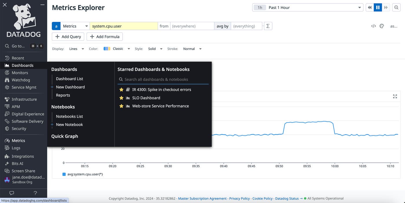
For easy access, we’ve placed our most frequently used functionality at the top and bottom of the sidebar. At the top, you can find our search bar next to your recently accessed pages, enabling you to quickly pivot to different areas of the platform. In particular, recently accessed pages can include monitors, dashboards, and notebooks, making it easy to jump back into ongoing projects. Direct links to popular features such as Watchdog and Service Management are also included in this top section for quick access.
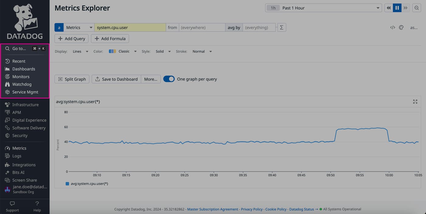
In the middle of the sidebar, we’ve placed features that are designed, by drawing on data from across our platform, to help users monitor complex systems. These are organized by product area—including Infrastructure, APM, Digital Experience, Software Delivery, and Security—enabling your teams to quickly find features that are most relevant to their day-to-day needs. For example, by hovering over the Security icon, you can jump directly to Cloud SIEM, Code Security, Cloud Security, App & API Protection, Workload Protection, and Sensitive Data Scanner.
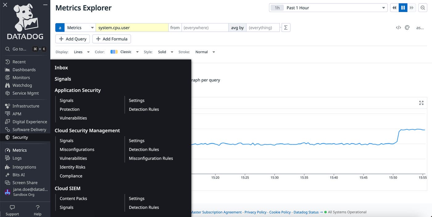
Within each sub-navigation menu, products and features are ordered both by their usage and relationship to each other. The lists within these menus are designed to be highly scannable—the left column displays the key highlights for each feature to help you quickly understand their functionality, with more detailed configuration and setup options listed on the right.
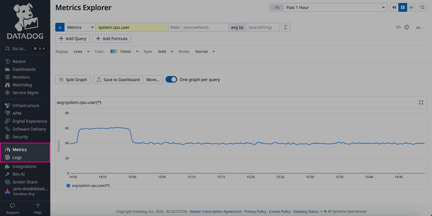
Towards the bottom of the sidebar, you can find our “core features.” These features—such as metrics and logs—collect data that populates the rest of our offerings, making them the backbone of our platform and a frequent resource for users. For example, most of our users query logs to troubleshoot issues—regardless of which particular team they’re on—in order to analyze data such as error messages, infrastructure health signals, and suspicious user requests. By placing logs at the bottom of the sidebar, users can quickly access and pivot to log data for fast investigations without needing to search through other menus of features.
At the bottom of the sidebar, we offer a variety of resources to help you use Datadog even more efficiently. As with our core features, their functionality spans our entire platform and is applicable to nearly all of our users. For example, here, you can find our integrations, which enable you to easily collect data from apps across your tech stack and monitor it via out-of-the-box tools. You can also access Bits AI, our AI-powered conversational interface that surfaces findings from the entire Datadog platform, bringing together data such as security signals, Watchdog insights, real-time user transactions, and cloud costs. This section also contains our CoScreen feature, which helps your teams quickly collaborate within a shared digital workspace, enabling them to use Datadog windows, IDEs, and developer tools side-by-side.
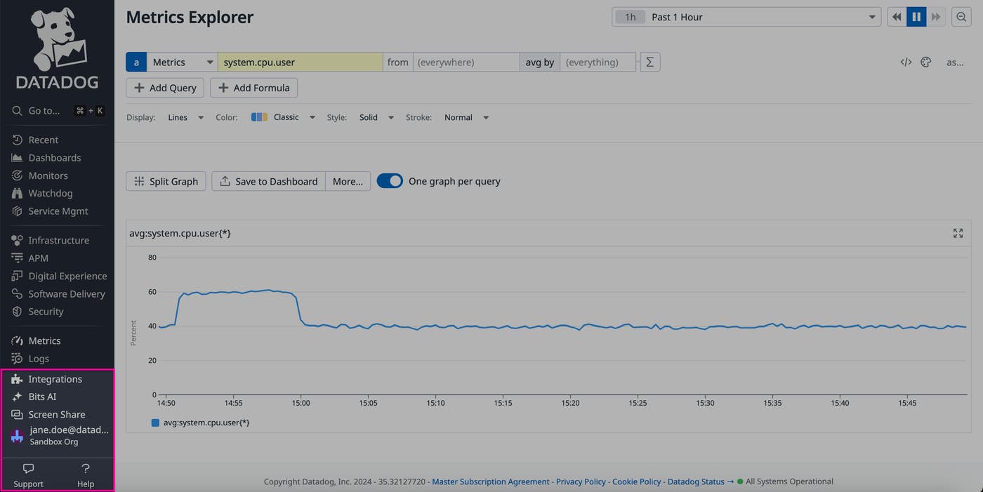
Below this section, you can find administrative settings and troubleshooting features, including our Help and Support resources. These features are essential for helping users navigate the Datadog platform. We’ve placed them at the very bottom of the sidebar, where they’re quick to find without drawing attention away from other features that users spend most of their time interacting with on a daily basis.
All throughout the redesign project, a top priority was making sure that changes didn’t come at the sacrifice of readability. In the process, we also found a couple of places where we could update our current schema. For example, we’ve updated the colors in our sidebar to have even greater contrast. This contrast carries over into both light and dark mode, making it easy to read no matter a user’s preference. This contrast also makes our sidebar more accessible to users with low vision or photosensitivity.
We’ve also provided more space for favorites, which makes their (often lengthy) titles easier to parse. Because favorites can encompass a wide range of features, they must be able to accommodate a wide range of title conventions. For example, a dashboard or notebook is probably going to have a longer name than a feature page, as its title may include details such as incident descriptions, timestamps, and lists of objectives. By expanding the characters that can fit in the sidebar, it’s easier to quickly see the names of your favorites as you’re switching among contexts.
With our navigation redesign, we’ve made our app easier to navigate, explore, and read. All this adds up to a more intuitive sidebar and a more streamlined product, helping you find the tools you need and take action on issues even faster.
You can check out the redesign in the app now. Or, if you’re not yet a Datadog user, you can sign up for a 14-day free trial today.
此内容由惯性聚合(RSS阅读器)自动聚合整理,仅供阅读参考。 原文来自 — 版权归原作者所有。