


As tools such as AI agents become more integrated with the instrumentation, governance, and centralization of product analytics data, product managers (PMs) still own the meaning of those events and the connected outcomes. Knowing when to trust the data, forming strong hypotheses, and being able to act on the insights requires an expert in the loop. Product analytics isn’t hard because reading a dashboard is hard, but because extracting meaning from a graph is often tricky: Data evolves, humans bring bias, and definitions change. Great PMs treat their data and their product equally: well designed, well documented, and connected to clear outcomes.
In this post, we’ll build upon an example of how two well-meaning PMs can come to different conclusions by looking at the same data. We’ll unpack what’s going on under the hood, which best practices can be used to extract meaning, and how modern tools and personal expertise go hand in hand with the way product teams work with their data.
We’ve all been there: You launched a feature and you start tracking its adoption via a funnel graph, one of the most common visualizations. You set an overall conversion goal of 50%, and now that your feature is live, your funnel conversion is at 42%—slightly below your original goal. It looks like the biggest drop happens at the “Enter payment details” step.
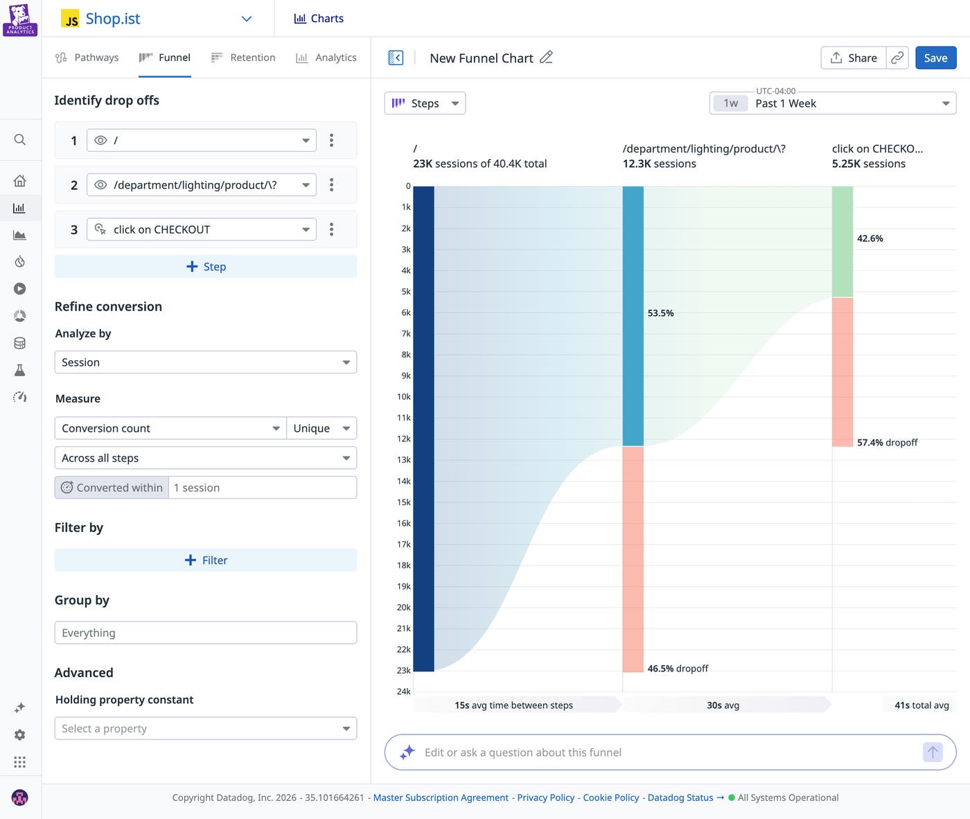
One PM focused on maximizing overall conversion might look at the data and decide to redesign that step entirely. Another PM hoping to attract high-value users might look at the graph and decide that the drop-off was a natural commitment filter, and that earlier steps in the planning phase targeted the wrong users. Both teams are competent and both are using data, yet they’re coming to completely different conclusions.
Collecting the data is just the first step. Agreeing on what the data means and how to use it is what matters in the long run. In fragmented environments, how do you reduce bias without slowing down the development process? Even with AI to help visualize and analyze data, interpretation is always going to be needed. You can’t eliminate judgment, but you can reduce the chance that your team finds a predetermined conclusion that isn’t necessarily supported by the data.
Let’s look at a few best practices to help you extract the right insights from your product analytics tool.
Writing a clear hypothesis before your feature launches clarifies what you expect to observe and what would change your mind if observed. There’s a big difference between looking at your data with the mindset of “Let’s see what’s weird” and looking at the same graph thinking, “I expect iOS users to convert more than Android users based on previous trends I observed. Let’s see if this is still true for this feature.” It’s your experience as a PM and your expertise with customers and the industry that will help you write the strongest hypotheses.
In our funnel graph example, while one PM blamed the payment UI design and the other blamed user targeting, a shared written hypothesis before launch would have clarified expectations. For example, a PM might define upfront that simplifying any friction in the payment form should increase paid conversion. If overall conversion remains flat, or if mobile conversion doesn’t improve relative to desktop, they would revisit whether acquisition quality—not UI friction—is driving the drop-off. To further strengthen causal inference, consider launching every new feature as an A/B test. The statistical rigor of experimentation will help you determine whether the observed change is due to your update rather than external factors.
If activation means something different to product, growth, and data teams, you’ll generate three different conclusions from one graph. Most analytics conversations fail because teams act like data is precise when often it isn’t. Instead, think of data as different layers that need to be handled differently:
Raw data: The source-of-truth events and logs (e.g., button_clicked, request_payloads, timestamps). Raw data is flexible and auditable, allowing teams to easily connect it to applications because they know exactly where requests hit or a database record is referenced. But raw data can also be noisy and easy to misread.
Modeled data: Cleaned, joined, standardized data (e.g., sessions, users, deduped events, derived properties). By using a data warehouse as the single source of truth, you ensure that consistency is defined at the core, preventing definitions from diverging across different tools. Modeling is where consistency is created, and where assumptions and definitions are embedded. Models can also drift over time, which can affect duplications, alter definitions, and develop other distortions if not properly tracked.
Business metrics: Definitions aligned to the business (e.g., “Activated user,” “Qualified lead,” “Net revenue retention”). These are the metrics leadership cares about, such as metrics tied to revenue, retention, or churn. They’re also the easiest to accidentally distort if the underlying model is shaky.
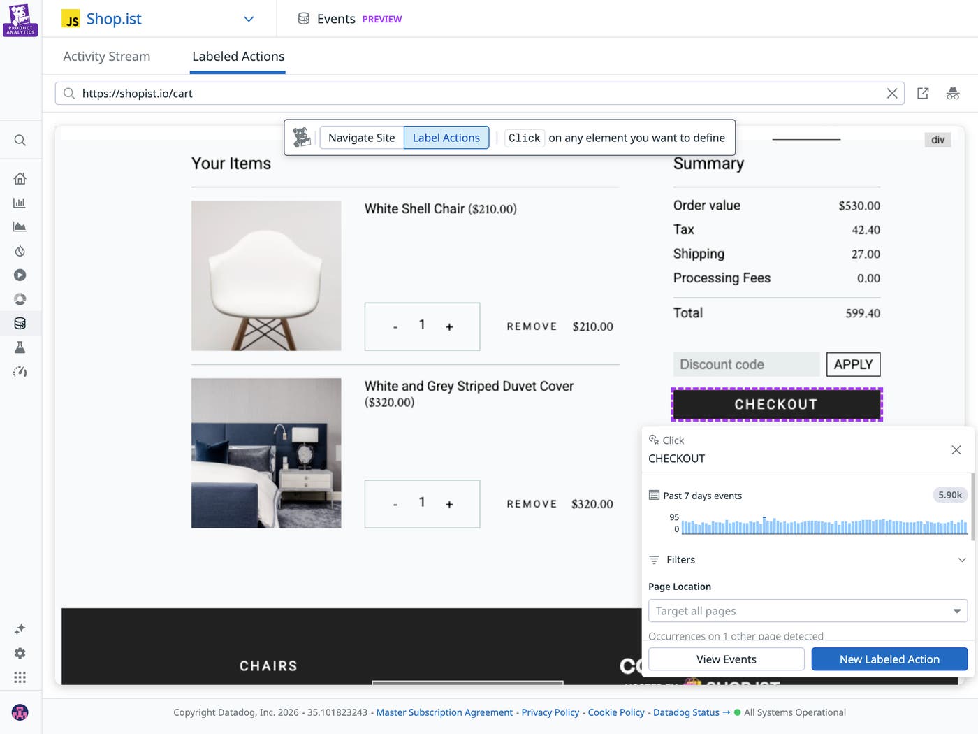
As a PM, you don’t need to be a data engineer. But you do need to be able to answer this question: “Am I looking at raw data, modeled data, or business metrics?” That way, when you’re looking at the data, you can be confident in its level of precision and the kinds of conclusions you can draw from it.
Funnels and other dashboards tell you the “what” behind user behavior. To figure out the “why,” you need to triangulate this data with other signals. These signals can live in many different places, such as session replays (watching a user go through a flow screen by screen), support tickets (understanding context outside of the screen), error logs (to see if technical hurdles are impacting conversion), and 1:1 user interviews.

If one product team looks at a funnel graph showing lower-than-expected conversion and blames the UI, it’s important they’re able to back it up with session replays showing users struggling with the app. Conjecture without supporting qualitative data can lead to premature (and costly) conclusions. In cross-functional environments, where product, engineering, and growth teams may rely on separate tools and signals, alignment on telemetry becomes harder. To speed up analysis, make sure these connections are easy and widely understood across different teams; otherwise, lack of access to these signals will likely steer your team toward the wrong conclusion.
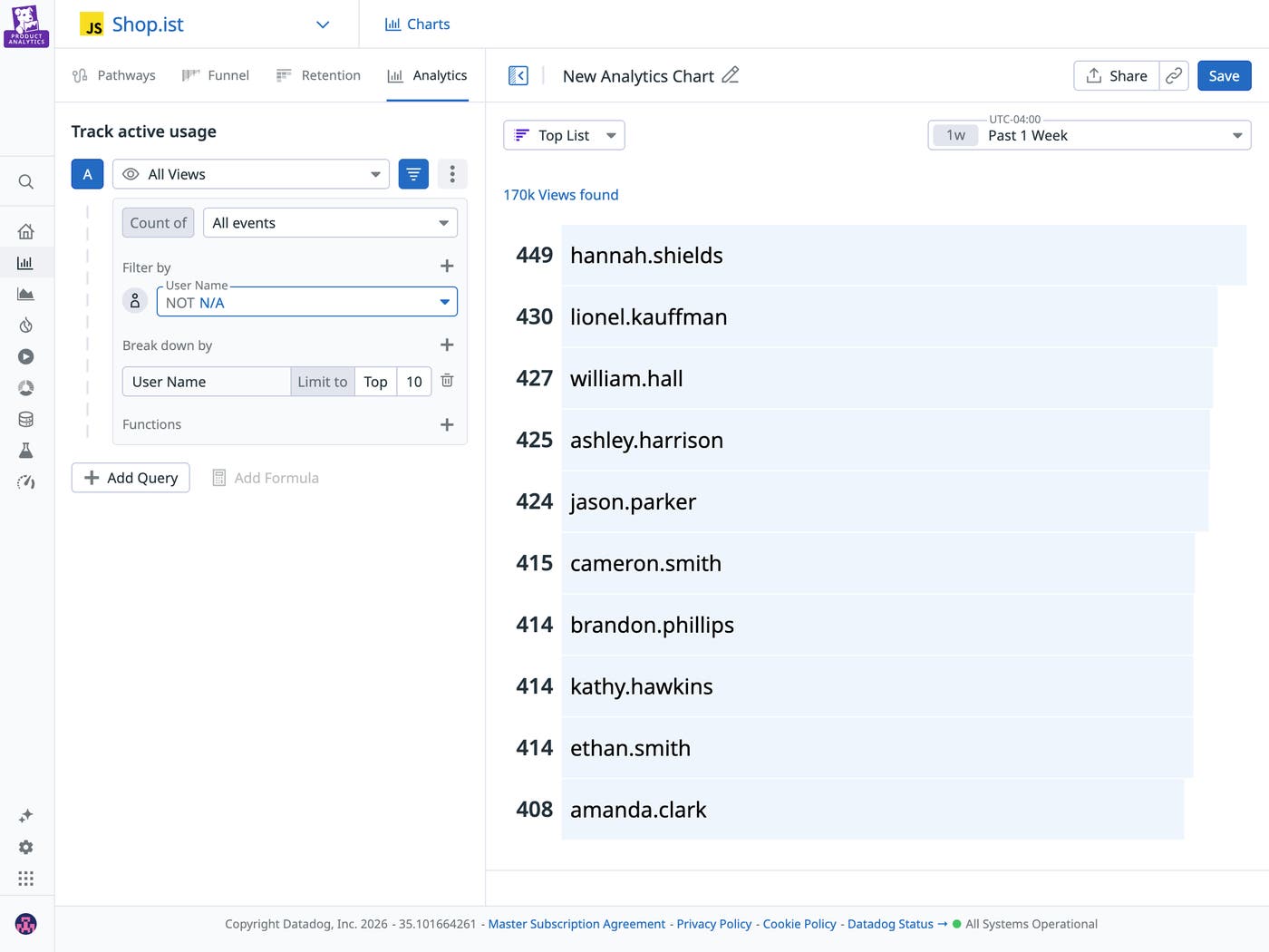
Segmenting results to isolate behavior to a subset of users is powerful but can be dangerous. If you slice the data in enough ways, you’ll often find a seemingly interesting pattern that upon deeper inspection is not meaningful.
Start with the obvious dimensions, such as device, source, geography, plan tier, role, and new vs. returning users. Then, stop when additional slicing doesn’t materially change the story. Make sure segmentation is also introduced into your hypothesis (for instance: behavior of Premium users vs. Free users), and enrich your data accordingly so you can answer the question from the moment your feature rolls out.
Analyzing a funnel is the beginning of the work, not the end. A thoughtful team pauses instead of jumping straight to a redesign or blaming acquisition. They revisit their hypothesis and break the data down. Is this happening across all users or just a specific segment? Does the behavior match what they expected?
Then, they validate what they’re seeing, using session replays, performance data, and support tickets to ask if these signals reinforce the story the funnel is telling. What initially looks like a broad conversion problem can often turn out to be something more specific. That specificity can lead to better product decisions and next steps.
In other cases, the right response might be to consider alternative approaches, such as:
A new life cycle messaging strategy to re-engage stalled users
Smarter defaults to reduce friction quickly
Performance improvements if some steps seem to be taking too long compared to others
Finally, make sure you always close the loop by deciding what success in the next iteration will look like and what you will do if the metrics continue not to move. Analytics is most valuable when it’s connected to clear outcomes and to the experience of real-life users.
If interpretation is the hard part of product analytics, your tooling shouldn’t make it harder. When evaluating a solution, ask:
How quickly can I answer a question?
Do I have access to all the different layers of data I need?
Can I connect behavioral insights to performance data, session replays, and experiments?
Can I segment my results by the right dimensions?
How easily can I turn insight into action?
Datadog Product Analytics provides visibility into the entire user journey through an auto-capture SDK and a fully retroactive dataset. Clean, complete instrumentation reduces blind spots and the need for manual setup that often leads to inconsistent data tracking.
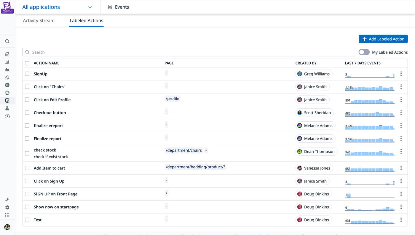
Action Management provides governance at the source to enforce consistent event naming (e.g., SignUp vs sign_up_confirmed) and can flag schema drift before it impacts your reporting. That means business metrics aren’t built on shifting definitions, and teams can reason on the same data foundation.
We’re in a new era of interacting with product analytics data, where it’s easier to delegate your tracking plans, your data audits, and even your instrumentation code. But key human decisions are needed more than ever to extract meaning, from forming clear hypotheses and data definitions to choosing what to segment and which data to correlate.
Datadog’s full-stack platform connects frontend behavior to backend performance and logs, giving teams the context they need to move from “what happened” to “why” and make informed decisions. In a world where dashboards are everywhere, the advantage isn’t more data. It’s a shared system that helps teams understand what their product data is actually saying. For more on Datadog Product Analytics, see the Product Analytics documentation.
If you’re not yet using Datadog, you can start with a 14-day free trial.
此内容由惯性聚合(RSS阅读器)自动聚合整理,仅供阅读参考。 原文来自 — 版权归原作者所有。