


惯性聚合 高效追踪和阅读你感兴趣的博客、新闻、科技资讯
阅读原文 在惯性聚合中打开

推荐订阅源

H
Heimdal Security Blog
P
Privacy International News Feed
S
Schneier on Security
P
Proofpoint News Feed
L
Lohrmann on Cybersecurity
Spread Privacy
Spread Privacy
P
Privacy & Cybersecurity Law Blog
D
Darknet – Hacking Tools, Hacker News & Cyber Security
Scott Helme
Scott Helme
K
Kaspersky official blog
大猫的无限游戏
大猫的无限游戏
freeCodeCamp Programming Tutorials: Python, JavaScript, Git & More
aimingoo的专栏
aimingoo的专栏
Simon Willison's Weblog
S
Securelist
Help Net Security
Help Net Security
B
Blog
H
Hackread – Cybersecurity News, Data Breaches, AI and More
Security Archives - TechRepublic
云风的 BLOG
云风的 BLOG
The GitHub Blog
The GitHub Blog
N
News and Events Feed by Topic
Hacker News: Ask HN
Hacker News: Ask HN
cs.CV updates on arXiv.org
CTFtime.org: upcoming CTF events
M
MIT News - Artificial intelligence
雷峰网
雷峰网
博客园 - 司徒正美
V
V2EX
AWS News Blog
AWS News Blog
Know Your Adversary
Know Your Adversary
N
News | PayPal Newsroom
T
Tor Project blog
Cisco Talos Blog
Cisco Talos Blog
OSCHINA 社区最新新闻
OSCHINA 社区最新新闻
PCI Perspectives
PCI Perspectives
Google DeepMind News
Threat Intelligence Blog | Flashpoint
U
Unit 42
C
Cybersecurity and Infrastructure Security Agency CISA
P
Palo Alto Networks Blog
G
Google Developers Blog
T
Threat Research - Cisco Blogs
博客园 - Franky
I
InfoQ
D
DataBreaches.Net
爱范儿
爱范儿
Y
Y Combinator Blog
博客园 - 叶小钗
奇客Solidot–传递最新科技情报
奇客Solidot–传递最新科技情报

Datadog | The Monitor blog

Introducing our open source AI-native SAST Instrument and monitor Boomi integration flows with OpenTelemetry and Datadog Not all index scans are equal: How we cut query latency by over 99% Platform engineering metrics: What to measure and what to ignore Integrate Recorded Future threat intelligence with Datadog Cloud SIEM CI/CD security: threat modeling using a MITRE-style threat matrix CI/CD security: How to secure your GitHub ecosystem Ingress NGINX is EOL: A practical guide for migrating to Kubernetes Gateway API Operating agentic AI with Amazon Bedrock AgentCore and Datadog LLM Observability: Lessons from NTT DATA Introducing the Datadog Code Security MCP Capture and analyze custom heatmaps in Session Replay Understand session replays faster with AI summaries and smart chapters Monitor ClickHouse query performance with Datadog Database Monitoring How we designed empathetic alert sounds for on-call engineers Search and act across Datadog to resolve issues faster with Bits Assistant Measure the business impact of every product change with Datadog Experiments Analyzing round trip query latency Configuring JavaScript caches for better performance Introducing Bits AI Dev Agent for Code Security Datadog achieves ISO 42001 certification for responsible AI Monitor Nutanix clusters, hosts, and VMs with Datadog Monitor Juniper Mist in Datadog A new Host Map for modern infrastructure Annotate traces to improve LLM quality with Datadog LLM Observability What’s new in Cloud SIEM: AI-powered investigations, enhanced threat intelligence, and scalable security operations Explore Kubernetes with native OpenTelemetry data Monitor Oracle Fusion Cloud Applications with Datadog Announcing the Datadog Terraform provider v4.0.0 Scaling Kubernetes workloads on custom metrics How to design cloud environments for AI-powered threat analysis Monitor Aruba Central in Datadog How we centralize and remediate risks with Datadog Case Management Accelerate incident response with Datadog and ServiceNow Monitor your application and network load balancer logs Understanding Karpenter architecture for Kubernetes autoscaling Tools for collecting metrics and logs from Karpenter Monitor Karpenter with Datadog What your product data is actually saying Key metrics for monitoring Karpenter Securing Datadog’s platform in the AI age: The role of observability data Four ways engineering teams use the Datadog MCP Server to power AI agents Approaching your observability migration with the right mindset Meet the new Bits AI SRE: Deeper reasoning, twice as fast Key learnings from the 2026 State of DevSecOps study Use plain English to query your multi-cloud infrastructure in Resource Catalog Simplifying troubleshooting across the user journey with Datadog Synthetic Monitoring Protect your OCI resources with Datadog Cloud Security This Month in Datadog - February 2026 Amazon EC2 security: How misconfigured and public AMIs expand your cloud attack surface Enable end-to-end visibility into your Java apps with a single command Measure and improve mobile app startup performance with Datadog RUM Evaluating our AI Guard application to improve quality and control cost Identify untested code across every level of your codebase Make use of guardrail metrics and stop babysitting your releases Monitor Versa Networks SD-WAN performance in Datadog Improve performance and reliability with APM Recommendations Remediate transitive vulnerabilities faster with Datadog Software Composition Analysis Generate audit-ready vulnerability and compliance reports with Datadog Sheets Monitor Fortinet FortiManager performance in Datadog Improve test coverage across codebases with Datadog Code Coverage Move fast, don’t break things: Consistent testing standards at scale Enrich logs with ServiceNow CMDB context before routing to any SIEM or logging tool Monitor Lustre with Datadog Make faster, better product decisions with Datadog Product Analytics Surface and remediate runtime posture issues with Workload Protection Findings Protect agentic AI applications with Datadog AI Guard How to optimize JavaScript code with CSS Trace Google Pub/Sub workloads in Cloud Run with Datadog Detect human names in logs with ML in Sensitive Data Scanner How we cut our NLQ agent debugging time from hours to minutes with LLM Observability Debug PostgreSQL query latency faster with EXPLAIN ANALYZE in Datadog Database Monitoring Datadog acquires Propolis Unify and correlate frontend and backend data with retention filters Scale compliance across global frameworks with Datadog Cloud Security Monitor Arista VeloCloud SD-WAN performance with Datadog Building reliable dashboard agents with Datadog LLM Observability Simplify log collection and aggregation for MSSPs with Datadog Observability Pipelines Mitigation for Node.js denial-of-service vulnerability affecting Datadog APM Automate flaky test fixes with the Bits AI Dev Agent and Test Optimization How we built an AI SRE agent that investigates like a team of engineers Datadog integrations 2025 recap: Observability for AI, security, and hybrid cloud Design effective executive dashboards with Datadog Implement dbt data quality checks with dbt-expectations Bring faster visibility into AWS Lambda functions with remote instrumentation Troubleshoot faster with the GitLab Source Code integration in Datadog How Cambia Health Solutions saved $30,000 monthly with Cloud Cost Management and the Datadog Resource Catalog Normalize any logs for Cloud SIEM with Datadog's OCSF processor Optimizing Datadog at scale: Cost-efficient observability at Zendesk Detect, diagnose, and resolve network issues easily with CNM Network Health Connect engineering errors to user impact in early-stage products Cilium configuration for Kubernetes operations at scale Designing feedback loops for progressive delivery Ship features faster and safer with Datadog Feature Flags Choosing the right OpenTelemetry Collector distribution Route your monitor alerts with Datadog monitor notification rules Automate Cloud SIEM investigations with Bits AI Security Analyst Cloud threat detection: How to identify risky activity across control and data planes Collecting Kafka performance metrics Monitoring Kafka with Datadog Monitoring Kafka performance metrics
Visualize user interactions with your pages by using Scroll Maps in Datadog Heatmaps
Nicholas Thomson, Jamie Milstein · 2023-10-11 · via Datadog | The Monitor blog

Heatmaps is now part of Datadog Product Analytics! Note that some visuals in this post may not reflect the updated UI.

When developing modern applications, product managers, designers, and website developers need to understand how users interact with web pages in order to guide those users through their desired journeys. For example, teams need to know if users ever see the content near the bottom of the page, where to place CTAs to ensure they are in high-traffic areas, and how to compare different pages based on user engagement.

That’s why we’re proud to announce Scroll Maps, a feature of Datadog Heatmaps that leverages Session Replay data to show you how far users scroll down a page. Scroll Maps display this data in a few different ways, including:

  • Helpful metrics, such as how many users made it to the average fold for different device types (including mobile, tablet, and desktop) and what percentage of users made it to specific milestones on the page (e.g., 25 percent and 50 percent of the way through)

  • A mini scroll map that presents the page as a gradient that changes in color, based on the number of users that made it that far down the page

  • A distribution graph presenting the data in a timeseries to illustrate changing trends in page views across the depths of the page

Additionally, Scroll Maps offer new, searchable facets so that you can take the data from the map and create your own queries in Product Analytics to see how one page compares to another page (e.g., readership of release notes for a new feature versus a previously released one).

In this post, we’ll show you how to use Scroll Maps to:

  • Gain insights into user interactions so that you can optimize a page

  • Compare viewership trends across different pages

Gain insights into user interactions so that you can optimize a page

Scroll Maps offer a great way to investigate user experience and engagement with your application, helping you design and deploy better features that fulfill user needs. These immediate benefits for the user can in turn lead to a more popular product and, hopefully, increased revenue.

For example, say you’re a web developer at an e-commerce site, working with a product manager who wants to improve the rate of users who sign up for an account. The call-to-sign-up button is generating new accounts at a low rate—0.5 percent of visitors to your site sign up for an account, and the PM is shooting for 2 percent—so you decide to leverage Scroll Maps to investigate what percentage of users are even making it to the button.

The modal on the left-hand side shows you statistics and a high-level distribution of your page, so you can tell, at a glance, that the majority of your visitors are spending their time in the first two-thirds of the page, where the product is displayed.
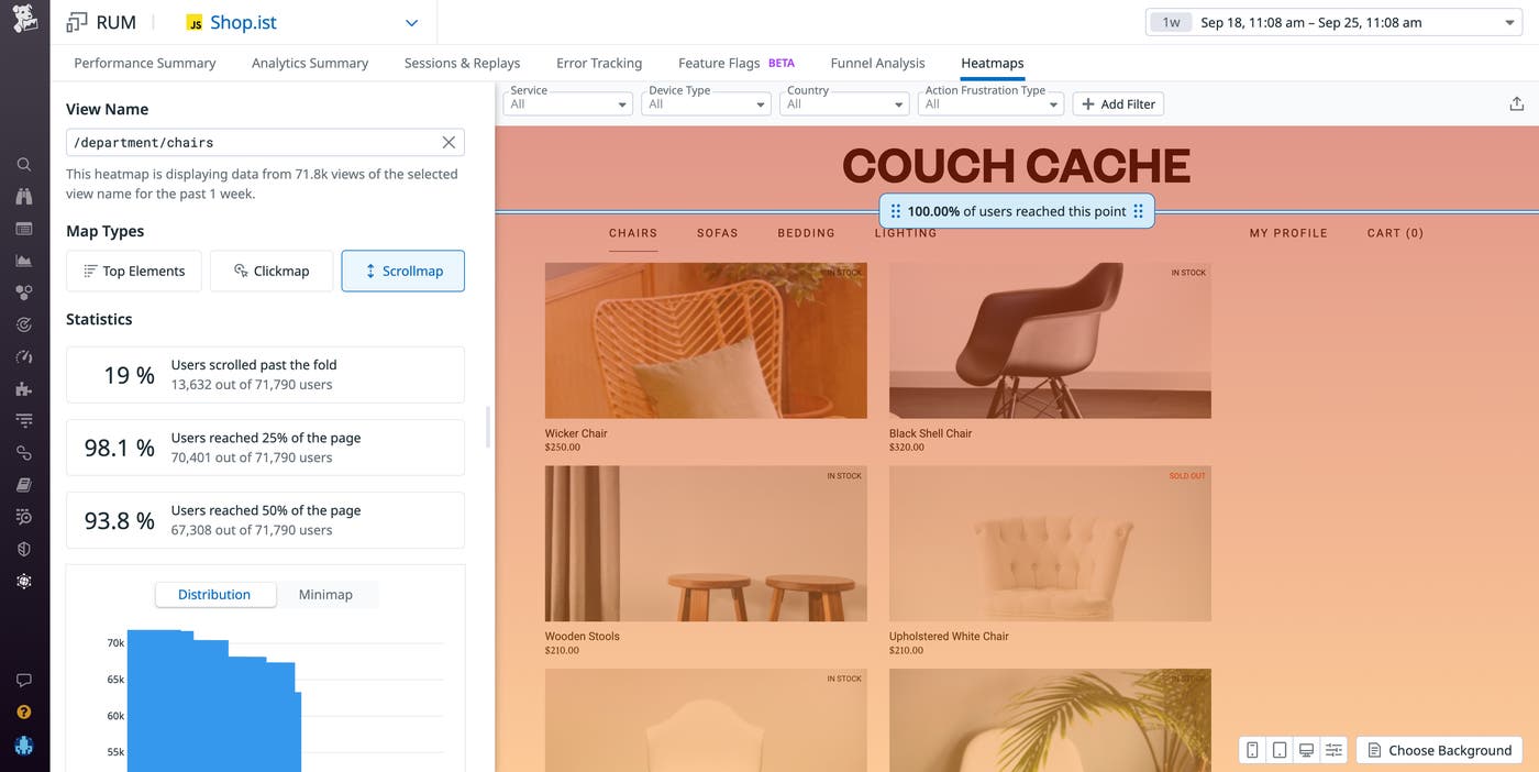
The distribution modal shows you where readers spend their time on your page.

Scroll Maps offer an interactive blue scrollbar that shows you the percentage of users that read to different depths.

You scroll down to your sign-up button, which is at the bottom of the app’s home page, and see that only 30 percent of visitors to your site scrolled down far enough on the page to see the call-to-sign-up button. The distribution graph shows you the same data, but in a distribution visualization, revealing that viewership is dropping off a cliff below the fold.

In this scenario, you could bring this data to the product manager and advise them to place the call to sign up higher up on the page to ensure that most visitors will see it. This adjustment, hopefully, will result in an increased number of sign-ups.

You can also use Scroll Maps to compare performance between different pages, providing layers of context to your analysis that can help you optimize your pages more effectively. For example, say you’re a product manager at the same e-commerce site from the example above. You want to understand what UX elements are leading to the cart page, as funnel analysis has shown that there is a high dropoff from users on the catalog page to the cart page.

To compare the two products, you navigate to the Analytics Explorer and search for the new facet enabled by Scroll Maps, @display.scroll.max_depth_pct, which measures the percent of users that reached a certain view.
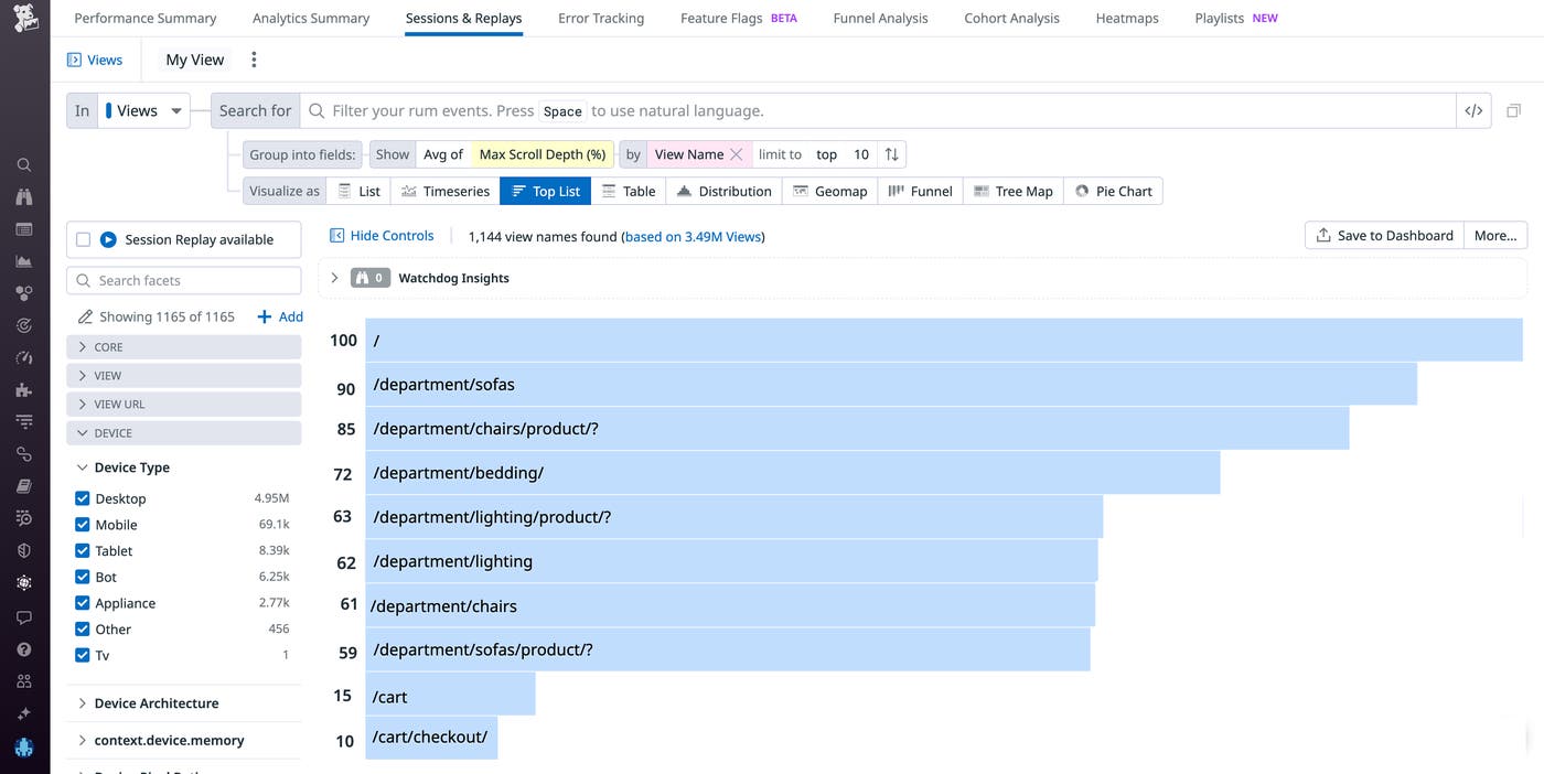
Scroll down the page to see how many users read to different depths.

You find that a significantly larger percentage of visitors to your site are seeing the product pages as compared to the cart pages, which makes sense given the funnel analysis that showed a low conversion rate.

Using Session Replay, you watch real user journeys from your site’s home page to these two different paths and discover that users are experiencing an elevated number of frustration signals—in this case, rage clicks—when trying to click on the lighting page. Specifically, you find that users are clicking on the wrong UI element. As it turns out, there is a second element on the page that users believe is the lighting button and this problematic UI element is inadvertently misleading users about functionality. With this knowledge in hand, you can redesign the UI to ensure that customers are successfully able to navigate to the lighting page.

With Scroll Maps, you can easily visualize user engagement at different depths of your pages in a single view. You can then use these insights to troubleshoot problematic page elements and optimize your UX. A feature of Datadog Heatmaps, Scroll Maps also complement the Analytics Explorer, Funnel Analysis, and Session Replay.

If you’re already a Datadog customer, you can use our documentation to get started with Scroll Maps and Product Analytics. Or, if you’re new to Datadog, you can sign up for a 14-day free trial today.