






Malay Haldar, Hongwei Zhang, Kedar Bellare Sherry Chen
Search is the core mechanism that connects guests with Hosts at Airbnb. Results from a guest’s search for listings are displayed through two interfaces: (1) as a list of rectangular cards that contain the listing image, price, rating, and other details on it, referred to as list-results and (2) as oval pins on a map showing the listing price, called map-results. Since its inception, the core of the ranking algorithm that powered both these interfaces was the same — ordering listings by their booking probabilities and selecting the top listings for display.
But some of the basic assumptions underlying ranking, built for a world where search results are presented as lists, simply break down for maps.
What Is Different About Maps?
The central concept that drives ranking for list-results is that user attention decays starting from the top of the list, going down towards the bottom. A plot of rank vs click-through rates in Figure 1 illustrates this concept. X-axis represents the rank of listings in search results. Y-axis represents the click-through rate (CTR) for listings at the particular rank.
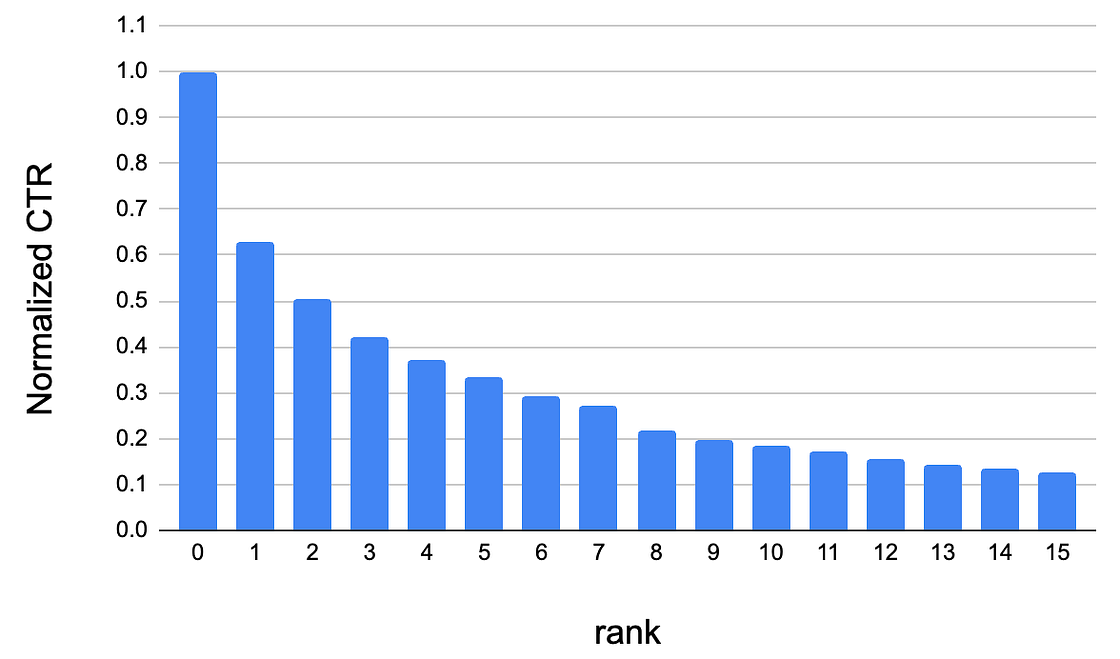
To maximize the connections between guests and Hosts, the ranking algorithm sorts listings by their booking probabilities based on a number of factors and sequentially assigns their position in the list-results. This often means that the larger a listing’s booking probability, the more attention it receives from searchers.
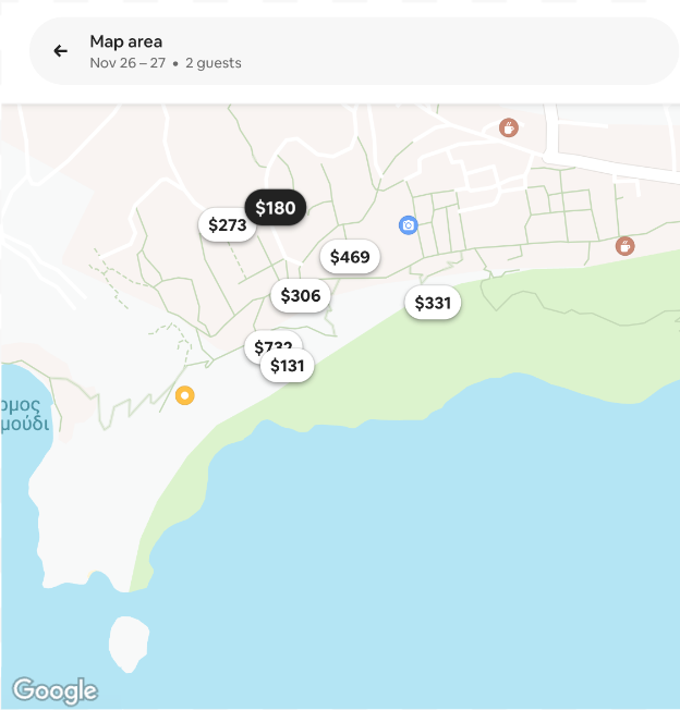
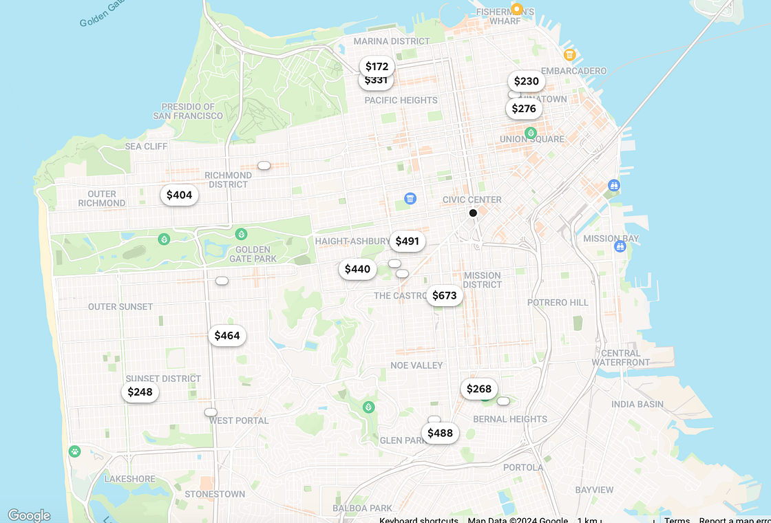
But in map-results, listings are scattered as pins over an area (see Figure 2). There is no ranked list, and there is no decay of user attention by ranking position. Therefore, for listings that are shown on the map, the strategy of sorting by booking probabilities is no longer applicable.
Uniform User Attention
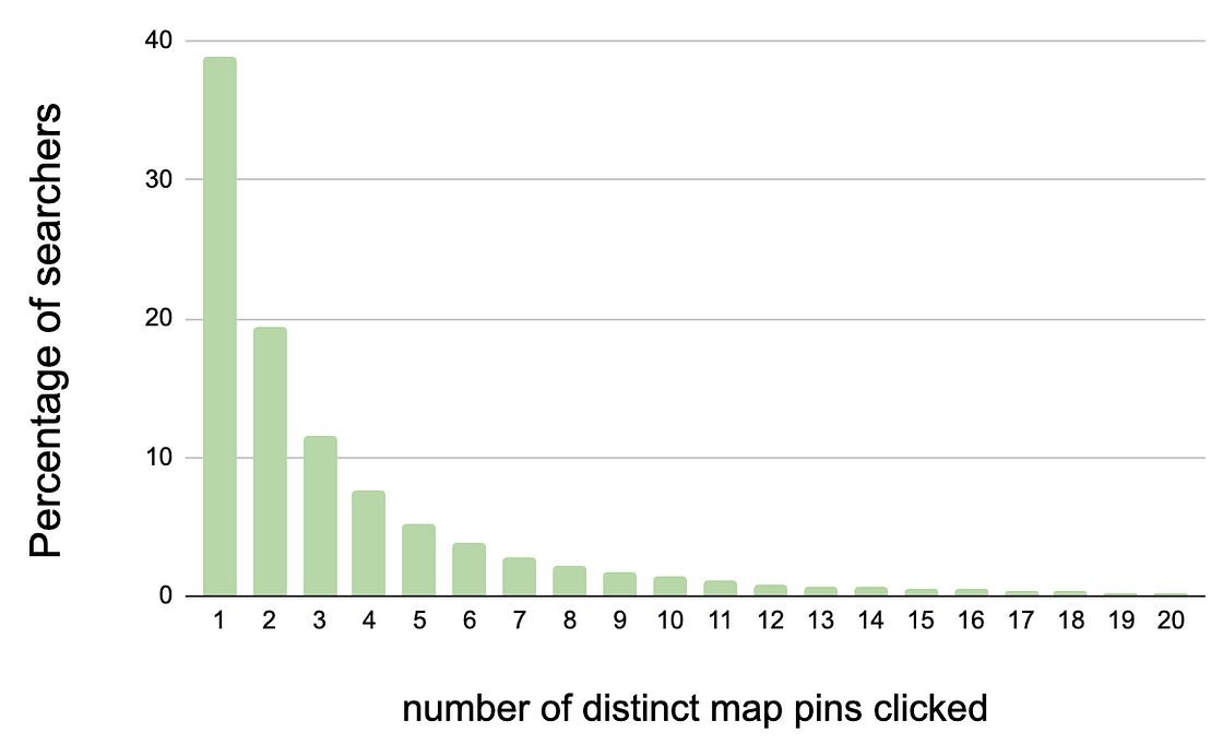
To adapt ranking to the map interface, we look at new ways of modeling user attention flow across a map. We start with the most straightforward assumption that user attention is spread equally across the map pins. User attention is a very precious commodity and most searchers only click through a few map pins (see Figure 3). A large number of pins on the map means those limited clicks may miss discovering the best options available. Conversely, limiting the number of pins to the topmost choices increases the probability of the searcher finding something suitable, but runs the risk of removing their preferred choice.
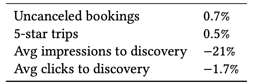
We test this hypothesis, controlled by a parameter . The parameter serves as an upper bound on the ratio of the highest booking probability vs the lowest booking probability when selecting the map pins. The bounds set by the parameter controls the booking probability of the listings behind the map pins. The more restricted the bounds, the higher the average booking probability of the listings presented as map pins. Figure 4 summarizes the results from A/B testing a range of parameters.
The reduction in the average impressions to discovery metric in Figure 4 denotes the fewer number of map pins a searcher has to process before clicking the listing that they eventually book. Similarly, the reduction in average clicks to discovery shows the fewer number of map pins a searcher has to click through to find the listing they booked.
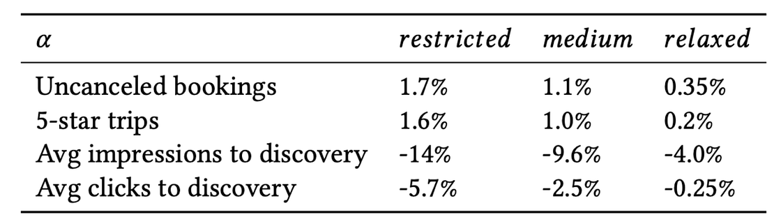
Launching the restricted version resulted in one of the largest bookings improvement in Airbnb ranking history. More importantly, the gains were not only for bookings, but for quality bookings. This could be seen by the increase in trips that resulted in 5-star rating after the stay from the treatment group, in comparison to trips from the control group.
Tiered User Attention
In our next iteration of modeling user attention, we separate the map pins into two tiers. The listings with the highest booking probabilities are displayed as regular oval pins with price. Listings with comparatively lower booking probabilities are displayed as smaller ovals without price, referred to as mini-pins (Figure 5). By design, mini-pins draw less user attention, with click-through rates about 8x less than regular pins.
This comes in handy particularly for searches on desktop where 18 results are shown in a grid on the left, each of them requiring a map pin on the right (Figure 6).
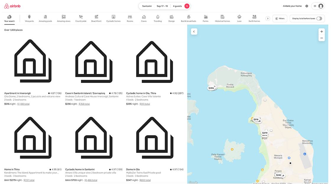
The number of map pins is fixed in this case, and limiting them, as we did in the previous section, is not an option. Creating the two tiers prioritizes user attention towards the map pins with the highest probabilities of getting booked. Figure 7 shows the results of testing the idea through an online A/B experiment.
Discounted User Attention
In our final iteration, we refine our understanding of how user attention is distributed over the map by plotting the click-through rate of map pins located at different coordinates on the map. Figure 8 shows these plots for the mobile (top) and the desktop apps (bottom).
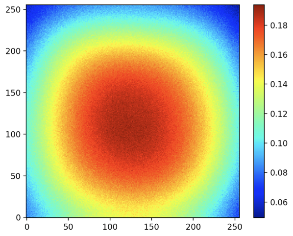
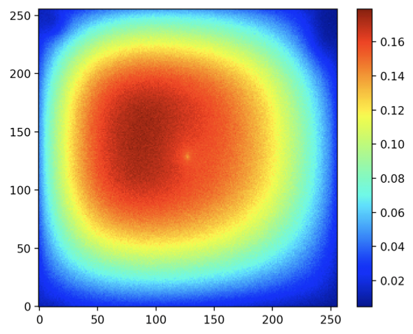
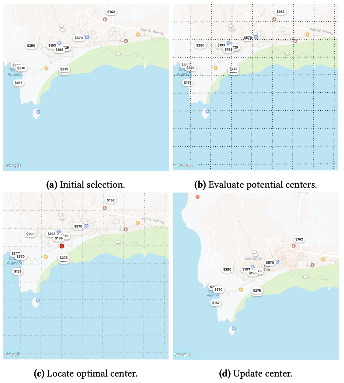
To maximize the chances that a searcher will discover the listings with the highest booking probabilities, we design an algorithm that re-centers the map such that the listings with the highest booking probabilities appear closer to the center. The steps of this algorithm are illustrated in Figure 9, where a range of potential coordinates are evaluated and the one which is closer to the listings with the highest booking probabilities is chosen as the new center.
When tested in an online A/B experiment, the algorithm improved uncancelled bookings by 0.27%. We also observed a reduction of 1.5% in map moves, indicating less effort from the searchers to use the map.
Conclusion
Users interact with maps in a way that’s fundamentally different from interacting with items in a list. By modeling the user interaction with maps in a progressively sophisticated manner, we were able to improve the user experience for guests in the real world. However, the current approach has a challenge that remains unsolved: how can we represent the full range of available listings on the map? This is part of our future work. A more in-depth discussion of the topics covered here, along with technical details, is presented in our research paper that was published at the KDD ’24 conference. We welcome all feedback and suggestions.
If this type of work interests you, we encourage you to apply for an open position today.